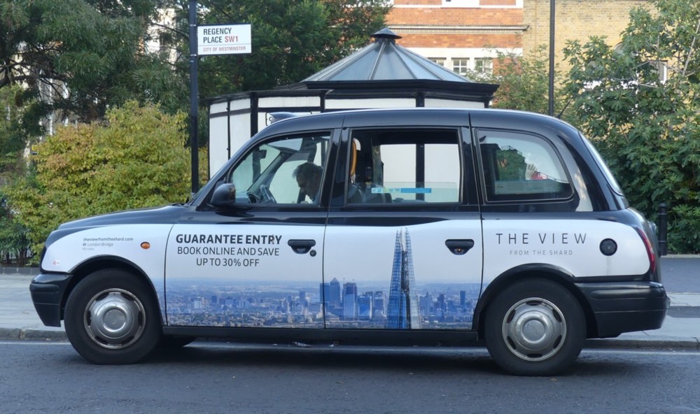
Earlier this evening I did some laundretting, and while I was there, this showed up outside:
I still photo taxis with adverts on them, and I especially liked this one, advertising this.
It made me think of the last time I went up to the top of the Shard, just over a year ago.
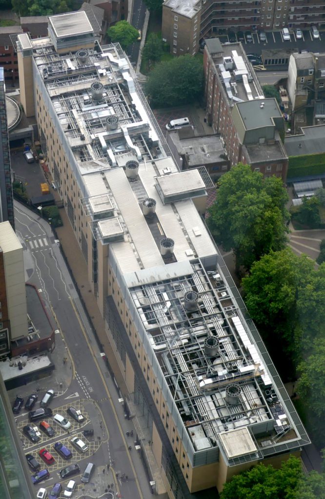
So I took a browse through the photos I took that day, and this time around, this one particularly struck me:
That was cropped to confine itself to the one building, and photoshop(clone)ed to resist the dullness of the day and general fogginess of the original.
Part of me wants to say that this is a classic case of the behind-the-scenes bit of a building, a chunk of it that you are not supposed to look at and get all aesthetic about. It is what it is.
But I actually think that this is the facade of the building that the architects of it were most proud. There is an exuberance about this roof, done in the equipment-as-decoration style, that is utterly lacking in the rest of the building. The “official” bits of which are about as dull as dullness can get. They didn’t have the budget to go full Lloyds Building, all over. But they were able to go crazy on the roof, because the politicians whose job it was to tell them to redo the design more boringly didn’t give the roof any attention. They thought they were building a machine for studying in, but only on the roof were they able to go mad with “expressing” that machineness.
I reckon they were delighted that the Shard was later put right next to this block of boredom with a great roof, enabling thousands of folks to gaze down on their favourite bit.. Gotcha, boredom police!
Okay, just a thought, and a thought that could well be wrong. Maybe they really didn’t care how the roof looked. But take a look through these photos of this mostly very dull slab, mostly taken from street level, of course, and see if you don’t share my suspicions.


