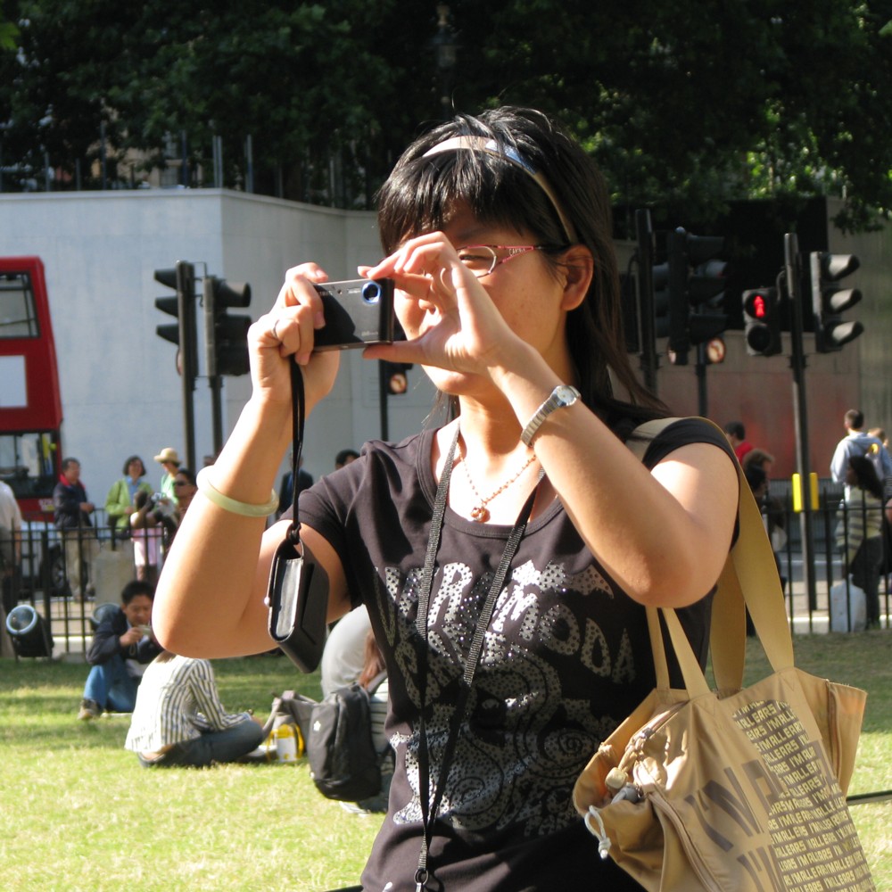
Photoers ten years ago today

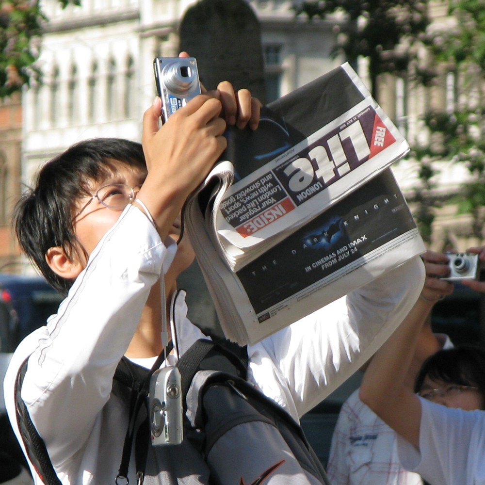
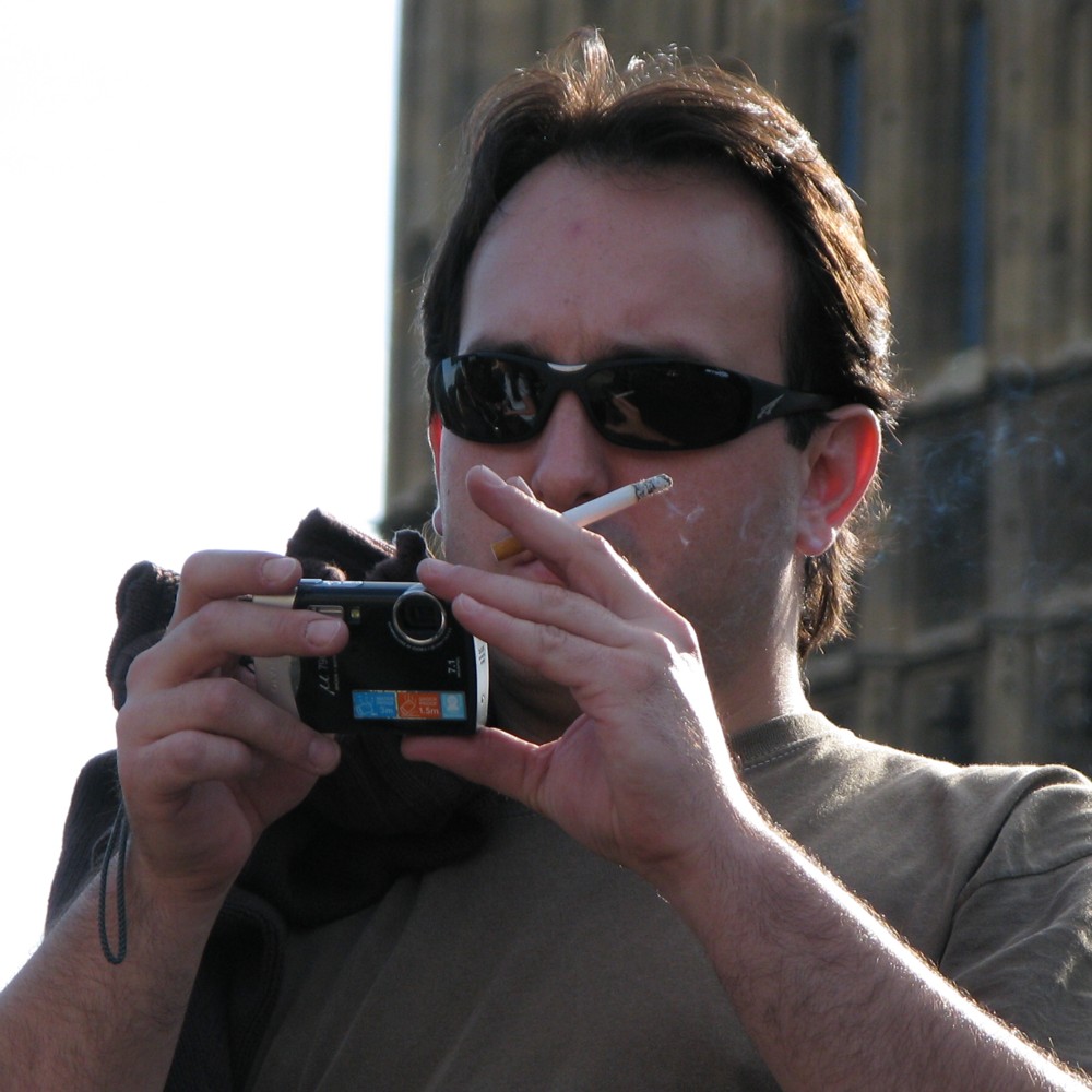
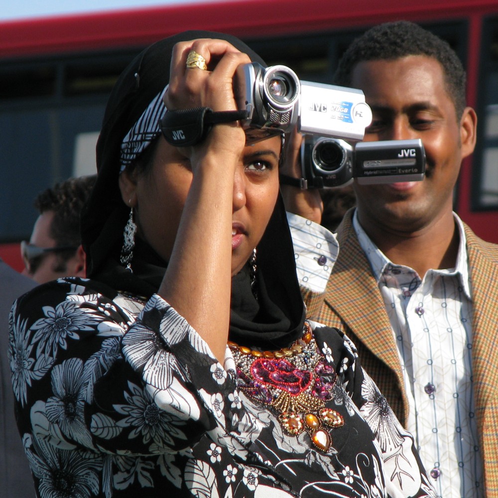
Yes, photoers photoed by me exactly ten years ago to the day, in the vicinity of Westminster Abbey, Westminster Bridge, Parliament, etc.:

Cameras you don’t see much any more. Even a free London newspaper you don’t see at all, any more.

Even the guy just smoking while photoing now looks a bit noughties.

Originally posted at Brian Micklethwait’s Old Blog

A new Big Thing alignment as seen from the Oval

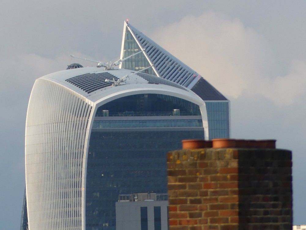
Yes, earlier this evening, my mate Darren arranged for me to drop by at the Oval to witness day 2 of the first Day/Night game of four day county cricket to be staged at the Oval. However, all I have the energy to show you for now is this new-to-me Big Thing alignment, as seen from the very superior seats way up in the pavilion, where Surrey members like Darren (and his plus one) can sit.

Not surprisingly, these superior seats are one of my favourite spots in London (therefore in the world), because you can see things like the above, and cricket.

What we mostly observe in the above photo is the Walkie Talkie. But behind we also see the newly erected Scalpel. And, eagle-eyed viewers will also be able to discern, from two very small clues, the Gherkin. Yes, that is definitely the Gherkin.

What the thing between the chimney pots in the foreground and the Walkie Talkie is, I do not know.

I especially like the two window cleaning cranes on the top of the Walkie Talkie.

Sleep well. I am definitely about to do this myself.

Originally posted at Brian Micklethwait’s Old Blog

A view from the Shard

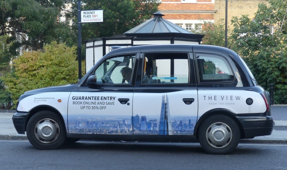
Earlier this evening I did some laundretting, and while I was there, this showed up outside:

I still photo taxis with adverts on them, and I especially liked this one, advertising this.

It made me think of the last time I went up to the top of the Shard, just over a year ago.

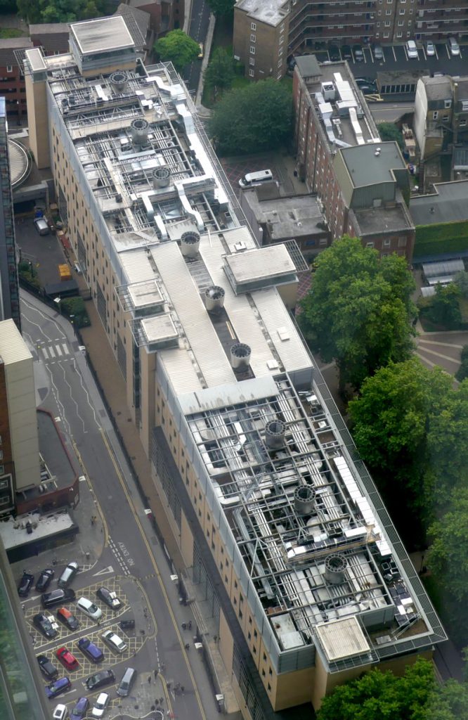
So I took a browse through the photos I took that day, and this time around, this one particularly struck me:

That was cropped to confine itself to the one building, and photoshop(clone)ed to resist the dullness of the day and general fogginess of the original.

Part of me wants to say that this is a classic case of the behind-the-scenes bit of a building, a chunk of it that you are not supposed to look at and get all aesthetic about. It is what it is.

But I actually think that this is the facade of the building that the architects of it were most proud. There is an exuberance about this roof, done in the equipment-as-decoration style, that is utterly lacking in the rest of the building. The “official” bits of which are about as dull as dullness can get. They didn’t have the budget to go full Lloyds Building, all over. But they were able to go crazy on the roof, because the politicians whose job it was to tell them to redo the design more boringly didn’t give the roof any attention. They thought they were building a machine for studying in, but only on the roof were they able to go mad with “expressing” that machineness.

I reckon they were delighted that the Shard was later put right next to this block of boredom with a great roof, enabling thousands of folks to gaze down on their favourite bit.. Gotcha, boredom police!

Okay, just a thought, and a thought that could well be wrong. Maybe they really didn’t care how the roof looked. But take a look through these photos of this mostly very dull slab, mostly taken from street level, of course, and see if you don’t share my suspicions.

Originally posted at Brian Micklethwait’s Old Blog

Poetry is not dead

Indeed:

Here.

She also wrote that NYT letter about white privilege, concerning which she Tweets:

Do not deny my lived experience.

Absolutely not.

Originally posted at Brian Micklethwait’s Old Blog

Steven Pinker Galapagos photos of weird and wonderful creatures

This is the exactly kind of thing I joined Twitter to be informed of. Pinker, it seems, is a Real Photographer, or at least Real enough for me not to know the difference. I’m sure that The World has known about Pinker’s photoing for as long as he has been doing it, but The World did not include me, until a few days ago.

Also rather Real Photographer is that if you left-click on any of the photos here, you get a little dark rectangle with little blue writing in it saying this:

These photos are copyrighted by their respective owners. All rights reserved. Unauthorized use prohibited.

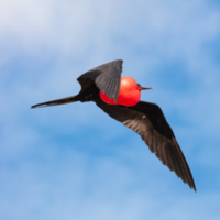
So I hope that the small and cropped repro that I have included here, of one of the more eye-catching of these photos, of something called a frigatebird, will not incur the ire of Pinker Inc., or whatever it is that might be irate. If Pinker Inc. does demand the removal of even this little photo, that will happen straight away.

But if it does, no matter. Follow the above links and feast your eyes and your mind on the weird and wonderful creatures of the Galapagos Islands.

Originally posted at Brian Micklethwait’s Old Blog

The paperback cover will be much more legible

The Devil’s Dice is a debut work of crime fiction, written by my niece (which I mention to make clear that I am biased in her favour) Roz Watkins, and published earlier this year. I enjoyed it a lot when I read it, but I did complain about the cover design:

Memo to self: If I ever design a book cover, make the title on the front either in dark lettering with a light background, or with light lettering on a dark background.

This earlier posting reinforced that point with a photo of a big display of books in Waterstone’s Piccadilly, from which you can only tell that The Devil’s Dice is The Devil’s Dice when you crop out that one title from that bigger picture and blow it up, thus:
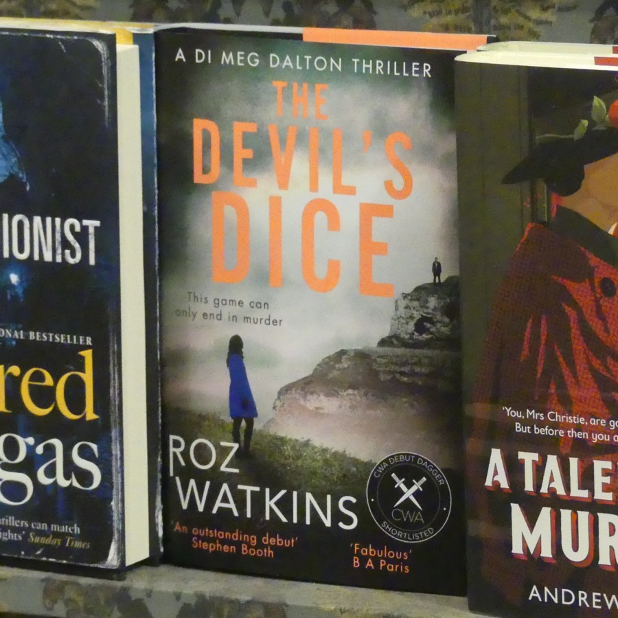
This illegibility effect is also all too evident in this photo, taken by Roz’s brother.

All of which means that this (this being the relevant Amazon link) is good news:
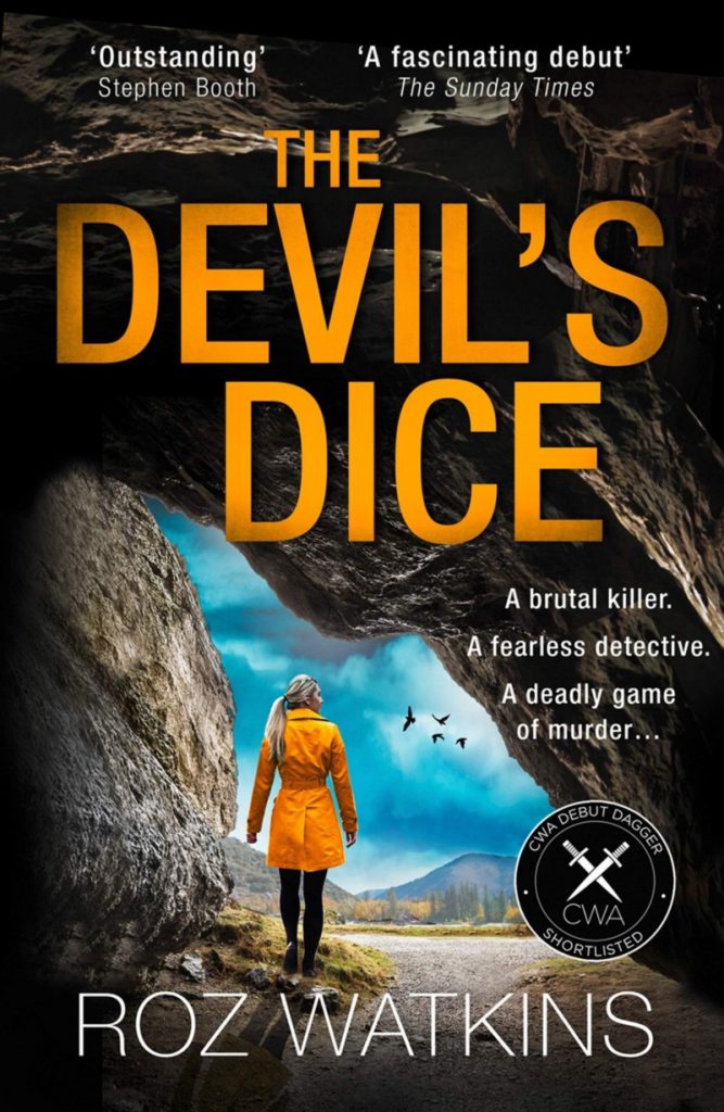
That’s the cover of the paperback version of The Devil’s Dice, which which will be available in January of next year. Okay, it’s not a huge change, but putting the same orange lettering on a black background instead of a near white background is much more likely to get the attention of the fading-eyesight community, of which I am a member, and which is surely a quite large chunk of the public for crime fiction. This is also the kind of thing that just might sway a decision about whether to put a book in a bookshop window display.

I bet I wasn’t the only one grumbling about that earlier hardback cover, and it would appear that the grumbling has had exactly the desired effect.

I know little about book publishing, but I’m guessing that paperbacks are where the volume sales are, driven by those early glowing reviews (The Devil’s Dice got lots of glowing reviews) penned by the readers of the hardback version. And from that volume comes the magic of a serious word-of-mouth wave. Most readers are probably willing to wait a little in order not to have to devote scarce bookshelf space to great big chunks of cardboard, and for the sake of having something a bit easier to carry around.

And, if you really insist of your books being ultra portable, or if your eyesight is even worse than mine and you need seriously to enlarge the text, The Devil’s Dice is also now available in Kindle format, for just £1.99. I am biased (see above), but for what it’s worth I agree with all those glowing reviewers, and recommend The Devil’s Dice in all formats, even the hardback with its dodgy cover.

Originally posted at Brian Micklethwait’s Old Blog

Kensington Gore

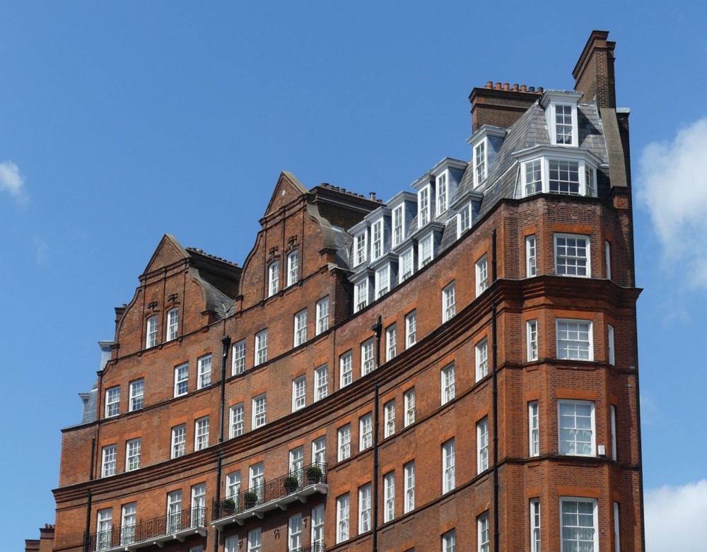
I think that’s what this building is called. Maybe Kensington Gore is the curved road which this buildings stands on. Google Maps suggests that Kengington Gore refers to both the building and the “thoroughfare”.

One of the most disagreeable features of Modern Movement architecture in and around the 1960s was its aggressive unwillingness to accommodate itself to the already established street pattern. Instead, higgledy piggledy streets at funny angles was bulldozed and replaced by rectangularity. Happily, those days are gone, and we are back to buildings being strangely shaped because the site is strangely shaped. Like the above pre-Modern-Movement edifice, which is now a favourite London sight of mine. I now visit the Royal College of Music quite a lot, to hear GodDaughter 2 sing or to be at some other event that she has arranged for me to attend. Every time I go there, I walk along Prince Consort Road, and there this Thing is.

I have only done a little googling, and so far I don’t have an exact date for when this Thing was built. Late Nineteenth Century is the best I can do for now.

Originally posted at Brian Micklethwait’s Old Blog

From the age of bridges to the age of bridge collapses?

Just a question, suggested by this bridge disaster. today, in Genoa.

Every few weeks I go looking for new and photogenic bridges, and don’t seem to find anything much. But now that all these great bridges have been built, and now that they are all getting older, or getting really old like this one, and are having to be kind of rebuilt …:

The highway operator said work to shore up its foundation was being carried out at the time of the collapse.

… this could be the first of many such bridge collapses.

Oh My God. Now I want more bridge collapses, just to be right.

Originally posted at Brian Micklethwait’s Old Blog

Helping hands

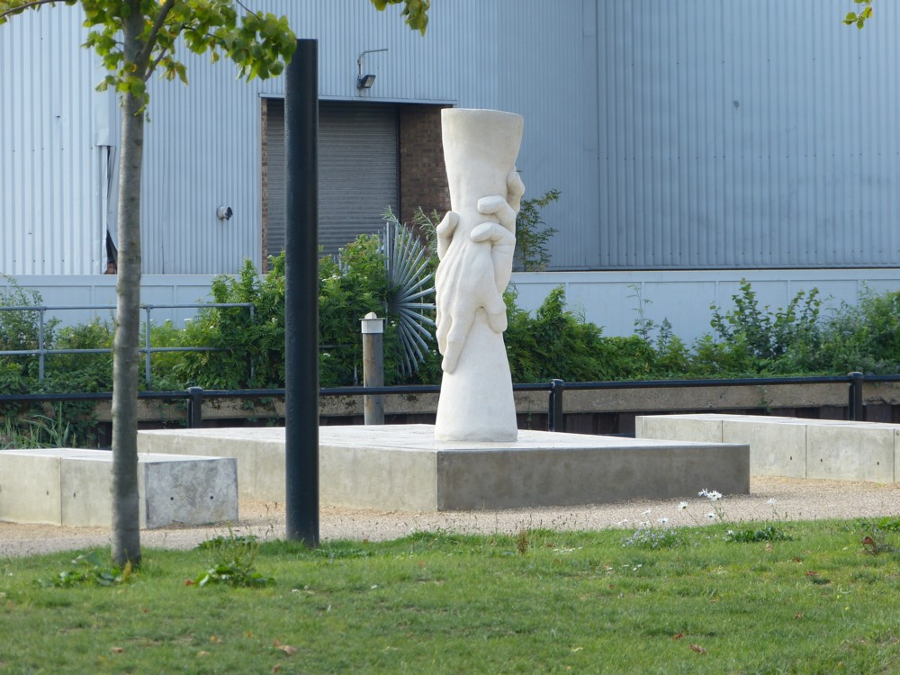
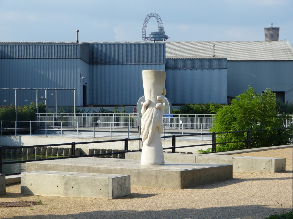
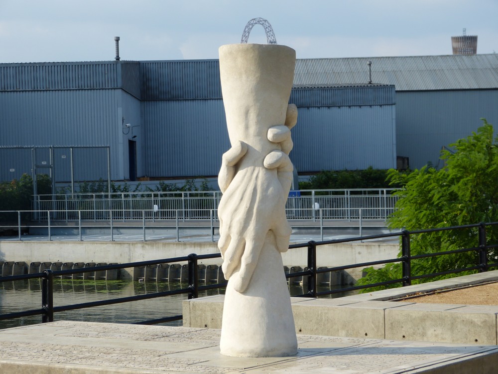
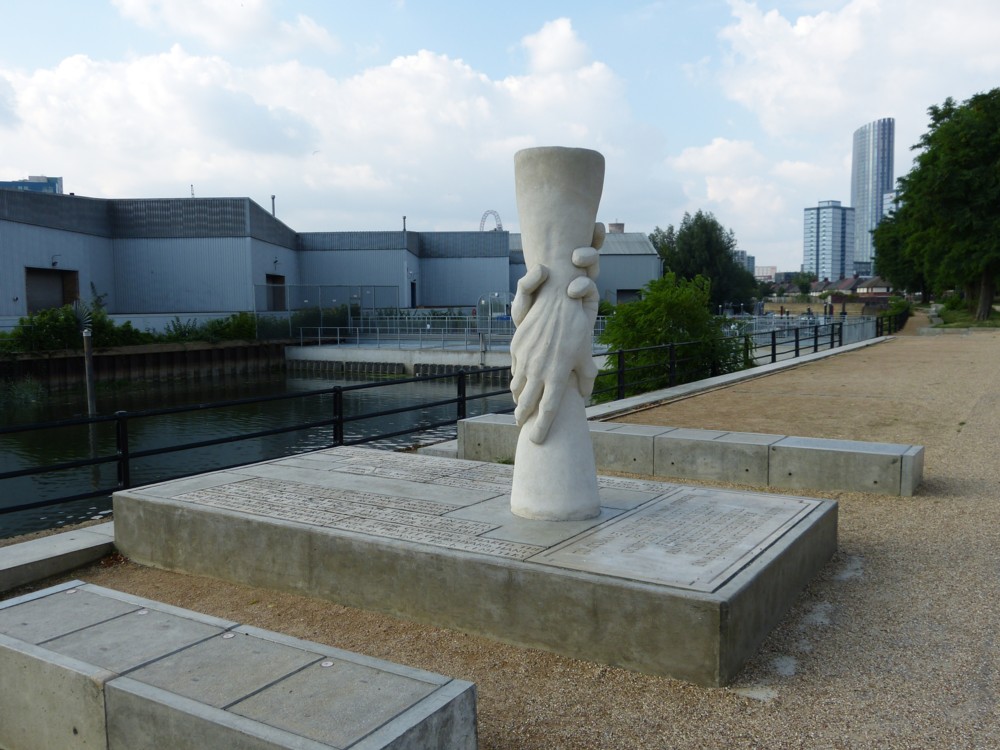
On that same photowalk with GodDaughter 1, five years ago, that I mentioned yesterday, and a bit earlier than when I took yesterday’s photo, of her and her shadow and my shadow, I took these photos:

You can see how that little mind of mine was working, can’t you? That being one of the amusements of me taking so many photos that comes across years later. I can now see exactly what I was thinking, in a little photo-moment, five years ago.

I encounter an interesting sculpture. (I find that I like sculpture more and more, provided I like it of course.) Then, in the distance, I see a favourite Big Thing, in this case the Big Olympic Thing. I line up the Big Olympic Thing up the sculpture. I line it up again, this time including only that very recognisable top of the Big Olympic thing, and putting that right on top of the sculpture, like a handle. Good. Nice one.

Then I draw back, and take another shot that provides some more context, while being careful to keep the Big Olympic Thing present, to one side. What I do not do, regrettably, is photo any sign or caption which told me about this piece of sculpture. What is it? Who did it? When? Why? What’s it of? There must have been some clue I could have photoed.

Happily, this is the twenty first century, and a little descriptive googling (“sculpture clasped hands” or some such thing) got me to places like this, which tell the story. And it’s quite a story.

Originally posted at Brian Micklethwait’s Old Blog

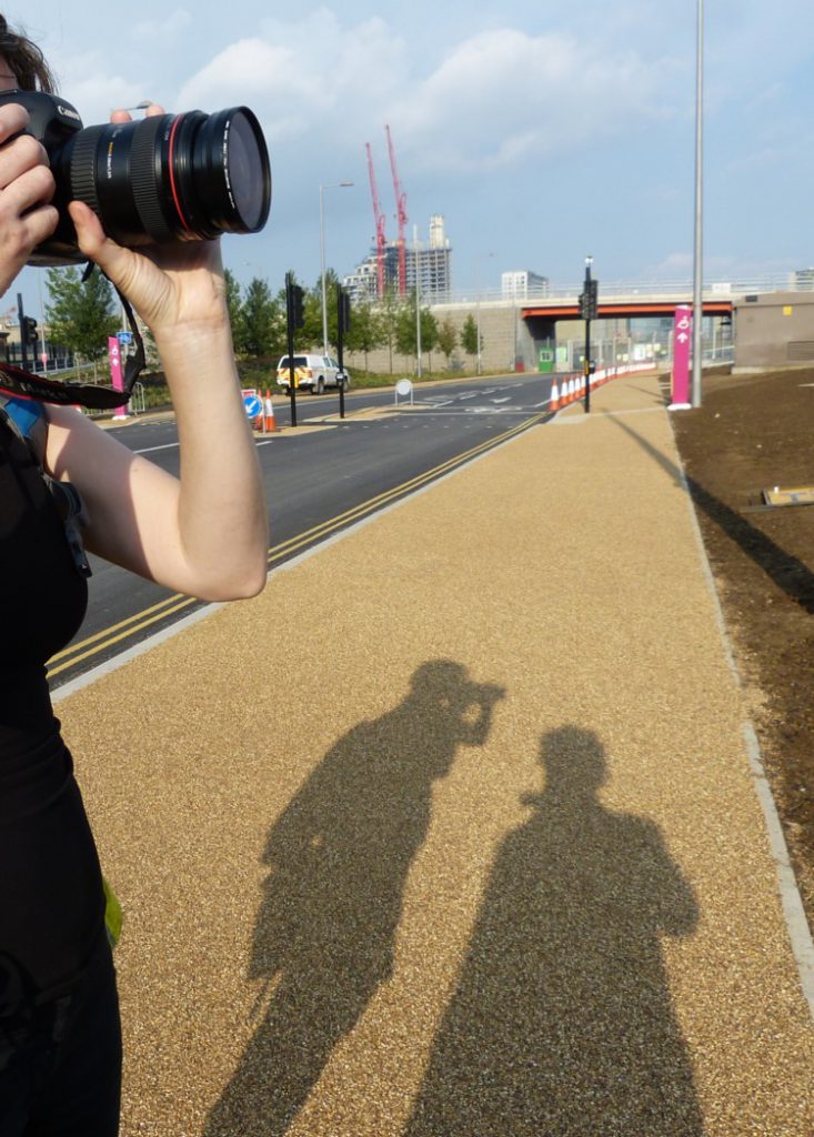
Photoer shadows

From the I Just Like It directory:

That’s GodDaughter 1 on the left there. We were on one of our photowalks, in August 2013, in other words just under five years ago. I was looking for something dated, perhaps because temporary, and there was quite a lot of stuff in that part of London, Olympic Games territory, that must look very different now. But that snap grabbed my attention, and I hope it tickles yours.

Originally posted at Brian Micklethwait’s Old Blog