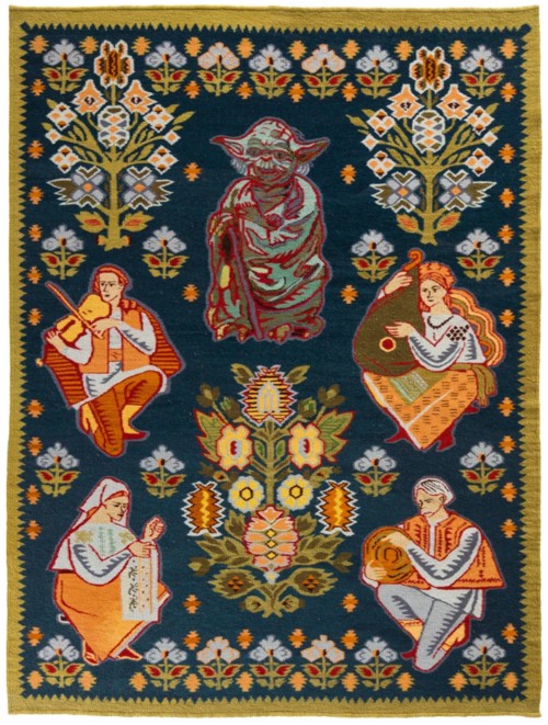
Again from designboom, this posting about a Ukrainian rug-maker who is souping up his designs with modern references. I particularly like this one:
This works for many reasons, one of them being that there is something very medieval and nostalgic about the whole Star Wars franchise, and lots of cinematic and other scifi in general. Faster than light travel, for instance, isn’t modern. It is a bogus technology trick for turning the future back into the Middle Ages, into a world full of faraway wonders and monsters, but not so far away that you can’t reach them soon enough to still be alive when you get there and make your visit count.
By the way, I think “designboom” postings are very badly designed. The basic problem, although not the only one, is their juvenile refusal to understand capital letters, and their determination instead only to use capital letters for acronymic organisations (like, in this case: “OLK”), but never to signal the beginning of a sentence, or the beginning of a heading. Or for something like Star Wars. This is stupid when you are simply writing a chunk of prose. But it is seriously stupid at a website, because websites are tricky to make clear at the best of time. Boom? No. Fail. Pity, because they seem to have a lot of good stuff.
This blog, the one you are reading now, is much better designed. To look at I mean. Not how it works, which is very badly.

