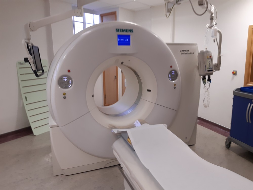
Today I was at the Royal Marsden, having a scan in a device that looked like this:
In other words it looked like a time travel portal in a rather bad movie. That photo’s a bit blurry, but they only allowed me one go at photoing it.
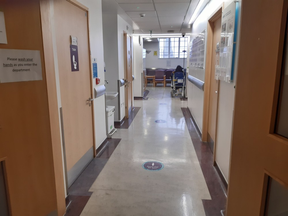
But that’s not my point here. What my point is is a hobby horse of mine, namely, well, … see the title above. The way that Architectural Modernism has totally triumphed indoors …:
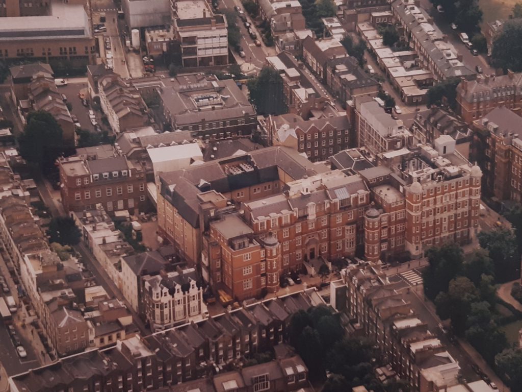
…, whereas, out if doors, there’s still everything to play for:
That being my cropped version of an aerial photo of the same Marsden Royal whose insides are entirely tricked out in Modernist Vernacular. I found it hanging on a wall, somewhere inside the Marsden itself. And that’s right. The outside of the Royal Marsden is not Modernist Vernacular. Anything but. It is Victorian Ancient, just as it has always been. But the inside is now entirely tricked out in Modernist Vernacular.
And that illustrates a widely observable contrast in our world, and is why so many Ancientist facades are being held up with metal frames, while behind all that, Modernist interiors are being erected.
There are lots of reasons for this contrast, but the basic reason is that Architectural Modernism works extremely well indoors, but rather less well out of doors.
Actually, that first photo does have something to do with it, as I may or may not get around to explaining, in another posting.


Related archive article: https://brianmicklethwaitarchive.org/la/cultn003.html
Something to do with wanting order inside, perhaps? Well you did say “works extremely well” so perhaps that’s it. Especially in a hospital.
Yes, hospitals especially suit modernity, because modern surfaces, being mostly smooth and undecorated, tend to be easier to keep clean. An essential feature of all hospital equipment is that germs can be easily removed from it. An important part of that smoothness is that dirt is more easily seen, as well as easily removed. Thus, hospitals like light colours. Architectural Modernism, especially in its early phase, loved, and still loves, whiteness.
Which of course, and here I’m getting ahead of myself, is easier to keep white indoors than it is outdoors. Outdoor facades don’t work if they need constant cleaning, because that’s so inconvenient and expensive. A lot of the appeal of outdoor decoration is that it retains and shapes damp patches, thus not allowing them to dominate the look of the building, and makes use of damp patches almost like make-up on a face. A smooth flat surface does no such channelling and guiding of the dark and light of damp patch stains.
When I first came to London to live – nineteen years ago now – I did a lot of long walks in the outer zones of London. I encountered a number of derelict Victorian hospitals. These were very solid but rather ugly buildings of the kind that the Victorians often did. They were often built from stone, and had rather grand signs saying “Patroness: the Princess of ” and “Funded by Public Donations” on the front, but also had a functional quality about them. They had the air of being places where you would find mad scientists at work. They were normally fenced off and there were signs saying that people should keep out. Some of them had been like this for decades. If I encountered them now, I am sure I would take hundreds of photos, but this was before I had transitioned to digital photography, so I don’t have photos.
Hospitals are interesting, because they are “important” – they are the sort of thing you will invite the Queen to open – but they are also very much of their time, because medical technology changes. And they are very much for a specific purpose, and once they are no longer useful as hospitals there isn’t really much way you can convert the building to anything else.
Those Victorian hospitals have now all been demolished, as land in London has because too valuable in the last decades to be left unused. I suspect those Victorian hospitals were once very, very much the quintessential example of a previous kind of architectural modernism