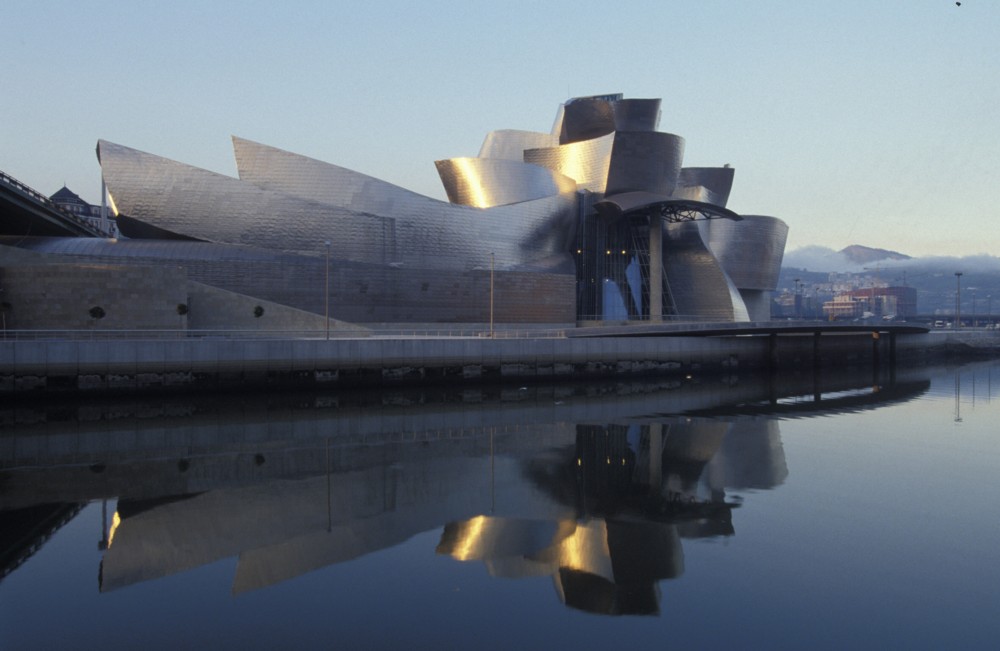
Most internetted photos of Bilbao’s Guggenheim Museum, designed by Frank Gehry, look like this:
Which I found here.
But the fact that almost all the internetted photos of this building look like that is misleading.
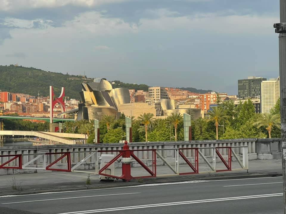
Here is a corrective, in the form of the exact sort of photo of this building that the pros earn their money by doing the exact opposite of:
Yet one more illustration of a belief I have long held about us amateur photoers, which is that we amateur photoers often tell you more about how a building actually looks, if you actually go there, than many of the photos carefully contrived by the professionals.
I hope that Michael Jennings does not object to being called an amateur photoer. By this I do not mean that he is a bad photoer. On the contrary …
I also particularly liked this photo of Michael’s, of Bilbao’s big transporter bridge


I wrote about this at length when I first visited Bilbao in 2003. I think you may have even linked to it at the time.
It’s still there in the ruins of my old blog. (The pictures are gone, alas, but they were something similar to what you posted here).