Down by the River – October 15th 2005

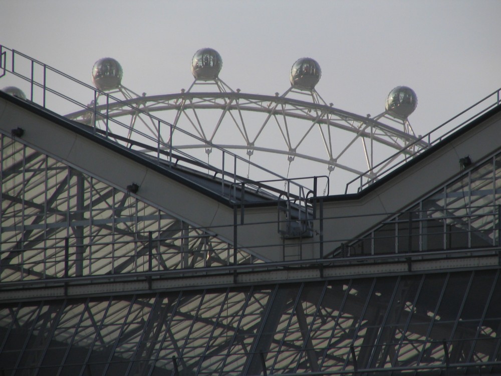
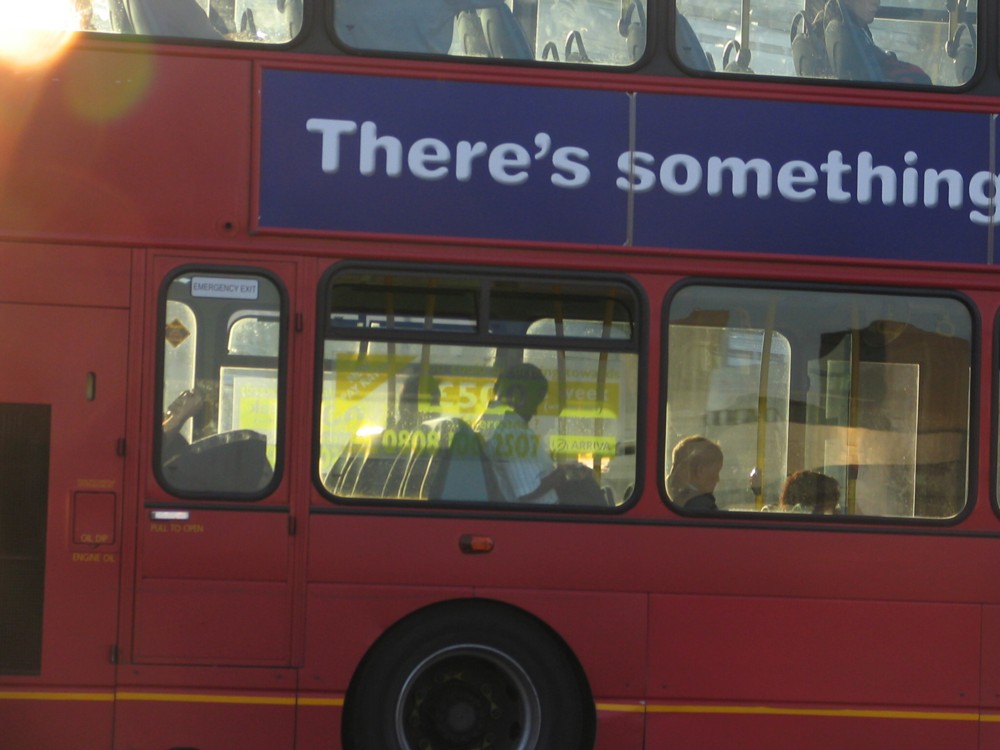
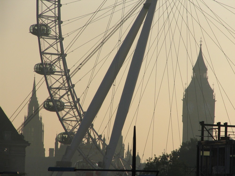
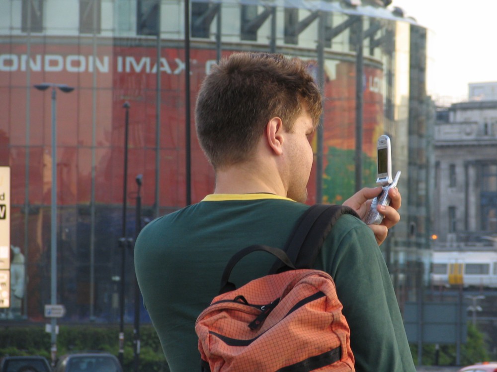
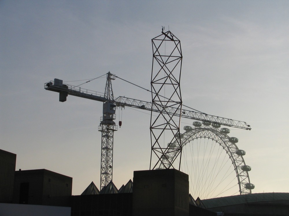
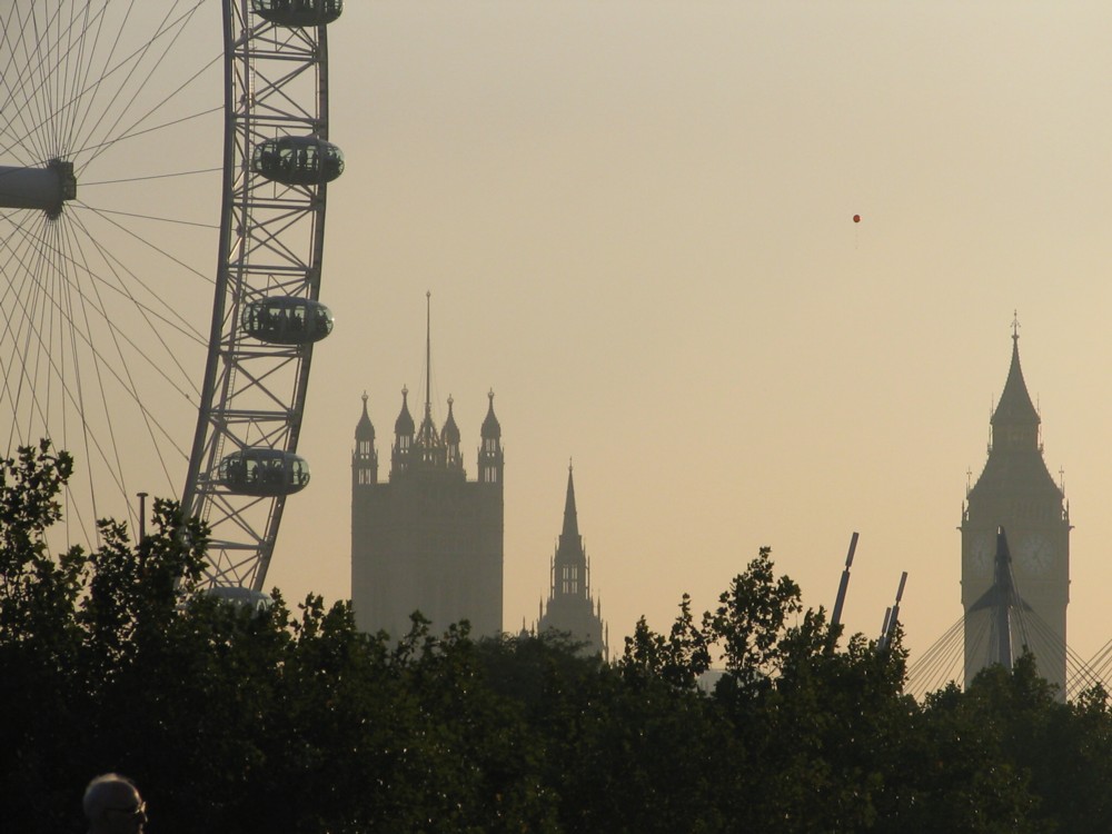
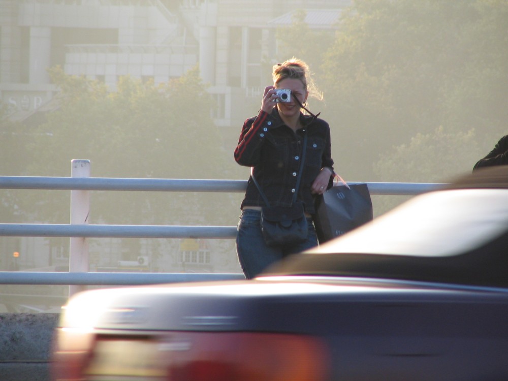
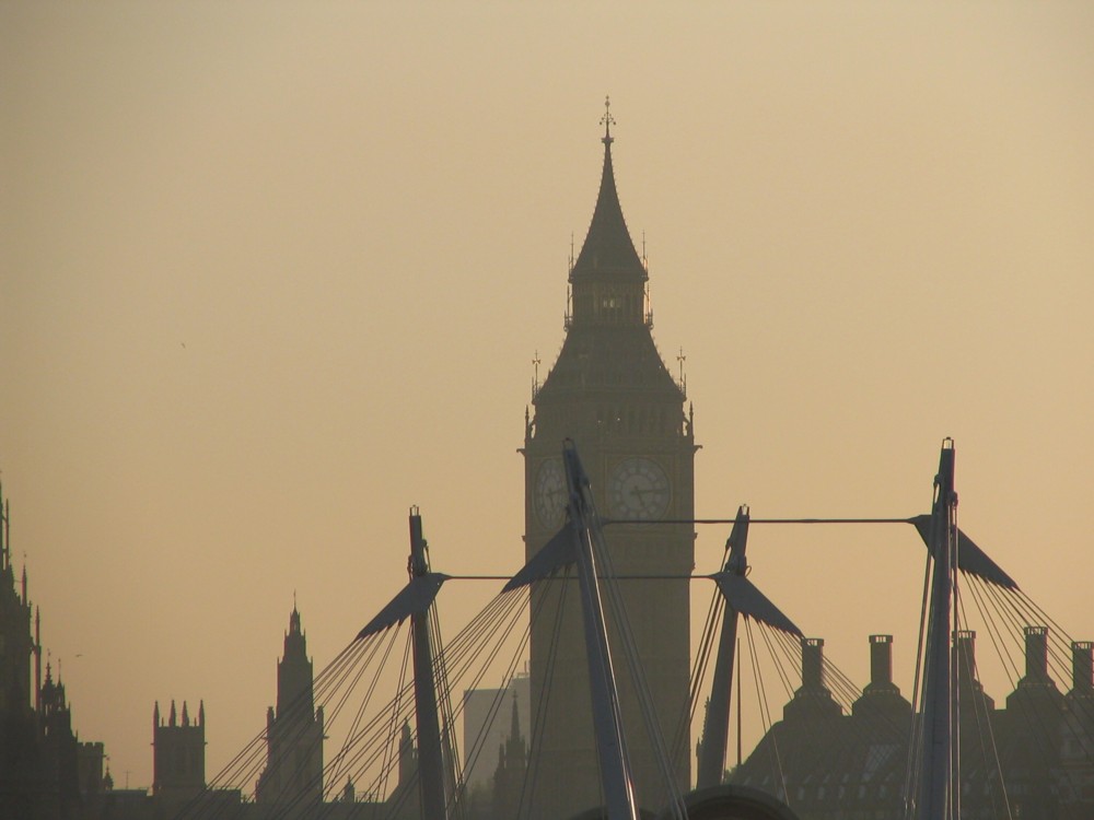
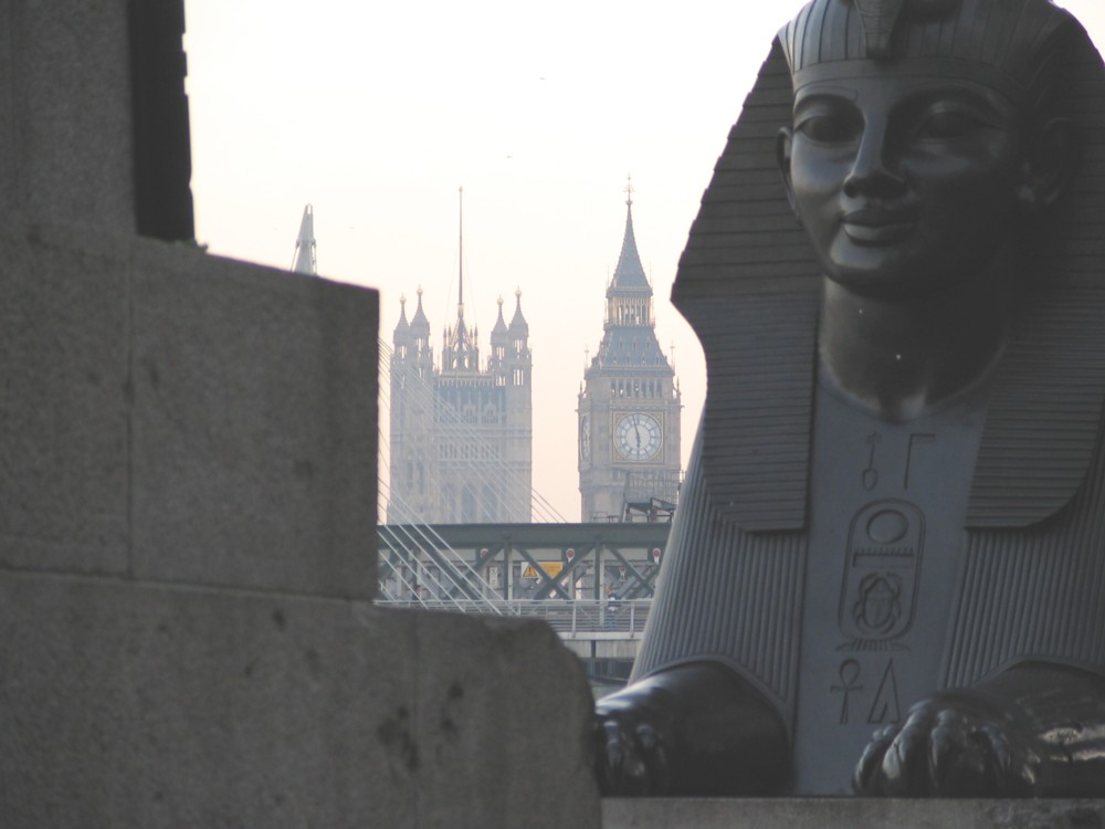
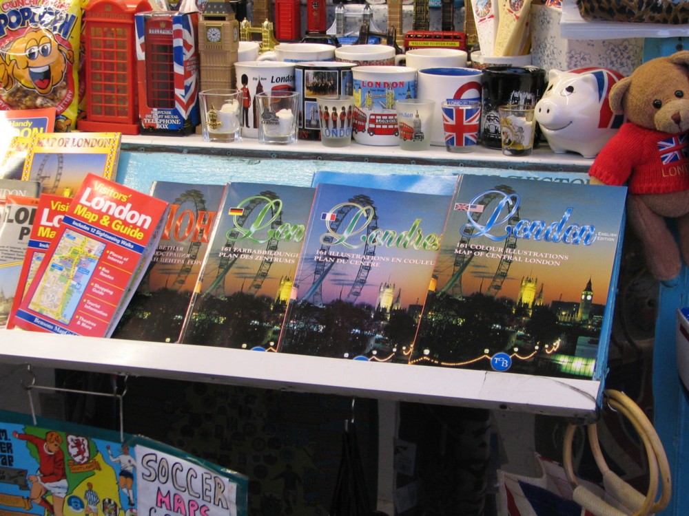
Yes, a quota gallery from yesteryear:

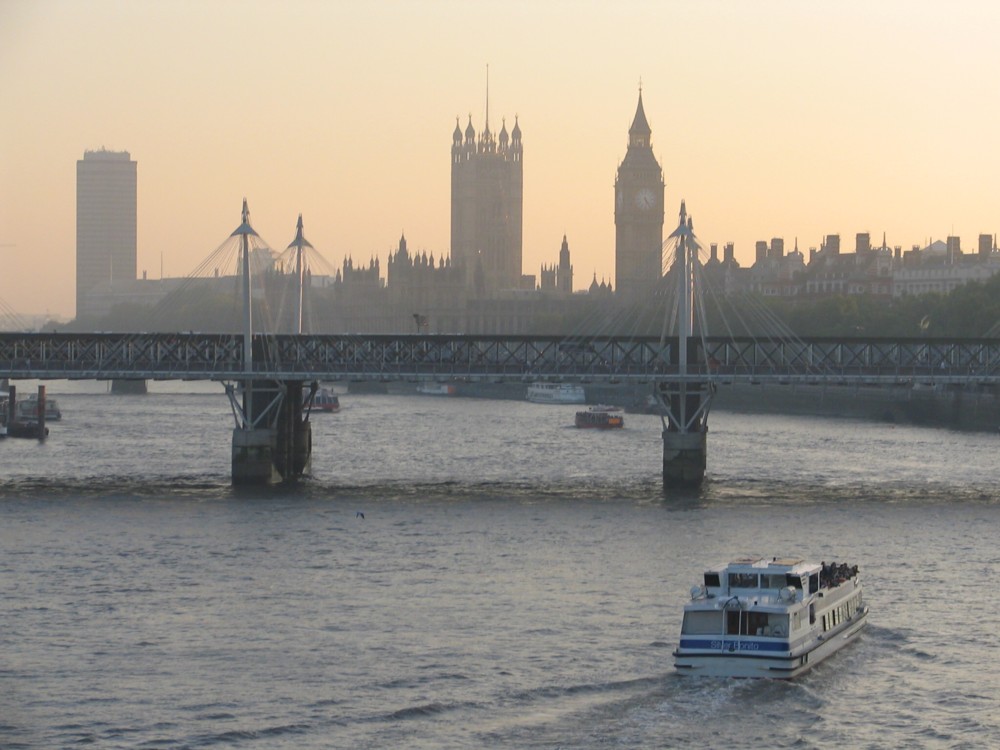
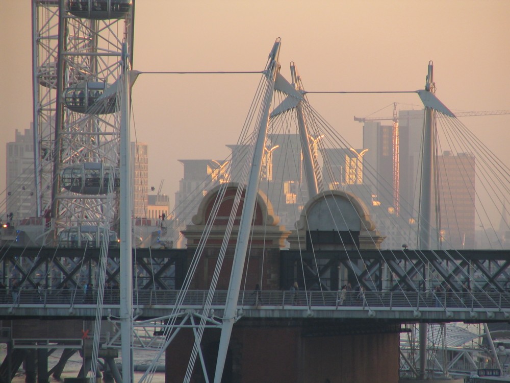
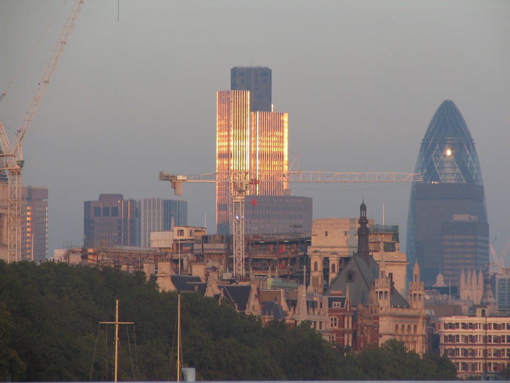
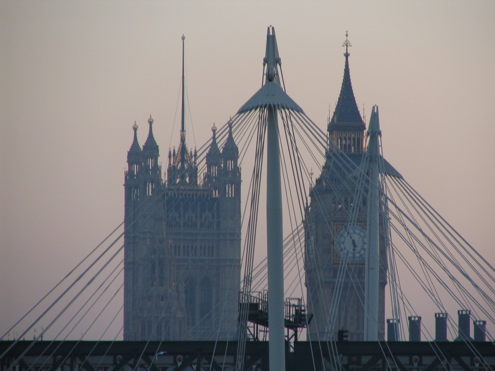
Even then, with my antiquated Canon S1 IS, I was already photoing goodish photos, or at any rate photos I thought were goodish (and still do). It was just that the success rate then was a bit lower, and the light had to be perfect. That day, it was.

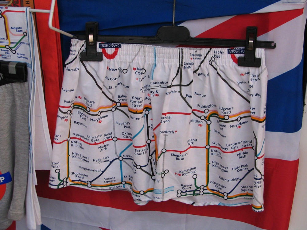
I reckon about a third of those views would look exactly the same now. However, anything with a camera or a map in it is now history. Cameras and maps are now the same things, apart from that tube map on those pants. Mobile phones can’t yet double up as underwear.

Plus, the City of London Big Thing cluster is now … a cluster, rather than just isolated oddities. Who knew then how quickly the Gherkin would be smothered by other Bigger Things? Well, probably a lot of people knew, but I was not one of them.

I have a particular soft spot for photo 6, the one with what looks to me like a thing made of cocktail sticks. It looks to me like a thing made with cocktail stick because I used to make things like that with cocktail sticks. Although, that one in the above photo is extremely primitive compared to some of the things I made, shapes I have never seen since. Memo to self: I must dig out the photos of those, such as the photos were. My stick objects, sadly, predated digital photography.

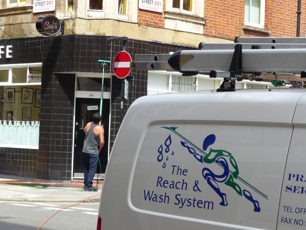
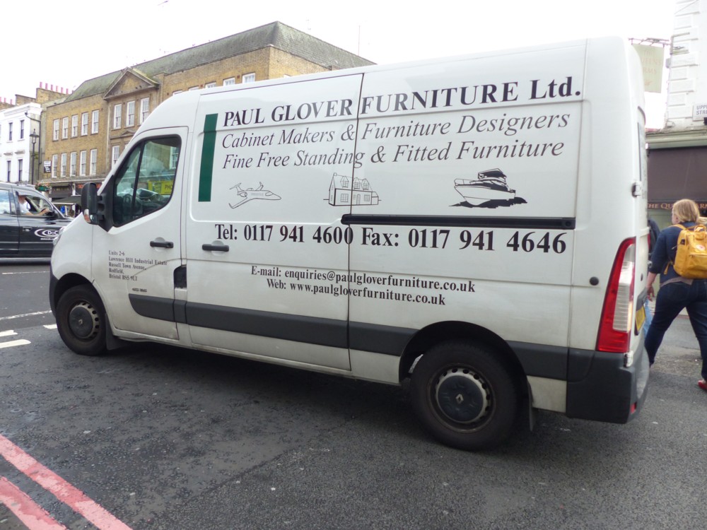
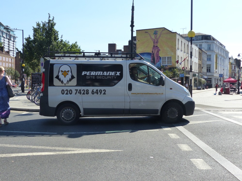
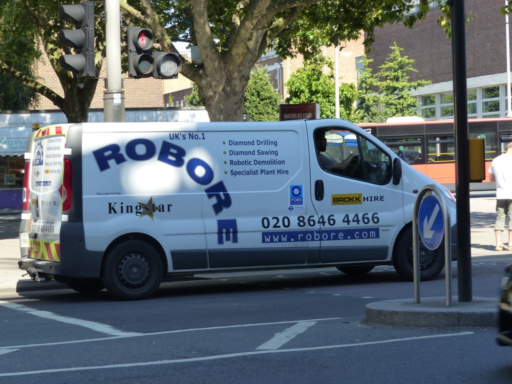
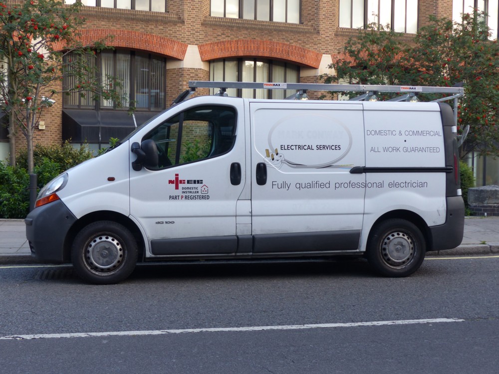
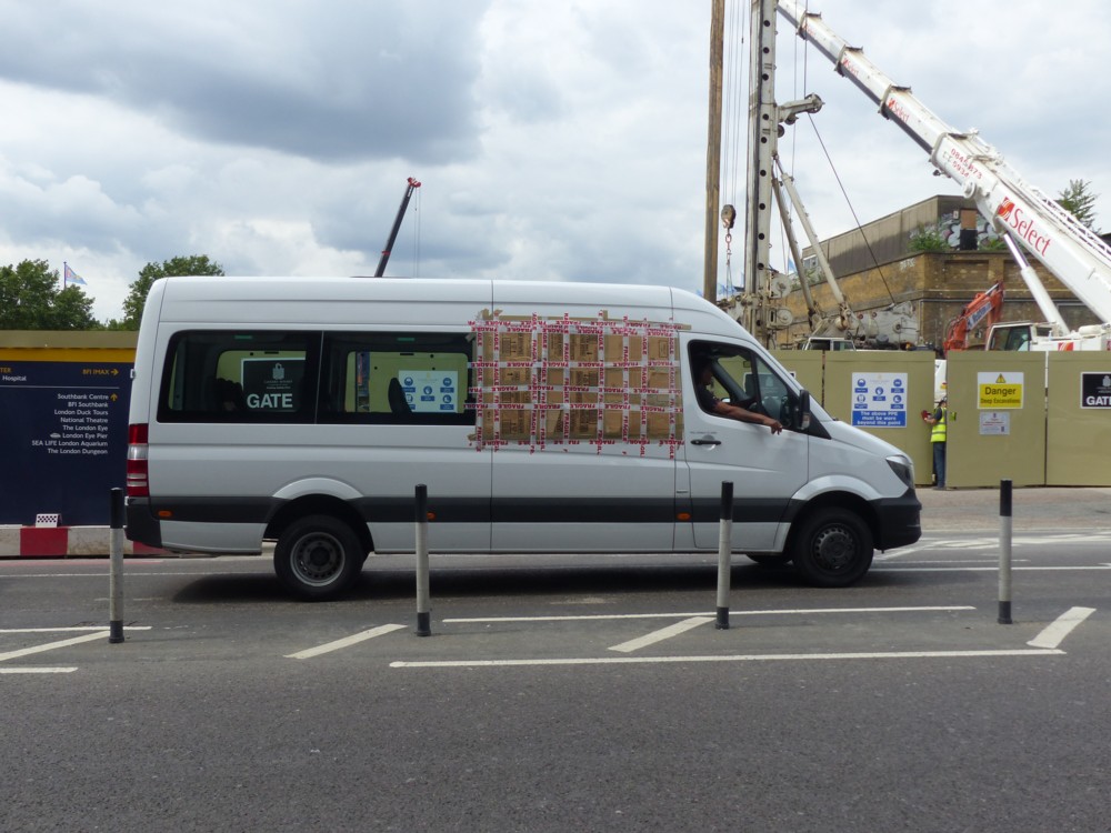
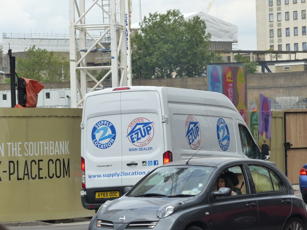
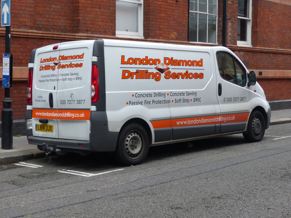
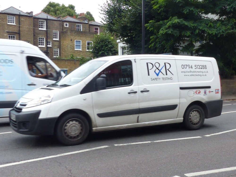
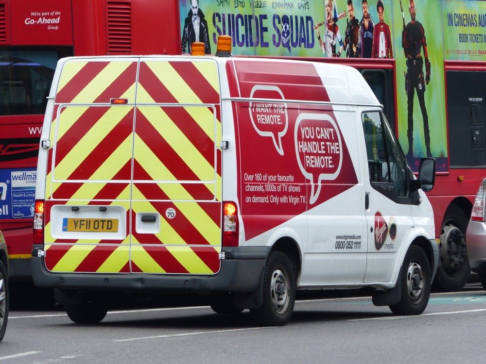
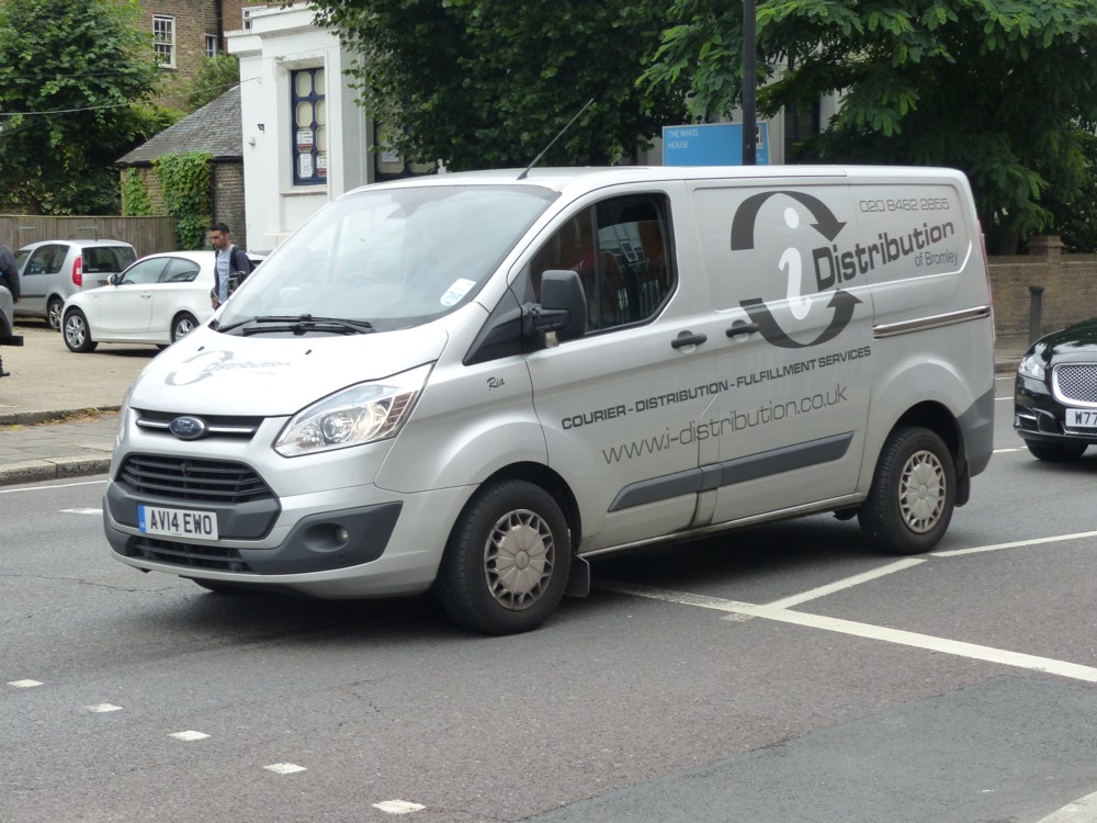
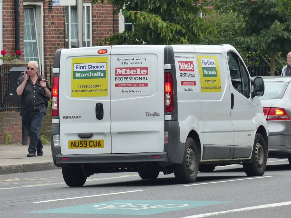
White vans five years ago

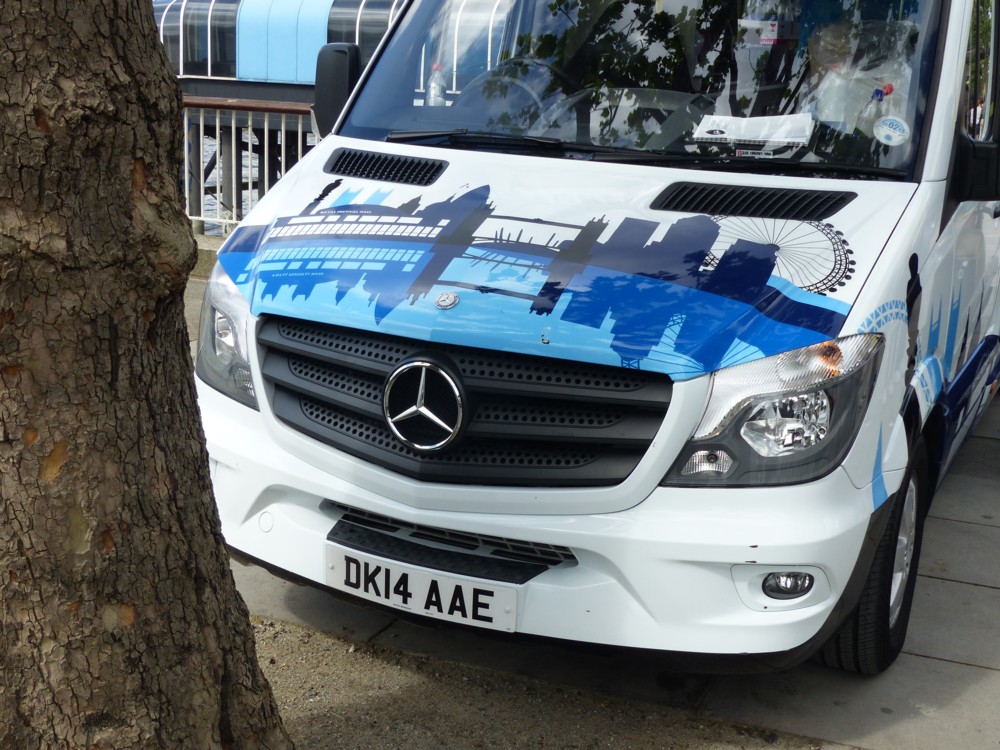
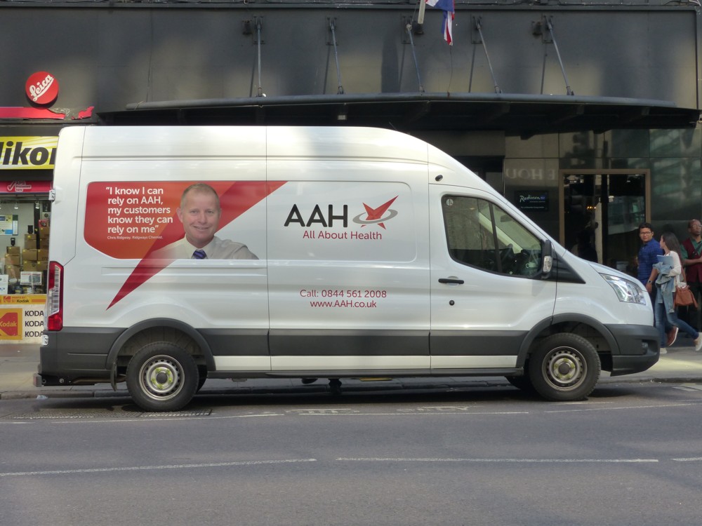
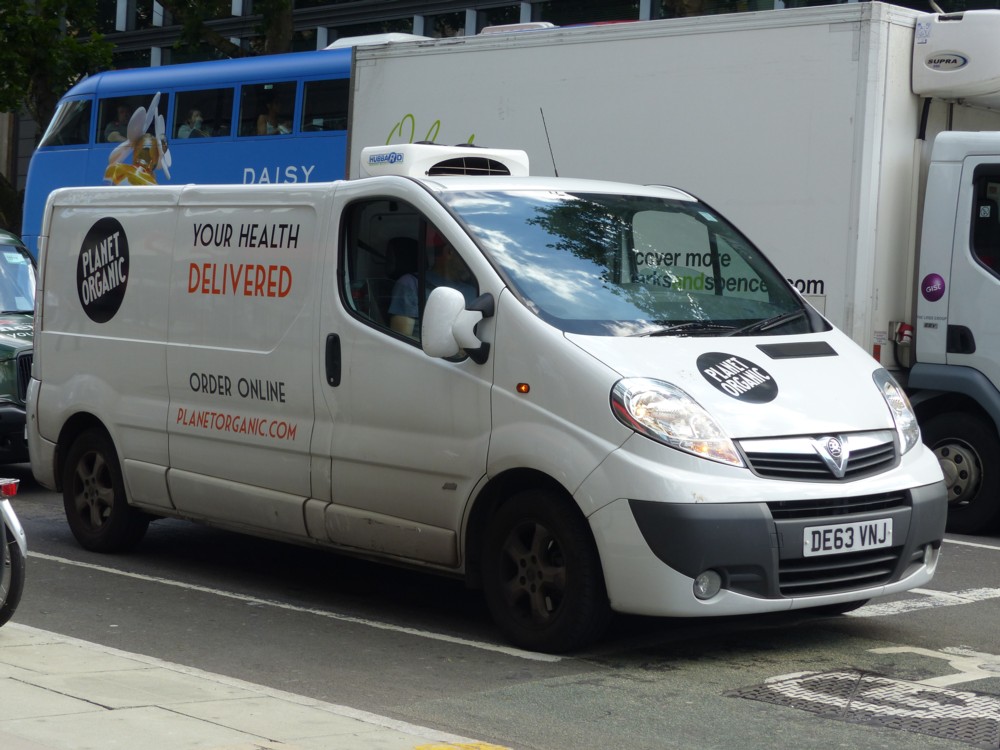
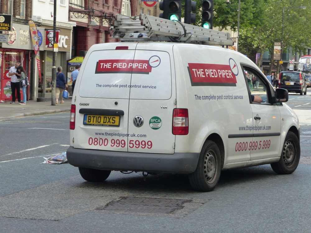
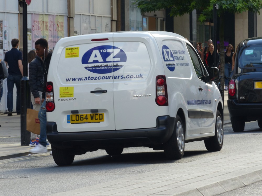
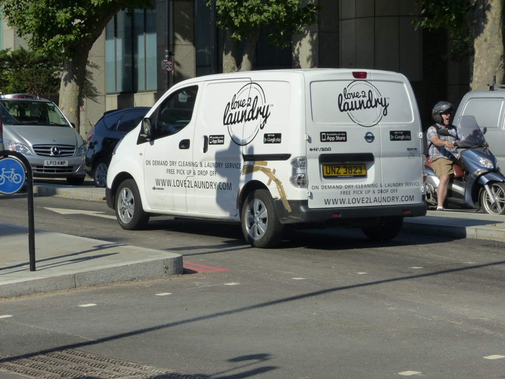
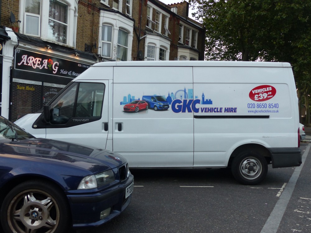
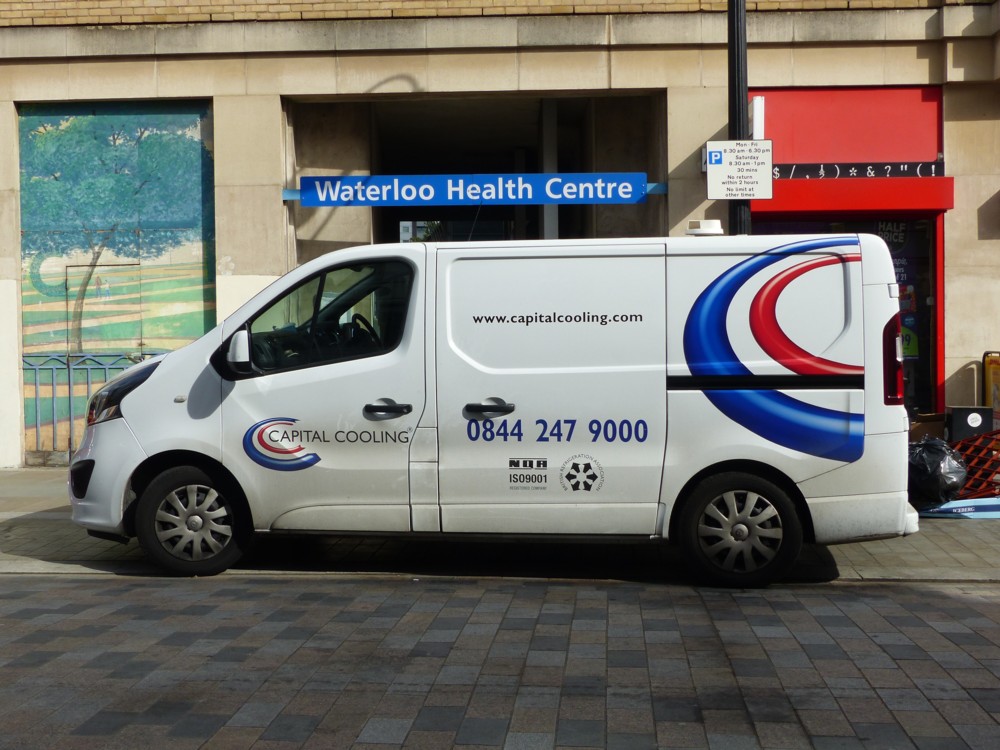
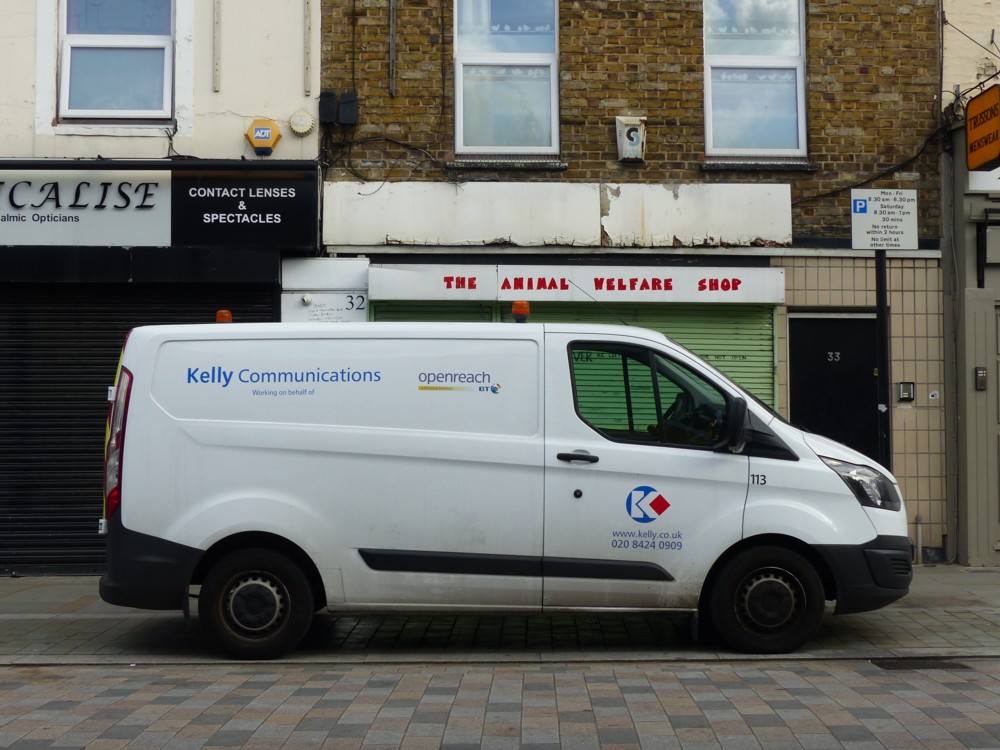
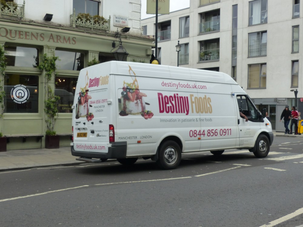
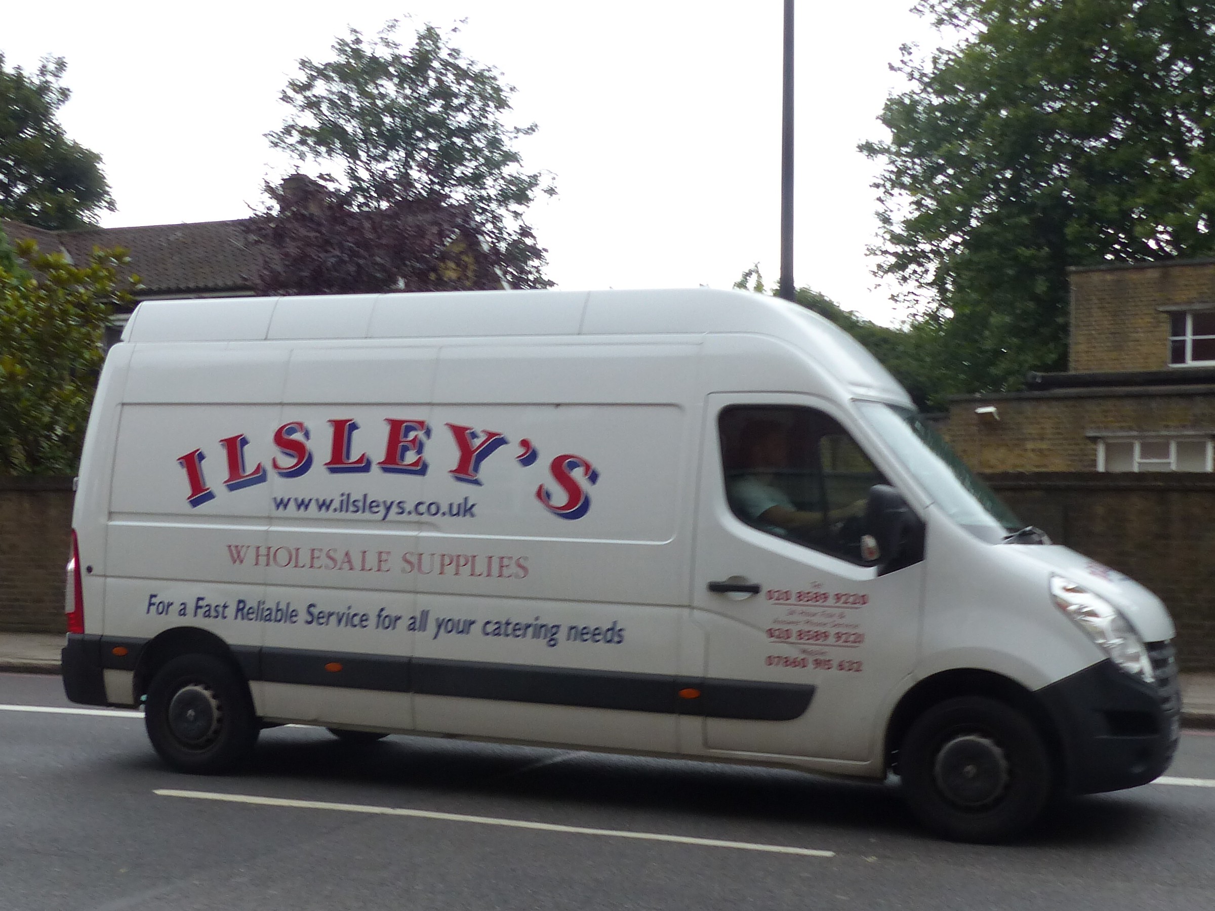
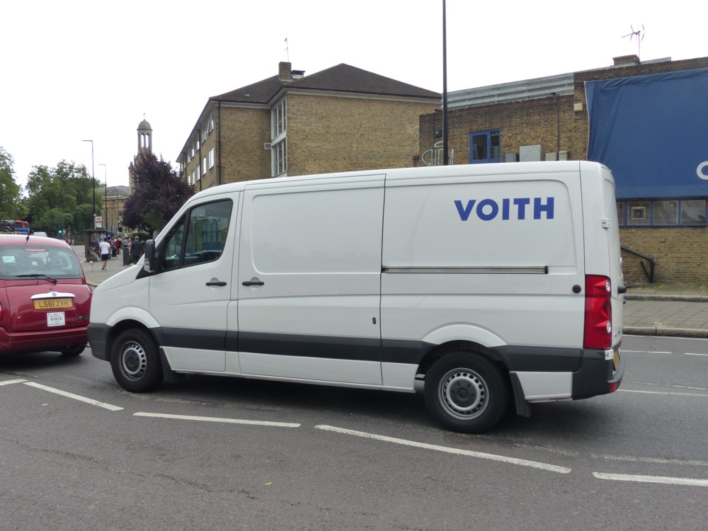
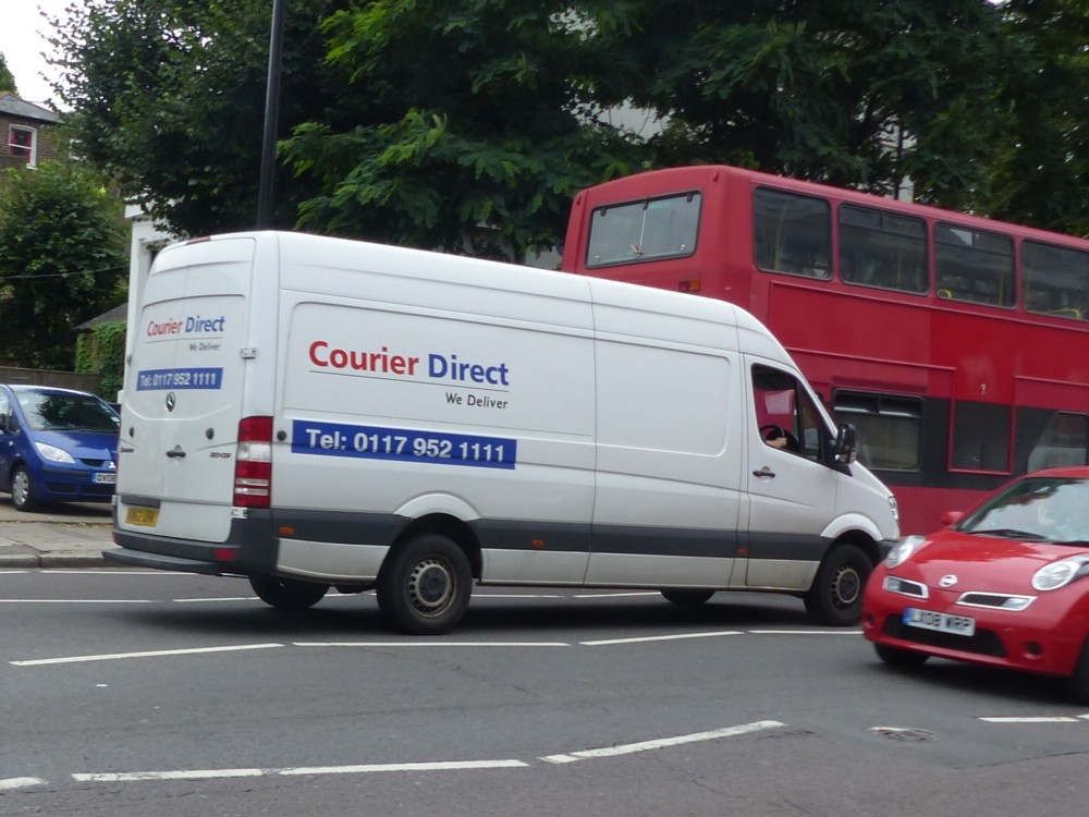
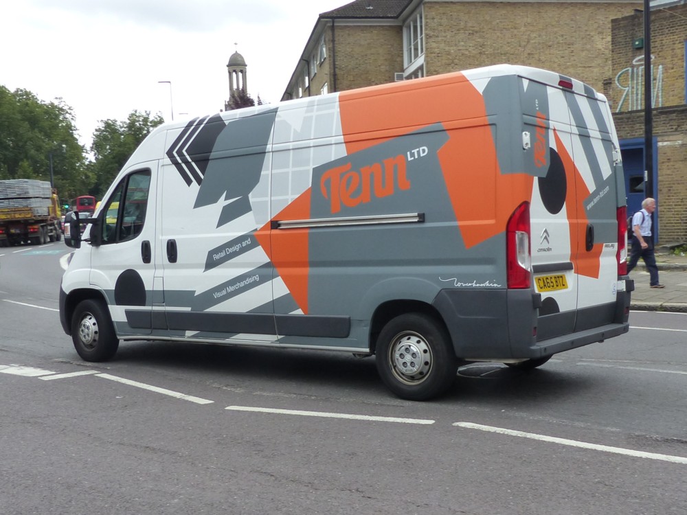
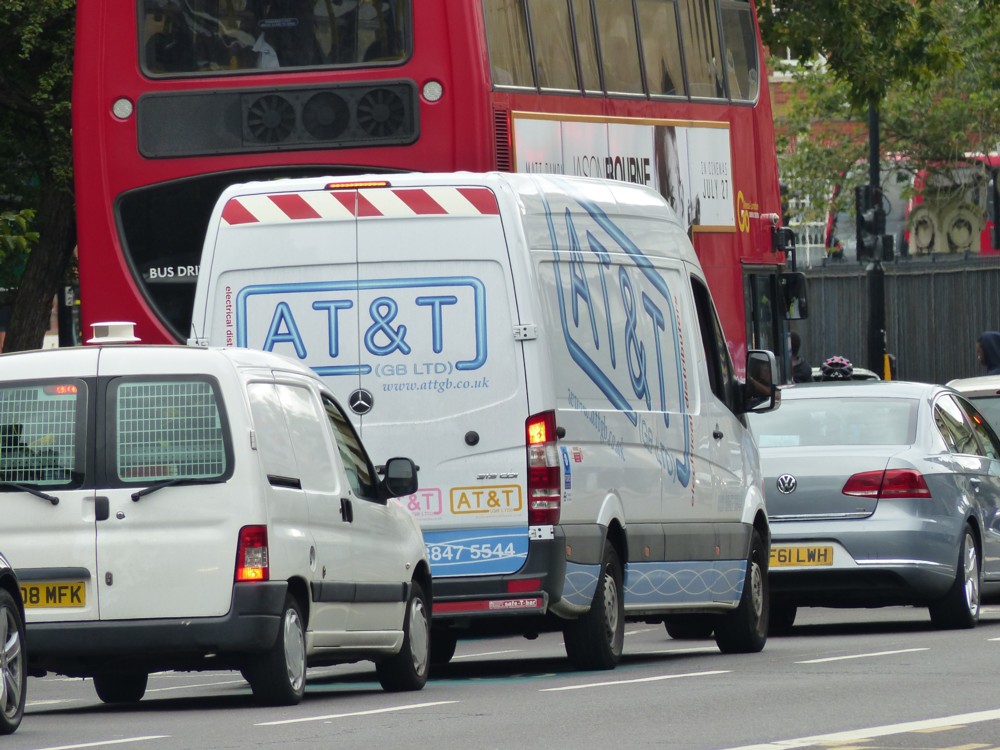
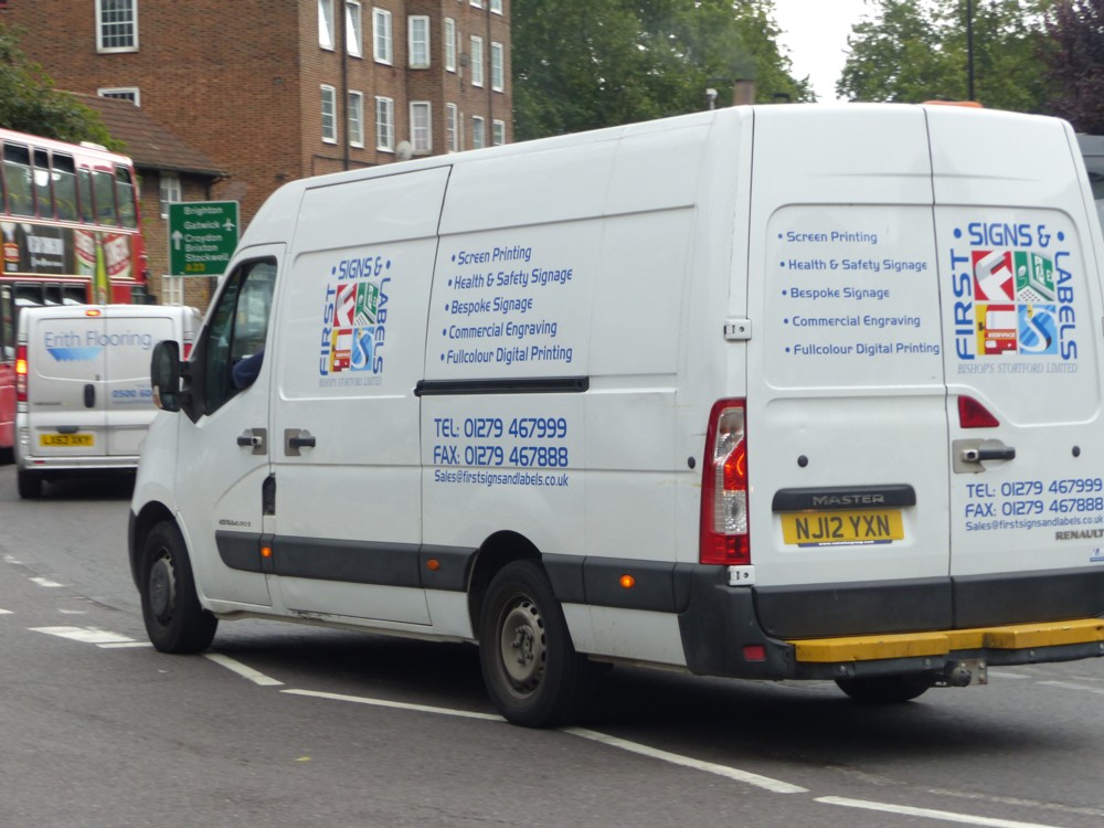
Yes, around five years ago, or so, I had a phase of photoing vans, white vans in particular. I seem to recall some Labour woman politician having a go at them, and I think that pissed me off and I had in mind to stick up lots of white van photos to glorify them and to unglorify her.

That lot is just the photos I photoed in the one month of July 2016. Which means there are a great many more such in the archives of around that time.

But then, I kind of lost interest in these things. Somewhere in my somewhere-on-that-spectrum mind of mine is the notion that these collections only work if the basic shape of the things in question is the same every time, with only the decor being different. That is certainly the rule I follow with taxis. Taxis come in several different shapes, but I only photo one shape. The others don’t appeal.

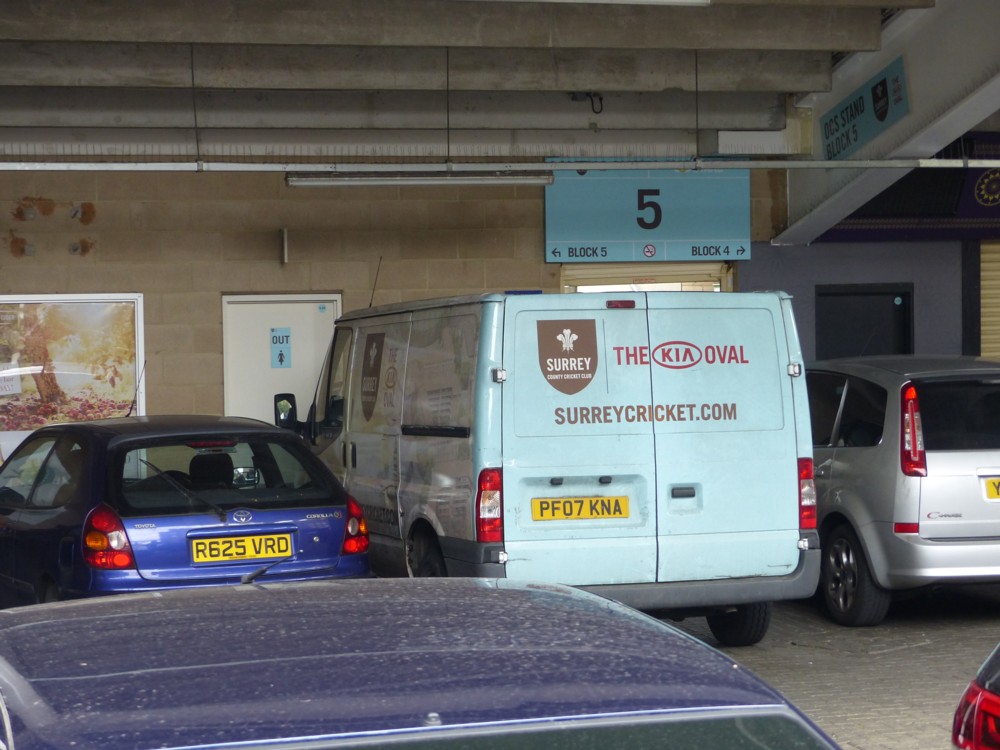
One of the above white vans (photo 20) isn’t even white. I include this van because I like it, what with it being parked under one of the stands at the Oval, and it’s nearly white. I recently heard Surrey cricket commentator Mark Church describe this colour as “duck egg blue”. He was talking about the Surrey shirts for T20 games, but they looked like they were the exact same colour.

A Helter Skelter ghost sighting in Croydon

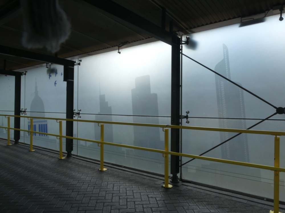
Yesterday I visited Croydon, and one of the more entertaining things I saw and photoed was this, of the frosted glass windows of the exit that rises slowly up from East Croydon station platform towards the main entrance:

Which is London’s most remarkable Big Thing? The Shard? The Gherkin? The Wheel? The BT Tower? The Walkie Talkie? The new and biggest one one still known only as 22 Bishopsgate? I hereby nominate: The Helter Skelter.

The two remarkable things about the Helter Skelter, a representation of which is to be seen in the above photo on the right, is, first, that it was never built, but, second, that the way it would have looked if it had been built still lingers. It certainly lingers here.

The expression “can’t wait” is overused, by people who can wait easily enough but who would rather they weren’t having to. But, those designers whose job it was at that particular moment in London’s history to plug London, by reproducing selections of its Big Things, actually could not wait until the Helter Skelter was finished before they started incorporating its presumed likeness into their designs.

City Big Things photo

I love photos like this, looking up at the City of London’s Big Things, which I found above a piece of “partner content” at the FT:

Like I say, I like photoing upwards at the City of London’s Big Things.

So, although that “partner content” is very dreary, I do like the photo.

A way to think about photos is to arrange them along a spectrum, at one end of which is a photo that looks exactly as whatever it was looked like if you had been there yourself. But at the other end of the spectrum are photos which emphasise how differently the way the camera can sometimes see things to the way we humans do, and makes whatever it is look quite different to the way we’d mostly see it. Both sorts of photo are worth doing, one way or the other, depending on what you and trying to do with the photo. I’m just saying that they’re two distinct ways to do photos.

Because of all the reflections in the above photo (helped by the the fine weather), because of the untypical direction things are being looked at from (cameras (especially cameras with twiddly screens) don’t get cricks in their necks), and because of the difference between how humans see perspective and how cameras typically do this (this difference being why human artists actually had to discover perspective), this photo is much nearer to the looks-different-from-how-it-looks-to-us end of the spectrum.

Which is all part of why I like it.

Out east in 2012

I haven’t been getting out much lately, so am instead exploring my photo-archives.

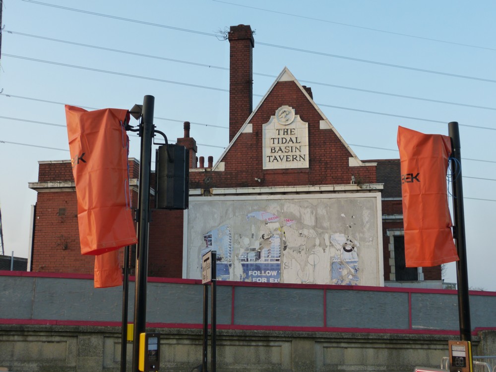
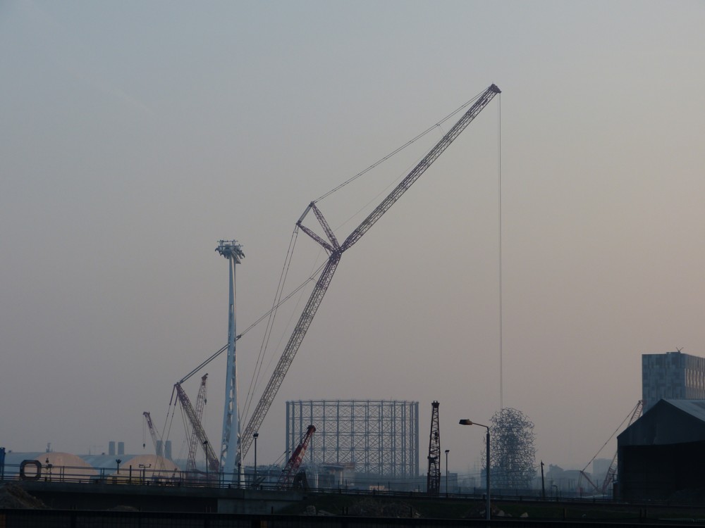
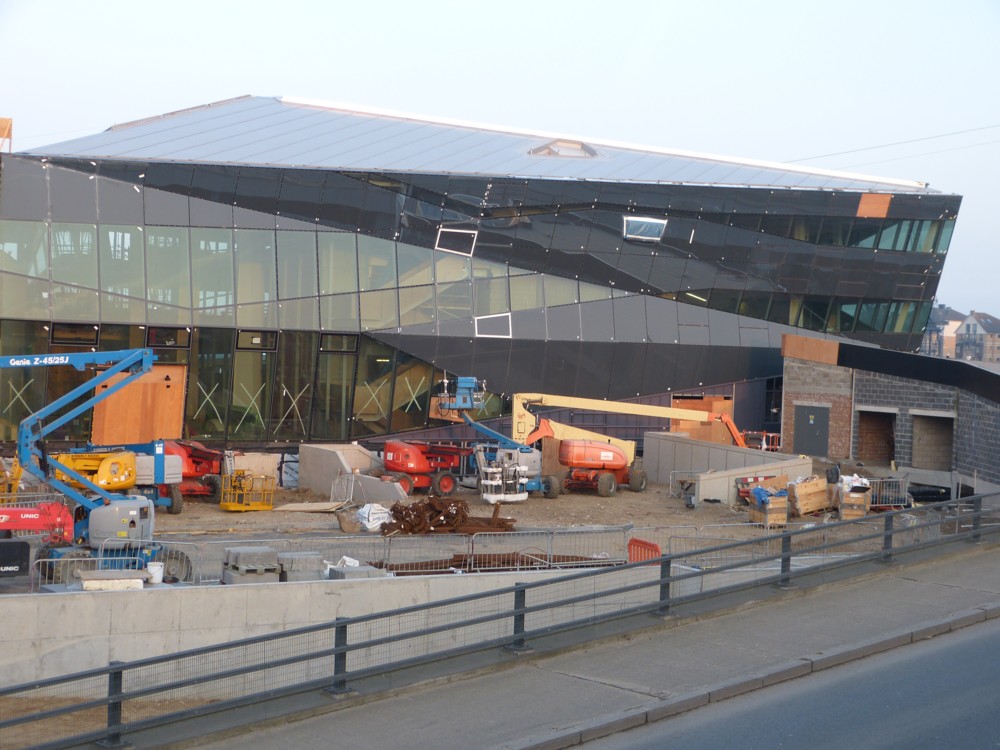
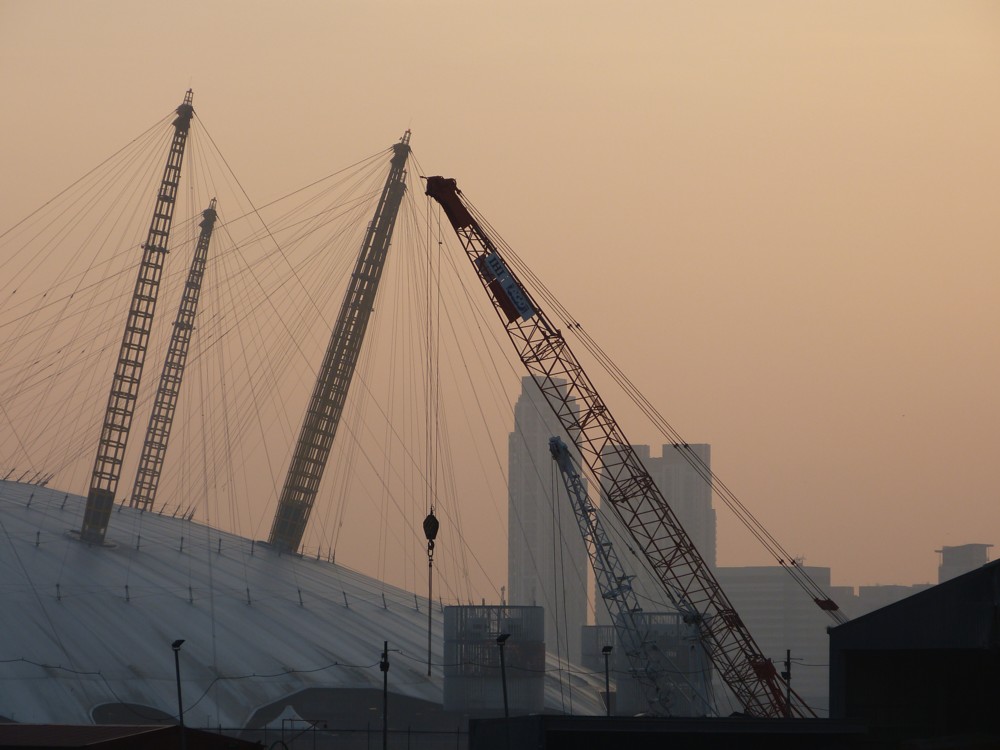
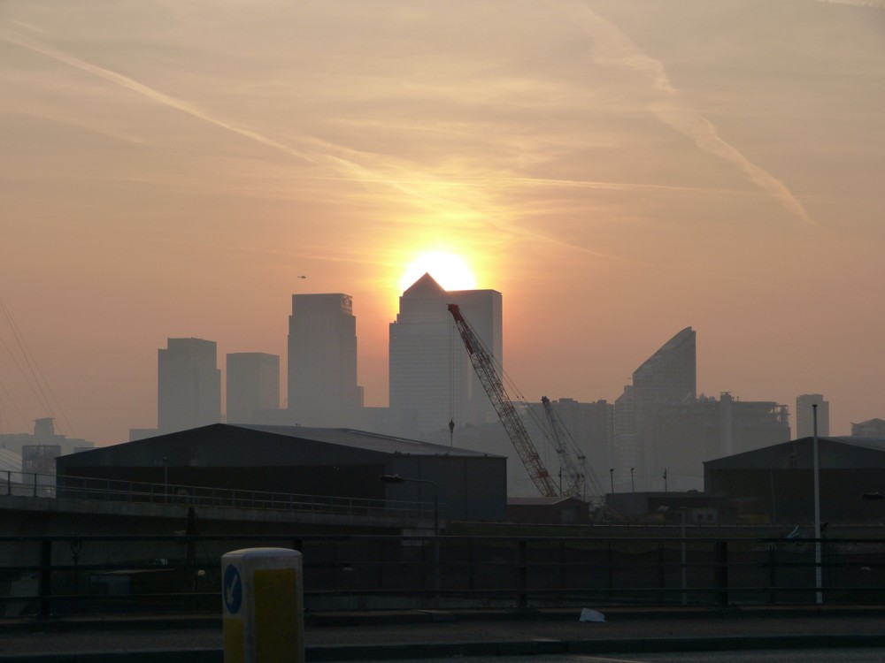
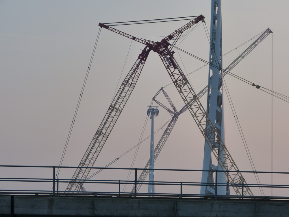
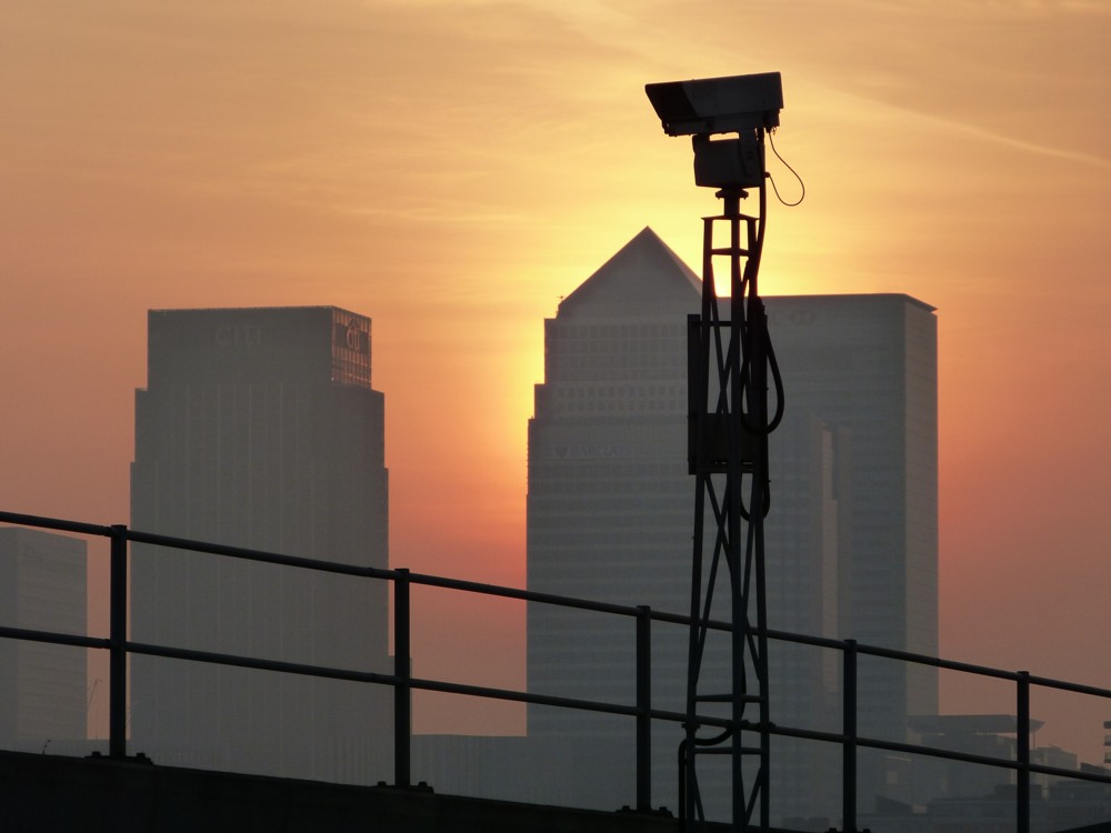
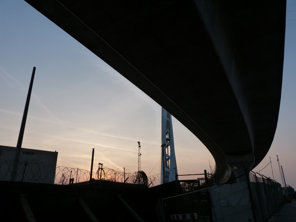
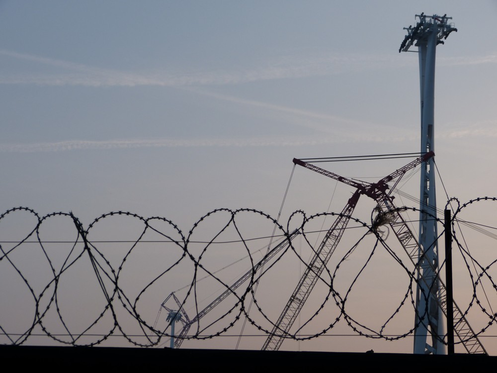
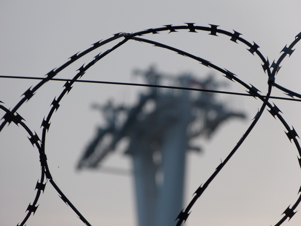
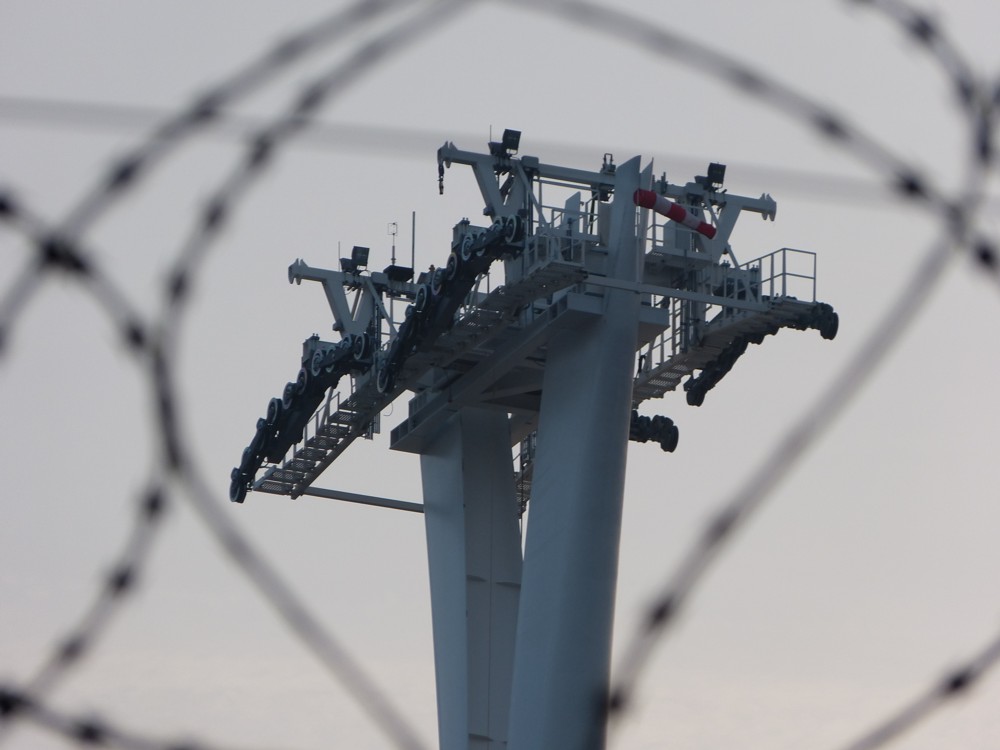
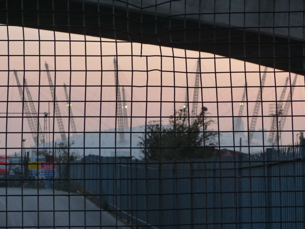
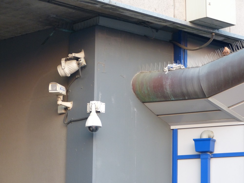
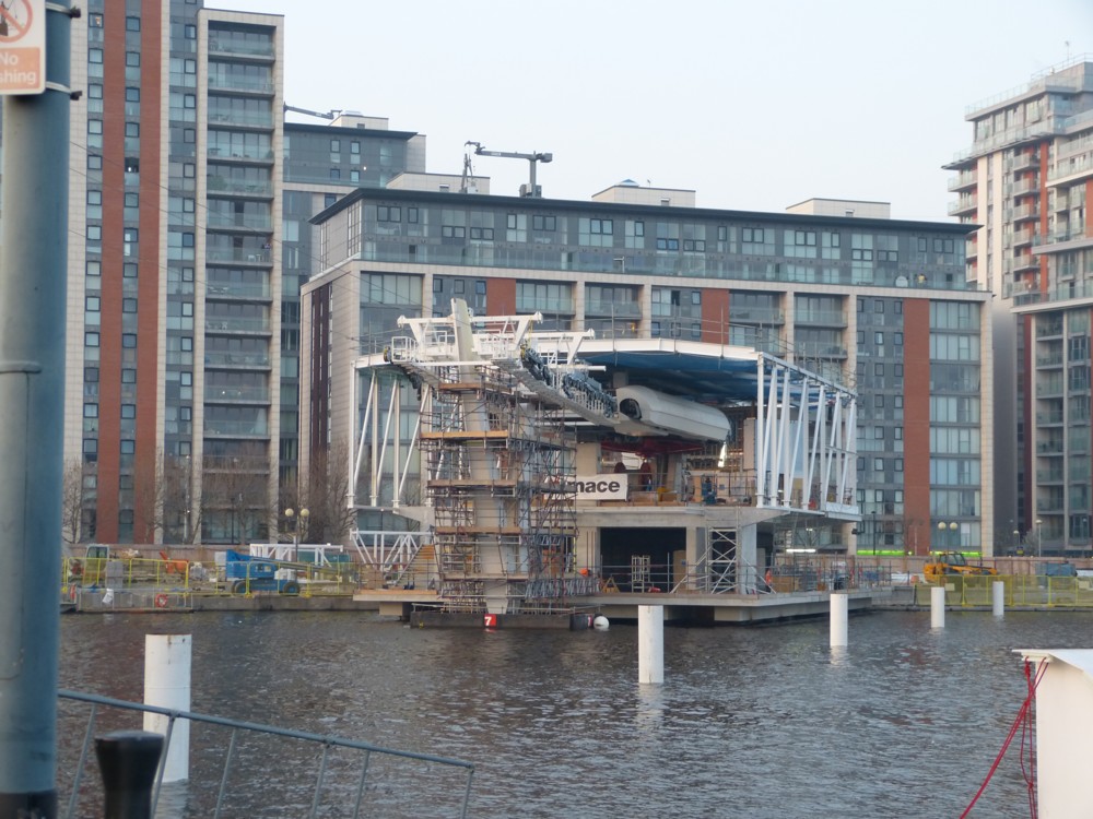
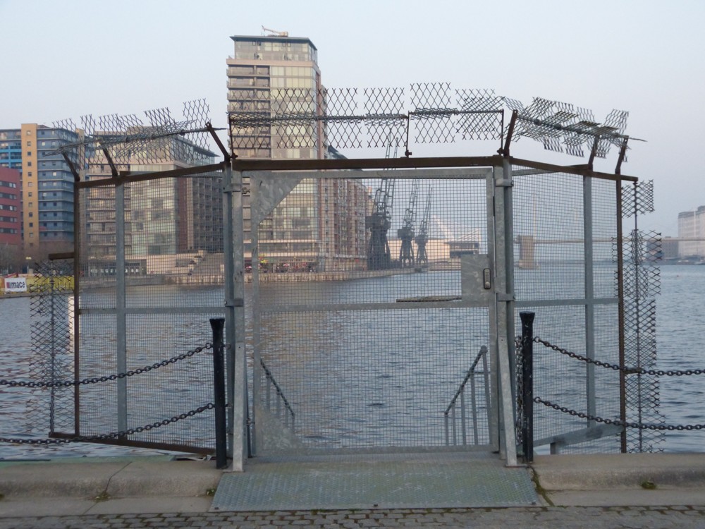
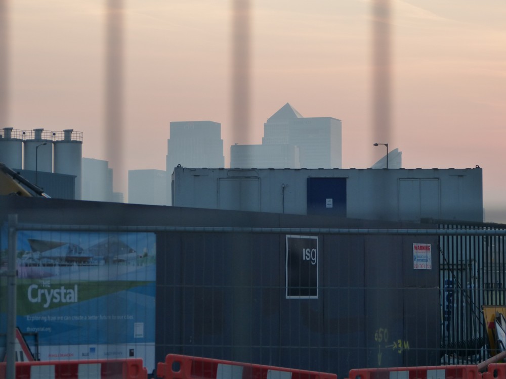
These from March 24th 2012, when I journeyed (and not for the first time) out east to the Victoria Docks, in the vicinity of the then-under-construction Emirates Air-Line, which is that strange ski lift that goes across the River:

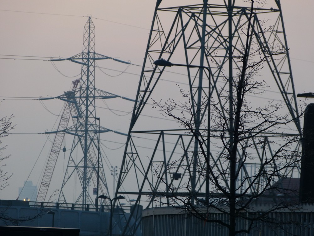
As you can see, I especially like the cranes. And the barbed wire. There were even pylons to be seen. Best of all is that newish (-ish now) footbridge.

I used to love that place, and especially then, with all manner of new stuff going on. Memo to self: go back and see how things there have changed. Because, they have surely changed quite a lot.

And this could be the biggest change of the lot. Apparently, spurred on by TikTok, people have recently been riding on the ski lift in large numbers. There’s a first.

Frisby sings about Wetherspoons and Bollocks

I just received an email from Dominic Frisby, plugging his latest aria video, which is entitled I Love Wetherspoons! State of the art culture warfare, which I highly recommend. The aria, not Wetherspoons. I’m not saying that I don’t recommend Wetherspoons, merely clarifying the point I am and am not making there.

So far so good. But the best moment, for me, came right at the end, when I was offered the chance to sample another Frisby musical delight, in the form of something called …:

Oh, Bollocks.

This is an English word I resort to regularly, and have also already talked about here quite a lot, one of my favourite examples of this word in action being this one, involving taxis. Very satisfying to see bollocks identified by my favourite Dominic as an important English usage. The word communicates a subtle mixture of regret, defiance and hence, consequently, perhaps even a dash (because you never know your luck) of triumph.

The scene with the Angel of Death, right at the end of this video, spoke to me with particular force, what with that personage having recently sat himself down next to me.

INTERNATIONAL CHEESE

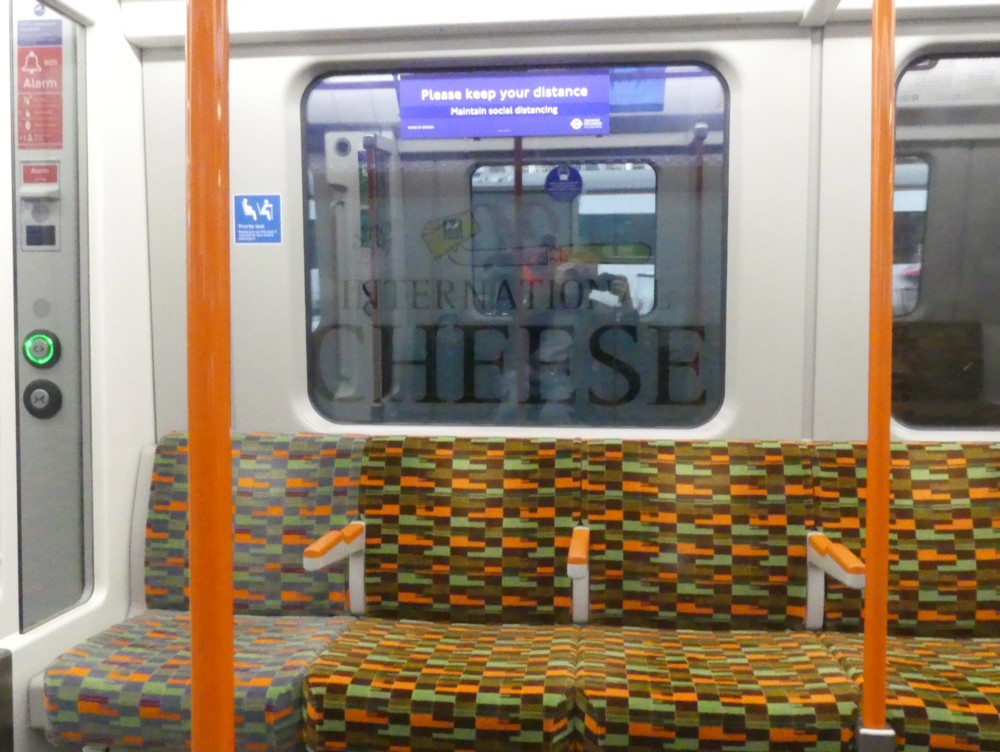
Michael Jennings, who is the technical curator of this blog, likes cheese, so maybe he can tell me how I managed to photo this photo:

The thing is, I remember seeing this in front of me recently, just as my train was about to depart from Victoria, and I photoed it, going to a bit of trouble to get it nicely lined up. But the train departed before I was able to discern what the original origin of the message was. “INTERNATIONAL” is just about decypherable from my photo. “CHEESE” is definite.

But who or what was promoting INTERNATIONAL CHEESE? Google google. It’s this. It’s a shop, at Victoria Station. That’s got to be what I photoed.

The Tripadvisor reviews at the other end of that link are what you might call “mixed”. I no longer trust the Internet when pseudonymous people review products, so that severely negative review first up means, to me, nothing.

APEROL brightens up Bankside

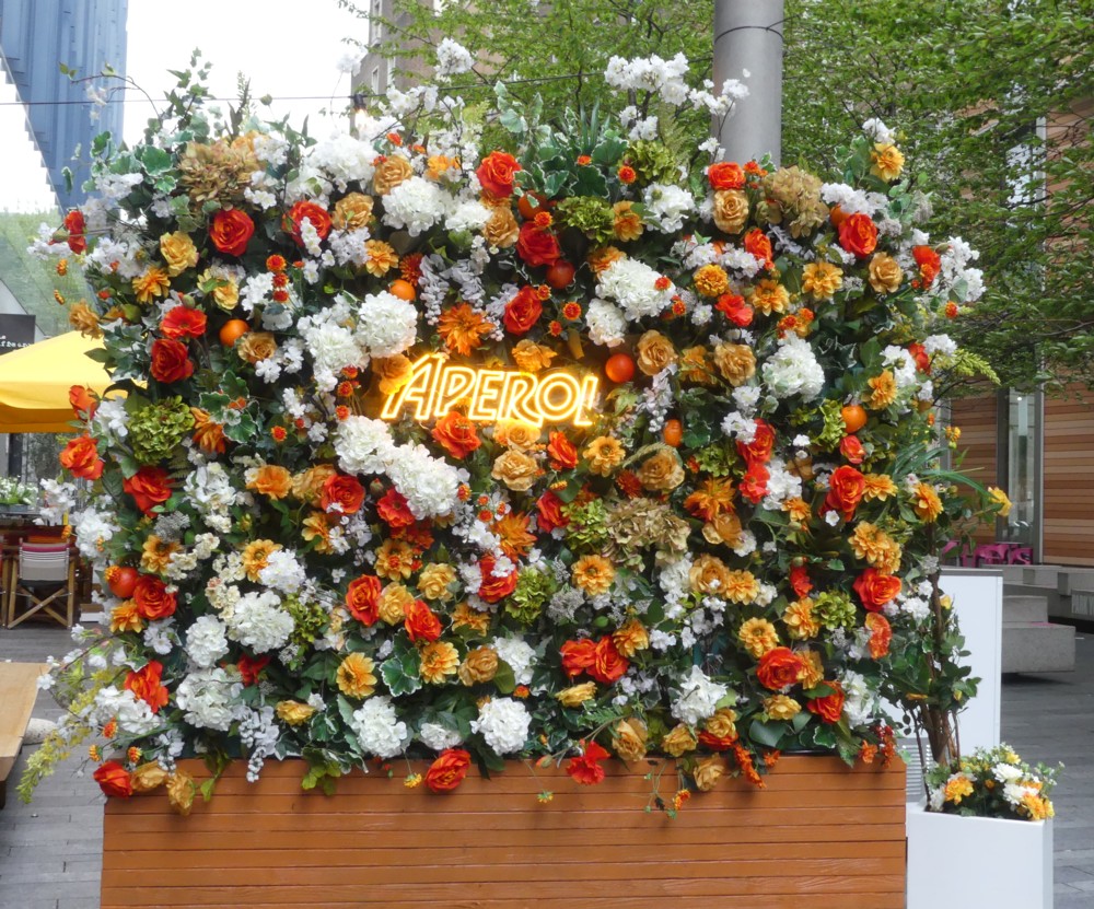
When I met up with GodDaughter2 last week at the Blue Fin Building I got there a bit early and had some time to kill. Which of course I did by photoing, one of the photos I photoed being this:

What appealed to me was how over-the-top colourful this fake-floral display was, so far over-the-top that it quite triumphed over the unseasonal and deeply gloomy weather that day. (Today has been a bit better, or at least a bit warmer.)

But what, I wondered, is “APEROL”? At first I thought APEROL was the name of the indoor place behind this display. Turns out APEROL is a drink, which has been putting itself about lately, and that the above sign was because APEROL was sponsoring a pop-up, whatever exactly that may be. See categories list below, which I now realise must include “Getting old”. No doubt someone can – and perhaps even will – explain. I’m guessing it’s an outdoor eatery or drinkery of some sort which isn’t so much built, but rather simply assembled in a hitherto public spot big enough to accommodate it, made into a trend by Lockdown. If that’s right then I assume that money changed hands, in the direction of the local authority concerned.

Fine by me. The architecture surrounding this sign (we’re a place that calls itself “Bankside”), is, especially at street level, as modernistically dreary as you could ever hope not to see, and anything that brightens up the area, like a piece of colourful product placement, is to be welcomed. It certainly cheered me up.

Architects are soon going to get over their obsession with black, white, brown and grey, and generally pale and lifeless shades of boring – even the Blue Fin Building isn’t properly blue – and start doing proper colour on the outside of their now boring buildings, big time. This is a stylistic pulse that I do happen to have my finger on, unlike the pop-up thing, and I know whereof I speak. And it can’t come too soon, I say.

Also, to fly off at something of a tangent, expect people to start saying that they’re starting to like Nova, instead of everyone just carbuncling on about how trashy they think it looks. At least that adds a bit of real colour to the London skyline.

A gallery of Michael Jennings photos

For the last few weeks, a strange glitch has been afflicting this blog, involving spacing. If I stick up just the one photo, stretching all the way across the width of the blog’s column of text, all is well. But if I stick up a gallery of photos, which is something I very much like doing, there has been a problem. Too much space was suddenly, ever since a recent software update or some such thing, created below the gallery. Any attempt I made to remove this space only resulted in further spatial havoc below, in the form of too much space between subsequent paragraphs of text.

But now, either because the guardians of this software have sorted this out, or because the technical curator of this blog, Michael Jennings, has sorted this out, things are back to how they were. Good. Very good. I attach great importance to how this blog looks. If it looks wrong, I hate that. It demoralises me and makes me want to ignore the damn thing rather than keep on updating it the way I actually do. This was especially so given that galleries look so very good when they are working properly.

Well, as I say, things have now reverted to their previous state of visual just-so-ness. And I will now celebrate, with yet another gallery:

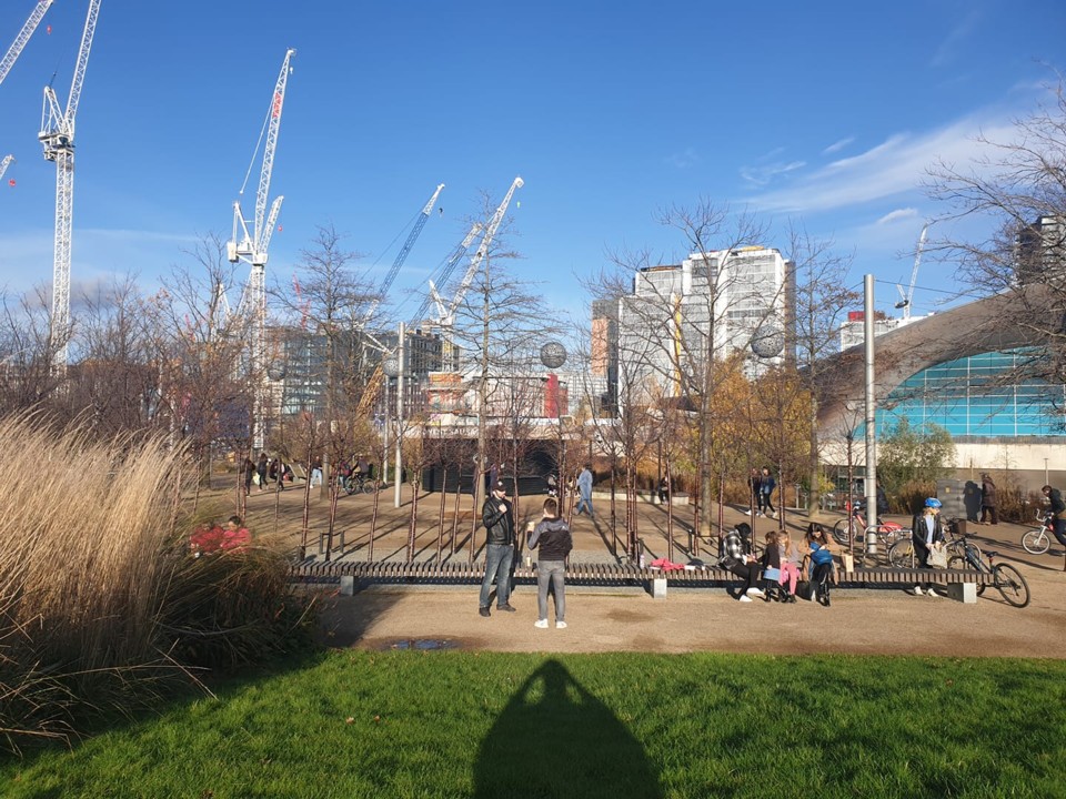
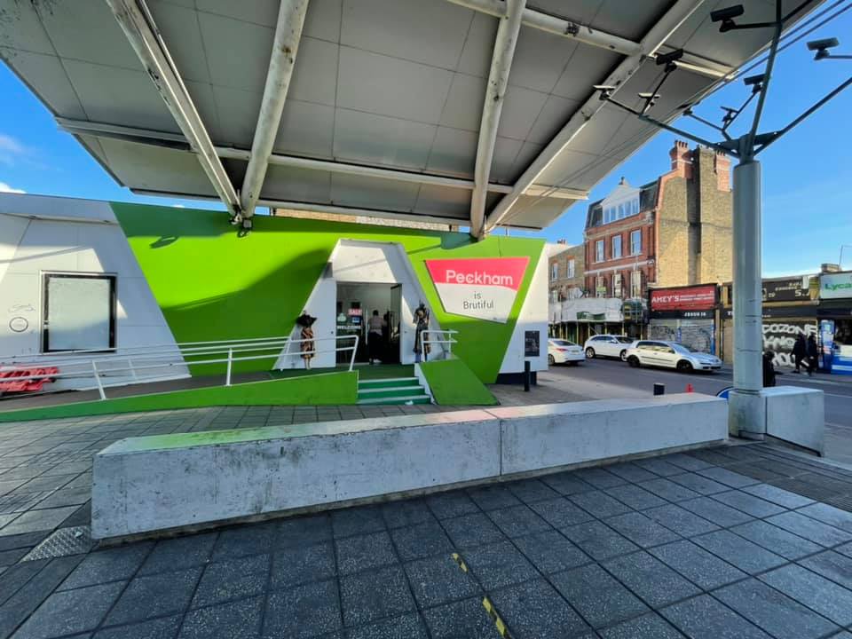
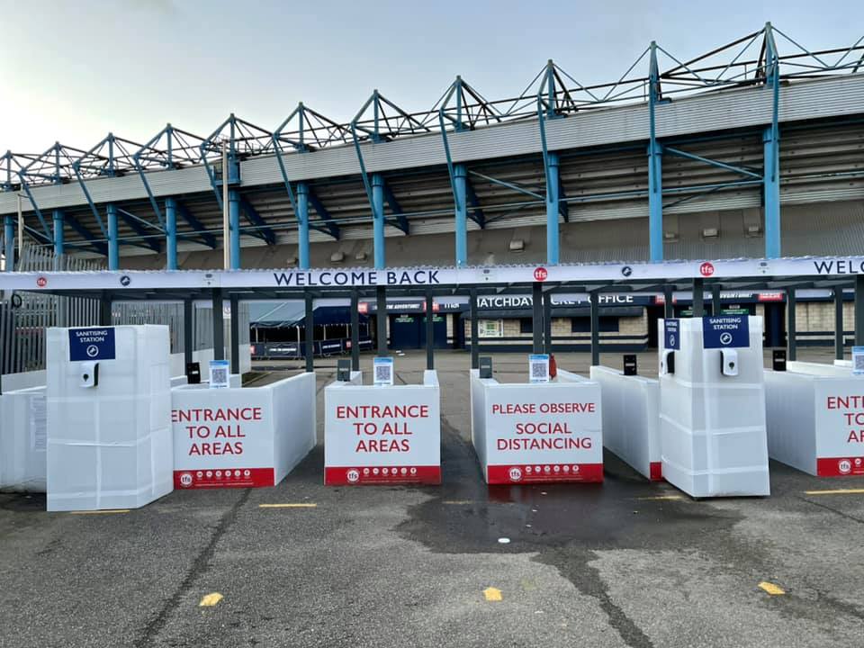
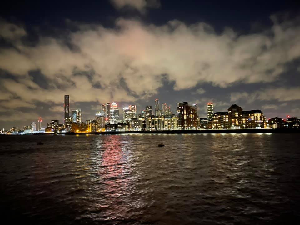
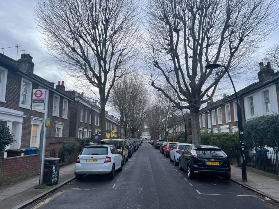
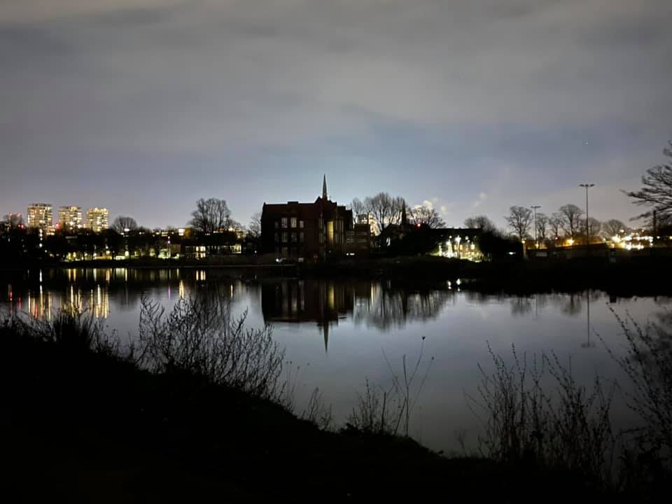
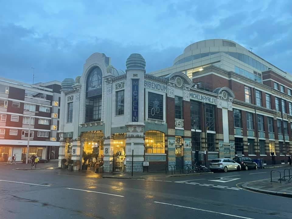
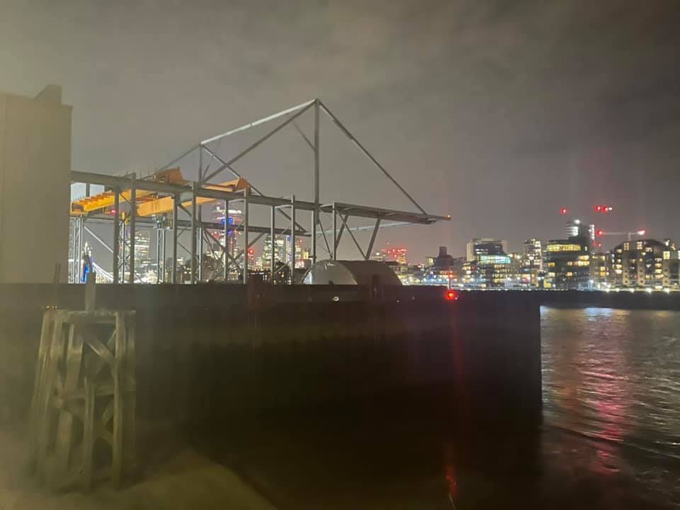
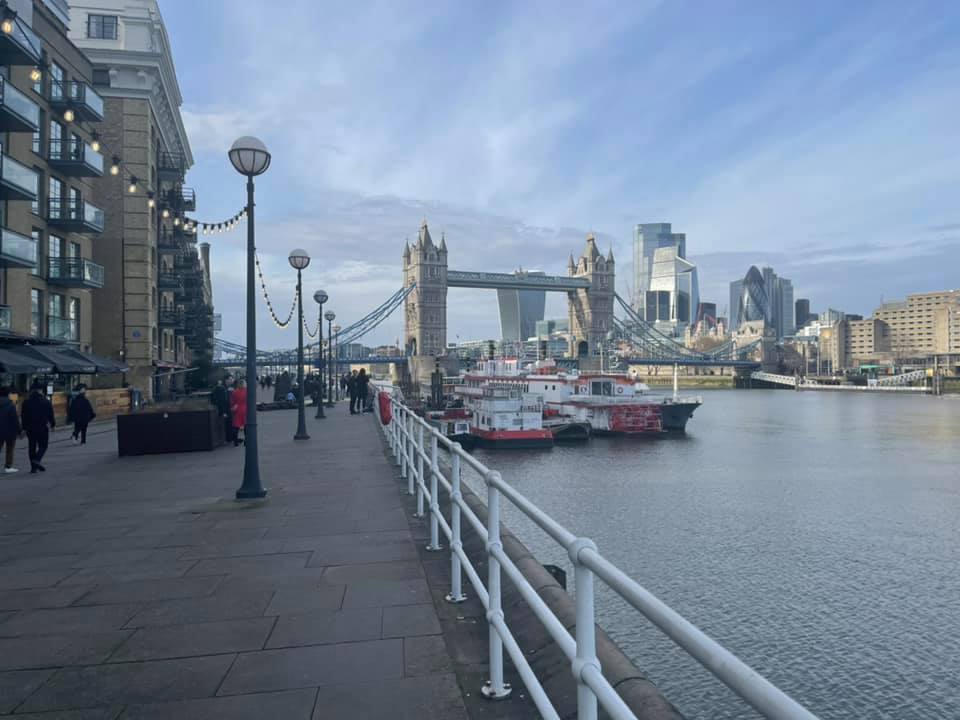
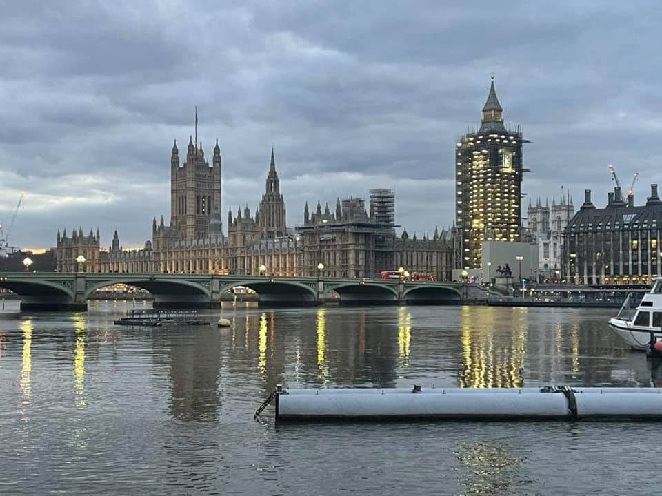
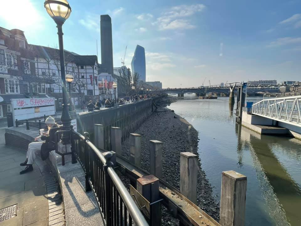
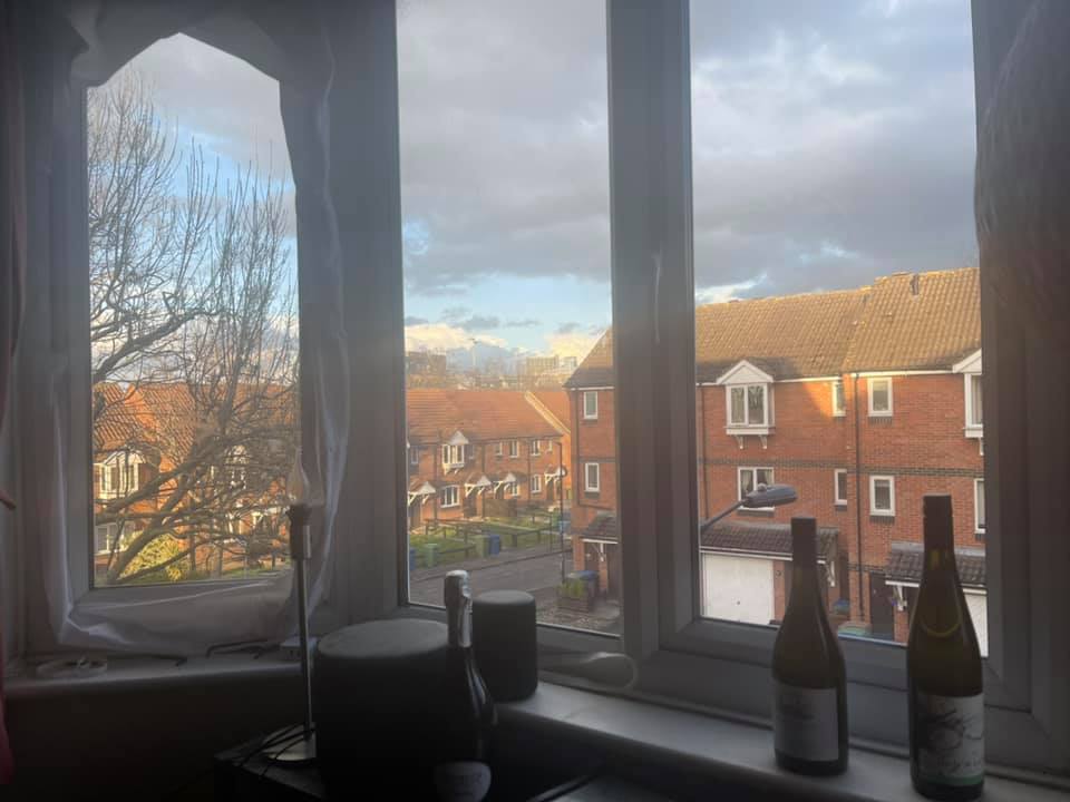
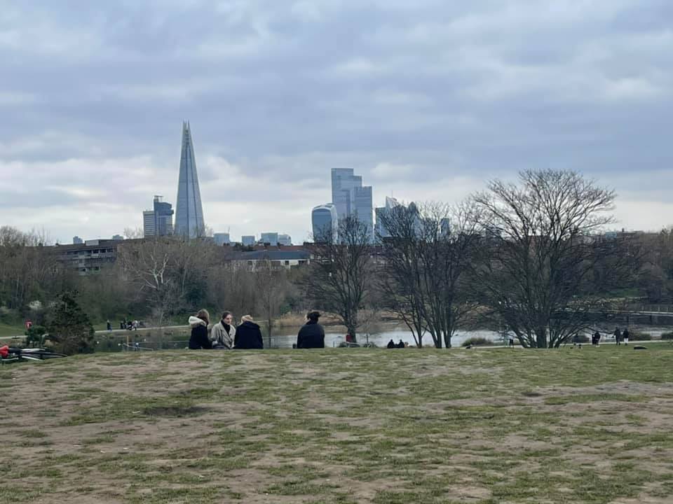
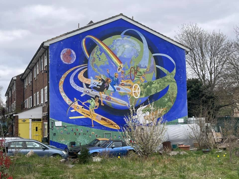
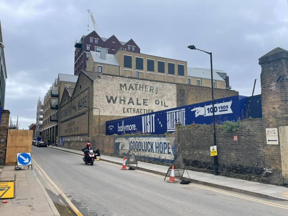
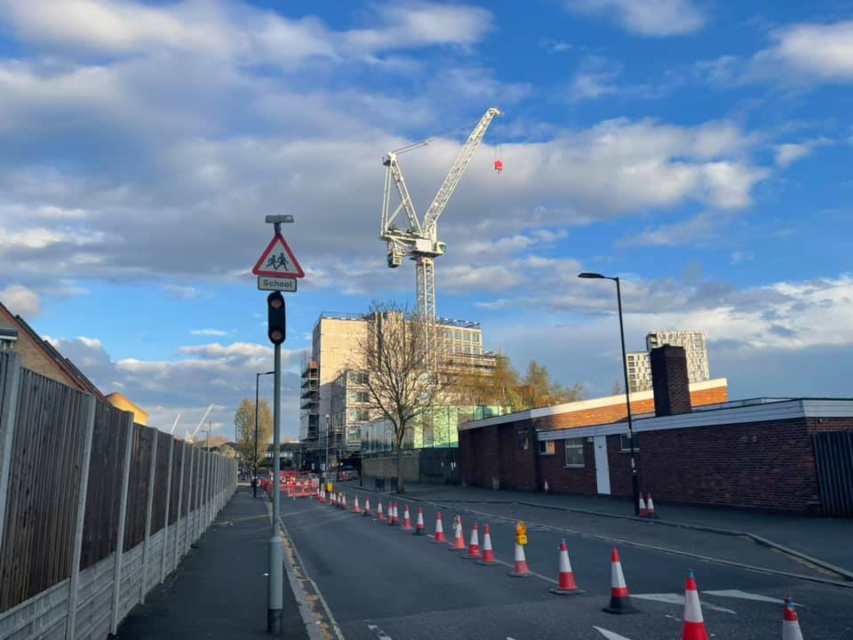
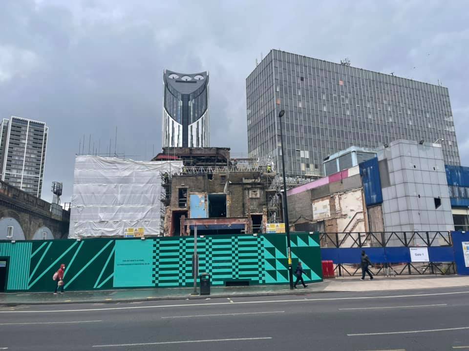
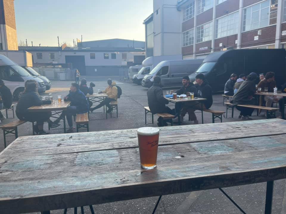
The above gallery, however, is not a gallery of my photos, but rather a gallery of photos photoed by Michael Jennings, all, I believe, with his mobile phone. Not having got out much lately, I have found the photos Michael has photoed while taking exercise, and then stuck up on Facebook, reminding me of how my beloved London has been looking, to be a great source of comfort during the last few months. And I actually like photoing in his part of London more than I do in my own part. This may just be familiarity breeding something like contempt, but is still a definite thing with me.

I started out having in mind to pick just four photos, which makes a convenient gallery. Then I thought, make it nine. I ended up with twenty four. It would have been twenty five (also a convenient number), except that one of the ones I chose was a different shape, which might have complicated things, so I scrubbed that one from the gallery.

But you can still look at that one. Because none of this means that you need be confined only to my particular favourites. Go here and keep on right clicking to see all of them.

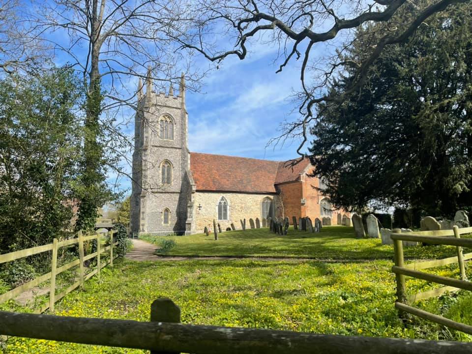
I have displayed my picks here in chronological order, the first of the above photos having been photoed in October of last year. The final photo (which is what you get to if you follow the second link in the previous paragraph), of the church, which I learned of today, and which is the only one done outside London, is something of a celebration, of the fact that Michael is now able to travel outside London without breaking any rules, or such is my understanding. (Plus, I like those unnatural trees (see also photo number 9)).

Patrick Crozier, the man I do recorded conversations with (see the previous post), is a particular fan of Viscount Alanbrooke, Churchill’s long suffering chief military adviser during WW2. So he’ll like that this church is where Alanbrooke is buried.

Two black cabs that are not black and sixteen black cabs that are black

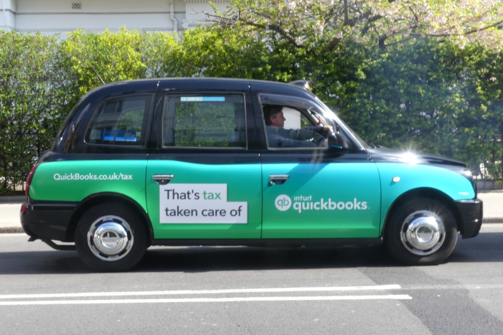
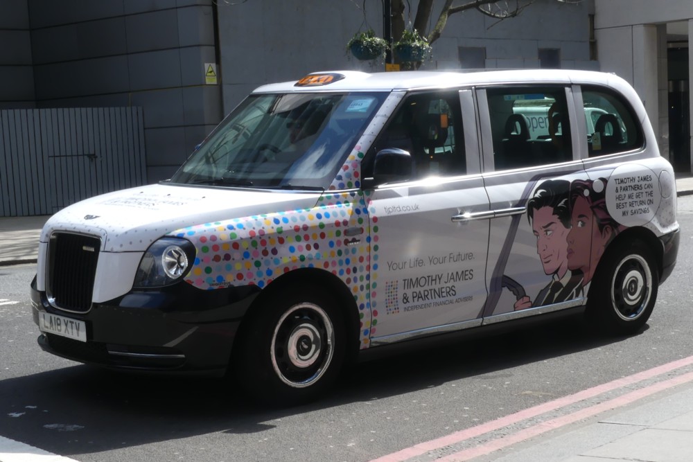
On my walkabout yesterday morning, I did encounter a couple of taxis with adverts, or black cabs as they are somewhat confusingly known. The point being, they are frequently not black at all:

Adverts advertising a way to speed up your tax process still make a lot of sense.

As do adverts about what to do with your savings:

But that still leaves a lot of taxi adverts that do not now make – or have not recently been making – much sense at all, on account of so many forms of spending having been put on hold, and on account of there being far fewer people wandering around and inclined to look at such adverts and act on their instructions.

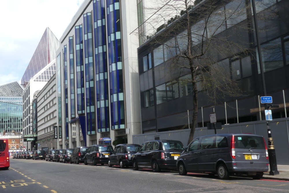
With the following result. Here is a photo I photoed moments before that taxi with the savings advert, of a line of taxis outside Victoria Station, …:

… with no adverts on any of them.

Sixteen taxis, I make it. About that number. What are the chances of that happening in normal times? Here is yet another business that has been suffering during Lockdown. When last I looked, cabbies got about a tenner a day for their adverts. So, just when a lot of them could really have used that little wage top-up, they’ve had to go without it.

These were black cabs that really were that. Apart from the dark grey one nearest to us.

This is not the first time that I have noticed the phenomenon of the truly black Lockdown black cab, but this has been my most striking such observation.

I have believed, for some time now, that Lockdown will in due course be retro-damned as a cure worse than the disease, that at the very least went on for far too long. A generation of “experts”, all gripped by the fallacy of the risk free alternative, are going to be proved as having been very inexpert indeed. What is ending Covid is herd immunity. And what does Lockdown do? Lockdown slows down the arrival of herd immunity and prolongs the agony, in a feedback loop of yet more Lockdown. Will it ever end? I’ll believe the end of Lockdown when I see it and when the idea of re-imposing Lockdown is no longer talked about. Such are my prejudices just now.
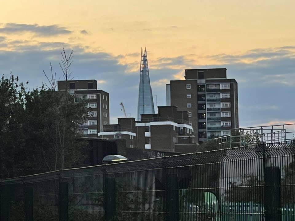
Also, too many people now like it.

I wonder if I’ll want to saying I Told You So in a year’s time. We shall see.