Remembrance photos – 2020 and 2018

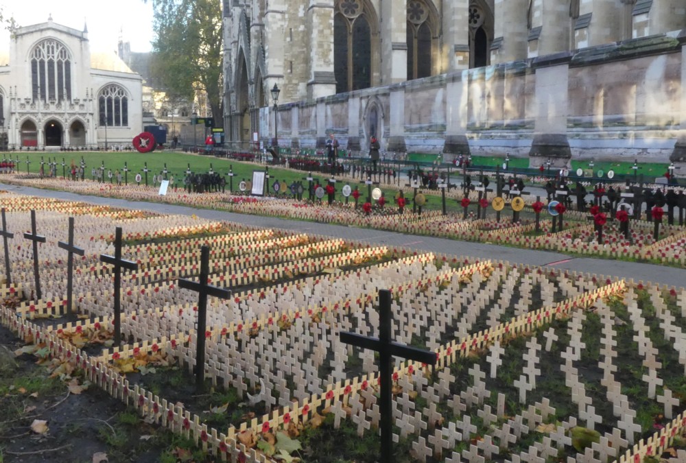
On that walk, a week ago now, I photoed the Remembrance preparations being made outside Westminster Abbey. Of course I did:

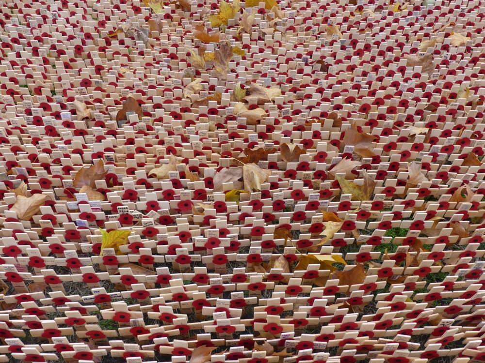
That was the first of them, and with a bit of cropping it is showable, but the rest were … Put it this way, I had to lean over the railings to photo anything, and I find that little crosses and dead leaves photo better if you get properly close to them.

Like this:

More Remembrance, of photos as well as of masses of young men dying. I photoed that on November 10th 2018, and showed it and other similar photos at my old blog on November 11th 2018, which was the exact one hundredth anniversary of the Armistice that ended World War 1.

This particular bit of Remembrance doesn’t seem to change much from year to year. I suppose it doesn’t need to. What else is there to say, and how else could you say it any better?

Big Things across the River

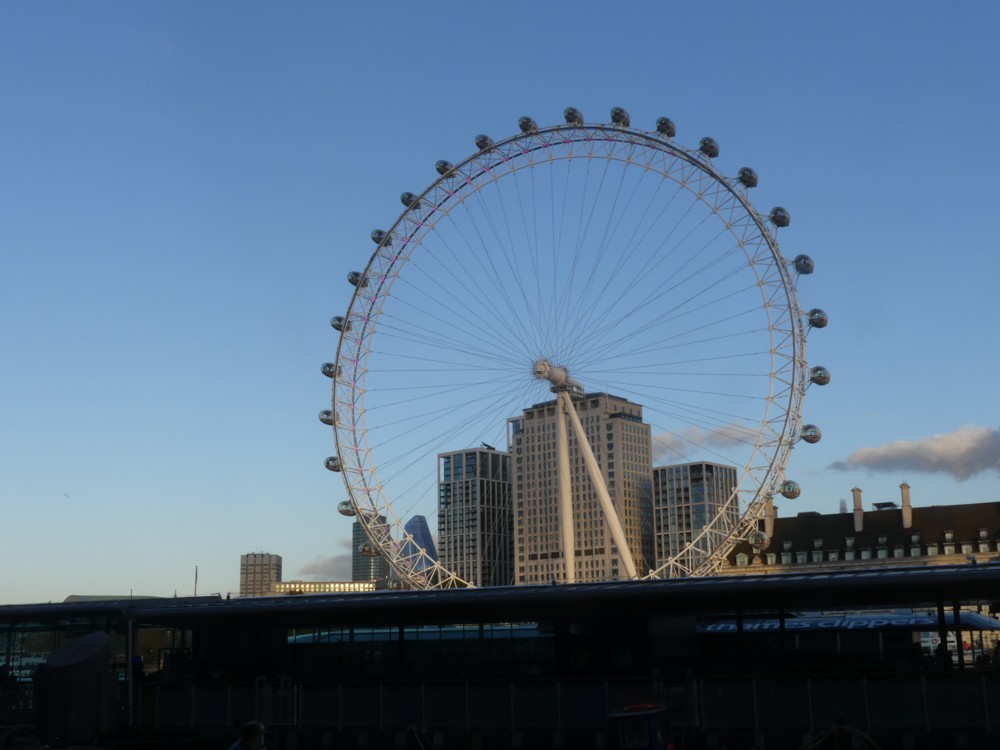
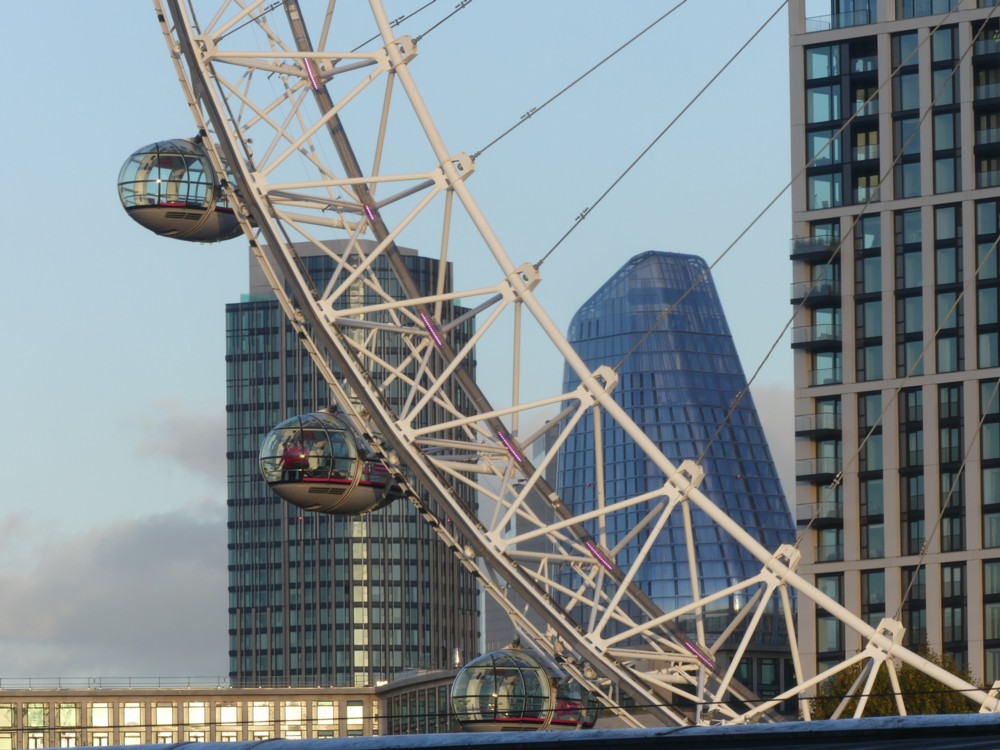
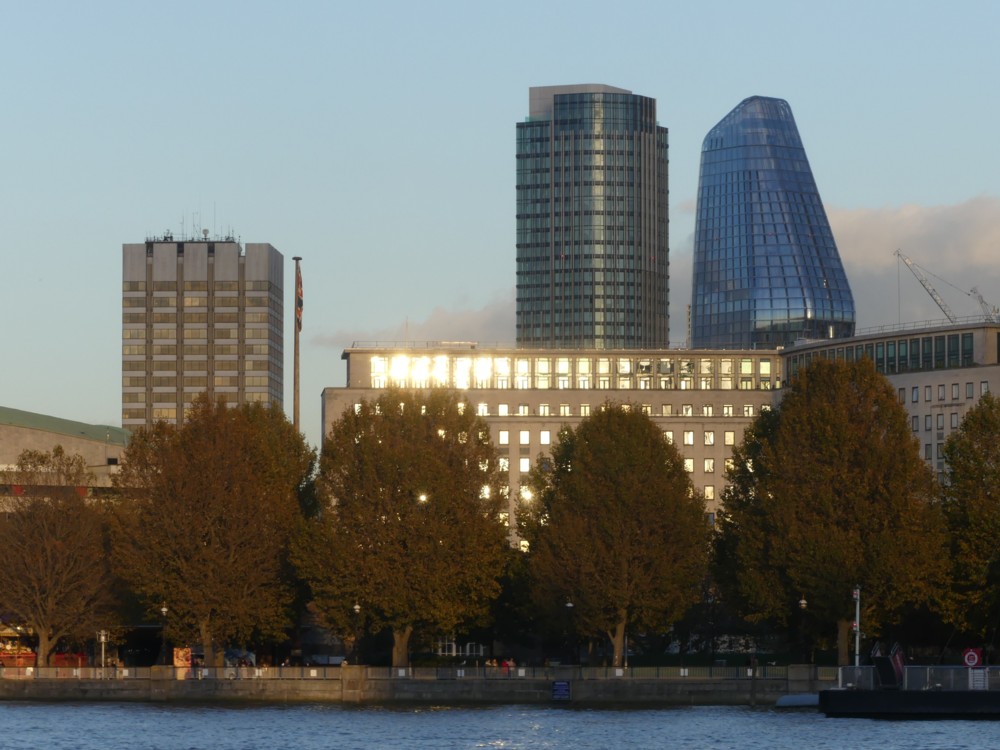
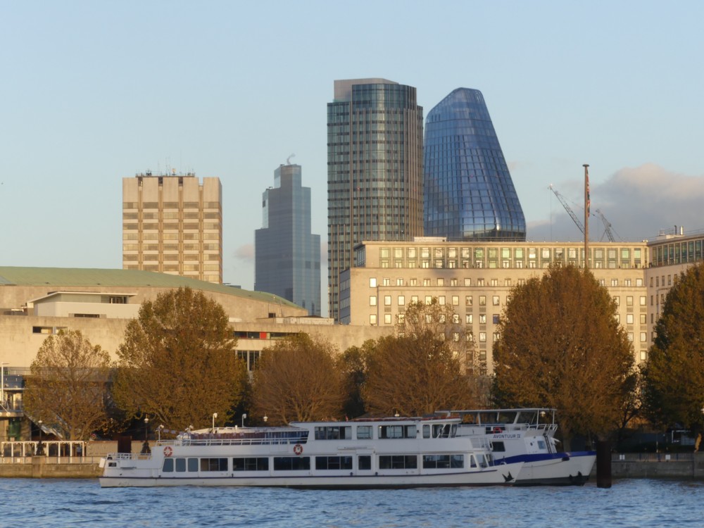
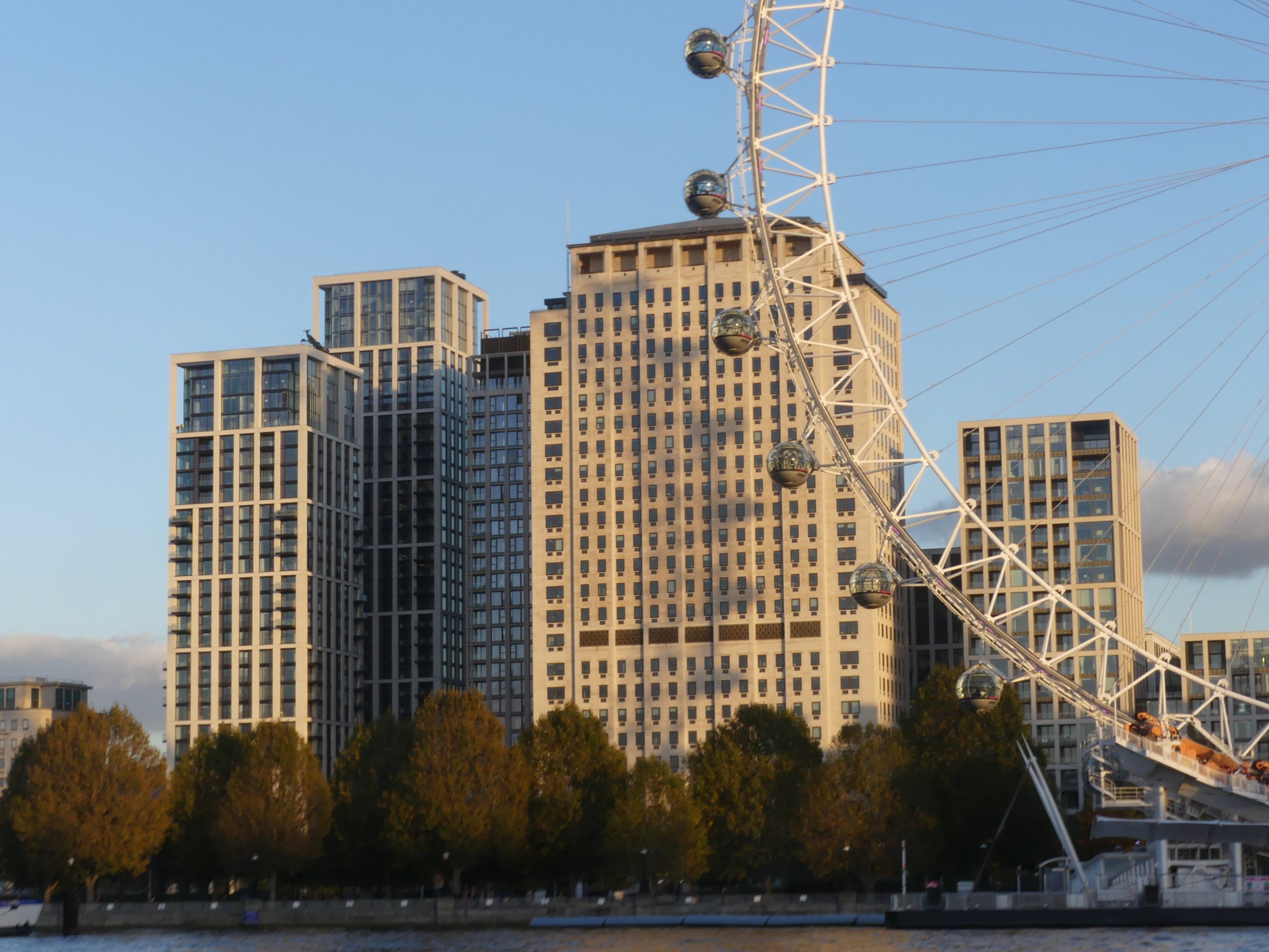
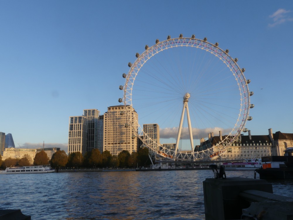
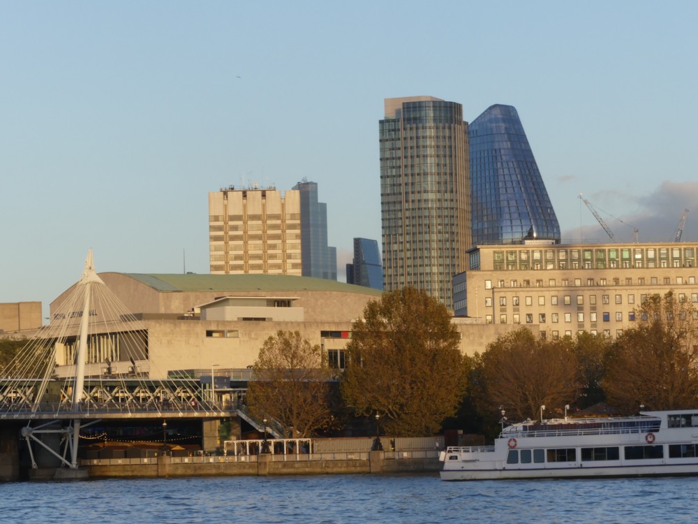
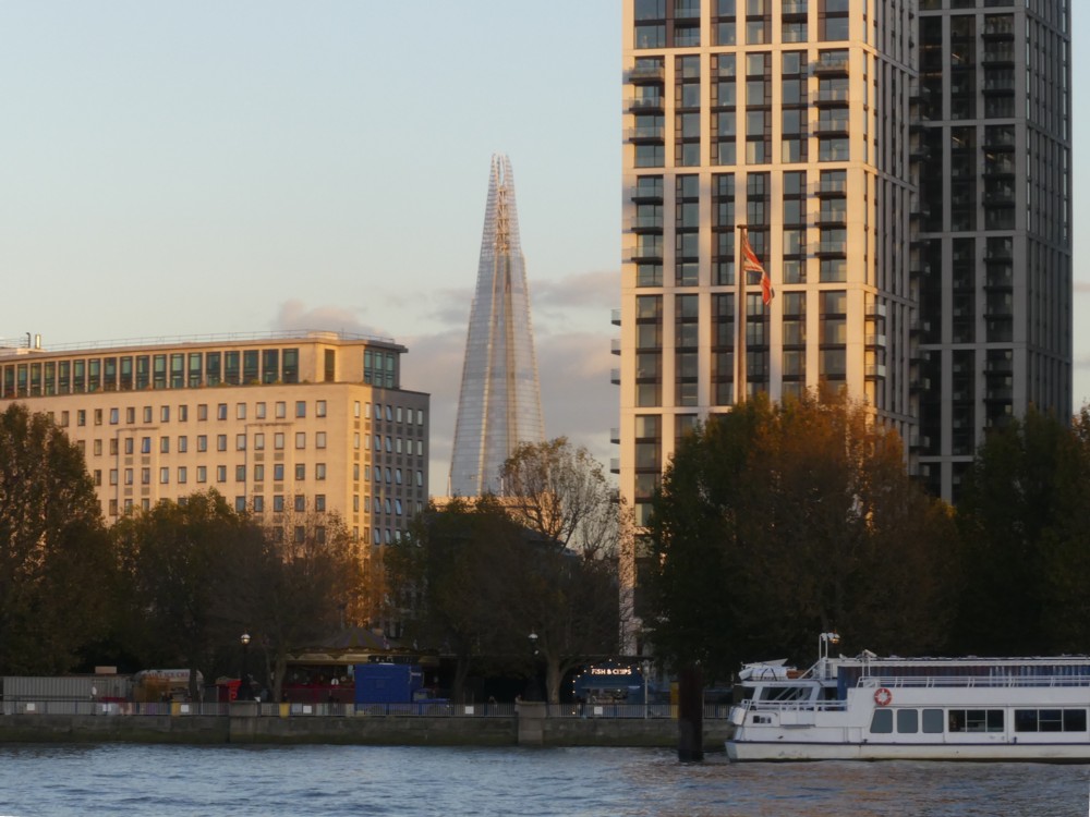
There were statues to be seen nearby, but there were bigger things, Big Things, further away, on the other side of the River:

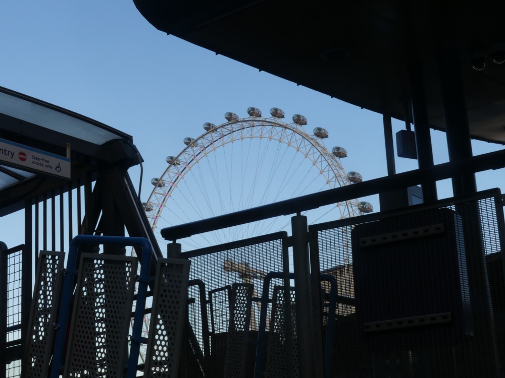
Photo 1 uses the clutter associated with getting on and off of a boat to frame the Wheel. All the rest are entirely of more distant stuff.

I like the colours, warm cream when the sun hits stone or concrete, dark glass, the perfect blue of the sky. My camera makes the dark glass, of such buildings as One Blackfriars (aka the Boomerang), all the darker by not wanting bright sunlight directly reflected to look too bright.

And once again with the shadow of the Wheel (for once London “Eye” works very nicely) on the Shell Building, but this time with the shadow seeming to be the wrong way round, as seen most clearly in photo 6 and also in photo 7. It is of course the shadow of the opposite side of the Wheel.

And in the further distance, in gaps, the Shard (photo 9), and a rather handsome view of 22 Bishopsgate (photo 5) looking like a more coherent shape than I am used to seeing, a bit like a ship, front on. Move along a bit, and we then see the Cheesegrater as well (photo 8).

These strange alignments all take a bit of getting used to when you first see them. This is because, like so many rivers in the middle of great cities, this river twists and turns, that being a big reason why the city got built here in the first place. By twiddling this way and that, the river brings valuable riverside spots closer to each other, and stirs up a lot more commerce than a straight river would. (See also: Paris.) But these kinks play hell with your sense of direction, or with mine anyway. I was on the north bank of the river, but, although I was looking straight across the river, I was nevertheless looking due east, rather than south. And back across another kink in the river again when seeing 22 Bishopsgate and the Cheesegrater, which are both part of the City Big Thing Cluster, which is on the north side of the river.

It is all part of London’s charm, and the charm of its Big Things. When out-and-abouting in London you can never be quite sure which Big Thing you’ll see next, through some gap in the foreground, or from what direction you’ll see it.

There are cranes to be seen, but very few.

Looking towards Vauxhall

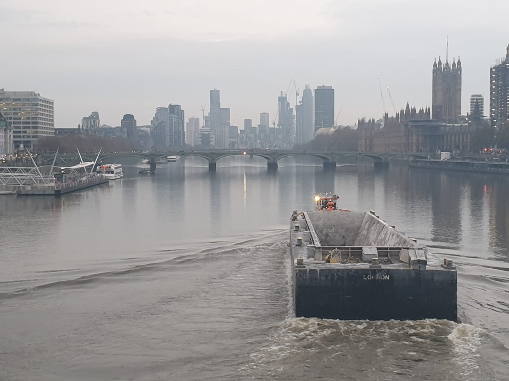
I really like this photo, with its excellent detail in unpromising light, with its only occasional bits of colour and its big grunge boat in the foreground, by which I mean forewater:

St Thomas’s Hospital on the left. Westminster Bridge. Parliament on the right, with half of the still heavily scaffolded Big Ben on the right. And in the distance, the towers of Vauxhall, but with Millbank Tower at the right hand end of the distant towers, that being on the north bank. I know all those well.

It’s the latest photo posted to Facebook by Michael Jennings. Michael often says of his photos of London that all they are is photos of London: Michael Jennings – in London, United Kingdom. But sometimes, as with this photo, he has a little more to say:

The cluster of buildings that is growing between Vauxhall and Battersea Park on the south of the Thames really is quite something.

This cluster being quite near to where I live, I can confirm that Michael is not wrong about the scale of what is going on over there.

I can’t tell from the info I looked at what camera Michael used for the above photo. Another case (see also: this) of an iPhone?

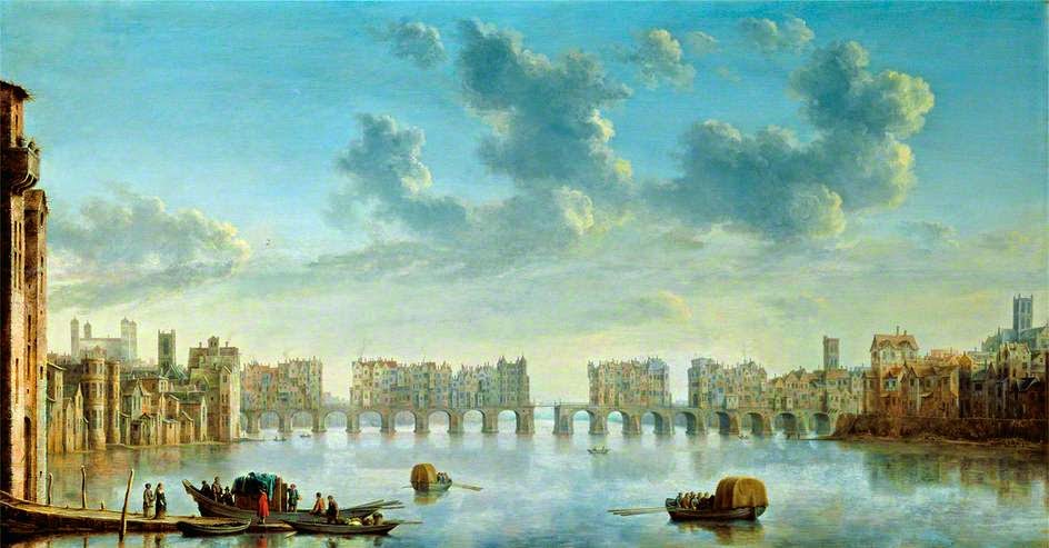
View of Old London Bridge from the West

Found this here:

Painted in 1650. it’s this.

I particularly like how this shows the architectural dominance of old St Paul’s, on the right, and even more so of the Tower of London, to the far left. These were, for many centuries, London’s Biggest things.

In 1666, the Great Fire damaged old St Paul’s so badly that they had to build a new one.

Until 1561, when it was struck by lightning, old St Paul’s had a spire. Blog and learn.

Westminster Abbey – modified and unmodified

Again with the photos from last Wednesday, this time photoed soon after I had photoed The Broadway, and its coffins.

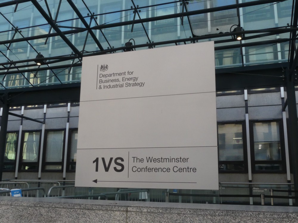
Proceed down Victoria Street from there, and you go past this place. If you are me, you notice:

This is one of those government departments which keeps having its name changed. That’s what it’s called for the time being. Not that I, or you, care very much. I’m just saying so you know what I’m talking about. “1VS” presumably means 1 Victoria Street.

Anyway, this Department of … whatever, has a fantastically over-elaborate glass and steel front entrance. There are two good things, along with all the obvious sneering, to be said about this front entrance. One, unlike with Big Lumps of the Concrete Monstrosity era of what you might call classic Modernism (which is pretty much what the rest of this building is), you can at least tell where the damn front entrance is. An elaborate front entrance is at least better than an infuriating guessing game.

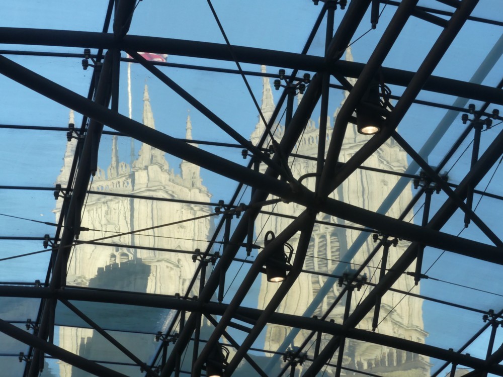
And second, through the fantastically over-elaborate glass and steel roof of this entrance, you can photo photos like this, of Westminster Abbey:

This is a fine example of a modified cliché photo, which is a favourite sort of photo of mine. Cliché: Westminster Abbey, photoed millions of times. Modified: by being photoed through this roof, not photoed that way more than about a thousand times.

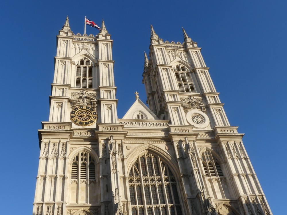
But, here’s a thought. What if you live in some terrible backwater like New York or San Francisco or Shanghai, and although there are lots of photos of Westminster Abbey that you could look at, you are so preoccupied with the details of your humdrum life that you seldom give them your attention. For the benefit of all such unfortunates, here is the unmodified cliché photo of Westminster Abbey that I photoed a little bit later:

God does not exist, but He still manages to occupy some of the best buildings.

Shard earlier today

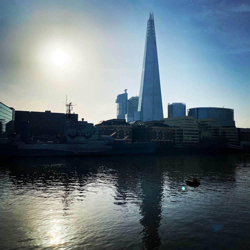
Photo taken by a friend earlier today, of the Shard from downstream:

Photoed with an iPhone 11. Pointed straight at the early afternoon sun. I’m impressed that the iPhone software managed to make so much of a distinction between on the one hand the Shard and its’s Guy’s Hospital smaller companion, and on the other the buildings in the foreground. Not sure my camera would have done so well.

In general, I love that blue-ish colour of the Shard and Guy’s. Again, don’t think mine would have managed this. I would have managed something, but it would have looked different.

What my friend saw when looking at this scene while photoing it was, I am sure, very different.

For all kinds of reasons, including the camera contrast but many others besides, my photos never seem to look quite like that. Strange that something so automatic should end up being so individual.

How The Broadway is looking in the sunshine

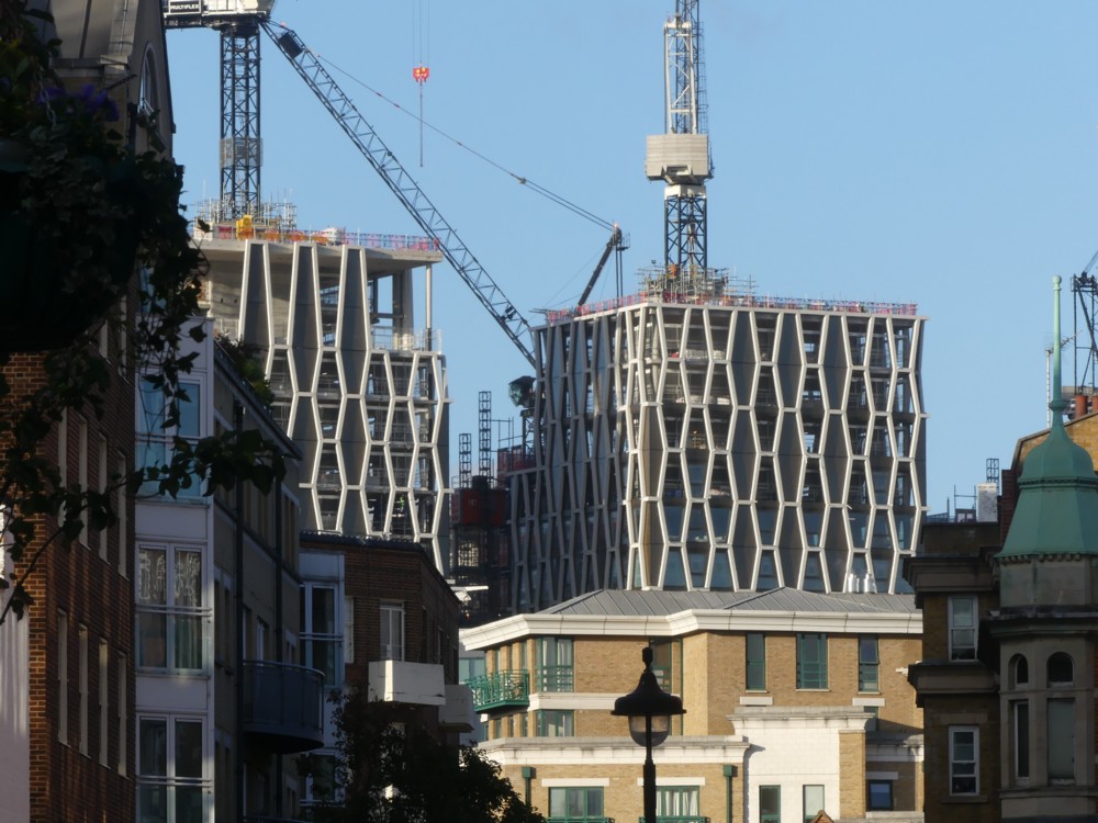
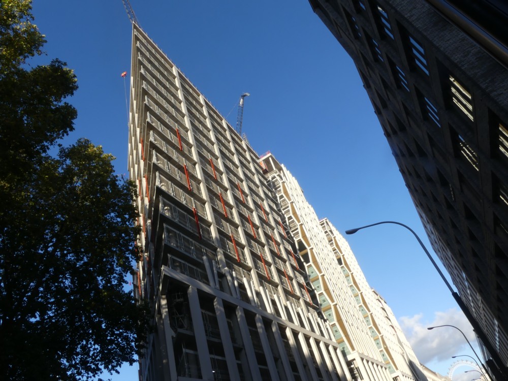
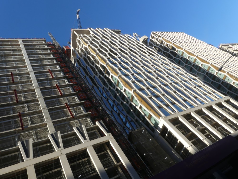
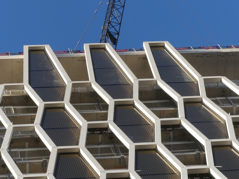
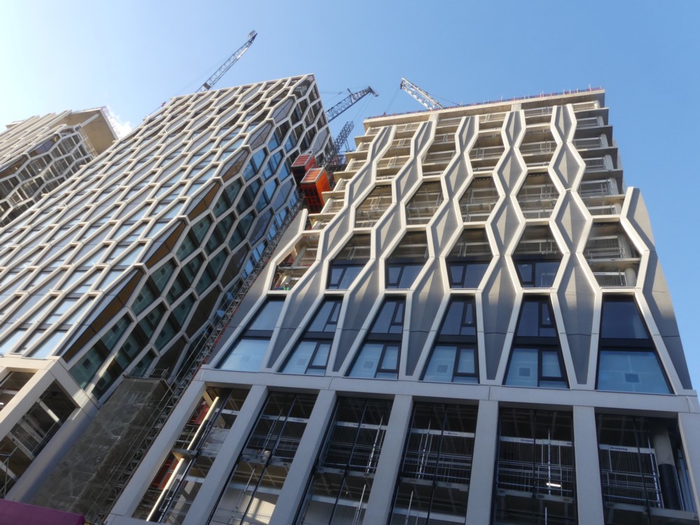
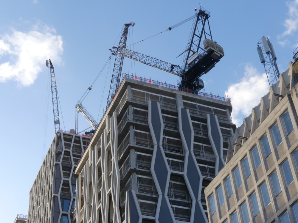
A while back, I showed photos of The Broadway being built, which, because of the weather, looked like black-and-white photos. Here is that same Broadway last Wednesday, nearer to being completed, in sunshine, and therefore in colour:

Photo 1 is the first view of these new towers that I get when I walk along Regency Street and look towards Victoria Street. In that photo, and in photo 4, we clearly see those coffins, which I first mentioned here way back in July, near the bottom of one of these towers. Now, there are also coffins at the top of that same tower. Odd choice.

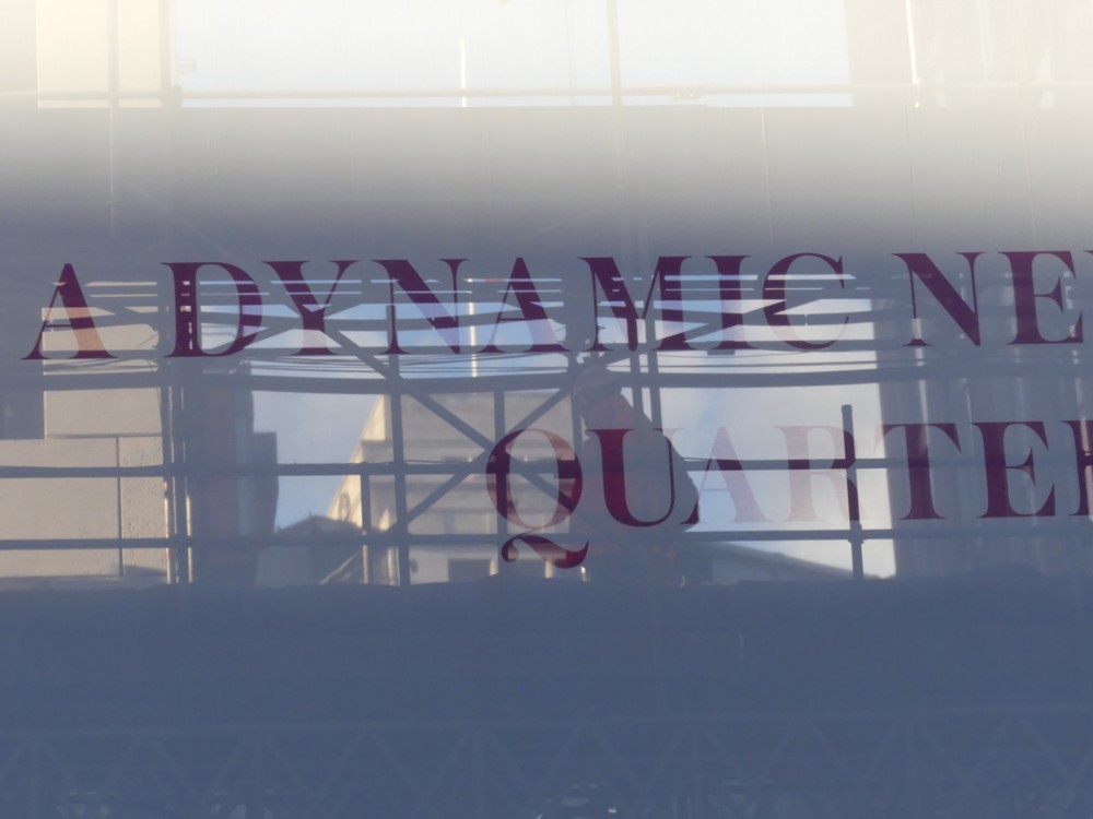
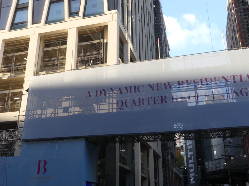
Photo 5 shows the games that light plays with the big sign facing Victoria Street. “A dynamic new residential quarter redefining …” what? I probably have other photos in my archive telling me what, but frankly, I don’t care and would be amazed if any of you did either. In photo 5, which is a detail of the same scene, you can see through this sign that 55 Broadway will, in you stand in the right spots in Victoria Street, be visible from there. Good. That’s not what happened when New Scotland Yard was in this same spot. The fake photo here shows this gap in The Broadway very clearly.

Photo 7 shows that the other two towers on either side of the coffin tower will sport a slightly different, although closely related, decorative plumage. Too thin to be coffins.

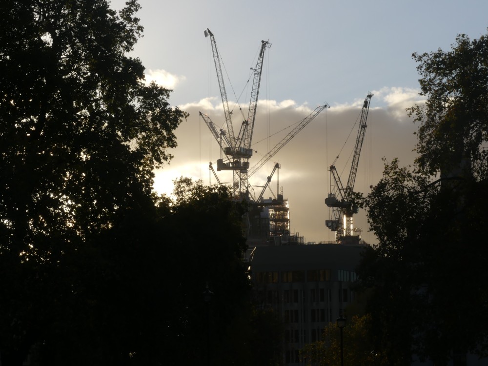
Photo 9: cranes. And in photo 9, I am looking back up Victoria Street from the other side of Parliament Square, at the same cranes, which look pleasingly tumultuous, I think. I really hope that the era of such tumultuous crane clusters is not about to end. Or, to put it another way: I wonder if these apartments will sell at anything resembling a profit?

Only a small risk of getting rabies

Michael Jennings:

Oh, those glorious days of the past when I could be bitten by dogs in beautiful places with glorious mountains, churches, food and wine, with only a small risk of getting rabies. I miss those days so much.

Sigh.

Regency Street reflections

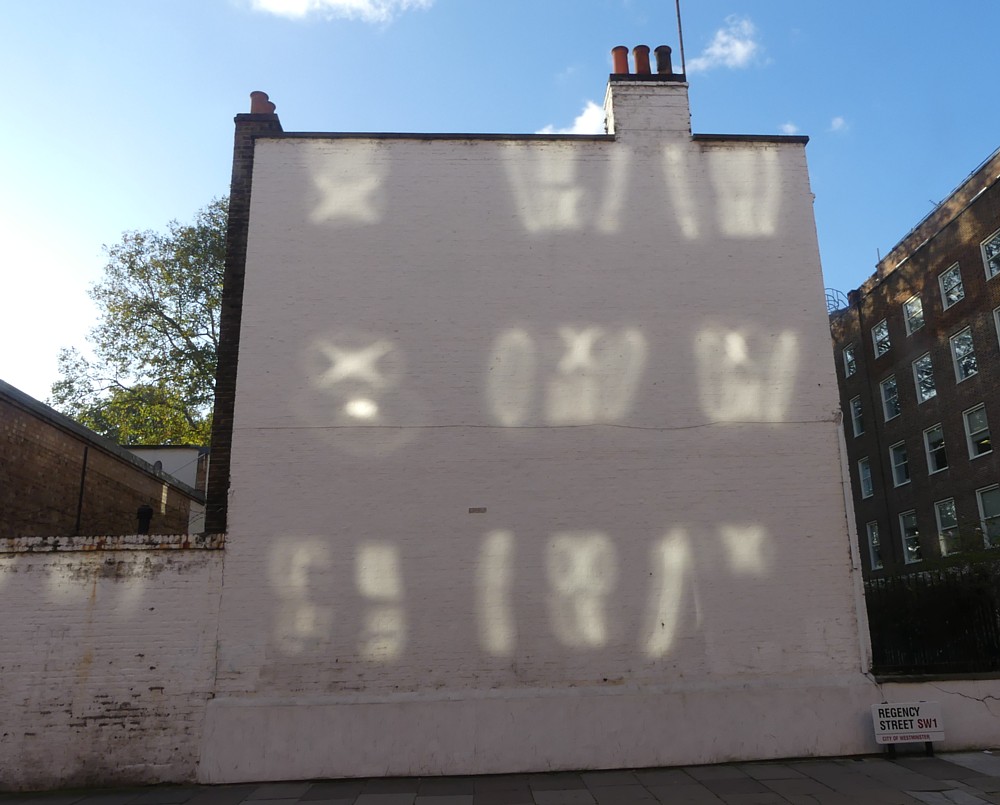
Despite not feeling a hundred percent, I managed to drag myself out of doors earlier today. This was among the first worthwhile photos I photoed:

The title of this posting makes it sound like I was being unusually thoughtful, when in Recency Street. But, as you can see, these reflections were actual reflections. Of the afternoon sun from beyond that white wall crashing into Regency Street and bouncing off the windows above and behind me. It’s an effect that happens quite often in that particular spot.

After I’d done my little burst of photoing, a couple of nearby hard hat guys, baffled but curious, then worked out what I was photoing and said something to that effect. The point being, they couldn’t at first see it. Cue an exchange of reflections (of the more metaphorical sort) about how we humans see past irrelevances like shadows and reflections to the shapes of the objects we look at, but cameras show us pictures with all the special lighting effects included. We make mental models of what we are looking at. Cameras just look.

Because of all the shiny glass that all modern cities contain nowadays, you see a lot of lighting effects of this sort in London. If you do see them, that is.

A walk like the one I did today would have tired me out even if I was fully fit, which, as I say, I now am not. So, more photos from today to follow, but for now, that’s it.

Colourful mural in Chelyabinsk

I get regular emails about new architecture, and trust me, there’s less of it happening now. And what there is now being done is mostly generic machines-for-living-in and machines-for-working-in. The age of starchitecture is pretty much over, for the time being. Covid? That hasn’t helped to be sure. But it felt like it was slowing down well before that.

So, to cause a stir and get noticed, what do “designers” now do? Answer: They paint eye-catching murals on the faces of all those regulation boxes.

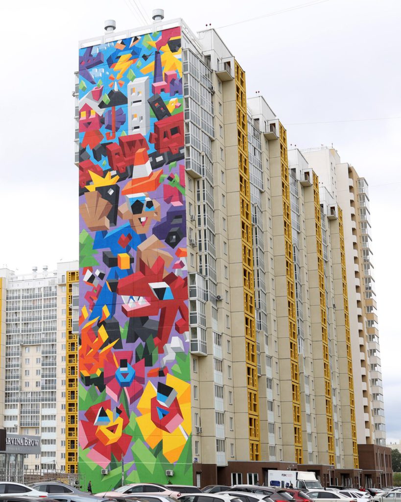
Thus:

The official explanation of this mural is that it’s something to do with the environment, human impact on, blah blah. Like that’s a bad thing. But, as Mick Hartley (at whose blog I found this) says:

… you’d be forgiven for not quite grasping the ecological message.

Indeed. It looks more like a celebration of how humans are able to subjugate their environment and make it their own. I’ve never been to Russia, but my understanding is that their “environment” is a lot scarier than ours is, and that they consequently sentimentalise it a lot less than we do.

But whatever this Chelyabinsk mural may “mean”, it is yet another straw in the wind of colourful applied decoration that is now seriously blowing around the world. If you can’t do new buildings of note, you can still paint the buildings you have, old and new, in a newly colourful way.

Also, I suspect that paint for use outdoors is getting better, as in fading more slowly. I tried googling about this, but all I got was stuff about how to become a better painter of indoor pictures. Can anyone offer any pertinent links on that subject?