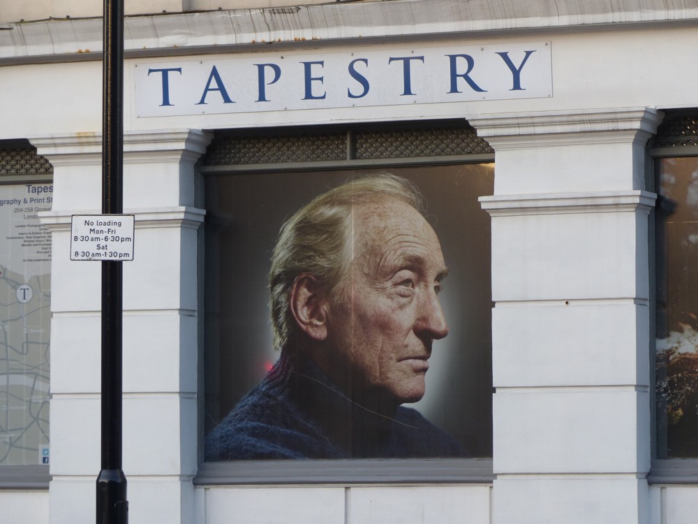
Charles Dance in Goswell Road

Back in 2016, a friend was regularly working in the Angel area, and I would often meet up with her at the Angel Tube, there to repair to a local coffee and cakes parlour. When we parted, I would often walk towards the Big Things of the City, photoing as I went. The photo I photoed of “Tower 42” and 22 Bishopsgate in this posting, being an example of the kind of photo I would photo on this sort of walk.

But perhaps rather more intriguing was this:

What was a big picture of noted veteran Brit Thesp Charles Dance, under the word “TAPESTRY” doing, in this part of London? What did this mean? I’ve been intending to mention this for years, but have never got around to it.

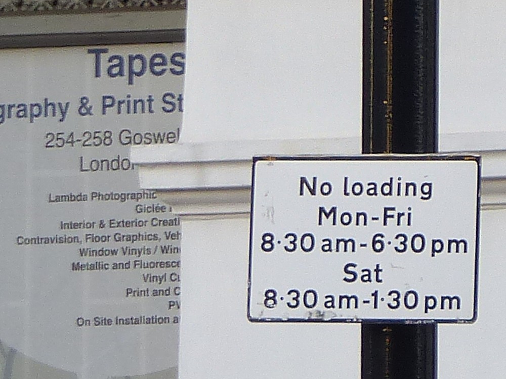
Recently, I made a breakthrough, by noticing that in the top left corner of the photo, next to the No loading sign, there is information, of the sort I should have photoed directly and completely:

Tapestry, it would seem, is the sort of enterprise that does specialist printing of a sort that especially interests me. Things like big photos on vinyl sheets. Such things have increasingly made their presence felt in London in recent years, as I have often noted here. Who, for instance, makes images like this one? Probably not Tapestry. But that’s the industry that Tapestry is a part of.

Alas, Tapestry is (or was (for I do not know if it is still there)) either too busy, or too preoccupied with other more pressing matters to be bothered with having its own website. I guess with a business like this, where everything has to look just so but where there is so very much to go wrong, word of mouth is everything, and internet boosting is beside the point. Or maybe Tapestry is no more, along with any website it may once have had.

Nevertheless, the picture of Charles Dance is pretty much explained. This wasn’t a plug for Charles Dance, though presumably his permission was obtained. No. It was a plug for Tapestry, who did the picture of Charles Dance.

Is it still there now, I wonder? Memo to self: go back there again and find out. (Guess: Not.)

Architecture for dogs

I get daily emails about “new london architecture”, and from Dezeen, the design website. From these emails alone, it is clear that the profession of architecture is in a bad way just now. Big new buildings just aren’t being built in anything like the numbers they were a few years ago. Even Zaha Hadid, who have been continuing to build big stuff in China, are being flattered by journos eager to keep in with them, not by plugging their latest Big Thing in China, but by writing about that space ship house that the late Zaha Hadid herself designed, several years ago.

The latest Frank Gehry project to get a write-up in Dezeen is a perfume bottle.

But of all the stories that speaks to this architectural go-slow, the one that I find most divertingly bizarre concerns an exhibition in London, organised by some Japanese goofballs, concerning architecture for dogs. Dezeen has noticed this, what with their being so little else of an architectural sort to be noticing, with a story about an architect who has done a sort of table thing that dogs can occupy, or something.

Dogs will get enthusiastic about anything their human bosses tell them to enthuse about. They’ll do anything to oblige. So they happily go along with this nonsense. But really. Could the world of “design”, all cool and calm and sophisticated and minimalist, be more completely at odds with the world of dogs, all enthusiasm and rushing about, sniffing each other’s arses and generally making a totally undignified spectacle of themselves and not caring a toss? To me, it all smacks of desperation. You can hear the wailing at Dezeen: What the hell else is there to write about? Well, I guess it’s dogitecture again.

Window pane sucker

Today I did the longest walk I’ve done in a month. I could show you a photo from that, but honestly, it would be quite the effort, after all my earlier efforts.

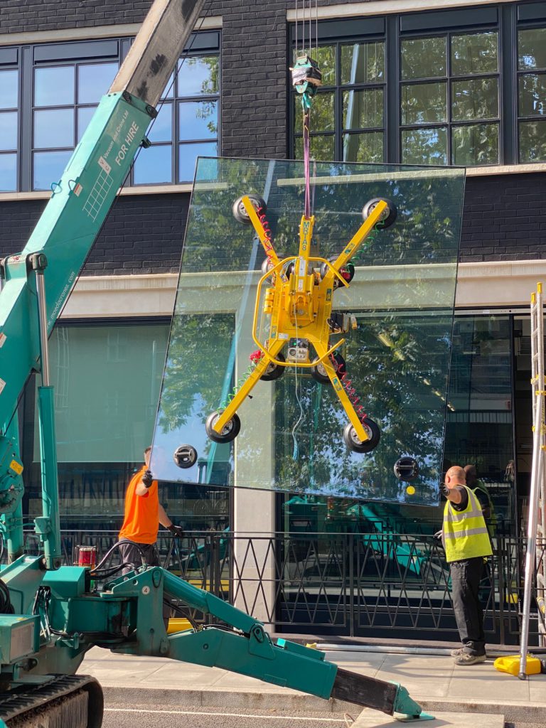
So this, when I got home, was a very nice surprise. GD2S, whom regulars here may recognise from that acronym and who for the benefit of irregulars is a lady friend of mine, sent me this photo that she had photoed, of men at work, with a window pane sucker and a crane:

Manhandling big sheets of glass into place on the outside of buildings is central to what the latest architecture now is, as anyone who pays attention to these things will already know. Typically, these days, the outside of a building is covered in sheets of glass so big that getting them up inside the building would, as likely as not, be impossible. So, the skills you see being applied in the above photo are doubtless finely honed. Especially when you consider how expensive, in cash and confusion, a mistake would be.

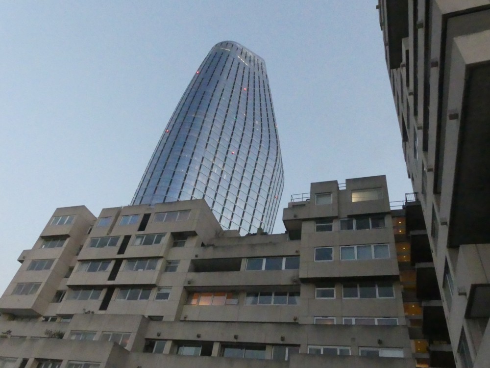
Come to think of it, here is a photo I photoed late this very afternoon, illustrating the exact trend I’m talking about:

There, in one photo, is that trend. In the foreground, we see Architectural Modernism from the Concrete Monstrosity era, with its windows all of a manageable size and uniformity and frankly not looking that expensive. Lose one of those window panes and getting another wouldn’t have been much of a bother. But in the background, rising up in the new new iconic style, is One Blackfriars, entirely covered in sheets of no doubt fabulously expensive glass, each sheet a different size and shape, capable of resisting all that the weather can throw at it. I presume that a fabulously more elaborate version of what is to be seen in the first of these photos is how all that glass got itself into place.

But, as of now, I am too knackered to pursue the matter, and if I’m wrong, I’m wrong. Whatever the real story, I still very much like that first photo there. I don’t know where it was photoed Somewhere in London, with an iPhone, is all I can tell you.

I really like all the reflections in that photo, in the regular windows, and in the new window that’s just arriving.

London from the air – in 2005 and in 2020

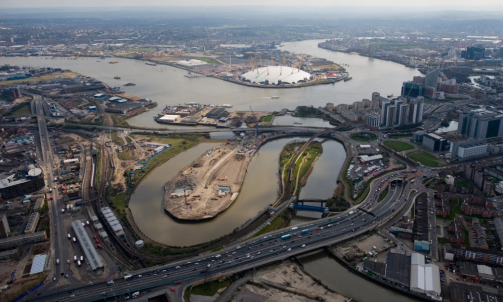
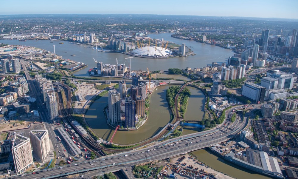
I’ve written here a few times about London City Island, and how a sort of mini-Manhattan of unspectacular but decent looking apartment tower blocks have been built on it.

Well, here are a couple of aerial shots that show that having happened. Here is how things in that part of London were looking in 2005:

And here is the same view now:

This blog actually knows a couple of people who have regular jobs doing tech stuff, but who also in their spare time own and operate photo-drones, and who sometimes visit London. These two are really good photoers, even if they may not be quite your Real Photographers, in the sense of making their living photoing, all their working life. I wish I could tell you that it was one of them who did the above photos, but actually, these photos were done by Jason Hawkes, who is as Real a Real Photographer as you could ever wish to drool over the photos of. (Besides which, no drones in 2005.)

The above two photos are just one pair of before-and-now, 2005-and-2020, photos featured in this amazing Guardian collection of photos of London from the air, with commentary by Hawkes himself attached. All you can do here is scroll back and forth between one such pair, reduced in size to fit here. If that amused you at all, you really should click on the Guardian original, and then scroll down and click on each photo to get the other version. There are, by my count, thirteen of such photo-pairs.

Amazing.

Although this wondrous Guardian offering is a “mainstream media” story, there is no way that it could be shown in all its glory in a mere newspaper. Was any of this in the actual Guardian, the one done with paper and ink and sold in shops?

Red dog – red cat

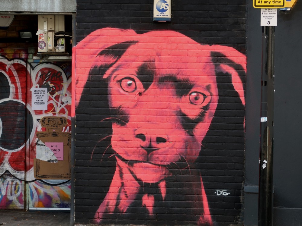
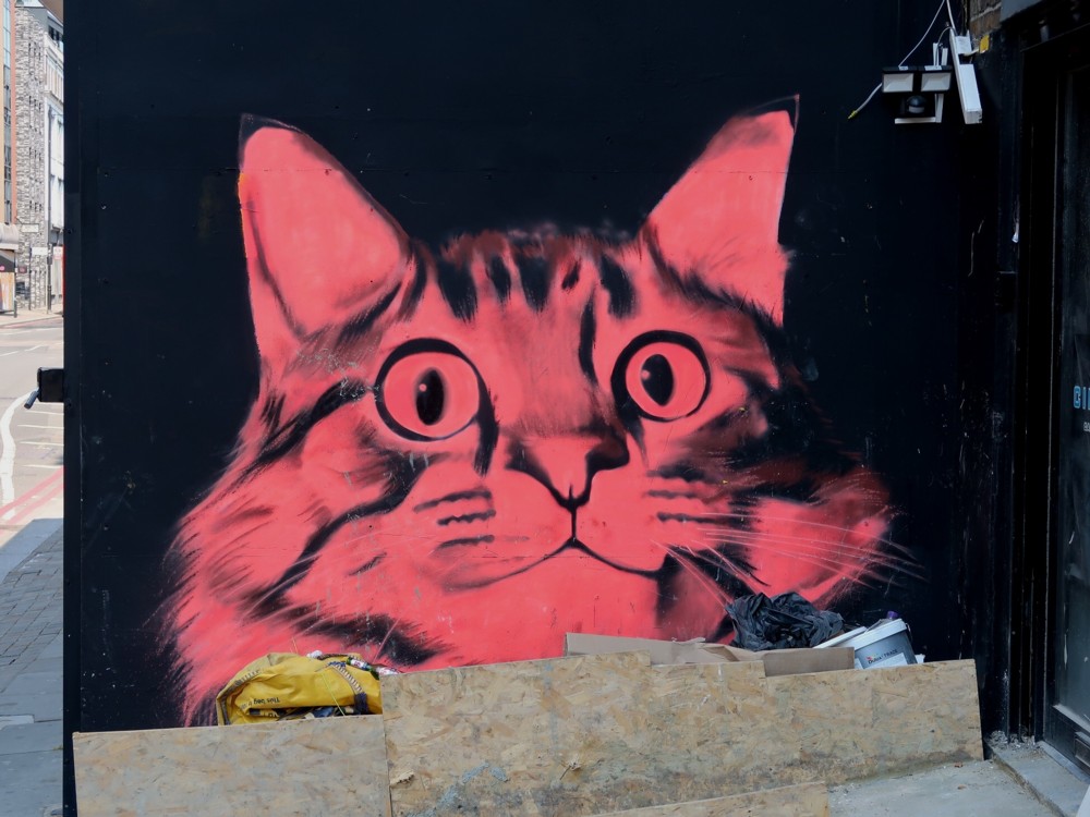
Mick Hartley has been spotting red pets, out East in Mick Hartley land:

Woof. Miaow.

In London, and I suspect elsewhere, interesting new murals now seem to be more numerous than interesting new buildings. And more interesting, I’d say. To put this another way, murals are now the latest architectural thing.

One of these muralisers should be let loose on this building.

The only house Zaha Hadid ever designed

Zaha Hadid Architects interests me because, Zaha Hadid having herself died, it is now run by a libertarian, Patrik Schumacher. People like this are rare, and we libertarians must make much of them. Also, they are interesting.

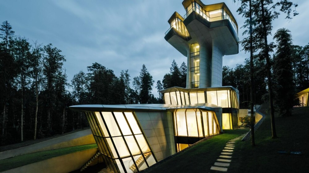
So, this house interests me:

That looks rather small. Rather disappointing.

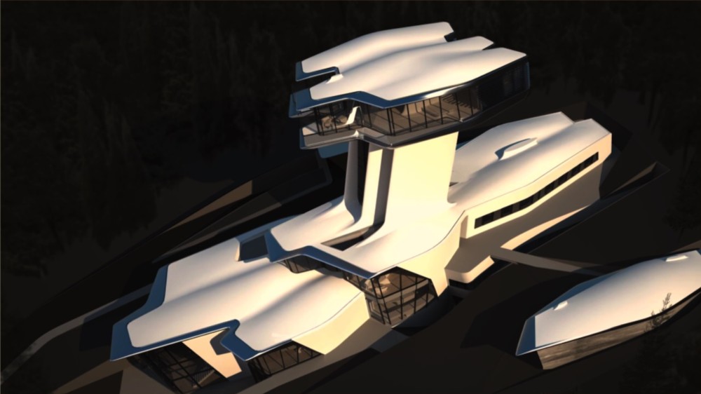
But look at this:

That being, I presume, a faked up photo beforehand of how it was going to look. Now you’re talking. Because of the rather odd procedure I found myself using to get that photo from here (where I found the above two images) to here, I found myself emphasising the darkness of the place where this house was going to be built, making it look even more like a spaceship than, I presume, it actually does.

The bit at the top is not the Bridge of Starship Enterprise. No.

The 36,000-square-foot home, formally dubbed “Capital Hill Residence,” has many unique features, but one of the most outstanding may be its narrow tower, and what it supports — namely, the master bedroom, situated over 100 feet high. The tower’s supporting column includes a glass elevator and staircase.

Now that’s a Master Bedroom. Feminists: cower in terror. I love that it’s a woman that designed this. Would any male architect now dare to create such a thing? I also wonder, did Zaha Hadid ever have any run-ins with feminists? That would have been fun to see.

I particularly enjoyed the bit where Zaha Hadid first got the job, from the Russian oligarch who paid for all this:

“She drew a sketch on the napkin and I said, ‘You’re hired.'”

Classic Because-We-Can! architecture. In my version, La Hadid does her sketch on the back of a restaurant menu, but otherwise, it’s just like I said.

Urban picturesque with Shard

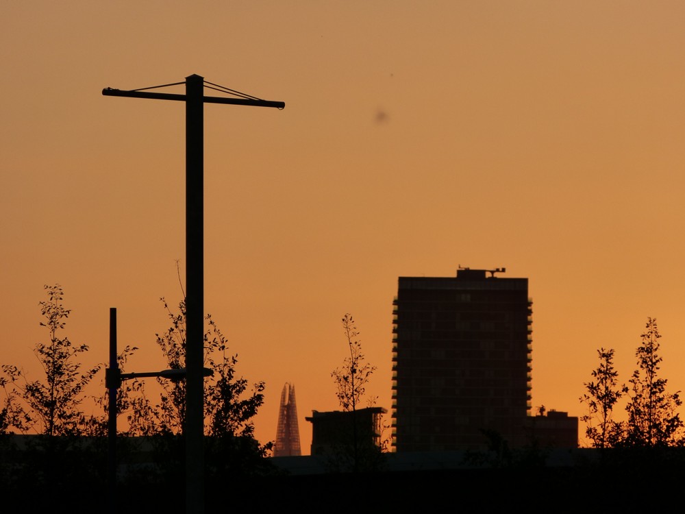
Same formula as the previous post. Ooh that’s nice:

But puzzle. What is it? We see the Shard there, but where are we? What direction are we looking at the Shard from?

Context:

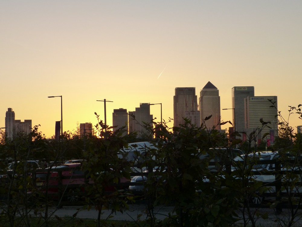
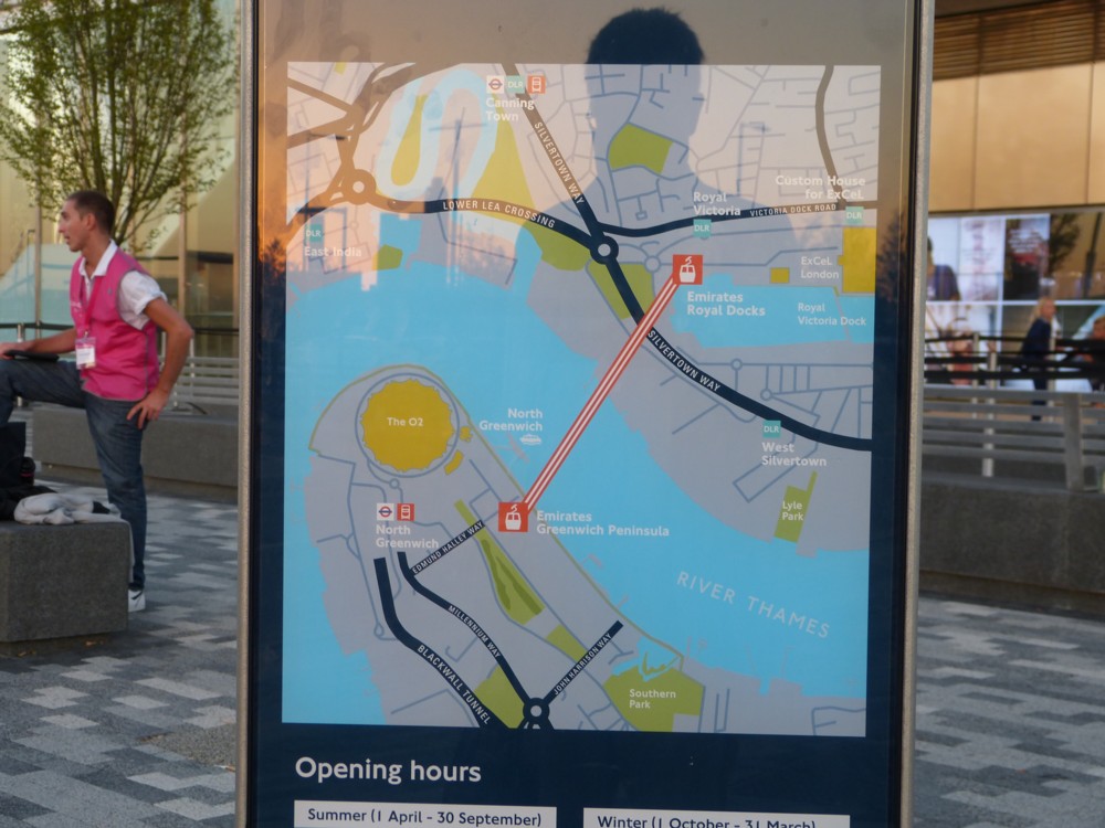
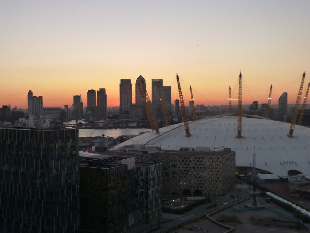
We are at the Dome end of the Dangleway, looking across the Greenwich Peninsular towards the towers of Docklands, with central London beyond. The City cluster is not visible, but the Shard is.

I still don’t know what that blob in the middle of the sky is. Mercifully, it isn’t to be seen on any of the other photos I photoed at this time.

The tall pole with sticking out bits in the original photos is for hanging banners, saying things like: “London Olympics 2012”, 2012 being when all these photos were photoed. Now, there are Machines-For-Living-In Things in the foreground, next to and just south of the Dome, and a great many more bigger Things in the Docklands Tower Cluster.

The photo on the right, featuriing the Dome, was photoed as I began a Dangleway journey across the River to Victoria Dock.

I love that part of London. An essential part of that being because it keeps on changing.

More London

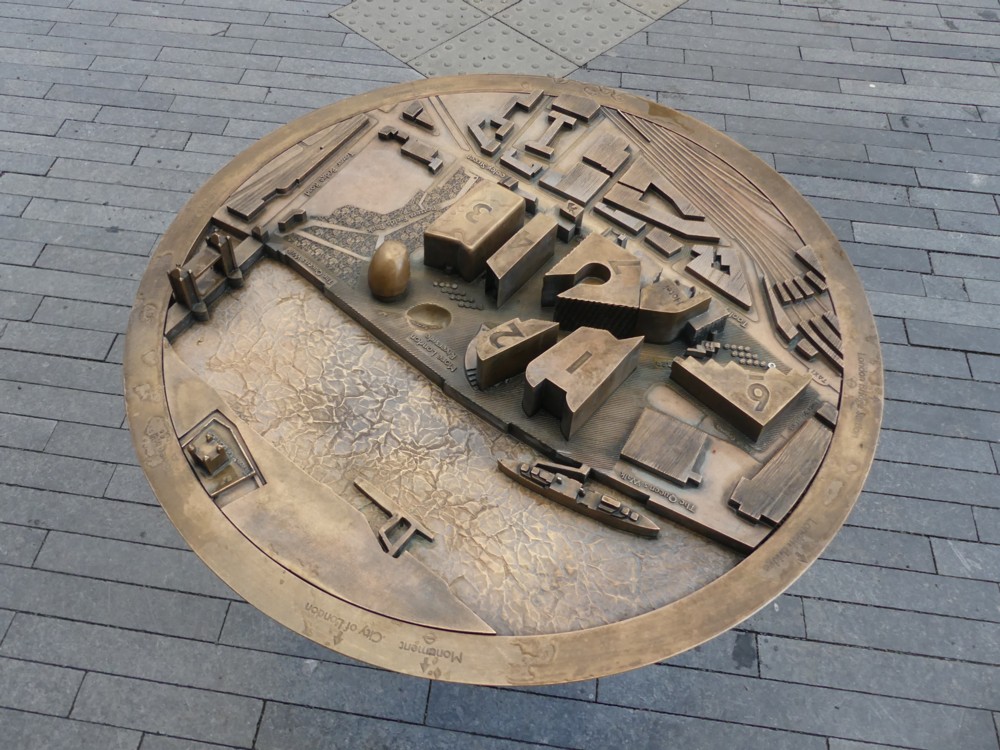
Back in March 2019, on the same day and just before I photoed these photos, I photoed this photo:

What I like about that is what I also find weird about it, which is the way that this metal circle of 3D map information kind of hovers weightlessly over the pavement.

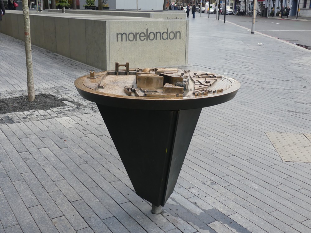
Luckily I soon found another photo which explained this weird effect with logic:

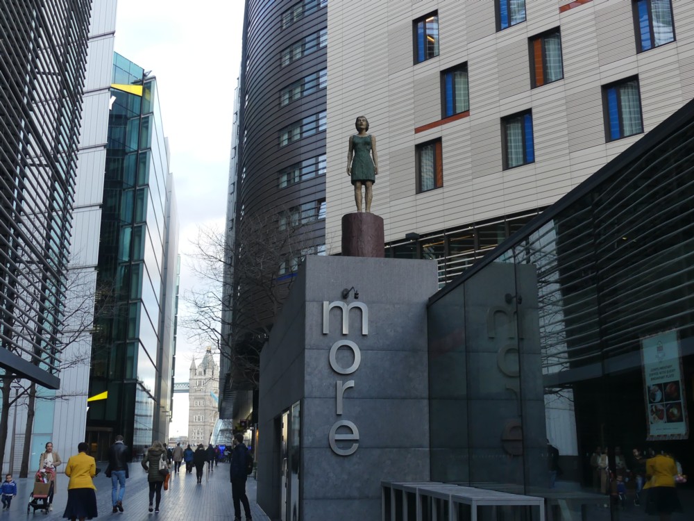
But now, there was another mystery. What is “morelondon”? Turns out it’s More London, which was the place where I was.

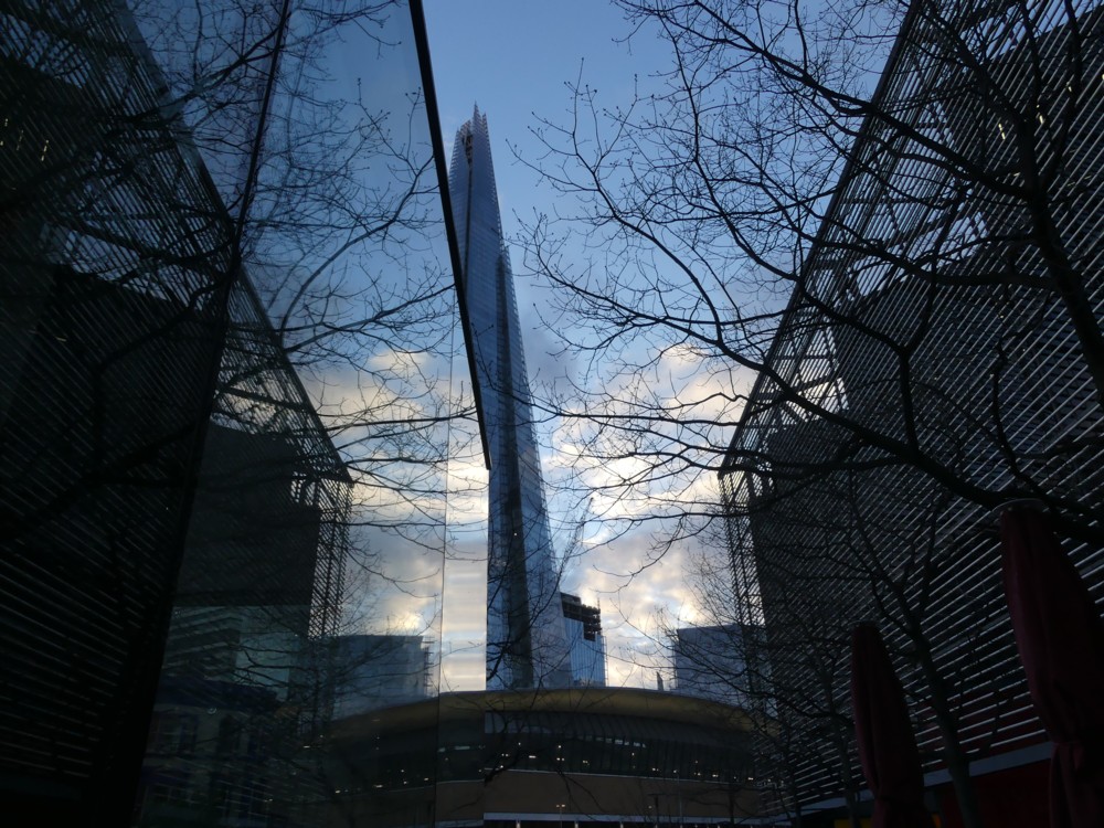
Here are some more photos I photoed at the same time as the two above:

The reason I made them look so small in this posting is in the hope that you will be deceived about what is going on, in photos 1 and 4 there, 1 especially, 4 in a general way, but 1 in a very particular way. Click and you’ll surely see what I mean.

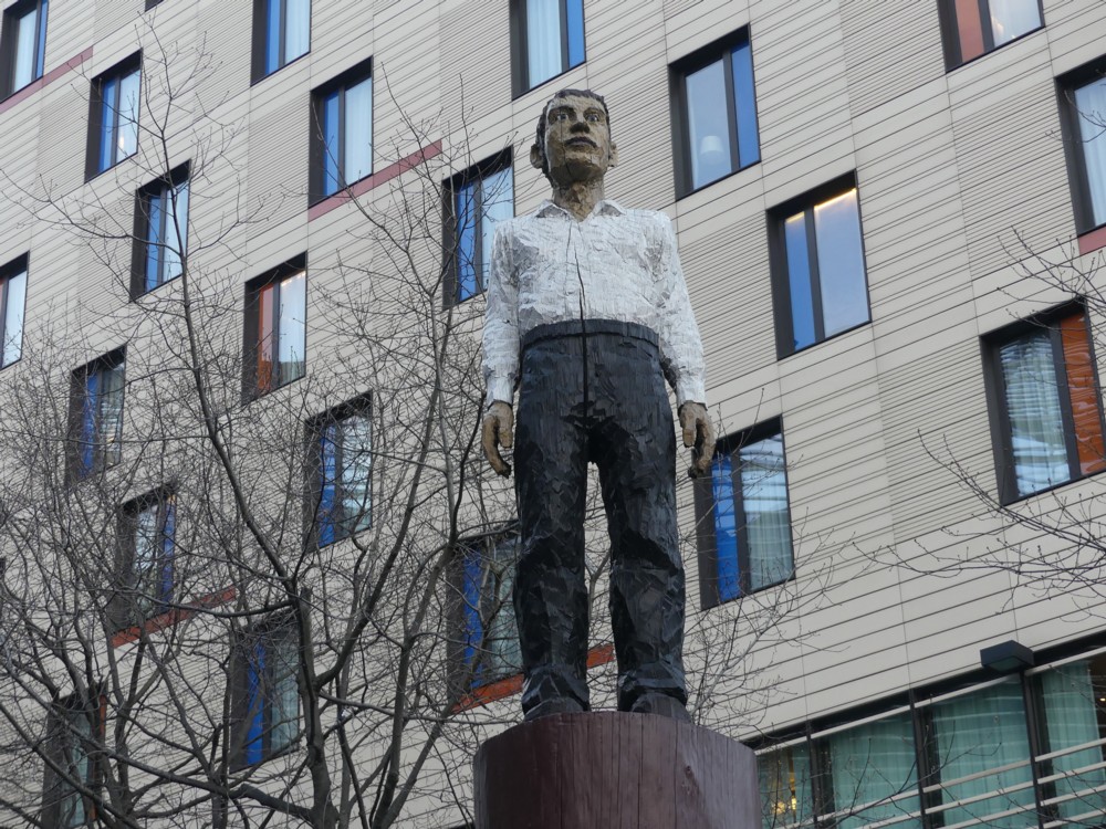
The strange coloured-in statues are, I now learn, by Stephan Balkenhol. More about him here. At the time I recall wondering if they were Art, or just advertising of some kind. Art, it would seem.

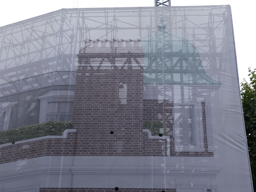
Another building with a picture of a building on the outside of it

I was browsing through the photo-archives and I encountered this favourite photo from two years ago:

Makes a nice contrast with this photo recently posted here, and this one of the Royal Albert Hall. The point being, in those two photos, they got pretty much the effect they wanted, whereas with this earlier one, they got something a lot more interesting than they were going for.

Had I done an earlier posting featuring the above photo? That the photo had a name as well as a number in the archives suggested: yes. And so it proved.

Photos like this don’t date. If anything, after what they are of has vanished, they get better. Click on that link, and you’ll also see another photo of the same thing, done with a slightly wider angle, and including the entire crane that you can only seen the bottom of in the above photo.

Camden Highline coming

Glad to see that this project is making progress:

The Camden Highline project, planned to open in phases from 2024, will create a new central London park and linear walking route – inspired by Diller Scofidio + Renfro’s New York High Line – featuring seating areas, cafés, arts and cultural interventions and spaces for charitable activities.

Cultural “interventions”? Does that mean sculpture and stuff? People wearing daft costumes? I guess I’ll have to wait until 2024.

I had already noticed this Camden Highline notion back in August 2017. I even included a map.