A model of London Bridge that is hard to photo

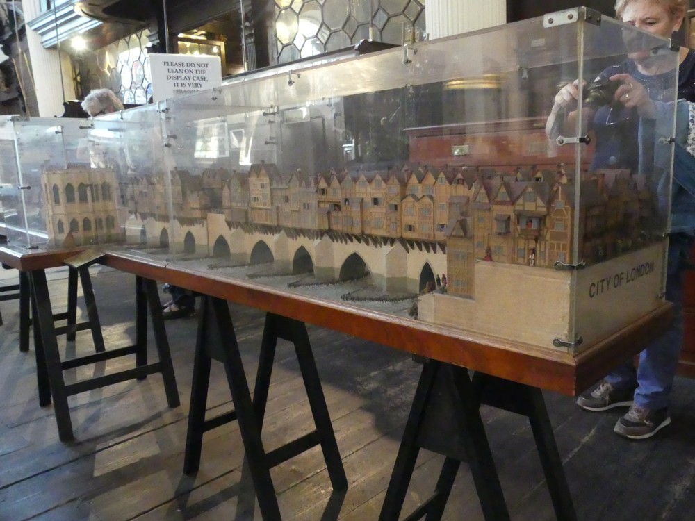
One of the more frustrating of the photo-expeditions I have done in the last few years was one to the Church of St Magnus the Martyr.

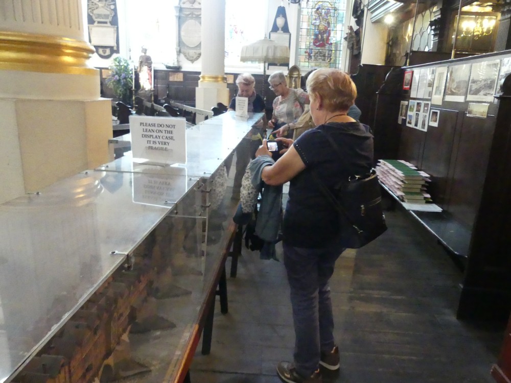
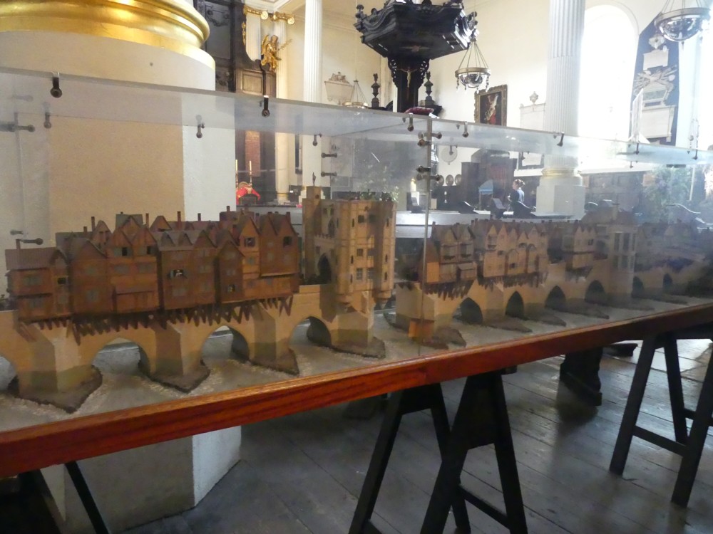
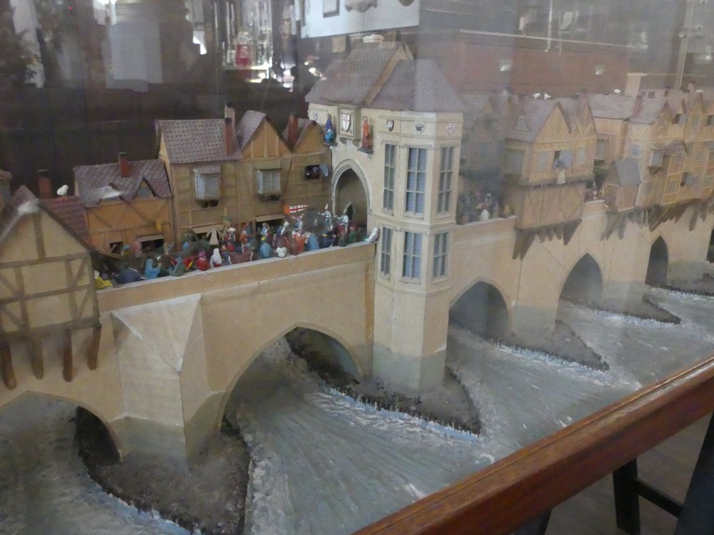
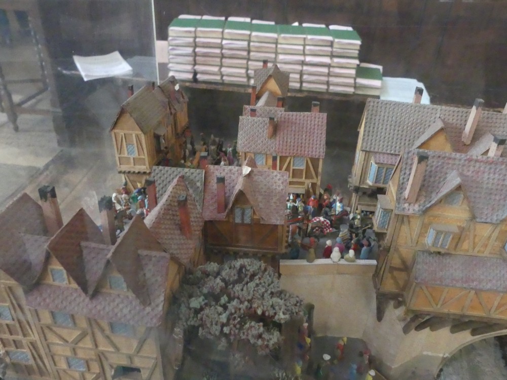
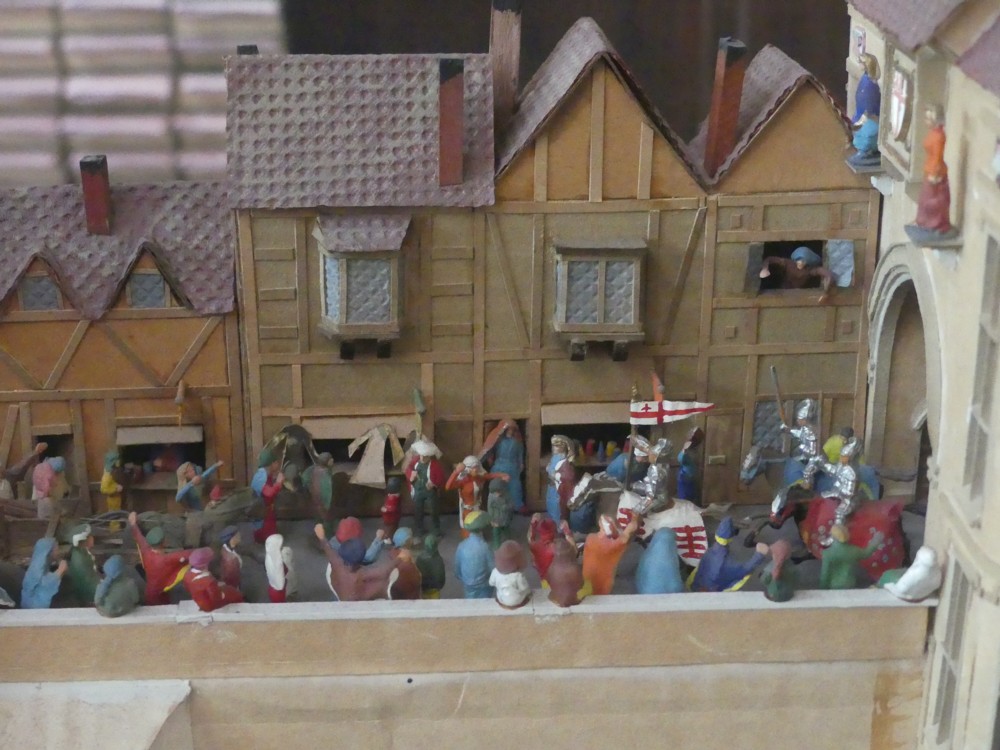
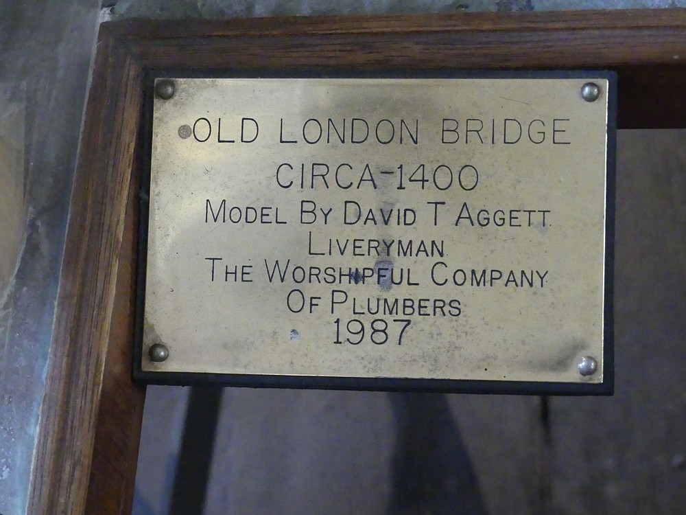
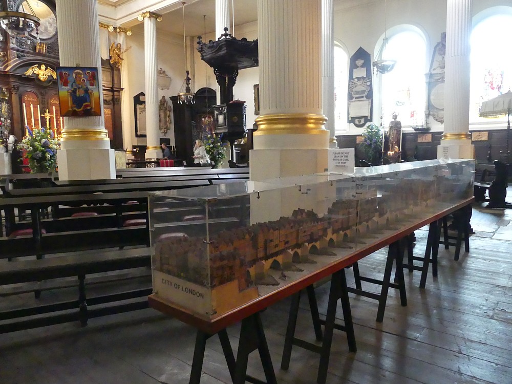
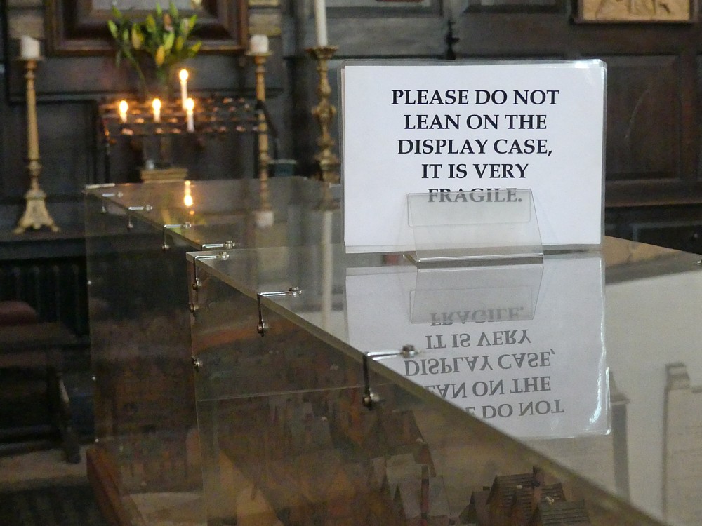
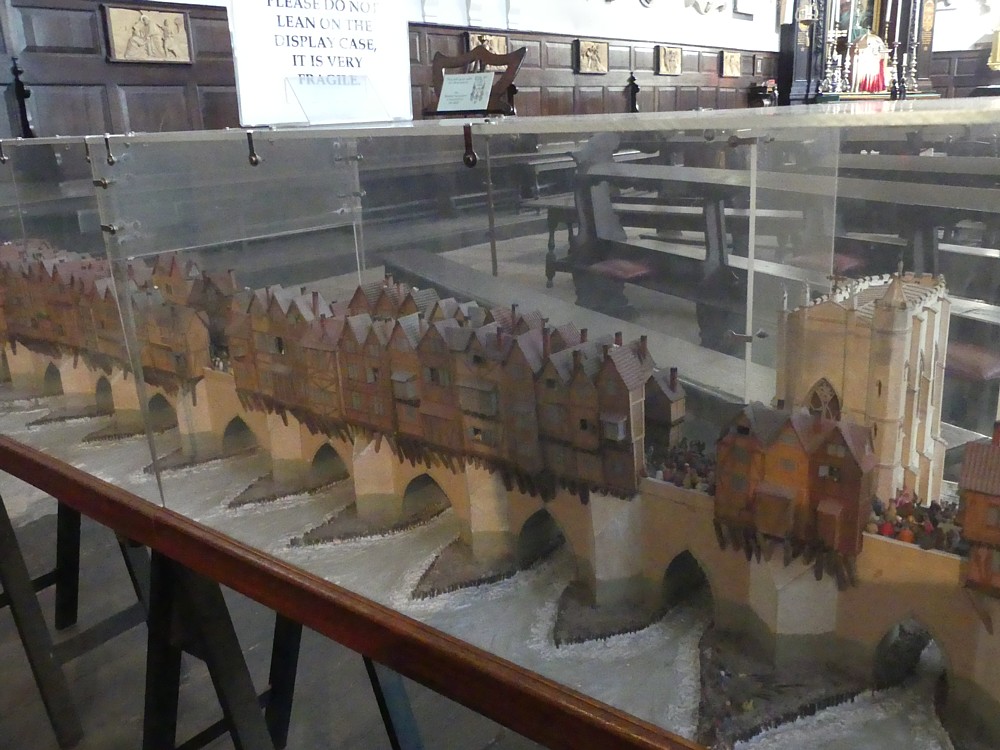
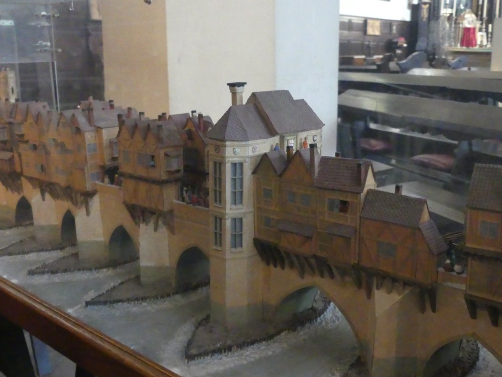
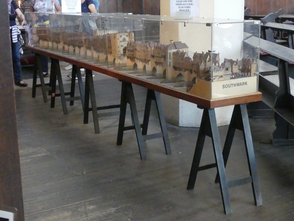
I was there, around a year ago. to photo a model of Old London Bridge, which I had found out about in some way that I now forget. And the model was there. That wasn’t the frustration. What was the frustration was that photographically, this model pretty much defeated me. Although clearly visible and clearly identifiable for what it was, it was protected by the photographic equivalent of armour plating, in the form of a very shiny glass box.

I still took lots of photos, and from the selection of those that I now show you, you do get some idea of what sort of model this is and how it looks in its ecclesiastical surroundings:

The less these photos are about the details of the model and the more they are about the model as a whole and its surroundings, the better they are, and I biased my choice of what to post here I had in that direction. So they are worth a click through, if London’s eccentricities and oddities are of interest to you.

I image-googled this model, and the results were not as disappointing as my own efforts but still rather disappointing. This model has been there since 1987, but at no time, then or since, has anyone taken any really classy photos of it, or not any that the internet seems to be have been told about. (If commenters can prove me wrong, I’d be be very happy.)

There are some photos of this model, which are definitely better ones than mine from the point of view of showing the details of the Thing, here. But even that photoer struggled, I think. As did this guy.

It would be nice if this church were to pick itself a Real Photographer, and let him have a go at this Thing, with Real Photographer type lighting, with the glass temporarily removed, and maybe with some specially supplied backgrounds to screen out the church clutter, and also all the uneven light that crashes into the church through its church windows. Maybe let the RP take the whole Thing to a studio of some sort.

That would be nice for the likes of me. But maybe the people running this church already rather resent the number of godless tourists of my sort who already come tramping into their House of God to gawp at and and to photo this bridge model, and who then tramp out again, ever to be seen again unless they want more photos of the model. And the last thing they want is to encourage a whole new flood of such people. If my guess is right, I can’t say I blame them, but it is just a guess and I could be quite wrong.

I could find no reference to this London Bridge model at the church’s own website, but again, that could merely be because I am terrible at searching websites.

There is another picture of this church in an earlier posting I did here about the Monument, showing how near that edifice is to this church.

The Tower Hotel could benefit from Magic Paint

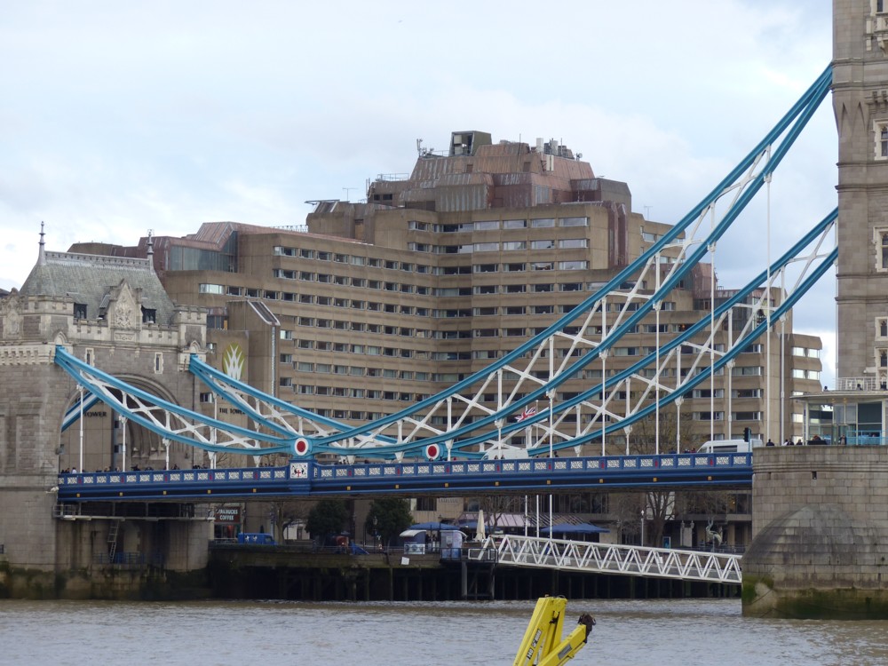
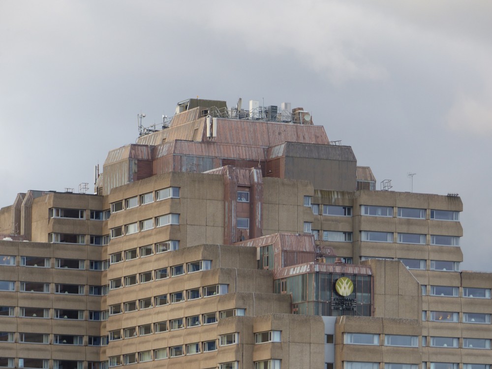
One of London’s more impressive architectural survivals from the Brutalist era is this building:

That’s the Tower Hotel, with Tower Bridge in the foreground. I am fond of this edifice, not only because of its Brutalism, but also because of its impressively cluttered upper reaches, which look like this:

Both of the above photos were photoed by me in 2016. (What is that VW sign doing there? Never noticed that before.)

I love the combination of orthodox Brutalism in the main body of the building and anarchy on the top of it. (See also this splendid edifice of the same architectural vintage.)

I also recall that this hotel played a prominent support role in the final scene of a long ago movie called Sweeney!, which was a movie spin-off from the TV show of that name. A sinister villain played by Barry Foster is being put on a boat by British spooks, after he’d stayed the night at the Tower Hotel, which then looked quite new and “modern”, not dated at all. But Regan (John Thaw) showed up and arrested the Barry Foster character for making money off of immoral earnings, and the Barry Foster character was immediately shot dead, by two other villains in a taxi, to stop him spilling any beans about even more sinister villains. (Regan was angry with the Barry Foster character because he had had a prostitute (Diane Keen) killed, and Regan wanted revenge.) All of which took place on the river bank between the Tower Hotel and the River. For some reason, this scene had a big effect on me, and a lot of the reason for that was the Tower Hotel.

The reason I mention this building is that it is a fine example of the sort of building that might go up in public estimation if it were decorated with the Magic Paint that I mentioned-stroke-invented in this earlier posting about Colourful architecture in the past and in the future. This was about how various ancient buildings, now as dreary in colour as the Tower Hotel has always been, used to be a lot more colourful, and about how similar effects might yet be contrived again, with … Magic Paint. (Magic Paint is paint that can take on any painted pattern at the flick of an electronic switch. Inventors: get busy!)

And the reason I mention this earlier posting about Magic Paint, colourful gothic cathedrals, and the like, is that someone on Facebook with quite a following has recently linked to this old posting, causing a rather gratifying spike in traffic here during the last few days. But, all I can learn from my traffic analysing page is that the link comes from somewhere on Facebook. It could well be someone I know, or know of, and therefore someone that some of my readers might know, or know of. Anyone? Maybe you, sir or madam, have just come from that very Facebook location of which I write, and can tell me who it was. That’s if you feel inclined.

The homeless are not as homeless as they used to be

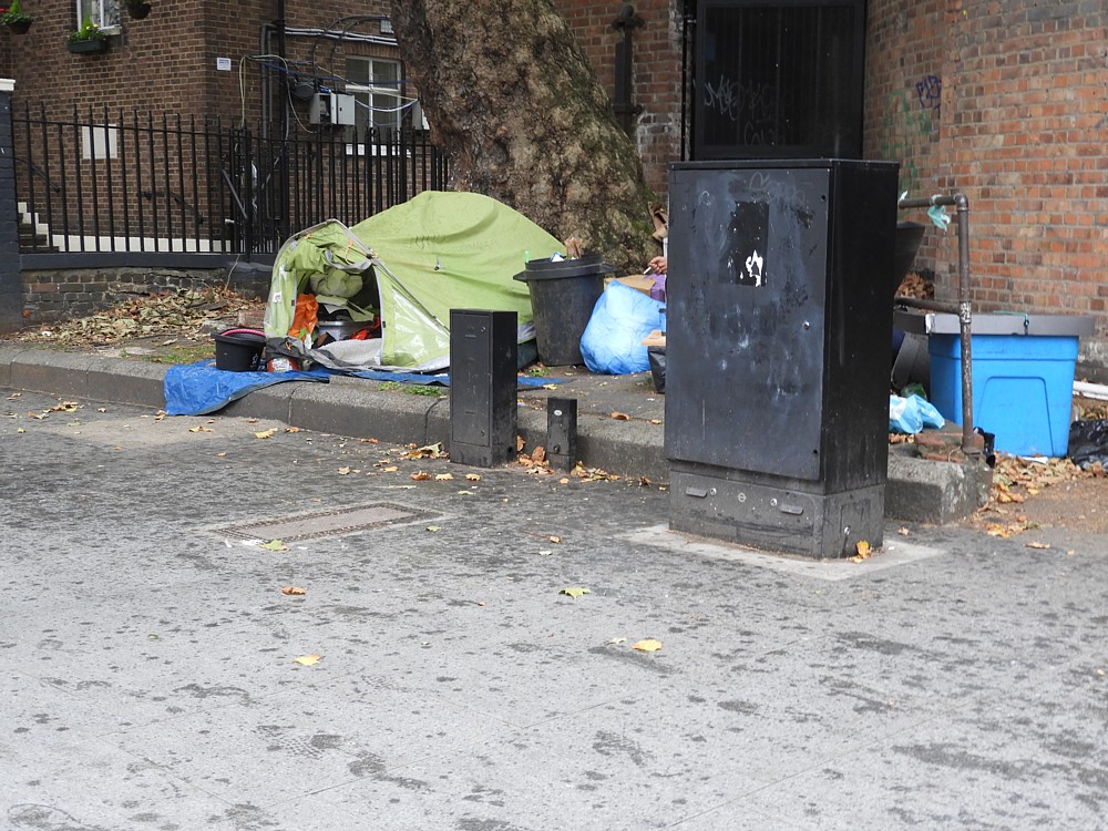
Okay, not the prettiest photo you’ll ever see, but it makes my point:

Which is that homes for the homeless have got a lot better lately. In two big ways. First, as you see in the above photo, shelter is now something you can just plonk down on any piece of land that is flat.

It is no part of my purpose in showing you this man’s home to make difficulties for the man himself, and I also didn’t want him even feeling threatened when I took the photo. So, I contrived to hide him (and myself as seen by him) behind that big black rectangular lump there. He couldn’t see me, and you can’t now see him. But I think you can see that what we’re looking at, in the autumn gloom at the top end of Tottenham Court Road last Thursday late afternoon, is a home.

The other thing that has got a lot nicer about living like this is mobile electronic communication. You can now live like this, instead of merely existing. You needn’t just sit there, hoping for nice weather. You can do all those things in those articles and diagrams and photos concerning all the clumsy great gadgets that have now been replaced by your mobile phone.

I’m not saying that living this way is easy or comfortable, merely that it has got less difficult and less uncomfortable in recent years. I’d hate to have to live this way. But if I had to, I would find it that little bit less miserable than it was a few decades ago, when electronic communication was implacably immobile, and when erecting a tent meant finding a grassy field that you could bang tent pegs into.

What all this means is that, if all other things are equal (which they never are but let’s be economists and pretend this for a moment), more people are going to be living like this than used to, thirty years ago.

See also this earlier posting, featuring a Michael Jennings photo of a tent erected next to a private jet.

The Royal Albert Hall with pictures of the Royal Albert Hall on it

Whenever 6k picks up on a posting I did here I always reckon that means I’m onto something, so I’m pleased that he noticed that posting I recently did about a building with a picture of itself on the front.

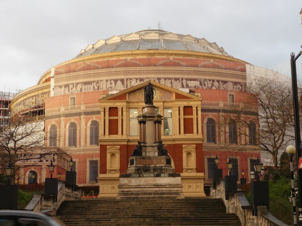
So, for him and for anyone else interested in such things, here’s another such circumstance, much more recent (February of this year), and much more spectacular. It’s the Royal Albert Hall, no less:

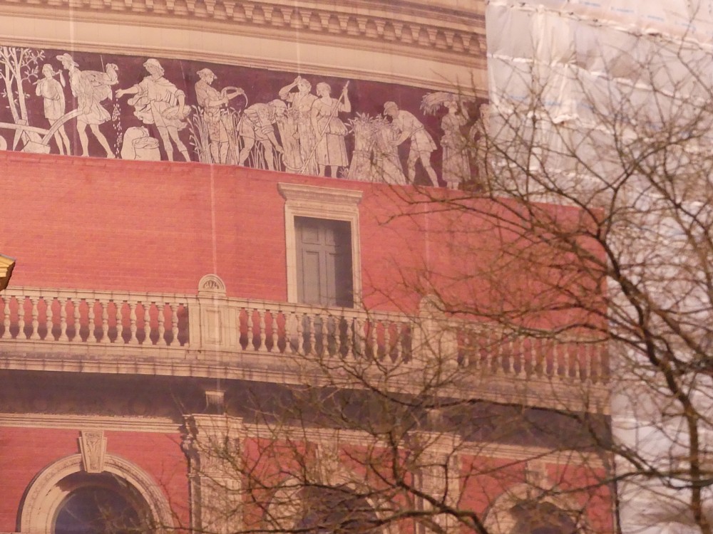
On the left, the big picture. And on the right, we can see the three elements involved in this sort of process. Top left, the ancient Greek looking frieze, that’s the actual Royal Albert Hall itself. On the right, the scaffolding, under a bog standard white covering. And then bottom left, occupying most of the picture, the photo (if that’s what it originally was) of the exact bit (or so I assume) of the Royal Albert Hall that it is covering.

The bit in the middle behind the statue is the also the building itself. “Shadows” is included in the categories list below, on account of there not being any real shadows, just fake ones, when it is just a flat surface. Which makes a real difference to how easy it is to see what the original building consists of. That difficulty actually being an early clue as to what’s really going on.

As often, the trees, although at least leafless, are not helping.

The statue in the front is of Prince Albert. On the other side of the Royal Albert Hall is his Memorial. For a view of the Royal Albert Hall from the same angle, but with rather less scaffolding, and also for some closer-up of this Prince Albert statue, see Royal Albert and his Hall.

LATER: In the original posting, the photo above on the left was a bad choice. I had a better one available, and that has now replaced the first photo.

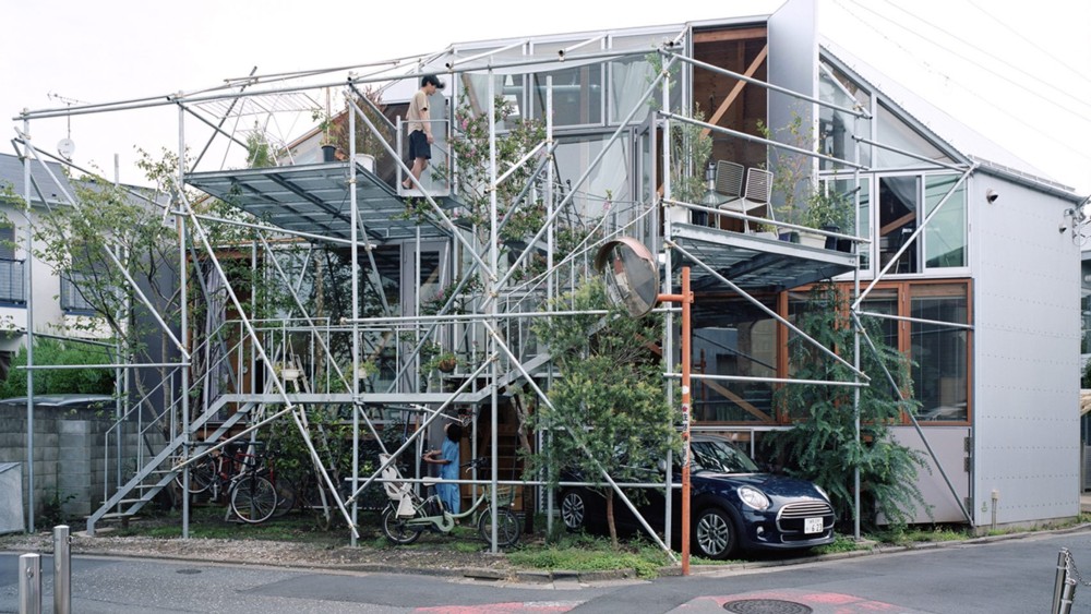
Scaffolding as architecture

I’m not the only one who thinks scaffolding is pretty:

That’s not a house that is being worked on by builders. It’s .. a house. It’s finished. Here.

However, when architects start “designing” scaffolding, I think that for me the scaffolding loses a lot of its appeal. A lot of what I relish about how scaffolding looks is that the people who put it up don’t care how it looks. When they start caring, as the designer of this scaffolded house clearly did, scaffolding loses its essential aesthetic purity.

Anther way of putting this is that once architects start designing scaffolding, I fear that it may start falling down.

Actual people attending a cricket match!

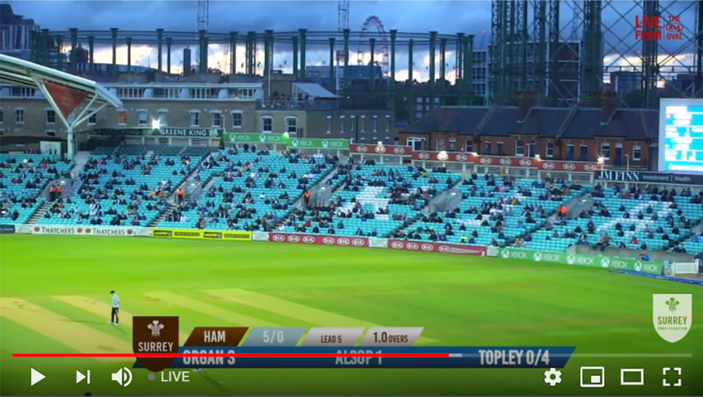
Yes, there’s an actual crowd at the Oval this evening. Well, a socially distanced crowd:

Note the presence of the Wheel, behind one of the gasholders. You can see a lot of Big Things from the Oval, if you know your way around.

It looks like a well attended four day game. Actually it’s a badly attended T20. I’m watching it here. Live. On almost-television.

Interestingly, they’re using the whole ground, and trying to hit sixes is rather difficult. They have to go a long way or you get caught in the deep. Makes a nice change.

Going by their form this year, Surrey, now well placed as I write this, will find a way to not win. If you care, see how it’s going, or more probably how it ended, here.

More urban picturesque

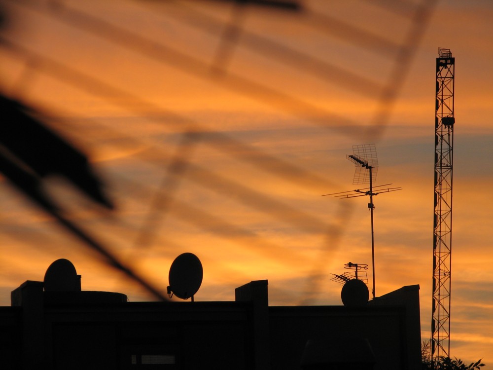
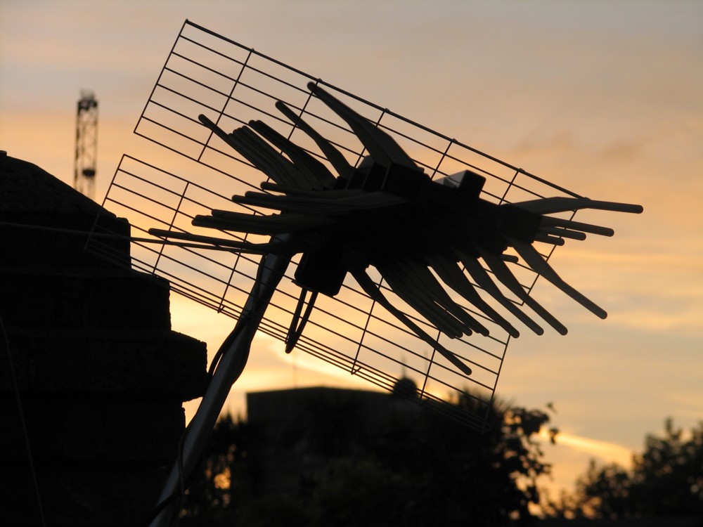
To add to the collection. Although the second one here is maybe more urban gothic, because in it, a piece of innocent roof clutter looks more like some kind of science fiction monster:

Those were taken at the top of my block of flats, way back in 2006, just as I was starting to get the hang of this photography thing, both in the sense of what was worth photoing, and what would photo well.

I often read about how photos “communicated the excitement felt by” the photoer, and am typically skeptical. If the photoer was excited, it was because he was excited by the photos he’d taken. They made him excited rather than vice versa. Nevertheless I do recall being very excited by my first visit with a camera to that roof, which for a long time I was not able to get to, because the vital door was locked. And the above photos were taken on one of the earliest visits to this spot.

On the whole, the close-up roof clutter proved more diverting than the rather distant views of the tops of Big Things, with dreary vernacular boxes getting in the way in the foreground. The fun I get from photoing Things Big or Small is when they are combined and seen in new ways. But every time I go up to that roof now, everything looks pretty much as it always did. On account of everything being pretty much as it always was.

A photo of itself on the outside

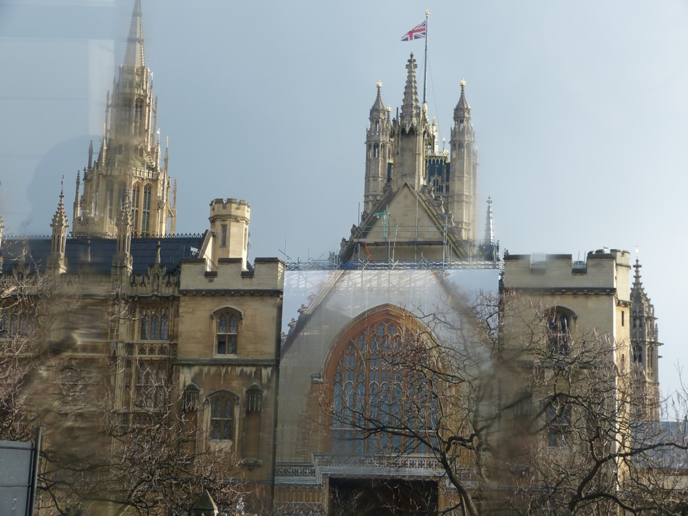
In this earlier posting, about the very underwhelming lights of Piccadilly, I mentioned the relatively recent phenomenon of buildings covered in scaffolding, and the scaffolding then being covered with a picture of the building.

Last night, I came across an example of this in the photo-archives, dating from 2013:

That looks like a photo to me, made possible by the latest graphic trickery that they do with giant printers nowadays. My photo was taken through a bus window on a rather rainy day, but I think you can see what I’m on about.

We’re in Parliament Square. To the left is Parliament itself, and to the right, Westminster Abbey and Victoria Street. Is that St Margaret’s Church? At present I find the statues in the Square more diverting than the buildings around it. I’m in a rush to get out and get some exercise, so I’ll leave that question there. If nobody else answers it, I’ll try to answer it myself later.

2013 now seems to me to be about when this sort of thing started being done quite a lot, presumably because, around then, it could be done. But maybe it’s that I first noticed this happening around then. When archive-trawling I’ll try to see if I have any earlier examples of this sort of thing.

Once again, what we’re seeing is how a temporary circumstance takes the visual shackles off. If it’s temporary, you can do whatever you want, because if it isn’t liked, it’ll soon be gone. In this case, anti-trad grumblers didn’t have to endure this obvious shunning of an opportunity for anti-trad modernity for more than a brief while.

The lights of Piccadilly Circus – and for once I’m impressed

London contains many tourist attractions that are truly attractive, truly impressive. But I have never thought that the lights of Piccadilly Circus are one of those attractions. What a let down. Is that it? Is that all?

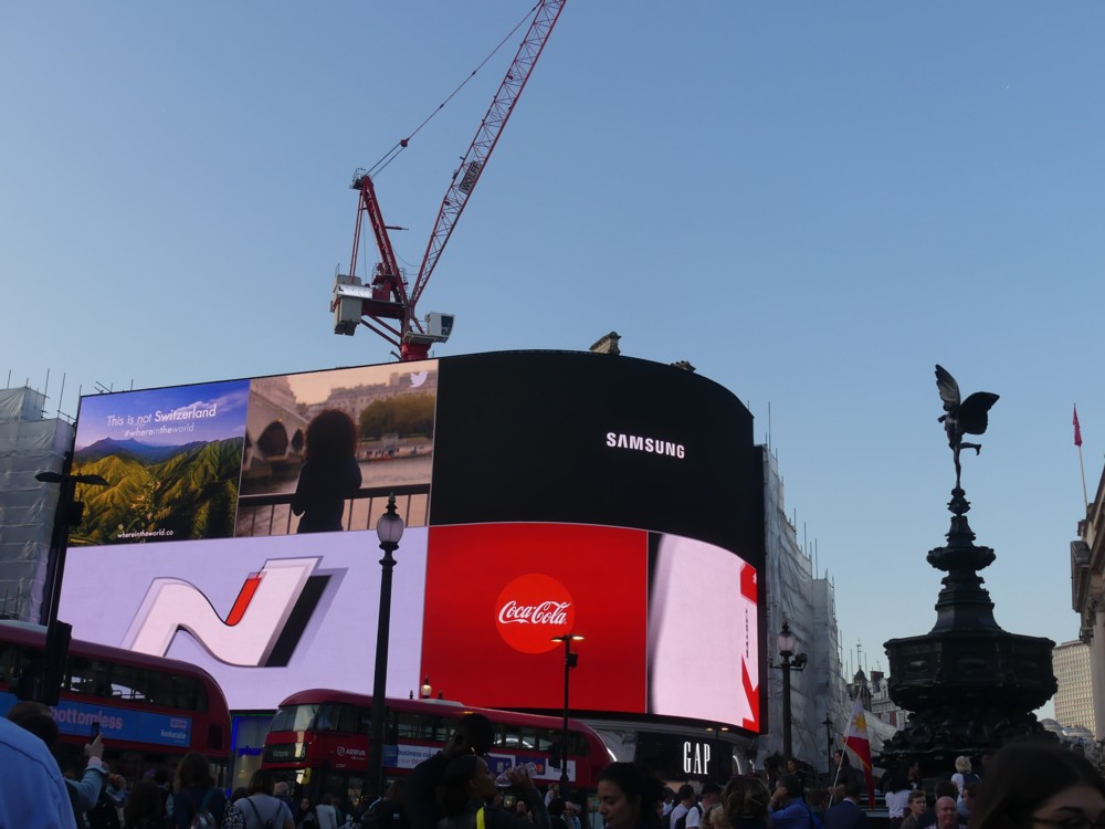
Usually they look like this:

I’m guessing that many a tourist, searching out these lights, has walked right past them. I mean, could those be them?

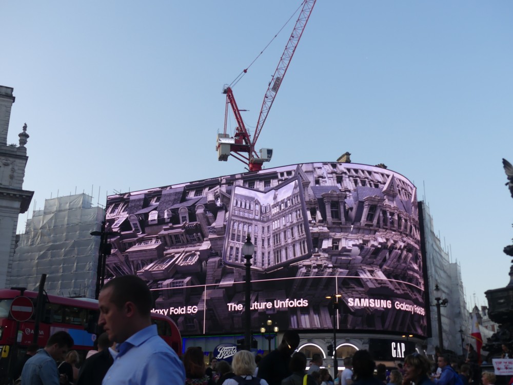
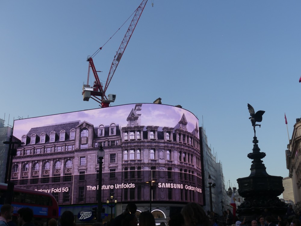
But about a year ago I happened to be in that part of London, and instead of silly bright colours, what I saw was this:

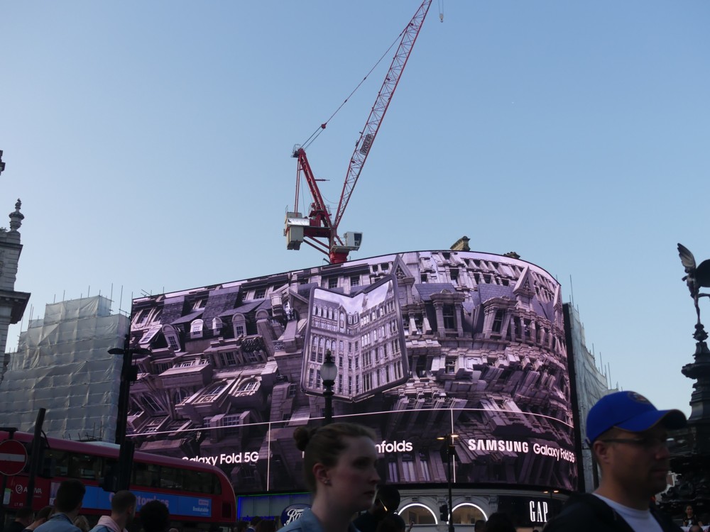
You may have to click on them to work out what is going on there. Some sort of Transformer type computer-trickery, it looks like. Whatever. Again, I’m not that impressed, although that could just be my terrible eyesight, and I don’t like it because I can’t make it out properly, unless I photo it and look at it later. But whatever, I only supply the three photos above as context for what followed:

And that I did like.

There’s been quite a lot of this kind of thing happening in London recently, this kind of thing being pictures of buildings, on buildings. Usually it’s because a building is being worked on and consequently covered in scaffolding, and then on the outside of the scaffolding they stick a picture of the building they’re working on. The above piece of advertising fun reminds me somewhat of that sort of thing, although it is contrived by different means and for a different purpose.

Win a home in London!

I haven’t been getting out enough, what with my back hurting. But today, I was determined to get out and about, as well as needing to do some shopping, and I decided to do that even before doing anything here.

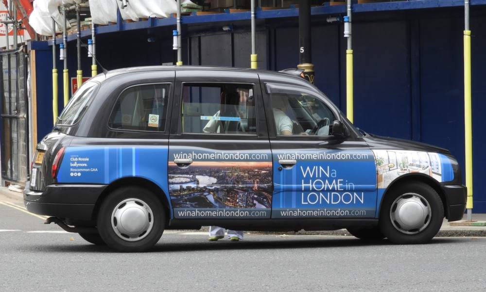
The plan was I might manage to photo something of interest. When I got home, and took a close look at this, …:

… which shows an advert for a lottery the winner of which gets a new home in London, I thought maybe I had. Whenever I hear that you can win something as a prize in a game of chance, I suspect that the thing in question is proving harder to sell than had originally been assumed and they’ve got some to spare for things like lotteries. Did this advert signal a London new housing slowdown?

I went to the website in the advert to investigate. And it would appear that my suspicions may have been excessively suspicious. This is an Irish fund raising operation, and apparently someone won a similar competition in 2018. But on the other hand, that could mean that even back in 2018 they were having trouble shifting newly built London homes.

One thing I will say, which is that I’ve not seen this advert on a taxi before. Maybe the number of people in London who are only able to think of owning a London home by entering a lottery has now gone up. That’s not the entire market for London homes. That’s global. But it doesn’t help, if you’re selling these places.

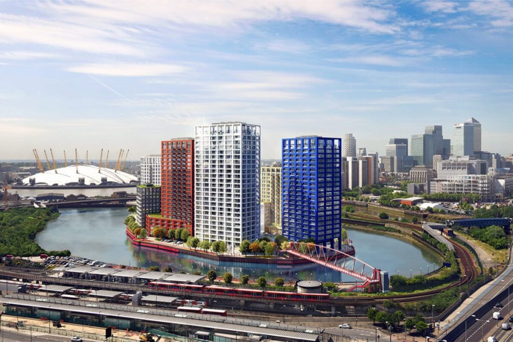
Whatever the truth of such speculations, I did at least, at the website in question, encounter an excellent photo of the London City Island tower cluster, photoed on a nicer and brighter day than today has been:

London City Island has already been noticed with a posting here, not so long ago.