Solving the puzzle of pictures

Martin Gayford’s book A Bigger Message: Conversations With David Hockney, seems very promising.

Hockney is an interesting and likeable man, I think, although I imagine he turns a bit nasty if you in any way get between him and his work. What I particularly like about him is that he doesn’t indulge in the usual artistic sport of epater-ing the bourgeoisie. He is content to be bourgeoisie.

Here’s an early nugget from this book (from the Introduction, on page 10):

The savants of the eighteenth century were much exercised by the question of what a person blind from birth, whose sight was suddenly restored, would make of the visible world. Amazingly, the experiment was actually performed. In the 1720s, William Cheselden, a London surgeon, removed the cataracts from the eyes of a thirteen-year-old boy. The latter gradually came to associate the objects he had known only through touch with what he now saw. One of the last puzzles he solved was that of pictures. It took two months, ‘to that time he consider’d them only as Party-coloured Planes, or surfaces diversified with Variety of paint’. And that of course is exactly what pictures are, but they fascinate us and help us understand and enjoy what we see.

When I’m done reading that book, I will be moving on to Gayford and Hockney’s more recent magnum opus, entitled A History of Pictures: From the Cave to the Computer Screen.

I have always been fascinated by the complex relationship between photography and painting. As has Hockney, it would seem. The very fact that this title talks about “pictures” rather than merely “art” or “painting” is, to me, highly promising.

Originally posted at Brian Micklethwait’s Old Blog

An interruption ends

Today I finally got to the end of The Judgement of Paris. I have now started making a list of some short bits of it that I hope to reproducing here.

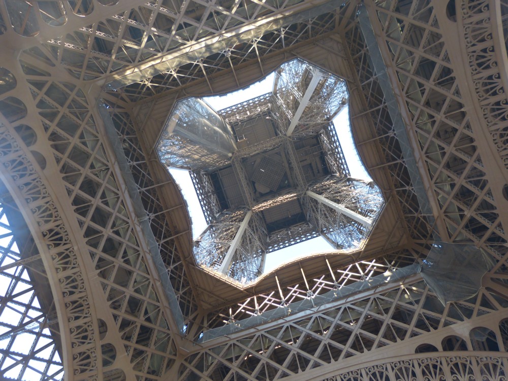
Meanwhile, by way of a small celebration, here is a Parisian photo I took, in Paris, way back in February 2012:

It’s the Tour Eiffel, of course, photoed from under it. Tour Eiffel is pronounced “Tour F L”, rather that “Tour I Fell”. Which reassures me that I know how to pronounce the leading historical character, Ernest Meissonier, in the above book. “May sonni eh” rather than “My sonni eh”.

Anyway, a big and very interesting interruption has stopped interrupting me and my life, and I’m very glad about that.

Originally posted at Brian Micklethwait’s Old Blog

A disruptive book about nineteenth century French painting

My recent life has been seriously deranged by this book, which is about French painting and painters during the nineteenth century. It’s by Ross King. Never heard of him until I acquired and started to read this book of his, but the loss was entirely mine. (Sounds more like a boxing promotor than an Art writer.) This is one of the most engrossing books about Art I have ever encountered.

I am learning about several subjects that greatly appeal to me. There’s French painting, obviously, which I have always wanted to know more about, in particular the rise to pre-eminence of Impressionism, which is what this book is about. There are fascinating little titbits about the rise of sport, the 1860s being one of the most important decades for that, because of railways. There’s French nineteenth century history in general, which this book, bless it, contains a lot of. In particular there is stuff about the 1870 war against the Prussians, and then the Paris Commune. There is French geography also, French geography being something that many of the more affluent French (including the more affluent artists) were getting to grips with properly for the first time, again because of those railways. There is a glorious few pages about a big bunch of artists going on strike! There are huge gas balloons. This is not the sort of book about paintings that is only about the paintings. Which means that it is much better than most books about paintings, because it explains their wider context. It explains what the paintings are of, and why.

I particularly like that the role of the media is well described. Tom Wolfe did not (with this book) invent that. Art critics, then as now, were a big part of the Art story.

But, although I know that I will be a much improved human being when I have finished reading this book, I am finding the actual reading of it rather tough going. For starters, there’s a lot of it, nearly four hundred closely printed pages, and my eyesight isn’t what it was. But worse, there are constant references to people and to things that a better educated person than I would already know a bit about. Who, for instance, was Charles Blanc? I feel I ought to have known this kind of thing, at least a bit. And then there’s the difference between Manet and Monet, which is all explained, concerning which about the only thing I knew beforehand was that they were indeed two distinct people. But, I feel I should have known more about exactly which of them painted exactly what. I could have whistled it all up from the www, but I do most of my reading away from my computer, because that way my computer does not then distract me. Ross King never assumes any knowledge, and introduces everyone and everything very politely, but I am still struggling to keep up.

Another problem is that this book is packed with little stories about excitements of this or that diverting sort, any one of which could have been the basis of an entire book, but in this book often get just one or two paragraphs. (I’m thinking of those titbits about sport, especially horse racing.) Accordingly, I find myself wanting to stop, to contemplate whatever fascinating little yarn I have just read, rather than dutifully ploughing on.

But plough on I am determined to do. Until I finish, you here must make do with inconsequential postings, based on things like my inconsequential photos, which I happen to have been trawling back through in recent days. But when I finally do finish this book, there may be some rather better stuff here. I promise nothing, but I have in mind to pick out some of those diverting little stories, and maybe also sprinkle in some pertinent paintings.

I also hope (but promise nothing) to do a more considered review of this book for Samizdata.

Originally posted at Brian Micklethwait’s Old Blog

Taxi with tree

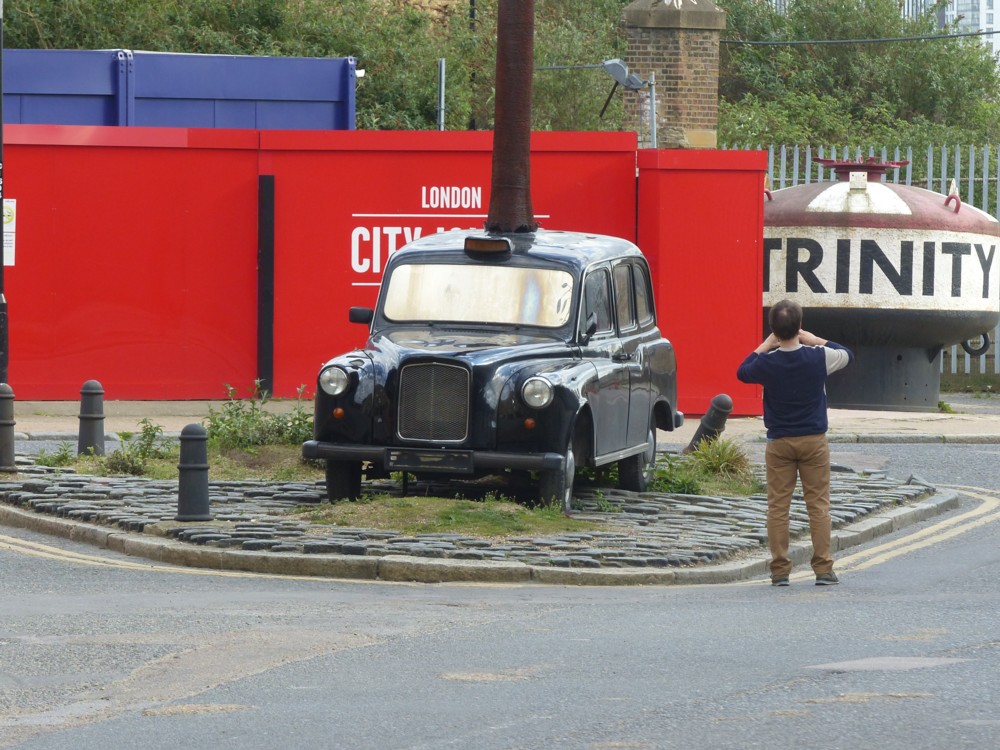
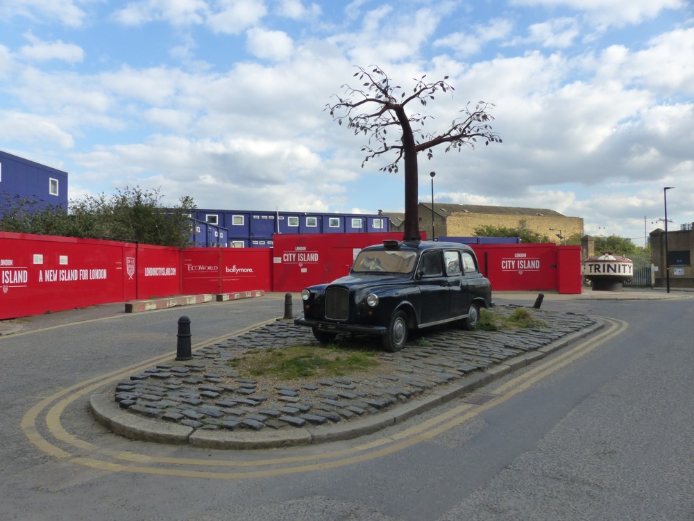
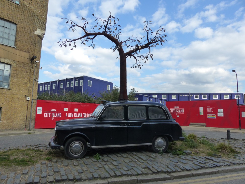
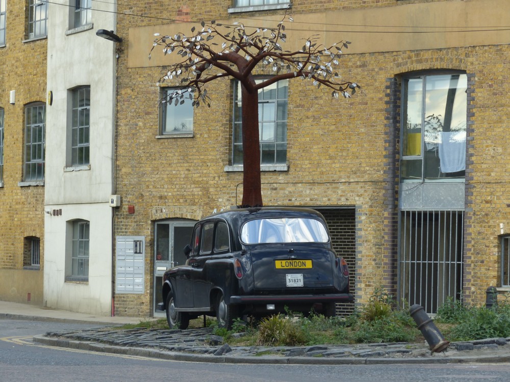
So there I was, wondering around the other side of the City of London from where I live, as I like to do, and I saw this taxi with a tree behind it. But the weird thing was, no matter which direction I photoed the taxi and the tree from, the tree was always directly behind the taxi:

What gave? Answer: the tree wasn’t and isn’t behind the taxi. It was and is right on top of the taxi, made to look as if it is growing right up through it. This taxi with tree was and is: Art.

Yes, this is one of those many places where hurt-your-foot-if-you-drop-it work has recently been replaced by “creative” work. (The sneer quotes are not because creative work isn’t, but because other work so often is also.)

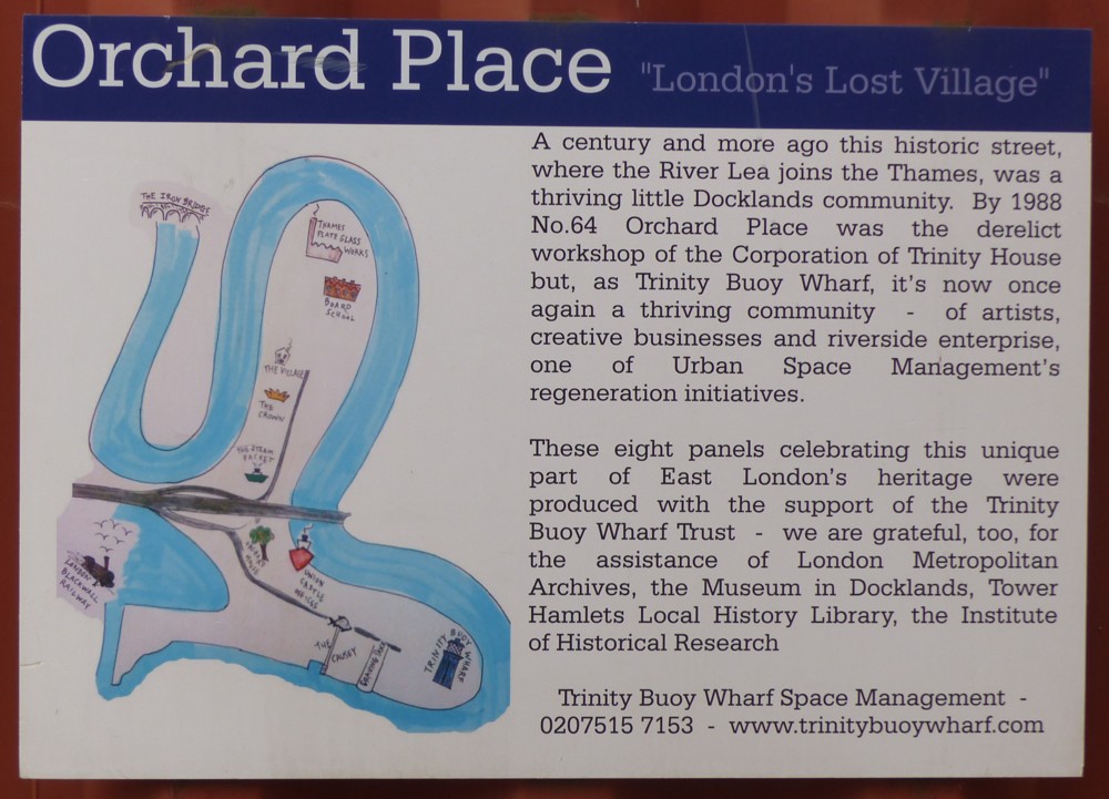
Here is a map of this place, together with a description of what has been happening there recently:

When exploring a new place, I always photo maps and signs which explain everything.

This map looks, I think, rather like one of those illustrations in a birds-and-bees instruction manual for adolescents.

More about Orchard Place here.

Originally posted at Brian Micklethwait’s Old Blog

Dr Salter’s imaginary cat statue

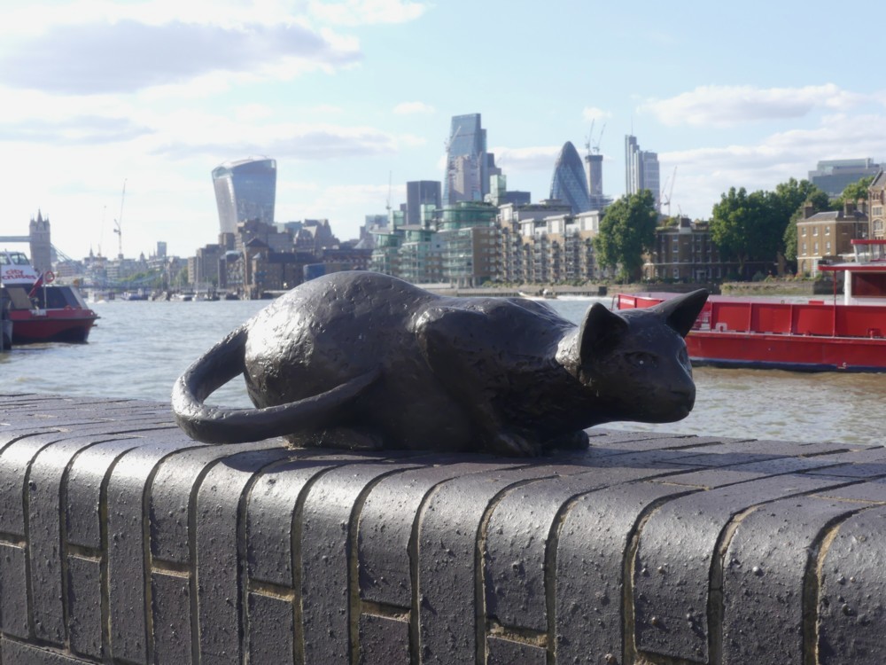
Indeed:

I took all these statue photos yesterday, in a walk with GodDaughter 2 that I have already referred to, which started at the Shard (see below), Tower Bridge, and nearby places, and ended … well, quite a way downstream.

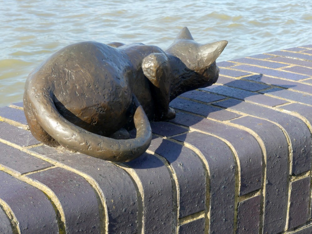
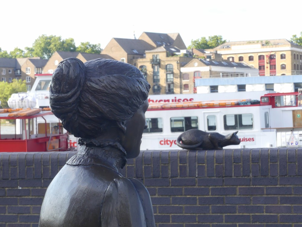
As often happens, my favourite photo of this subject was the first one I took. But I also liked this next one, which neglects what seems to be the usual Big Things of The City background and adds only wall and water:

The explanation of the rather odd title of this posting is that what we have here is not so much a group of statues as a drama acted out by a group of statues. Dr Salter (see below) is looking on at his small daughter, and at her cat. But it is all taking place in his imagination, because the small daughter died tragically young. It is all very well explained, with more pictures, here. Follow that link, and you’ll even find a map of exactly where this all is.

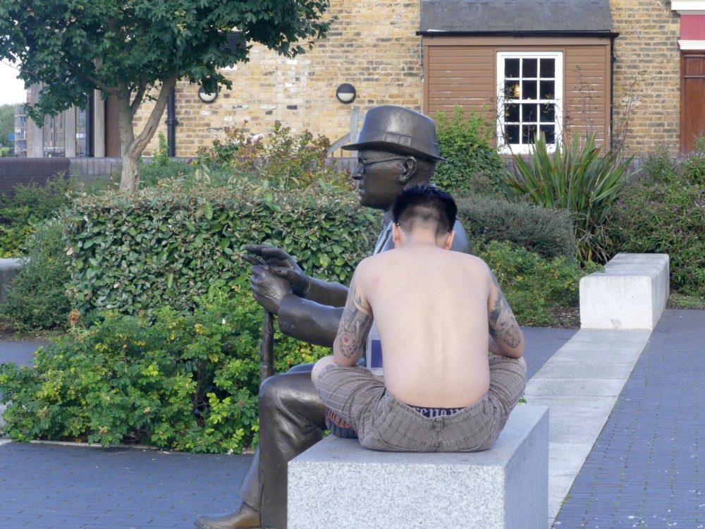
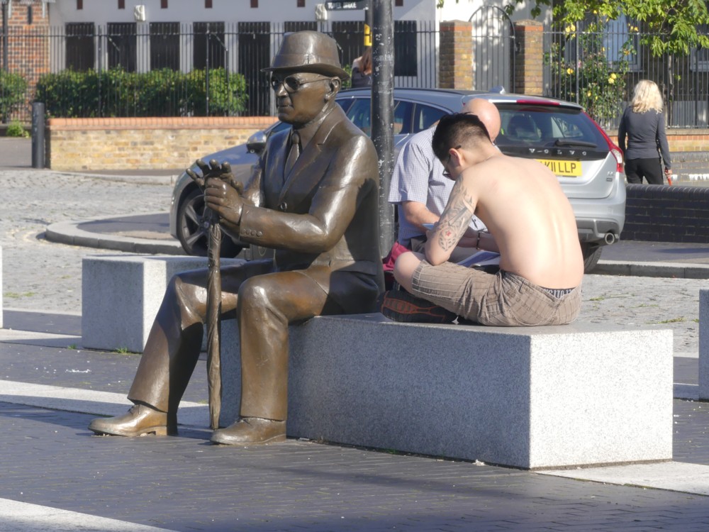
The drama gets an extra layer of drama, because the original statue of Dr Salter was stolen, for its value as scrap metal. I think I preferred the stolen one, but here is the replacement, with the addition of a young man with tattoos:

The tattoos on the front of that guy were remarkable, and I regret now not asking him to let me photo them. I know, I know, creepy. But if he had said yes, I would have been delighted, and if he had said no that’s creepy, I’d have got over it.

Mrs (Ada) Salter also looks on, and these two headshots of her came out quite well too:

While taking these photos, or maybe it was a bit later, I found myself musing aloud to GD2 (with her agreeing) that people seem greatly to prefer statues that are very clearly statues, made out of some sort of monochrome material such as stone or metal, rather than something more realistically coloured, a fact which has, from time to time, puzzled me. Were the latter procedure to be followed, people wouldn’t be able to tell the difference between statues and actual people, and this would freak them out.

A “realistic” painting or photo of a person is actually not realistic at all. People are complicated in shape. Paintings and photos are flat. So, if you encounter a photo or a painting of a person, even if it’s life size, there is no possibility that you will be duped into introducing yourself to it or asking it for directions. But if you encounter a genuinely realistic 3D statue of a person, only its deeply unnatural stillness would eventually tell you that this is not a real person. And this would be awkward to be dealing with on a regular basis.

A giant statue of someone, realistically coloured, might be okay. After all, miniature statues (go into any toy shop or gift shop to see what I mean) already are okay. Just as with a tiny but realistically coloured person statue, you could tell at once that a giant realistically coloured person statue was only a statue rather than a real person.

A giant cat statue, on the other hand, probably wouldn’t be a good idea. People might think: Woooaaarrrrgggghhh!!! A giant cat!!! Get me out of here now!

Originally posted at Brian Micklethwait’s Old Blog

How Michael Tanner both misunderstands and understands Turandot

Yesterday I attended a Royal Opera House Covent Garden dress rehearsal, of Puccini’s Turandot. Never having seen Turandot on stage before, I learned a lot. The singing was pretty good, especially the choral singing, but maybe I say “especially” about that because I generally prefer choral singing to “operatic” solo singing. The staging looked appropriately splendid and exotic.

But the best fun of all was, afterwards, finding this bizarre piece of writing by Michael Tanner, for the Spectator. What is bizarre is that Tanner disapproves of the characters and he disapproves of the “happy ending” at the end of Turandot, like some myopic Victorian moralist objecting to King Lear because of what sort of people they are and because of what happens at the end of that.

Turandot is obviously a very wicked and tyrannical ice-queen type of a woman. But Calaf earns Tanner’s special condemnation. This is because Calaf, being from Asia in olden times rather than the Home Counties of England now, prefers conquest, sexual and political, to the love of a good woman. He is going to subjugate Turandot, sexually and politically, or die trying, and damn the consequences. But in Michael Tanner’s world tenors are not supposed to think and behave like that. Their job is to embody virtue, not watch while the slave girl who has been in love with Calaf throughout the opera is tortured and then commits suicide to spare herself more torture. After which Calaf carries right on with subjugating Turandot. But the fact that Calaf is not the sort of person whom Tanner would want marrying his sister is rather beside the point. Or to put the same point a quite other way, it is exactly the point. It isn’t just the setting of Turandot that is exotic. These are profoundly different sorts of people to those that Michael Tanner, or for that matter I, approve of.

This is like denouncing the Ring Cycle because Wotan is a god rather than a geography teacher, or because the dragons in the Ring Cycle do not behave like hedgehogs.

Calaf was also criticised by Tanner for standing still and just singing, instead of doing lots of “acting” in the modern style. But Calaf’s whole character is that of a would-be ultra-masculine tyrant. And tyrants instinctively exude power and strength, for instance by standing still in a very masculine chest-out pose, and singing very sonorously, rather than by doing lots of fidgety acting. It is their underlings and victims who do all the acting, by re-acting to people like Calaf.

However, it often happens that critics who denounce works of art in rather ridiculous ways nevertheless understand them very well, and often a lot better than the people who say that they like them. They absolutely get what the artist was doing. It’s just that they don’t happen to like it. I recommend Tanner’s piece as a way of understand how very different Calaf and Turandot are from their equivalents in, say, La Boheme.

Originally posted at Brian Micklethwait’s Old Blog

Prophetic graffiti?

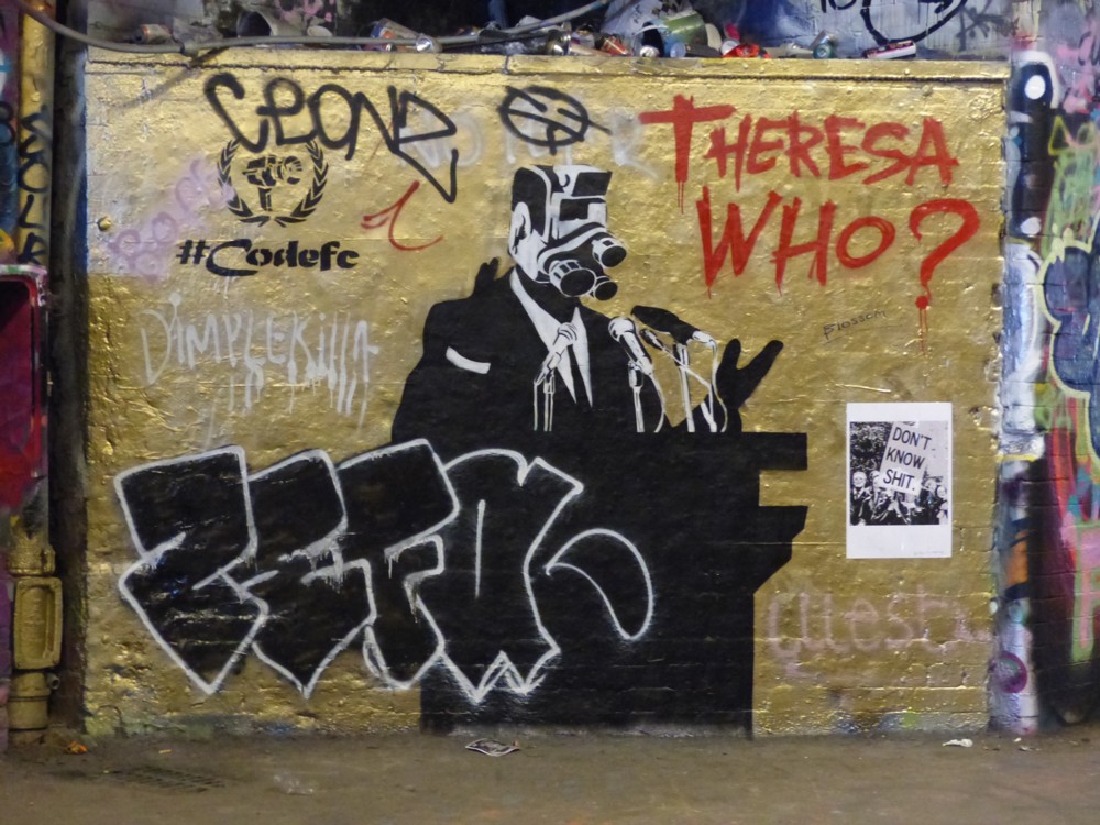
Photoed by me in Leake Street, a week ago:

I have no idea what most of the stuff in this photo is about, but the Theresa Who? That certainly looks like happening pretty soon.

Originally posted at Brian Micklethwait’s Old Blog

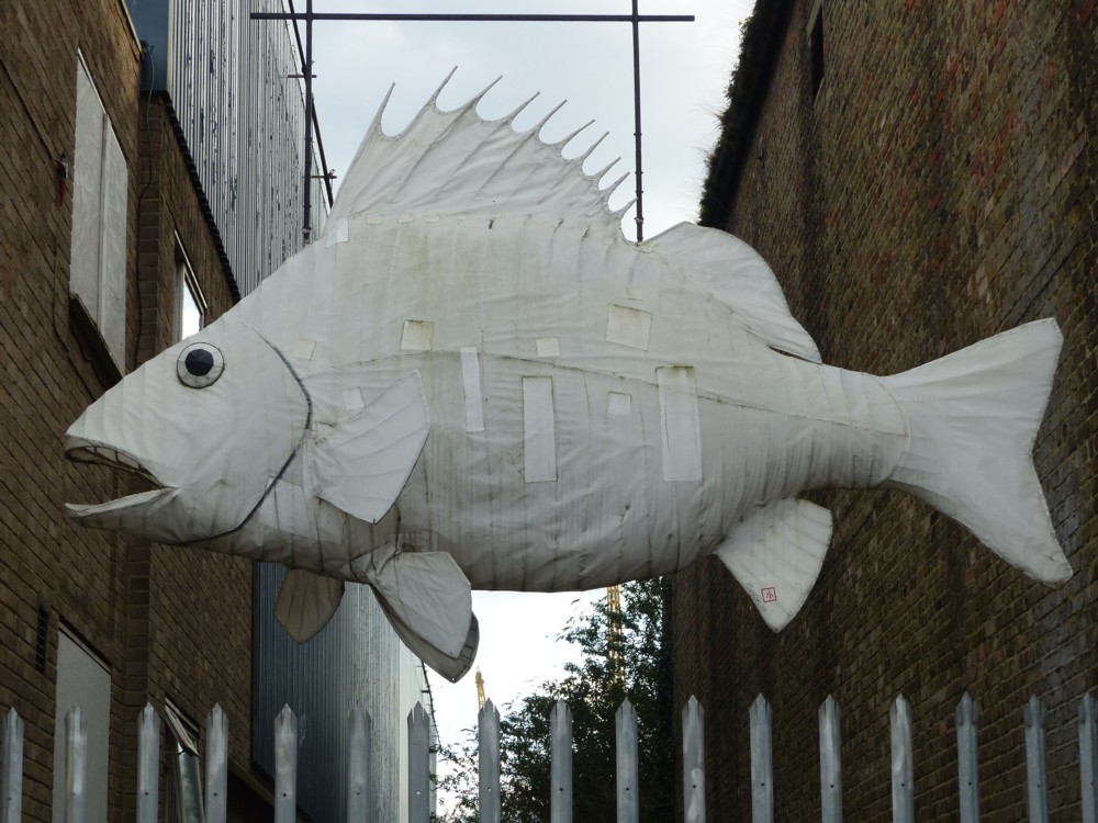
Fish in Orchard Place

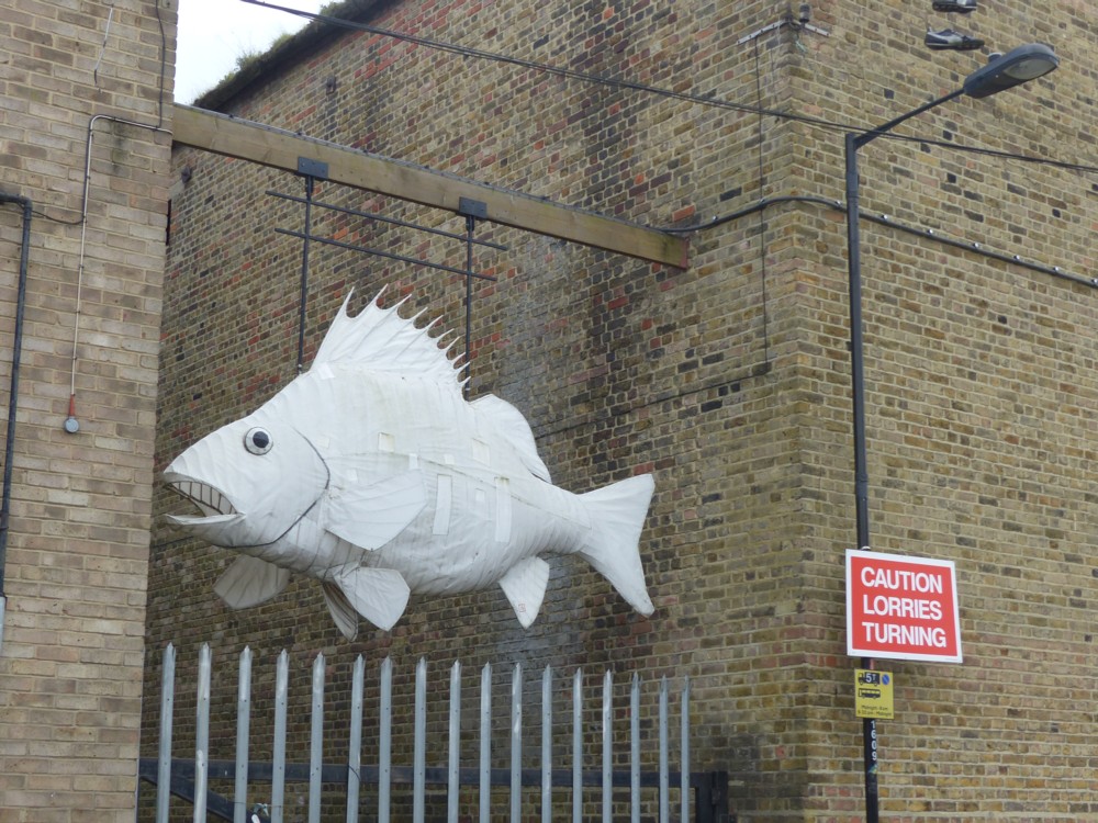
I couldn’t decide which of these two fish photos was the best, so here are both of them. The photo on the right is better of the fish itself. The photo on the left shows more of the rather strange setting. Click on either, or both, or neither, to get the bigger pictures:

I encountered this fish in Orchard Place, last Sunday. Orchard Place is the road you need to walk along if you want to check out Container City, which is what I was doing at the time. To find Orchard Place on google maps, and to satisfy yourself that we are both talking about the same Place, got to Canning Town tube station and go south.

Originally posted at Brian Micklethwait’s Old Blog

IKEA furniture – Lego furniture?

So I had a look around Dezeen to see what’s there that’s interesting, and their most popular posting right now is about IKEA. All I saw, for several days, was: IKEA. So I ignored it. But on close inspection, the posting is actually rather interesting. Its title is: IKEA switches to furniture that snaps together in minutes without requiring tools.

Quote:

The fiddly ritual of assembling IKEA furniture is set to become a thing of the past as the furniture giant introduces products that snap together “like a jigsaw puzzle”.

The brand has developed a new type of joint, called a wedge dowel, that makes it much quicker and simpler to assemble wooden products. This does away with the need for screws, bolts, screwdrivers and allen keys.

My chosen destinations for furniture are charity shops, mostly. That or basic second hand places. Partly that’s an aesthetic preference. I take pride in the cheapness of my living arrangements, that being my preferred look. But part of that is because I have always assumed that flatpack furniture is indeed too fiddly and complicated to be relying on. Also, frankly, I basically just don’t like IKEA’s furniture.

But for those who do like IKEA furniture, it looks like it is about to get a bit simpler to assemble.

Thought. Does Lego make furniture? I just googled that question, and google answer number one was this:

A company is making furniture that is like giant Lego for your home:

This furniture is designed to be taken apart over and over again.

It is called Mojuhler and is flatpack, modular furniture that can be changed from a chair to a table in minutes.

You can fund the project on Kickstarter from about £80.

Nice basic idea, but scroll down and you get to pictures of brackets and screws! Screw all that, and not with a screwdriver. It looks more like Meccano than Lego, I’d say. It says on the right at that place that it failed to get its funding. If that’s right, I’m not surprised.

This is more what I was thinking.

One of the basic drivers of design is the desire to own bigger versions of the stuff you played with as a little kid. A lot of Art is like this, I believe. So, why not furniture too?

Originally posted at Brian Micklethwait’s Old Blog

Shopping Trolley Spiral beside the River Lea

Yesterday I told you about a photo I took on January 20th of this year. Earlier that day I had journeyed to Bromley-By-Bow tube station, then walked south along the River Lea, and ended my wanderings at Star Lane Station. It was a great day for photoing, and I especially enjoyed photoing this witty sculpture:

But who did it? This evening I realised that I seemed to recall Mick Hartley having something to say about this, and so it proved.

It’s by Abigail Fallis, and it is called DNA DL90. Well, I say that’s what it’s called. That’s what Abigail Fallis called it, but I bet nobody else calls it that. I bet what most people call it is more like: Shopping Trolley Spiral. I’m guessing further that Abigail Fallis regards her sculpture as some kind of critique of late capitalist consumerism. But such ArtGrumbling need not stop the rest of us thoroughly enjoying the thing, and also continuing to relish our trips to the supermarket, there to sample the delights of early capitalism. Because you see, Abigail, capitalism is just getting started.

Yes. I was right. Says Hartley:

It is, says Fallis, a symbol of modern society’s consumer culture, which has now become entwined in our genetic make-up. They can’t help themselves, can they, these artists?

The usual bitch about Artsists is that they are predictable, and indeed they are. But this was something else again. I literally predicted this, before I read it. How predictable is that? Very, very.

Originally posted at Brian Micklethwait’s Old Blog