Two beautiful days

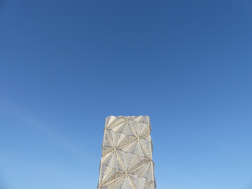
On Thursday, perfet weather was perfectly prophesied by our brilliant short-term weather forecasters, and I journeyed to the Dome and places south, to take a closer look at The Optic Cloak:

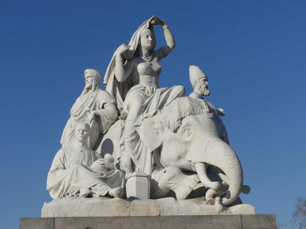
And then yesterday afternoon, following a similarly prescient forecast, forecasting similarly perfect weather, GodDaughter2 and I, as recounted yesterday, walked through Hyde Park:

That being one of the accompanying sculptural collections next to the Albert Memorial, which at the moment I think I prefer to the Memorial itself.

I basically spent today recovering from all this self-propelled travel. You, like me, are not getting any younger, no matter how young you may now be. But this expression is only used by people of my kind of age to describe how I felt after two such days of exertion.

Originally posted at Brian Micklethwait’s Old Blog

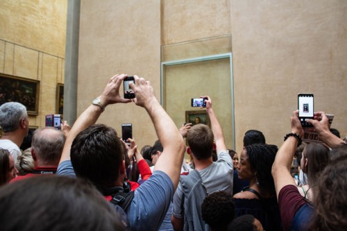
Photoing the Mona Lisa in the Louvre

6k: (I know someone who will like this picture …) Who can he mean?

He’s talking about this picture:

I like it. And like I say, the Age of the Smartphone will be with us for quite a while yet.

I can remember when places like the Louvre used to forbid photoing. But they can hardly complain if students … take notes.

Originally posted at Brian Micklethwait’s Old Blog

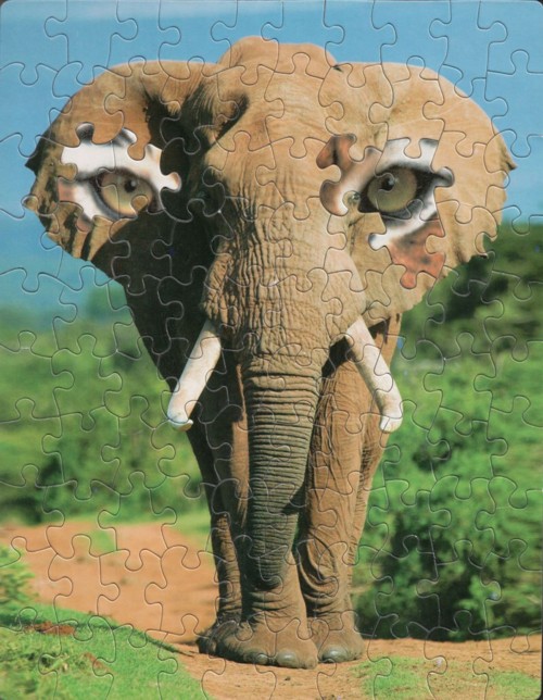
Eyes on its ears

It’s Friday, so you want cats and/or other creatures. So, what sort of other creature is this?:

It’s quite a puzzle isn’t it. I’m describing my question, but I’m also answering my question.

It was one of these.

It is rare that I categorise a posting as this and that. But this defies ordinary classification.

Originally posted at Brian Micklethwait’s Old Blog

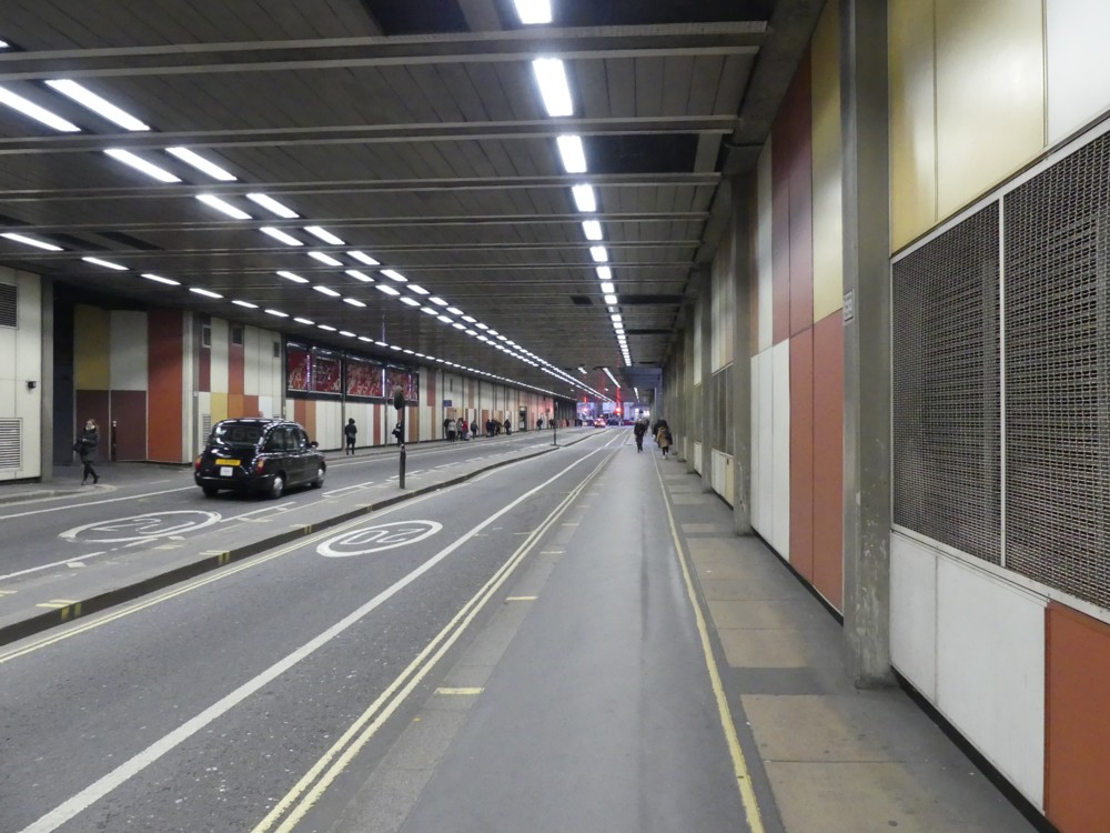
The light at the end of the Beech Street tunnel

Today, I was meeting a friend in the area of Angel tube, and then, because the weather was so good, I decided to walk a little, to the canal nearby, and then south, towards the City. I took many photos. But as often happens when I photo ordinary things but in better than ordinary light, one of the best photos I photoed was something of a surprise. It happened right near the end. It was getting dark before I reached the City, and a signpost sent me along that strange tunnel near Barbican tube, to Barbican tube.

This is the tunnel I’m talking about:

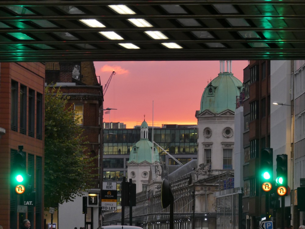
I googled “Barbican tunnel” when I got home, and soon learned that this is apparently the Beech Street tunnel, although all it said on google maps was “B100”. Earlier this year, there was a apparently some sort of light show on show in this tunnel. But this evening what got my attention was the light at the end of the tunnel, which looked like this:

The natural pink and yellow of the sunset is what makes this, but I also like the non-natural green of the traffic lights, and the green reflections in the tunnel roof, joining in with those green roofs beyond.

In the distance, a crane. In London, cranes are hard to avoid. Not that I’d want to.

Originally posted at Brian Micklethwait’s Old Blog

The last really fine day of 2018 (2): Scaffolding wrapped and unwrapped – and the Reichstag wrapped

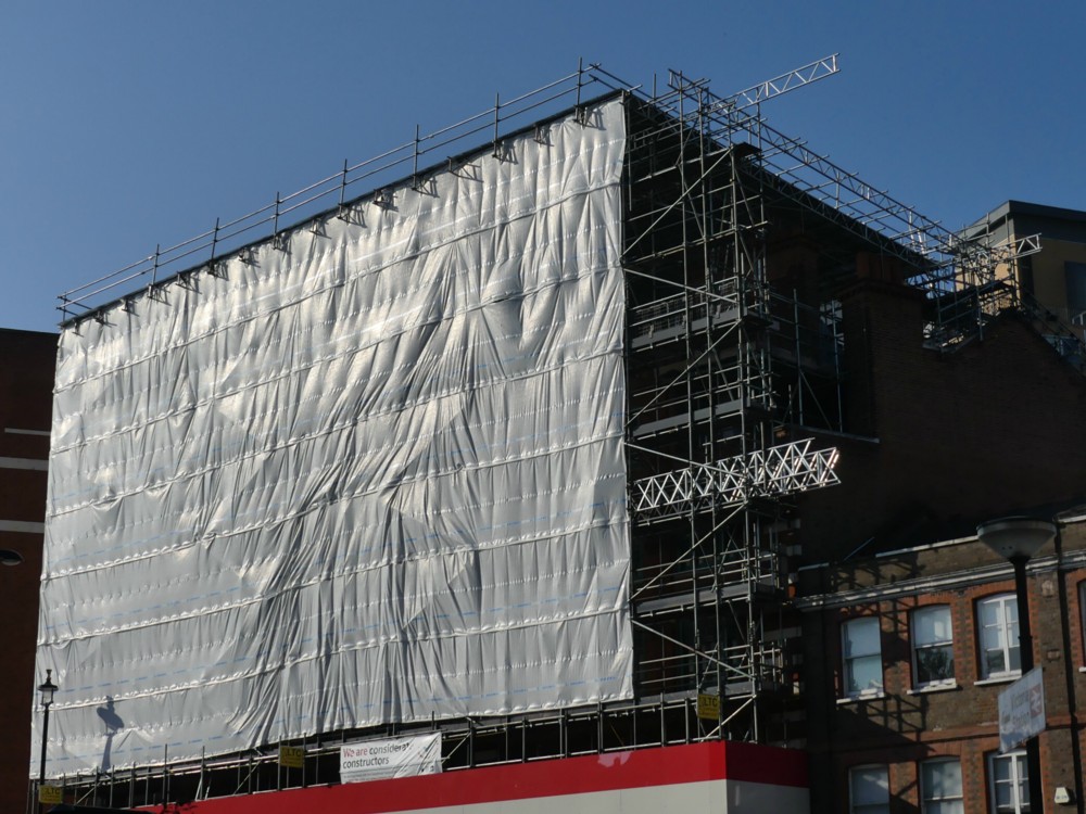
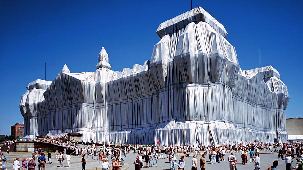
I’ve asked it before and I’ll ask it again. Why do I regard most of Modern Art as silly, yet relish real world objects which resemble Modern Art? Objects like this:

The above photo was taken on The last really fine day of 2018, just minutes after I had taken the one in that earlier posting.

You don’t need to go to an exhibition of sloppily painted abstract art, when the regular world contains wondrous looking objects like that. And what is more, they are wondrous looking objects which have worthwhile purposes. This wondrous object is for supporting and protecting workers as they work on a building.

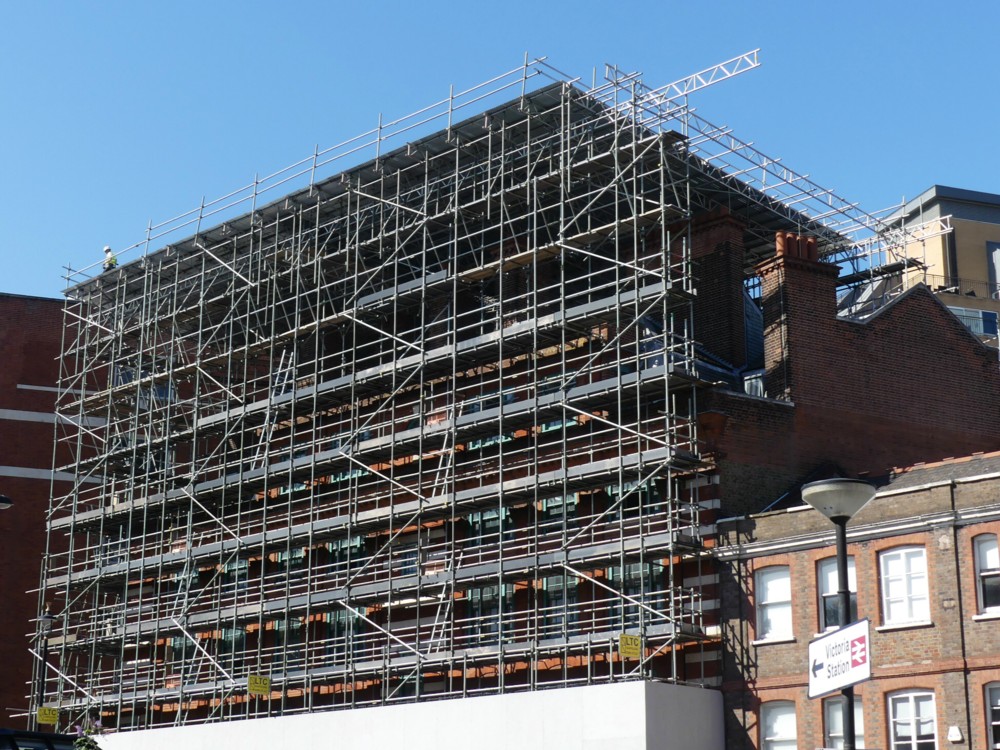
Here is how that same scaffolding looked, unwrapped, about a month earlier:

I particular enjoy how the sky changes colour, in my camera, when a big white Thing is inserted into the picture. (This afternoon, I encountered this, by Real Photographer Charlie Waite. Same effect.)

Thank you to the (to me) invaluable PhotoCat, for enabling me to crop both of the above photos in a way that makes them more alike in their scope and which thereby points up the differences. I’m talking about the invaluable Crop But Keep Proportions function that PhotoCat has, but which PhotoStudio (my regular Photoshop(clone)) 5.5 seems not to offer. (I would love to be contradicted on that subject.)

Despite all my grumblings about how silly most Modern Art is, I do nevertheless greatly like the way that this Big Thing (the Reichstag) looks in the pride-of-place photo featured in this BBC report, an effect which presumably makes use of the same sort of technology as we see in my photo, but on a vastly grander scale:

I have to admit that this is several orders of magnitude more impressive than my scaffolding. (Maybe that was the last really fine day of 1994.) My scaffolding looks lots better than some badly painted little abstract rectangle in an Art gallery, but it’s not nearly as effective as the Reichstag, as wrapped by Christo and Partner.

Because this Big Wrapped Thing was so very big, and because it is such a very interesting shape, it really does look like it added greatly to Berlin, in that summer of 1994. I entirely understand why all those people assembled to gaze at it. Had I been anywhere in the vicinity, I would have too. And had there been digital cameras then, I would have taken numerous photos, as would thousands of others. Thus giving permanence to this vast piece of temporariness.

Because, what I also like about this Reichstag wrapping is that, just like my scaffolding, and just like all the other wrapping done by Wrapper Christo and his Lady Sidekick, it is temporary. That BBC report calls it Pop-Up Art, and it is of the essence of its non-annoyingness that any particular piece of Pop-Up Art by Christo will soon be popping down again.

This Reichstag wrapping happened in 1994, but is now long gone. Did you disapprove of what Christo and his lady did to the Reichstag? You just had to wait it out. Soon, it would be be gone.

Do you think scaffolding, especially when wrapped, is ugly? Ditto.

Originally posted at Brian Micklethwait’s Old Blog

Orange umbrellas in Lower Marsh

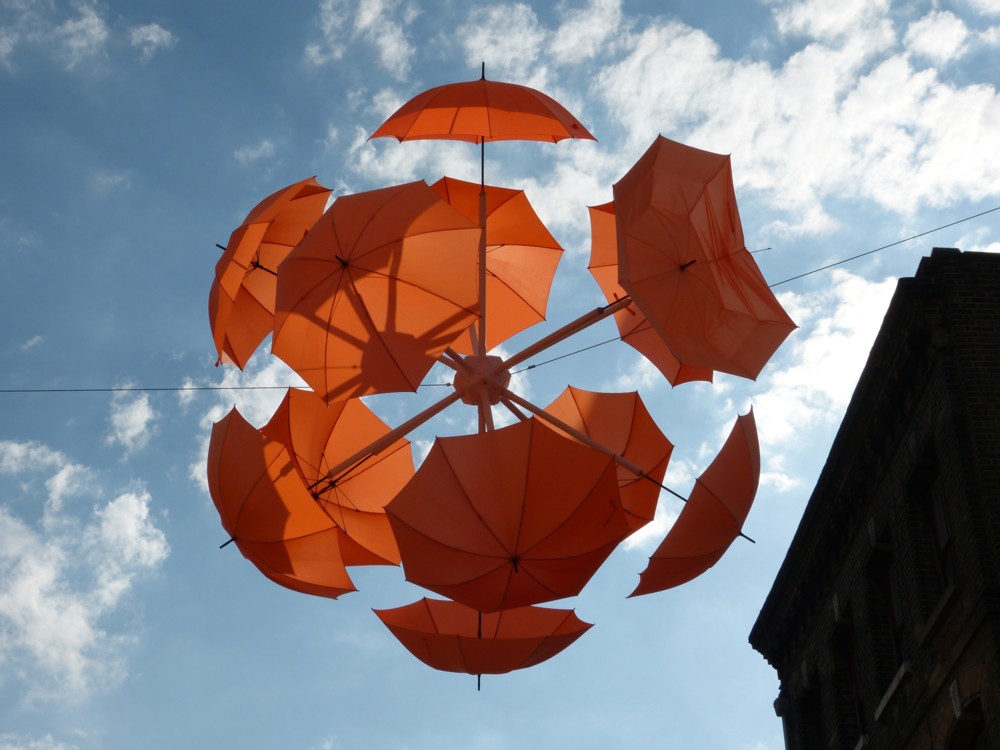
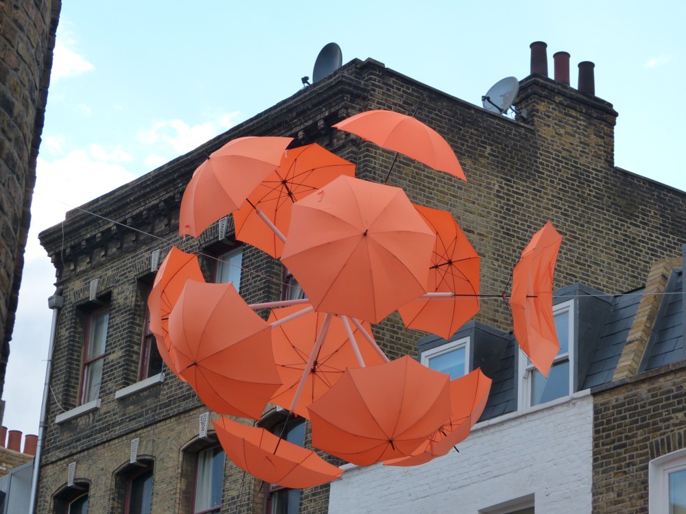
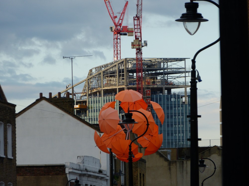
On August 2nd 2013, exactly five years ago today, there was a clutch of orange umbrellas above Lower Marsh. (Also (see bottom right), 240 Blackfriars Road was under construction.) I don’t believe I mentioned these umbrellas at the time I photoed them, and now, I can’t google my way to any sort of explanation of them. But, I think I recall investigating them at the time, and I think they were some kind of advert for an art gallery. This guy agrees that these umbrellas were indeed there, then, but he doesn’t say anything about them either.

Anyway, here they are, as I photoed them then:

The bottom left one looks to me like the head of some kind of oriental feline creature.

Originally posted at Brian Micklethwait’s Old Blog

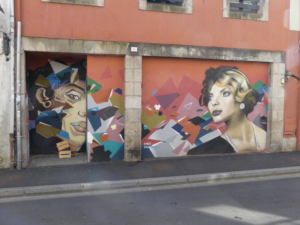
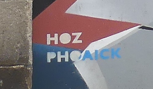
HOZ PHOAICK?

In Quimper, the city in Brittany which I recently visited on account of having friends who live there, I photoed this:

My camera’s ability to notice details that I didn’t notice at the time …

… immediately enabled me to learn who did it, and what else he has done.

I love the internet.

Originally posted at Brian Micklethwait’s Old Blog

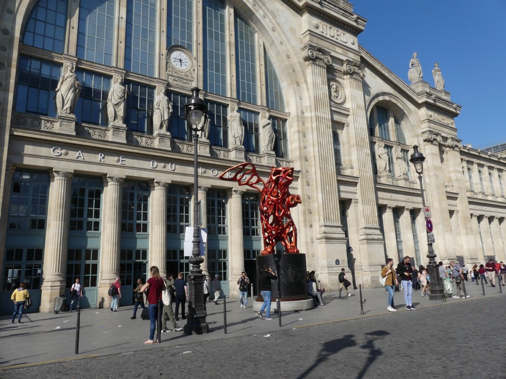
Angel Bear outside the Gare du Nord

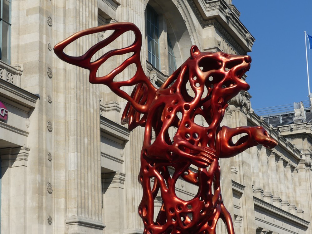
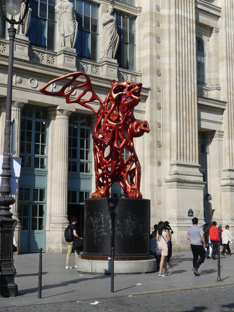
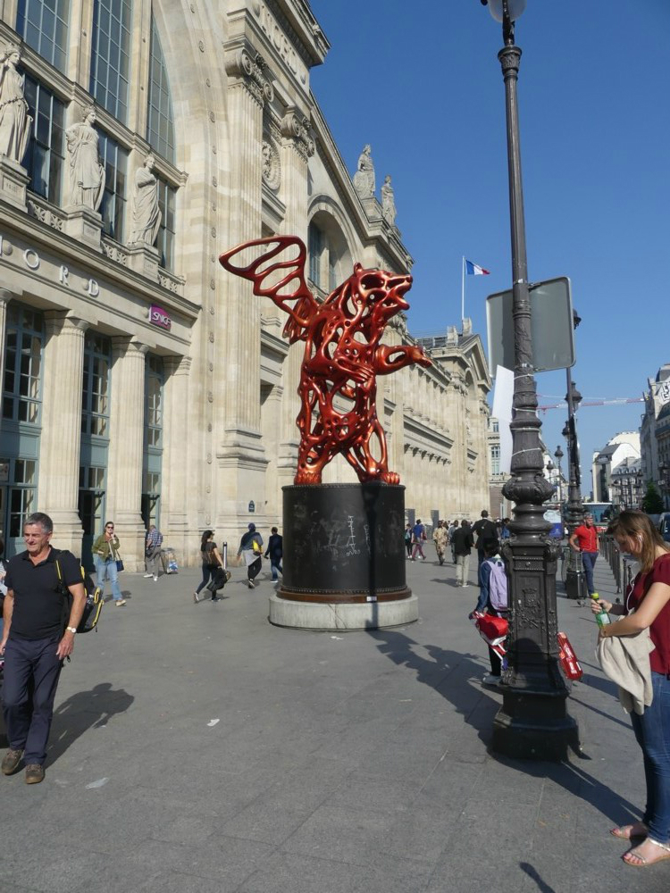
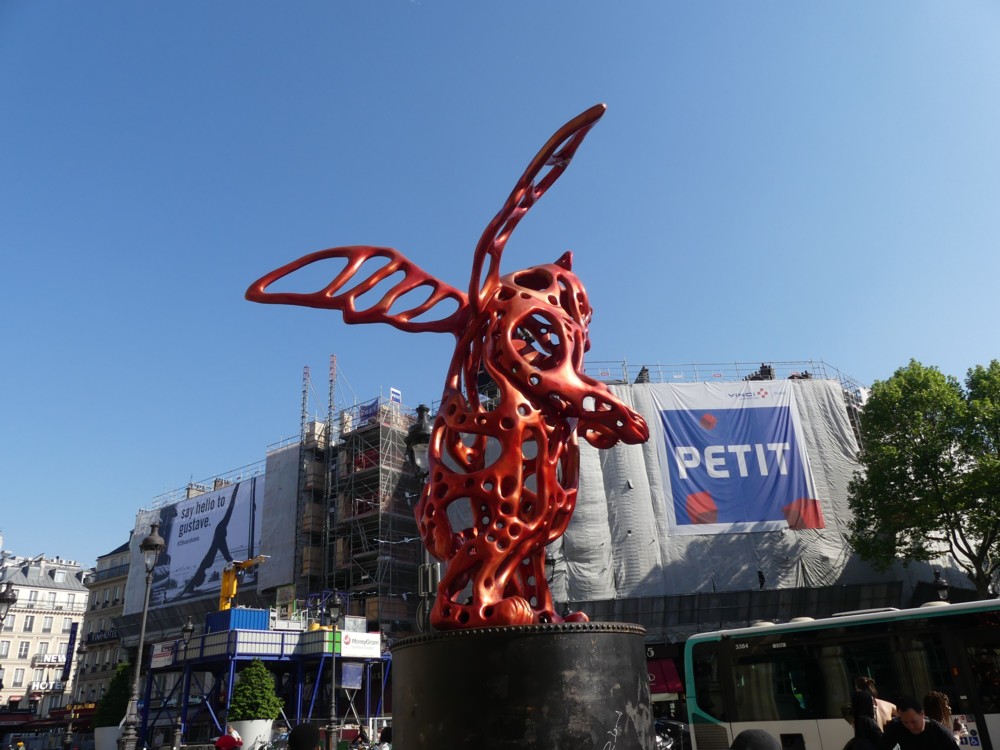
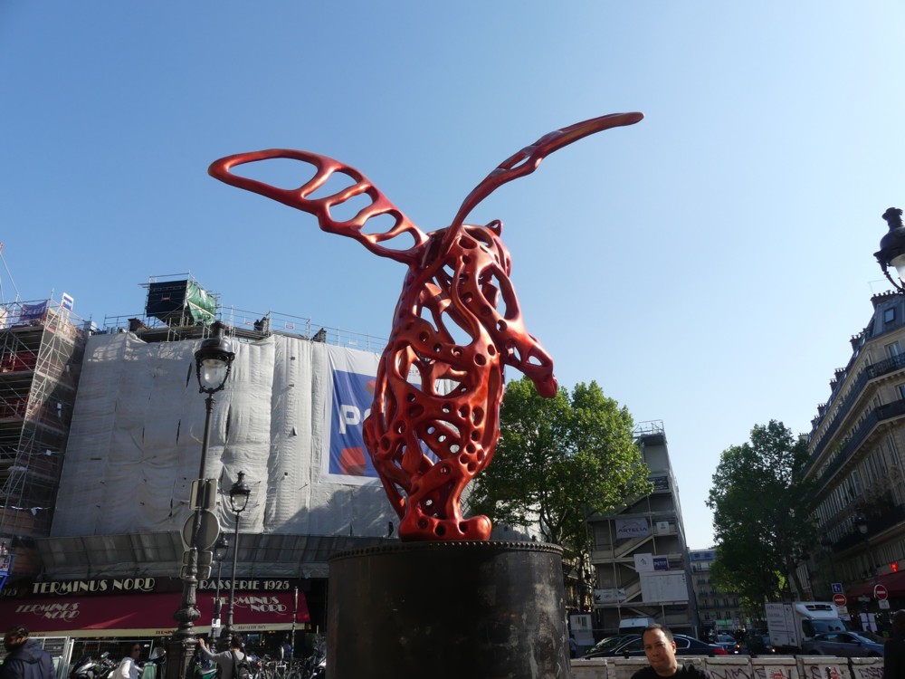
When you go by train to Quimper from London, you start by going by Eurostar to the Gare du Nord in Paris. And when you step outside the main entrance of the Gare du Nord, you find yourself next to a big red bear with wings.

Although I noticed this big red bear with wings when I first got to Paris, I only photoed it on the way back, a week later, when I and GodDaughter 2’s Mum were in less of a hurry between trains and when the weather was much better.

Also, on the way back, we didn’t suddenly see the big red bear with wings. We could see it as we approached the Gare du Nord, and I had my camera ready to go, as it had been all afternoon:


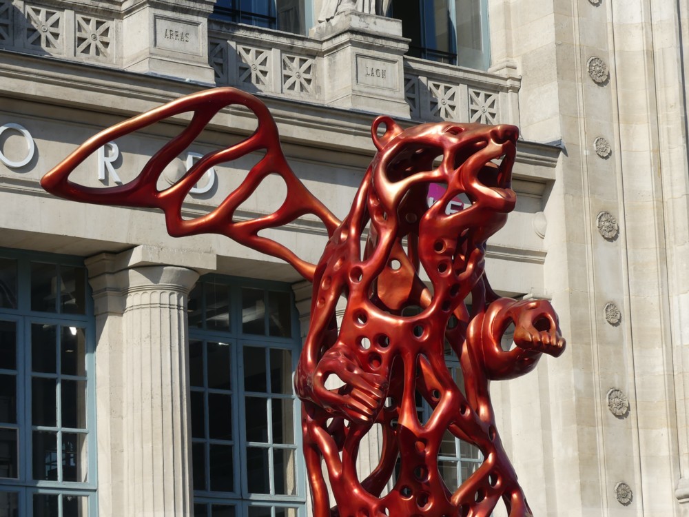
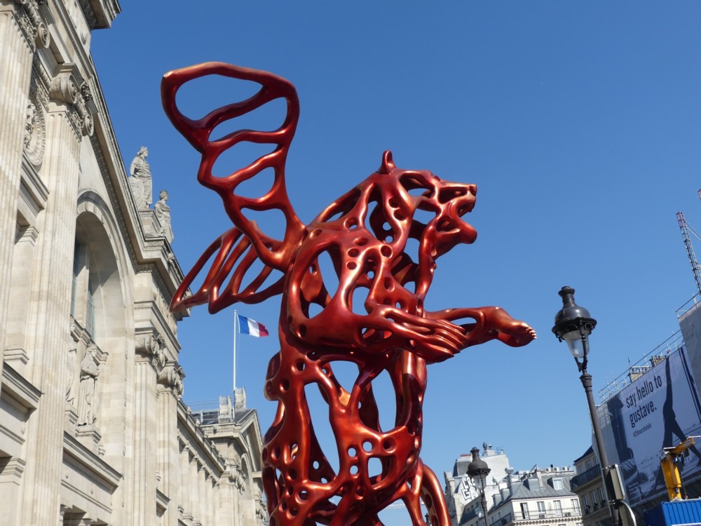
I quite like this big red bear with wings, but I am less sure about whether I admire it. It seems like a mixture of too many unrelated things. The lots-of-holes style of sculpting, which I associate with 3D printing, is one thing. Making a bear look like a bear is something else. And then, there are those wings. On a bear. Wings with holes in them. The idea of the wings is that they turn the bear into an angel bear. Something to do with global warming and the melting icecaps, I read somewhere and then lost track of. The artist, Richard Texier, is not big on logic. He prefers to stimulate the imagination. To evoke magic.

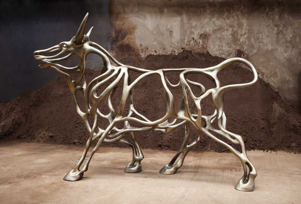
The big red bear is called, see above, “Angel Bear”, and it has an inescapable air of kitsch about it, to my eye. Like something you’d buy, smaller but still quite big, in a posh gift shop, for far too much money. I prefer a bull that Texier has also done, in the same 3D printed style. No wings. Much better, to my eye. Cleaner, as a concept.

Richard Texier Artist

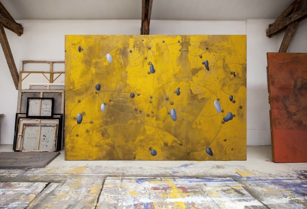
But still a bit gift shoppy, I think. Which is another way of saying that I bet these big old animals are by far his most popular works. I suspect that Texier may be a bit irritated by this. He likes being popular and he likes these big animals. But he also likes his more abstract less gift shoppy stuff, and wishes the populace liked them more too. Things like this:

I found both of those images at the Richard Texier website, at this page.

Despite my reservations about the big red bear with wings and my preference for other Texier works, I can, when I look at his big red bear with wings, feel Paris trying. Trying to become that little bit less of the big old antique such as, compared to London, it now is. I mean, you can’t miss the big red bear with wings. Personally, I don’t find it to be wholly successful. But it is holey.

Originally posted at Brian Micklethwait’s Old Blog

Sorry but not sorry

I liked this, from the Megan Mullally character in Will & Grace (latest series, episode 6, beginning of):

“Sorry I’m late, but I got here as soon as I wanted to.”

At their frequent best, American sitcoms keep on nailing down these universal feelings about the world and its various demands, yet in a way that you never heard before. It’s like they show you the world, but with perfect subtitles attached, explaining everything. My sense is that a gag like that one is proposed by one person, and then talked through by a huge team of gagsters at a big table for about half a day until it is polished and refined down to its pure and perfectly funny essence. (Either that, or some bloke just thought of it, just like that.)

In general, I really like American sitcoms, because, in addition to being funny, they are another world, but another world where they speak an almost identical language to mine.

In English, and also in American it would seem, sorry is definitely the hardest word.

Originally posted at Brian Micklethwait’s Old Blog

Show and tell

A reason I like to put my photos on a blog, rather than just shove them out to the world on Flickr or Instagram or some such thing, is that I often like to say complicated things about them. I like to say why I like about them, basically. For the photos I show here, this blog is about what’s in the photos, as well as just photoing itself.

I also like explaining the photos. Often it isn’t obvious what they are off, or where the thing they are of is.

Distressing though it is to contemplate, not everybody in the world is able to live in London, the way I do. Some of these unfortunates read this blog and view my photos. Not knowing London, such persons require explanations.

Take this photo, for instance:
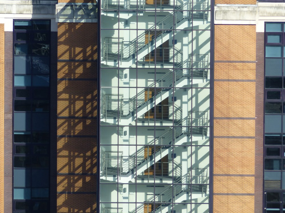
Very pretty, I hope you agree. But where on earth is it, and where was it taken from? It was taken from the top of the Tate Modern extension, which is the brick building in the middle of this photo:
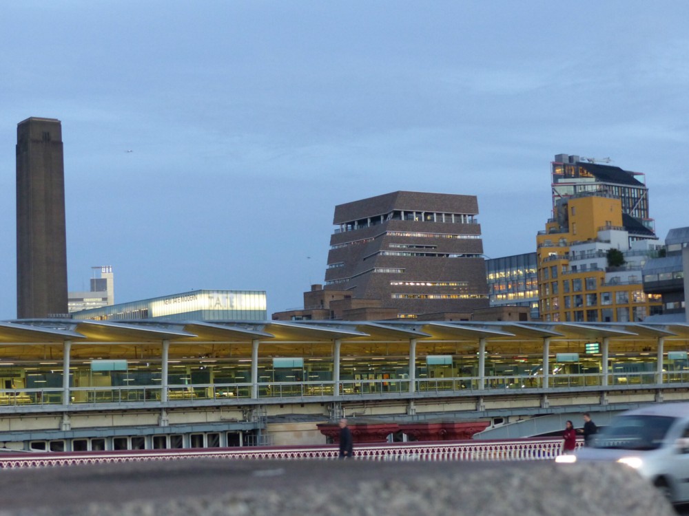
What we also see in that photo is the big old tower of Tate Modern, and in the foreground, one of London’s more interesting railway stations, interesting because it is on a bridge. I love that about it. Especially if it encourages other bridges to be building, say out east, which also have buildings on them, like old London Bridge once did.

But I digress. Which is another reason for sticking photos on a blog. On a blog you can digress all you want.

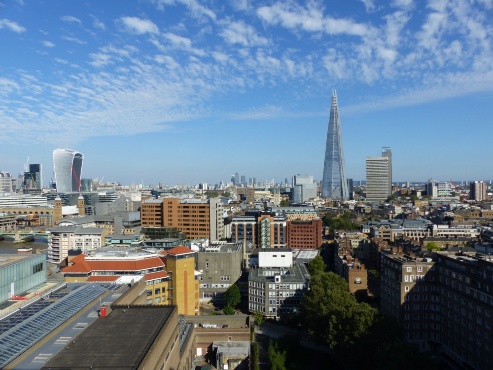
So anyway, back to that photo at the top, of the staircase with all its shadows. Where would that be?

Well, here’s another photo taken from the exact same spot, at the top of the Tate Modern extension, which puts the staircase in context and shows where it is. It is right in the middle of this view:
Or consider this rather banal view, also to be seen from the top of the TME, this time looking south:
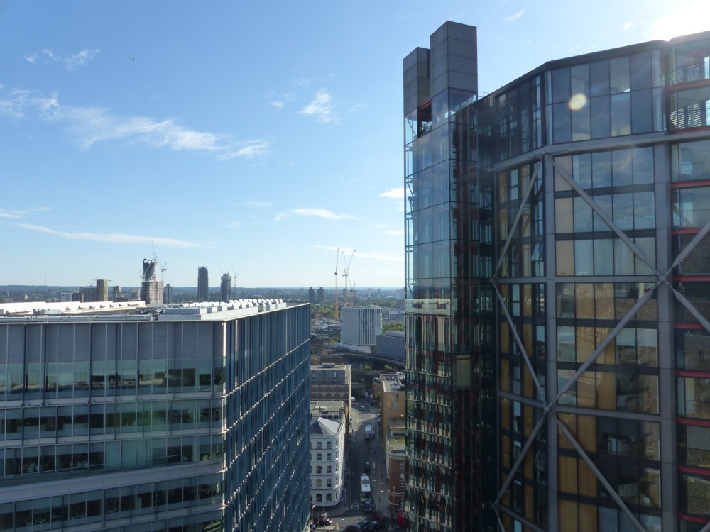
On the right are those flats, whose inhabitants have been complaining about being looked at through their big windows, with its big lift shaft on its left. And further over to the left, further away, we see the three-eyed tower that is Strata, or the Razor as some call it. Why do I show you that? Because this …:
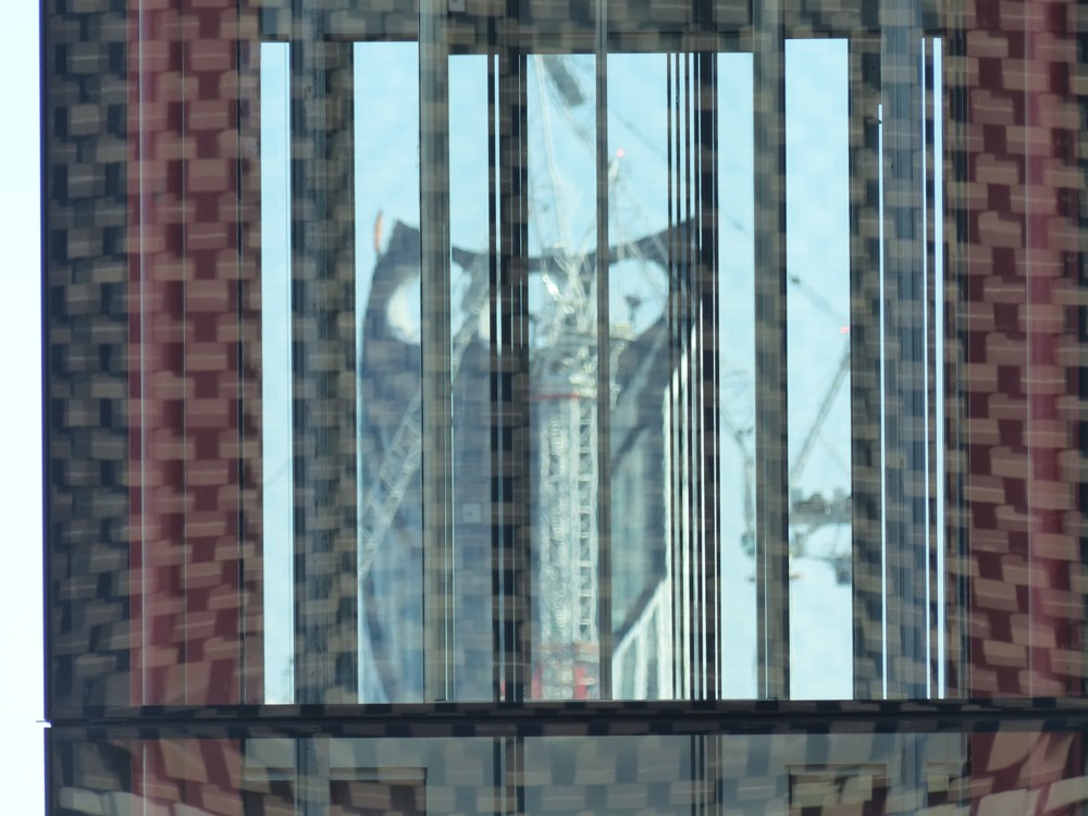
… which is what I saw by moving along a bit to the right, and looking at Strata through the lift shaft.

How would you know what that was, if I didn’t explain it?

And there’s more explaining to be done. What is that odd brick pattern, reflected in the glass of the lift shaft, through which Strata is to be seen?

Well, here is a closer-up photo of the TME, taken around the same time, but when the sky was white rather than blue:
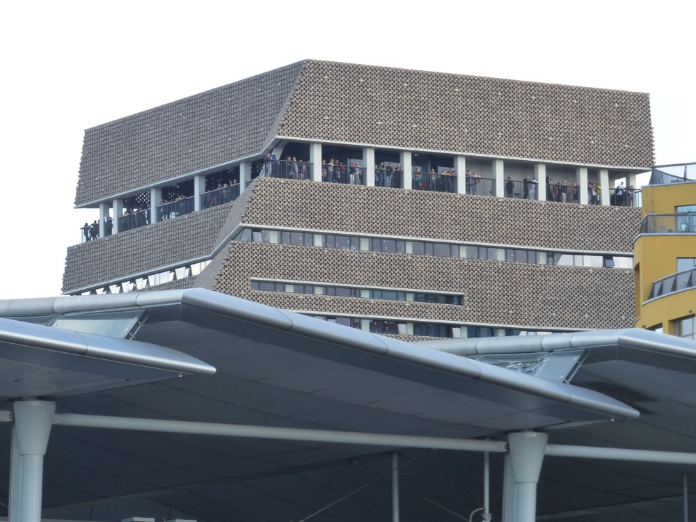
Click on that and you get a closer look at that brickwork. Or better yet, just look at this even-closer-up photo of it, that I took, also on the white sky day:
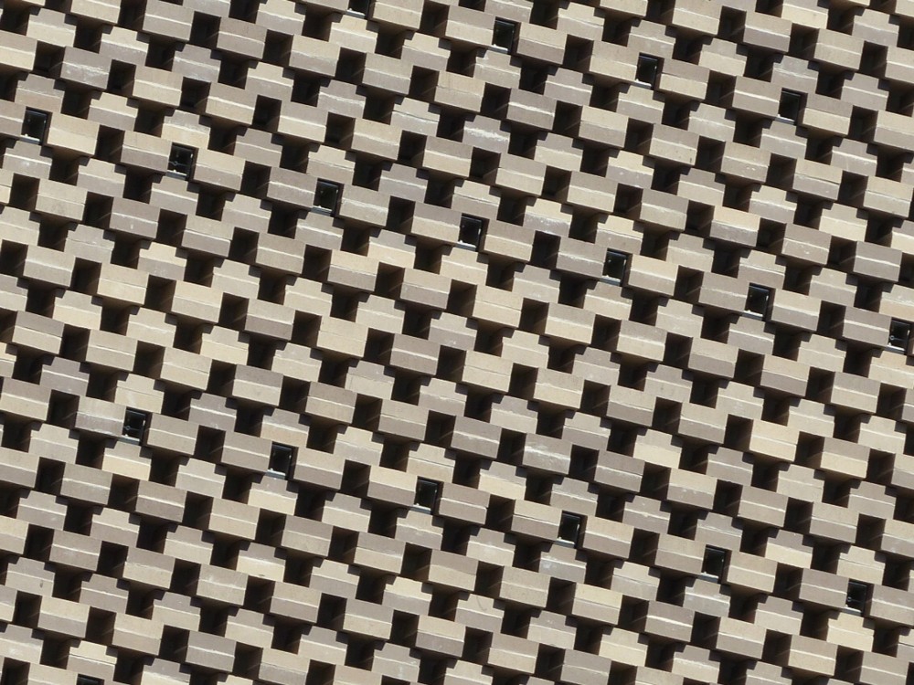
I actually like this brickwork a lot. It makes this extension both blend in with the old power station that Tate Modern used to be, and yet makes the new building distinctive. In general, this extension has a highly individual look about it. As I think I’ve said here before, Art I can take or leave, but I do like the new buildings they build for it. Yes, see also here.