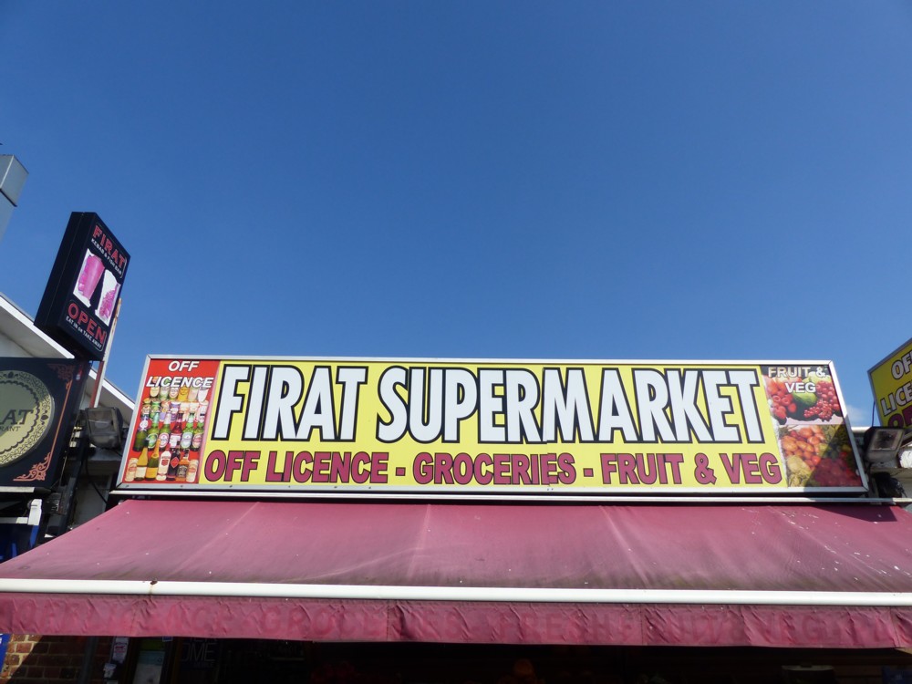
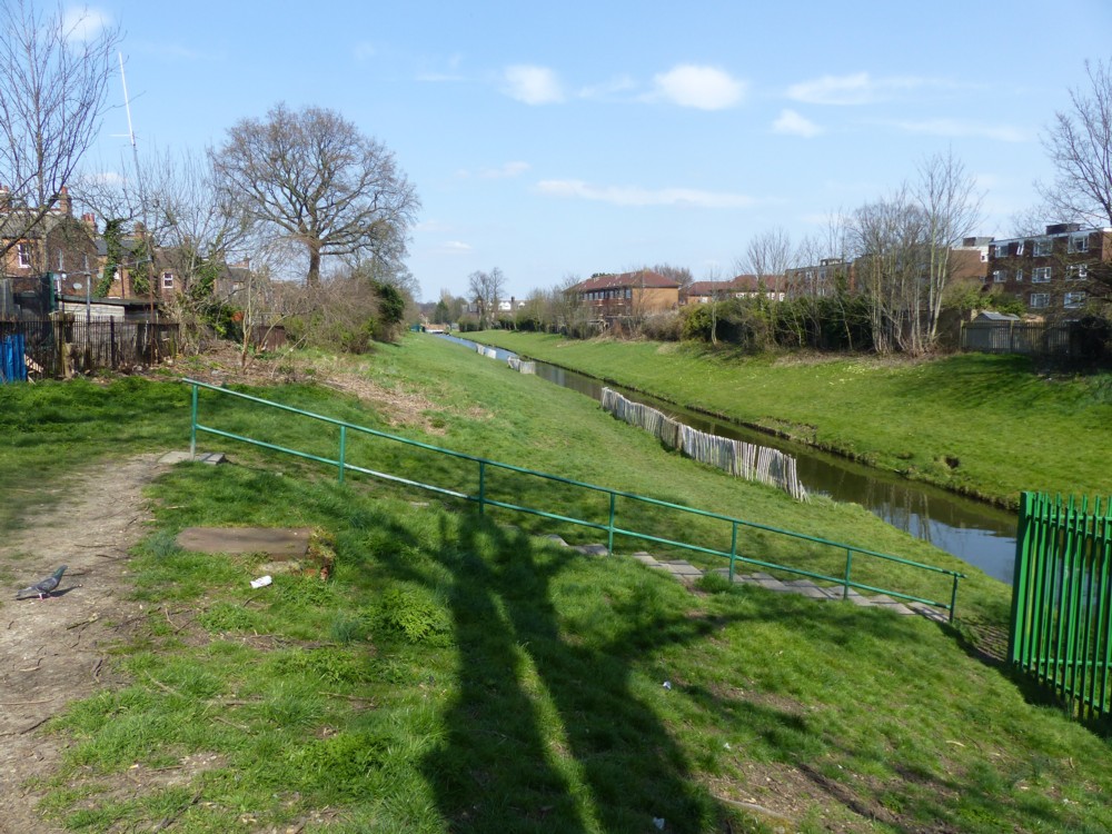
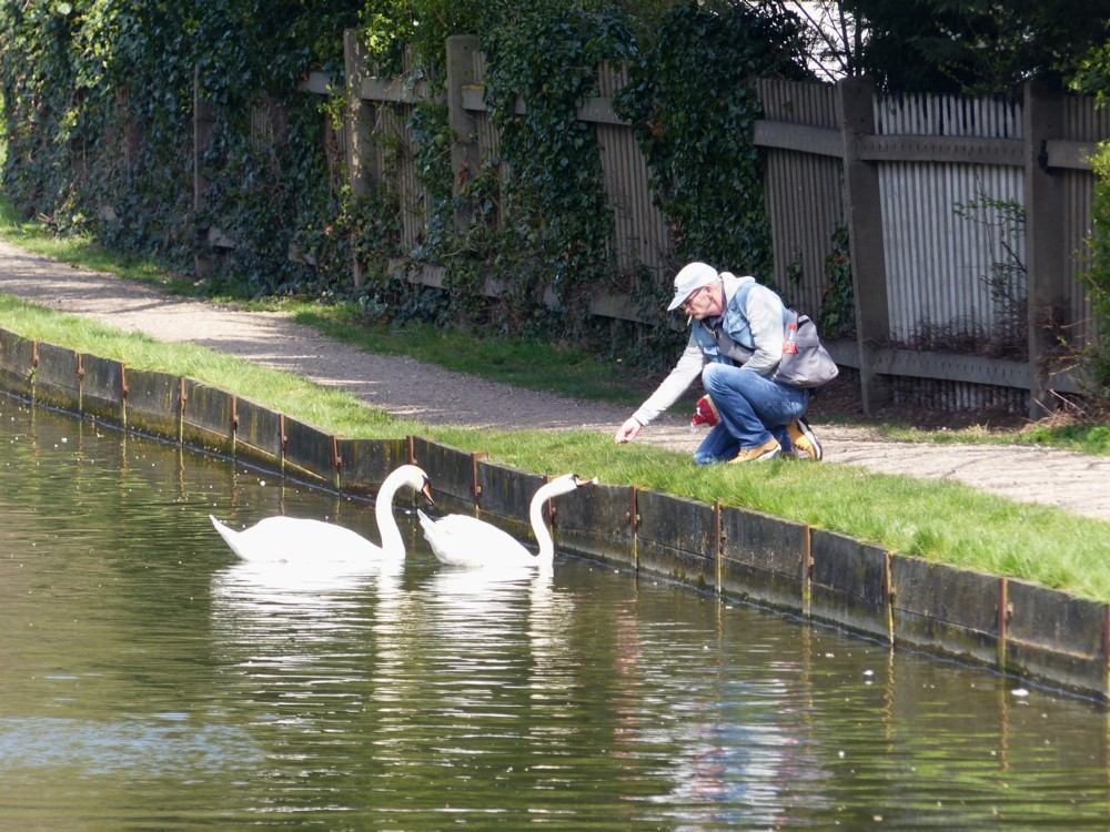
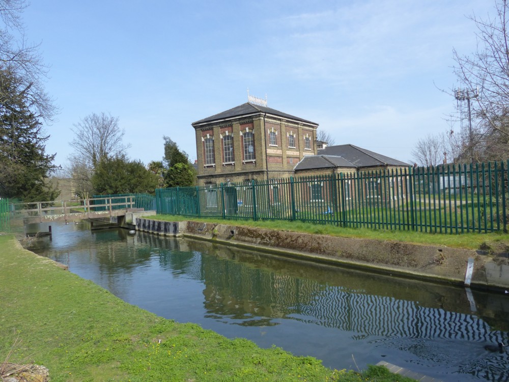
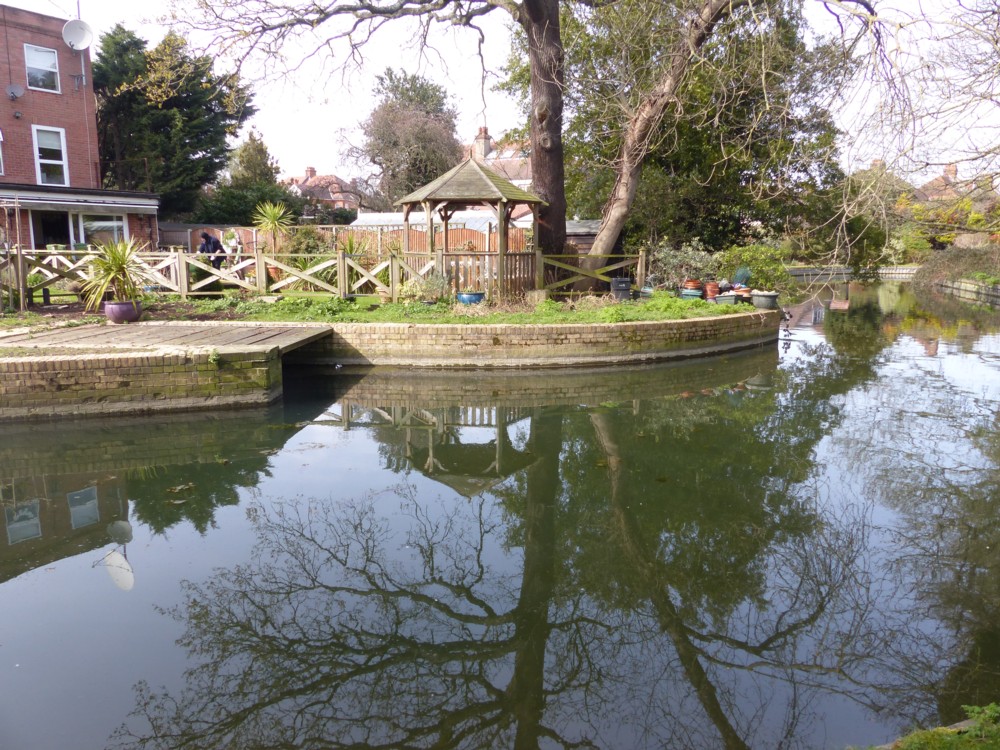
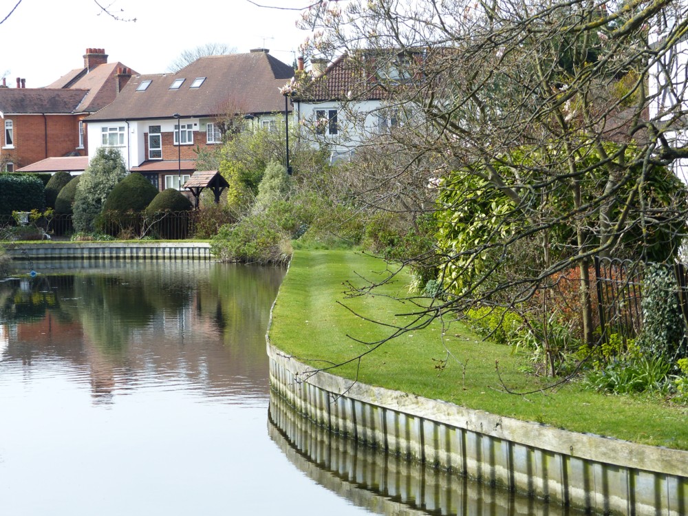
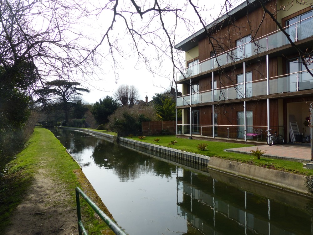
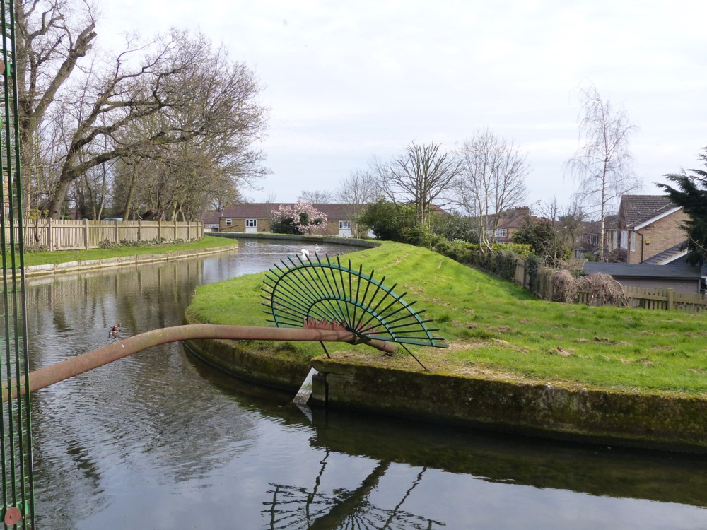
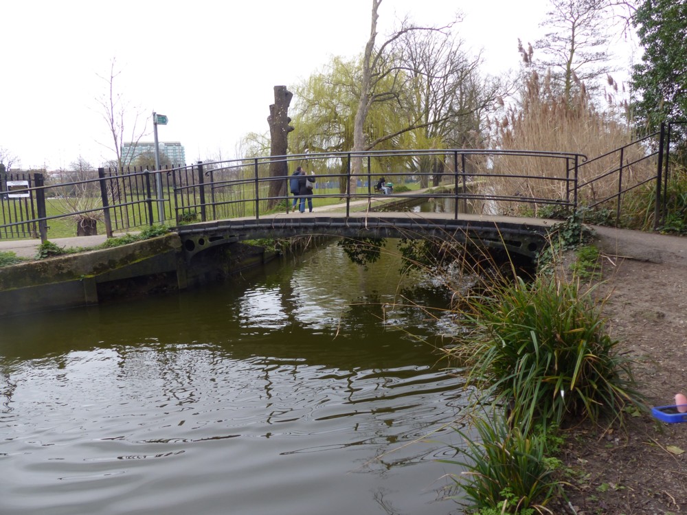
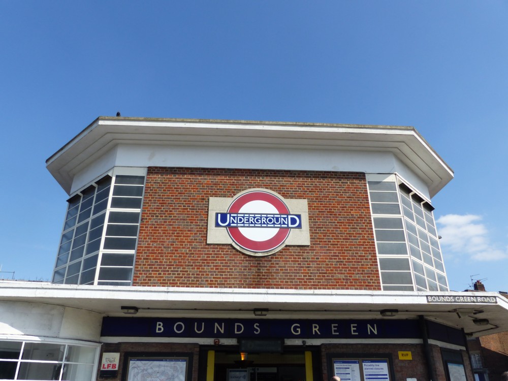
New River walk with GodDaughter1 from Bounds Green to Enfield

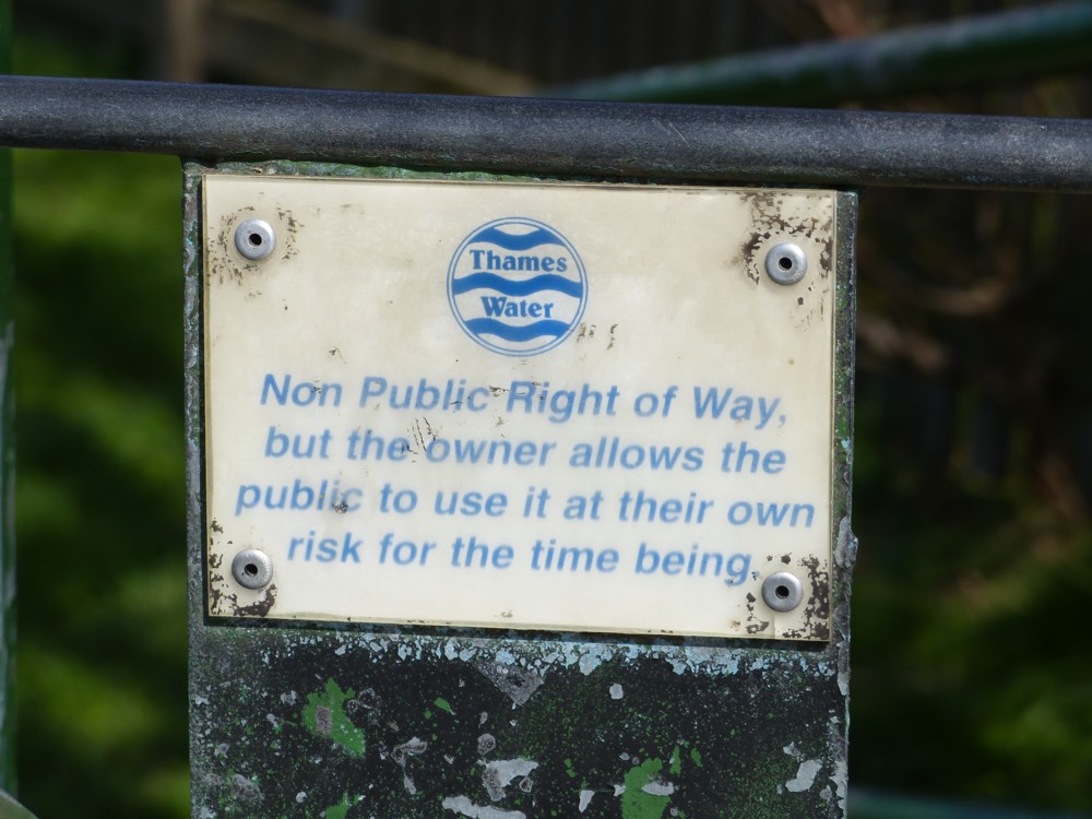
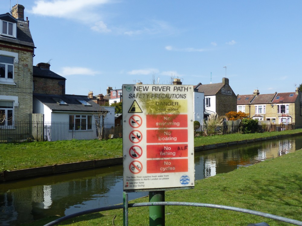
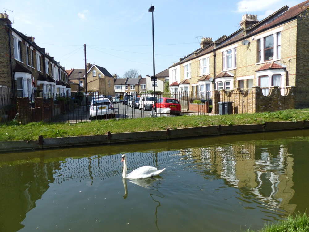
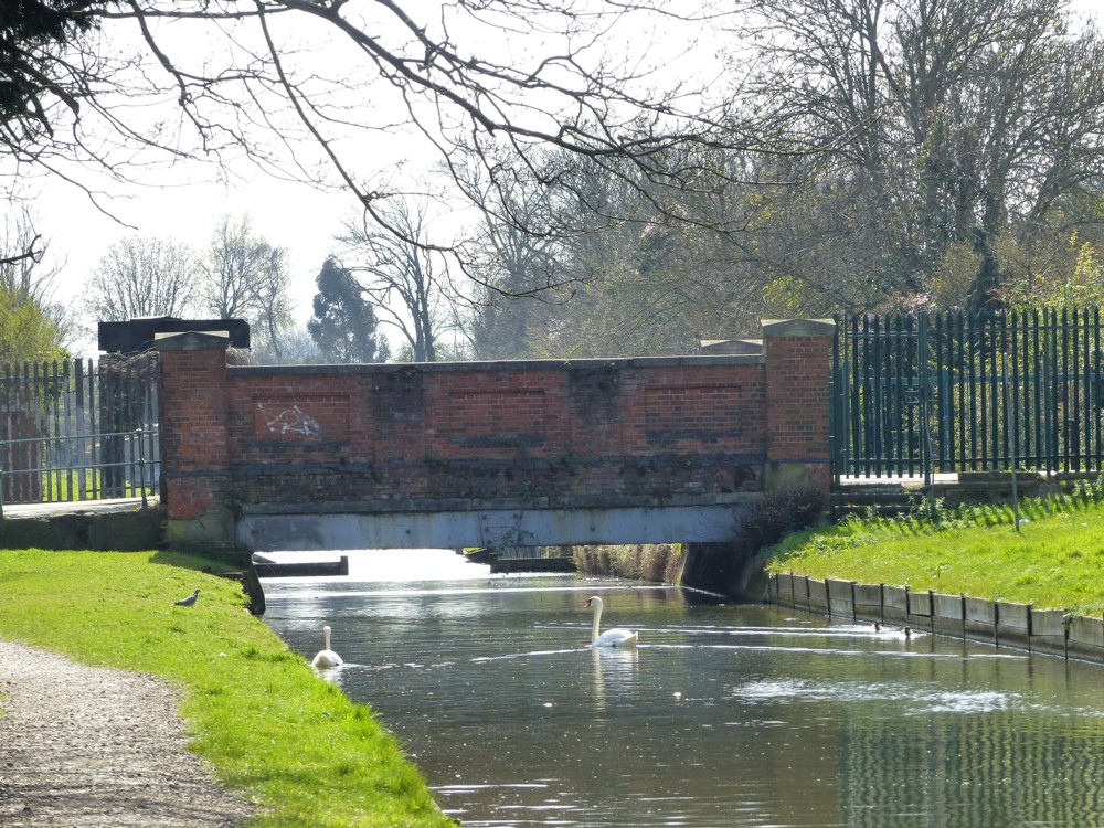
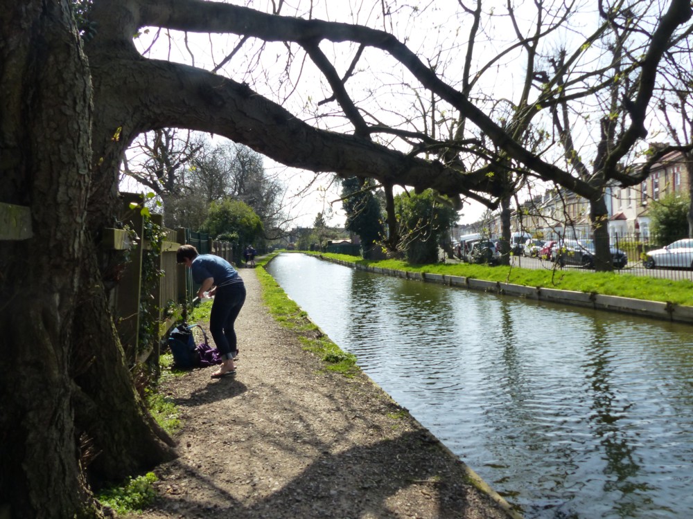
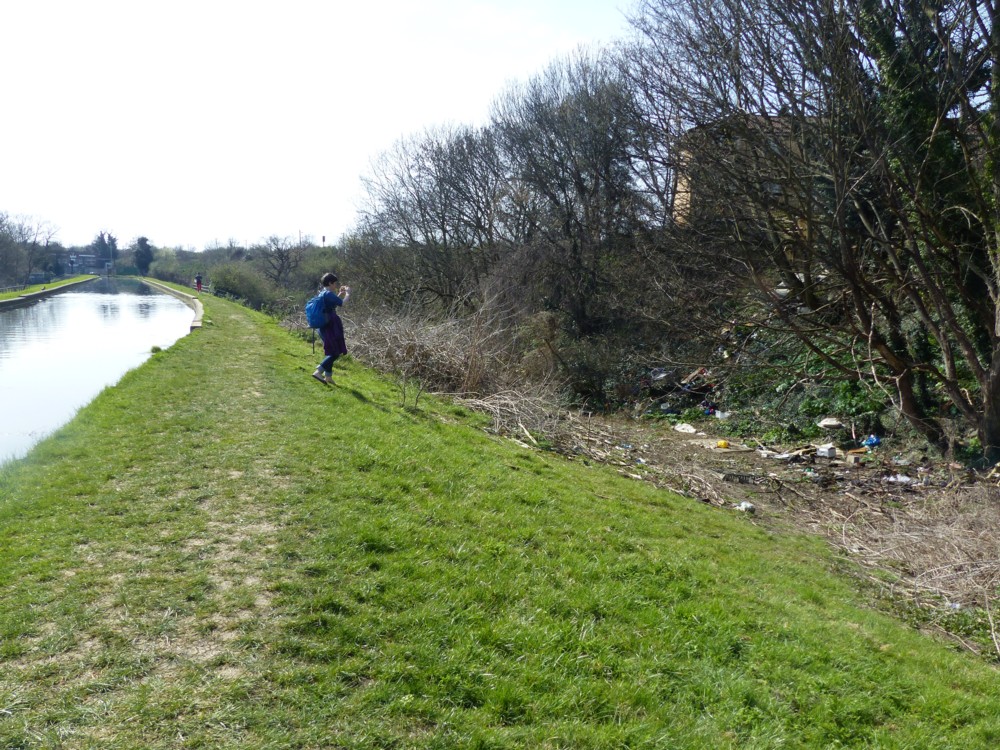
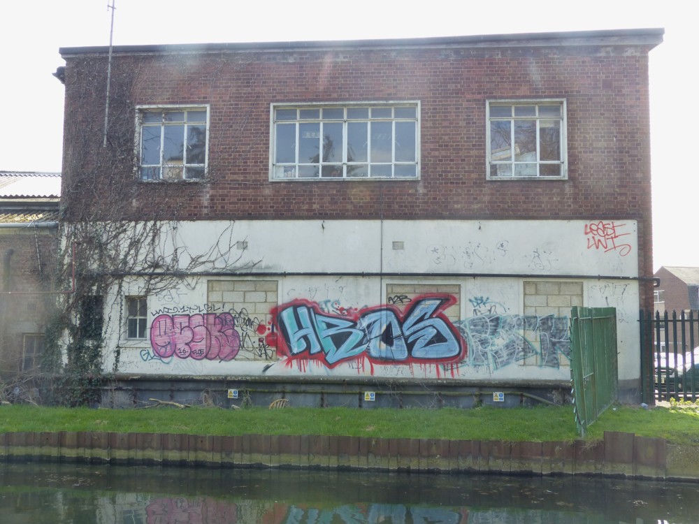
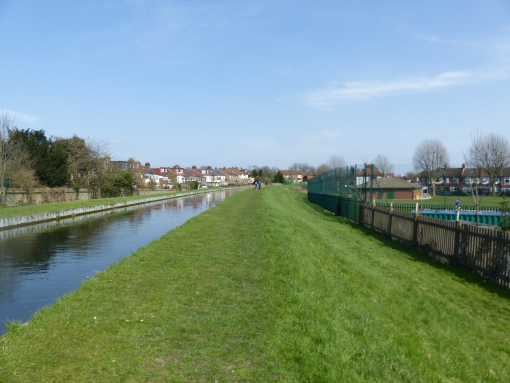
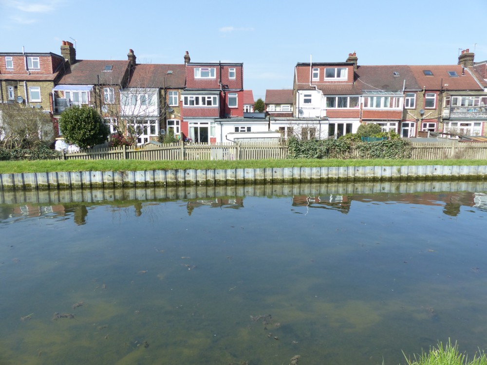
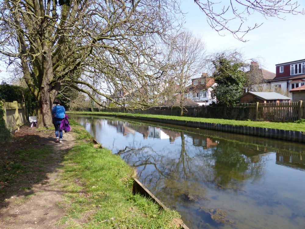
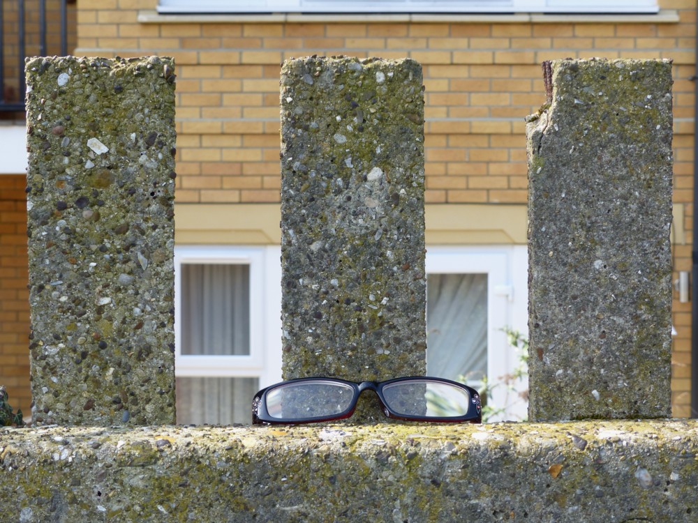
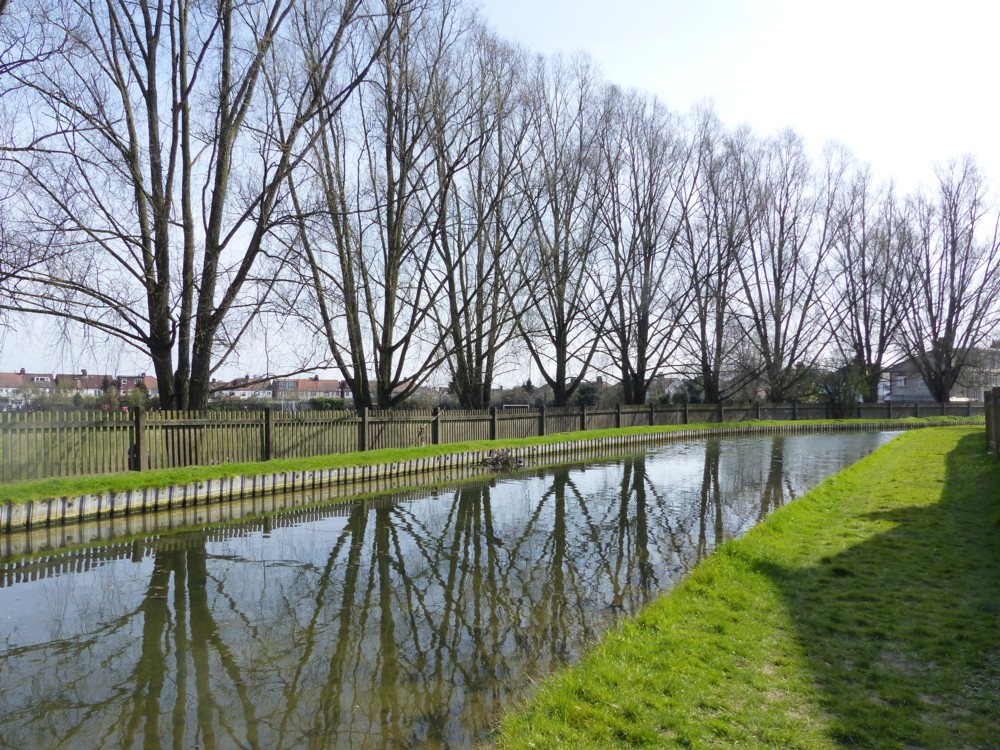
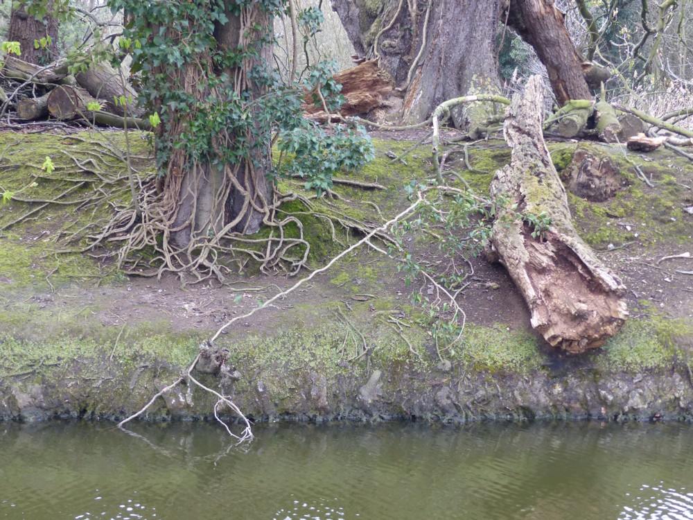
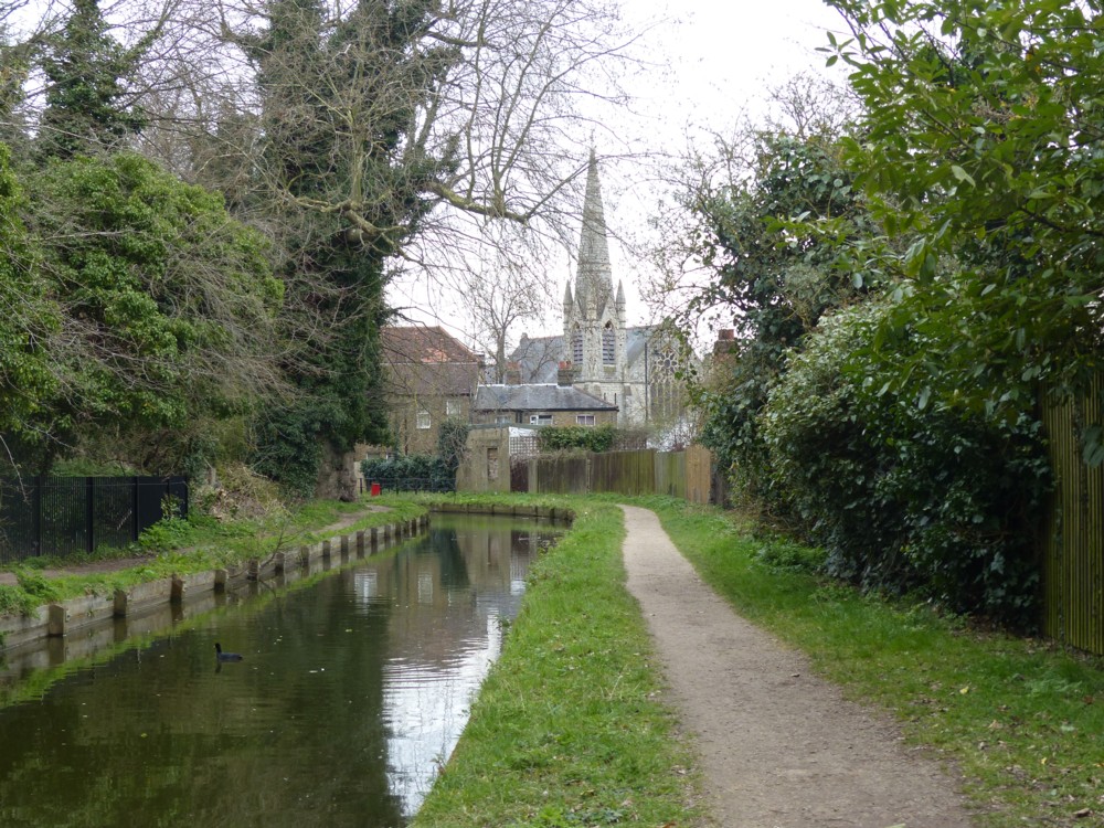
On April 2nd 2016, GodDaughter1 and I went on a photo-expedition along the New River. It was most enjoyable, and I prepared another of those big photo-clutches that I could seldom bother to do on the Old Blog, so that you can now, if you feel like it, click-click-click through them on this New Blog. But I also wanted to link back to an earlier posting I did about a rather exotic looking duck that we had encountered that same day.

For reasons explained in this posting, all postings on the Old Blog linked back to from this blog have to have been transferred to the New Blog. So, here I am linking back to What sort of duck is this?

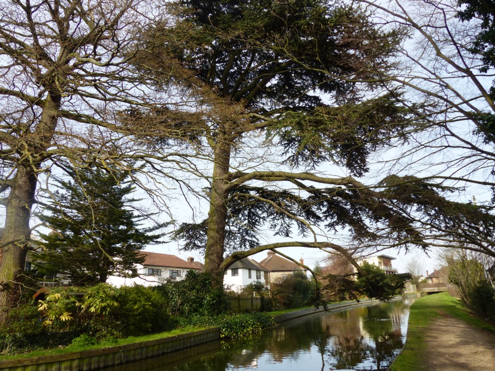
But, problem. That posting itself linked back to a posting about Trees pruned into strange sculptures, because GD1 and I encountered a really strange piece of tree surgery (photo (6.2), on that same expedition.

Which, in its turn linked back to Losing the leaves in Victoria Park, because, well, because it did. So that had to be transferred across too.

When I put it like that, it all seems pretty simple. But following the link chain backwards and then forwards again, opening up each posting about four times over, was the Grandma of all muddles that I had not seen coming, and muddles you do not see coming can get really muddled.

Anyway, it’s all sorted now, and here are all those photos I mentioned, at the top of this:

My favourite is the plate-shaped foliage that has been emptied upside down into the water (photo 28 (4.4)).

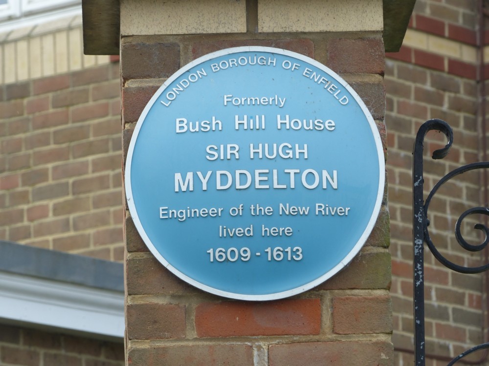
There’s lots more I could say about all these photos, but this posting has already gone on far too long, and I confine myself now to saying: See also the plaque about Sir Hugh Myddelton (photo 37 (5.5)), who designed the New River. Designed? You don’t design rivers. They’re just there. But yes, he designed it. The point being it was designed and built, to supply London with fresh water, right at the beginning of the seventeenth century. So, at a time when so many stupid things were in the process of happening, something truly creative also happened.

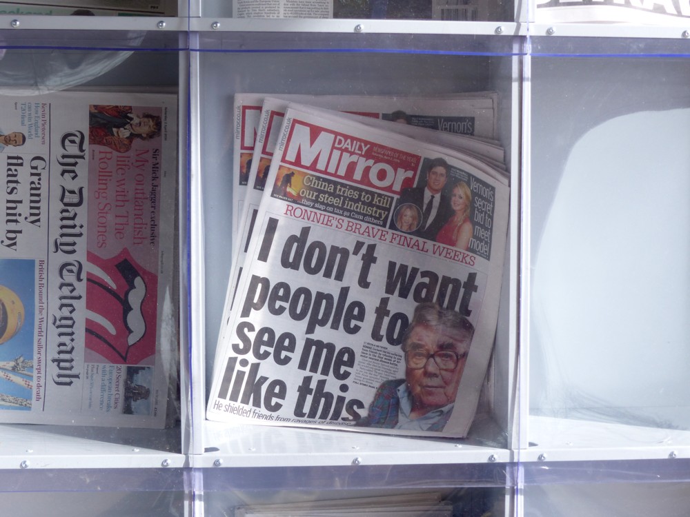
Well, one other thing: the occasional interpolation of extreme urbanness (e.g. a newspaper headline about Ronnie Corbett (photo 27 (4.3)) and the van covered in stickers (photo 21 (3.5)) is because when you walk along beside the New River, it sometimes dives underground and you have to go up to regular London, until you get to the next bit.

An inflated unicorn with a serious point attached

It’s Friday, so time for some Frivilous Friday Other Creature Fun:

Photoed by me on the South Bank, under Waterloo Bridge, in the summer of 2016, in a time when you were able to purchase such non-essaential things, without having to wait for them to be delivered. Photo severely cropped to eliminate faces of strangers.

That’s it, really. So skip this next bit if all you wanted was Friday silliness. But if I want to be a bit more serious, as I find that I now do, I could and will connect this photo to one of my recent themes here, namely colourful architecture. A strand in that tapestry of thought of mine, as woven in several recent posts here, says that architecture lags behind the design of other and smaller things, because architects have to be powerful to do what they do and consequently older. And another strand in the same tapestry goes that smaller things, already designed by mere designers, who are on average younger, for their customers, ditto, are already now more colourful. Just like the above unicorn. Sooner or later, architecture will follow. Here endeth the lesson.

Also, nice hairdo.

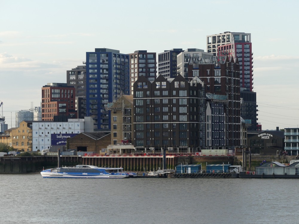
The London City Island cluster from across the River

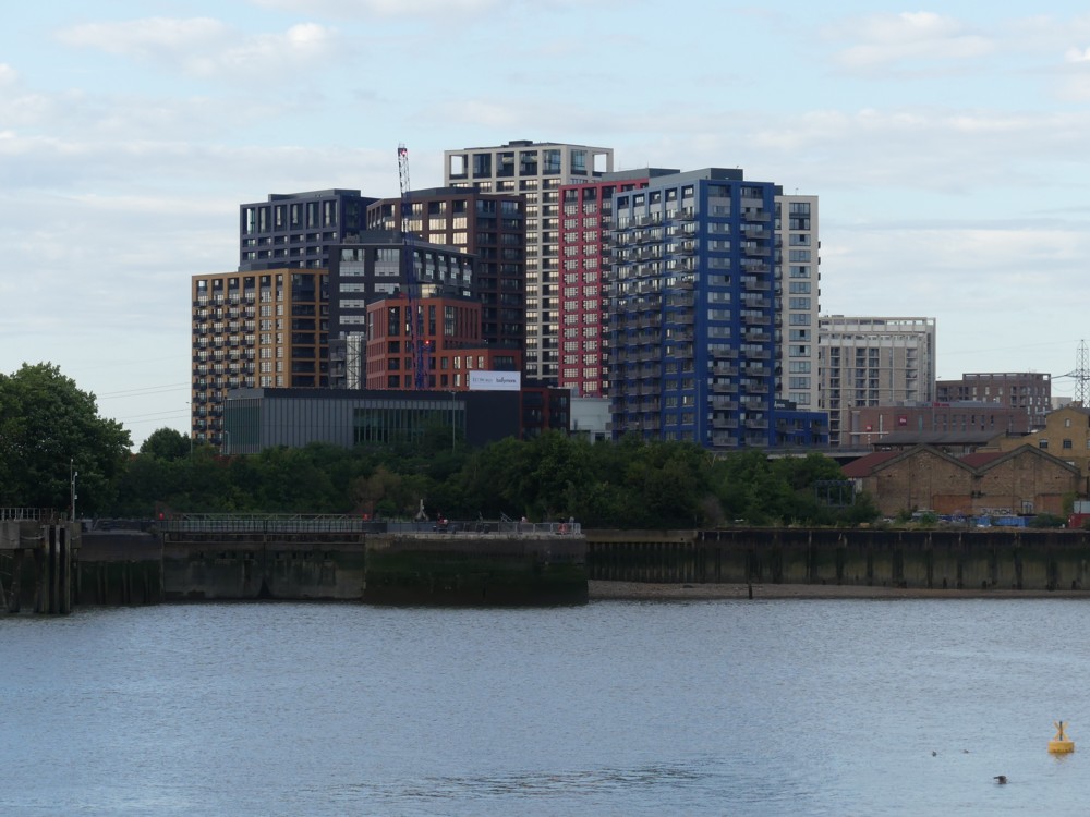
Last year, at the end of July, I went on an expedition out East, to the Dome and related attractions and excitements, and this evening I was looking through all the photos from that expedition, some of which I’ve shown here already. And, I found myself rather liking these two photos, both of the London City Island tower cluster, on the other side of the River from where I was:

This cluster is just the the other side of the River Lea (the final meanderings of which create the island in question), from Canning Town Station. The one on the right photoed about forty minutes of wandering downstream after the the one on the left.

In the second and smaller of the two images in this 2015 posting from the Old Blog, now here, you can see an aerial fake-photo of how they then merely reckoned it would look. By now, it’ll be finished and occupied.

London is fast become a city not so much of towers, but of tower clusters. The Big Things of the City have now coalesced into one big lump. Docklands ditto. Battersea is heading that way. Soon there’ll be another cluster, upstream from Tate Modern. In the years to come, it may join up with the nearby cluster around the old Shell Building at Waterloo, next to the Wheel.

The light wasn’t that good when I photoed the above photos, but you can see what I want you to see. What I like about this London City Island cluster is that, well, I like it. Its basic job is to fit lots of people into a small area, without excessive cost or bother in the form of “architecture” – unfunctional curves and weird shapes of various sorts, or strange structural illogicalities. This isn’t Starchitecture. It’s a collection of Machines for Living In. But, because the design of all the blocks has been made, as it were, to “rhyme”, the effect is rather pleasing, unlike the usual London cluster mess. Don’t misunderstand me, I don’t mind cluster messes. They’re very London. But I’m glad that one of these clusters is a bit more aesthetically coordinated, because it makes a change. The bright colours of each of the towers adds to the air of a group of buildings all designed at the same time. In London, this seldom seems to happen.

But, if you come back at me and say it’s just ugly lumps, in the usual London way, well, so be it, I won’t argue. Like I say, basically these are Machines for Living In. What they do for London is accommodate more people in comfort. How it all looks is somewhat beside that point.
But, I like the way it looks.

The e-scooter story gets more interesting – in Sainsburys

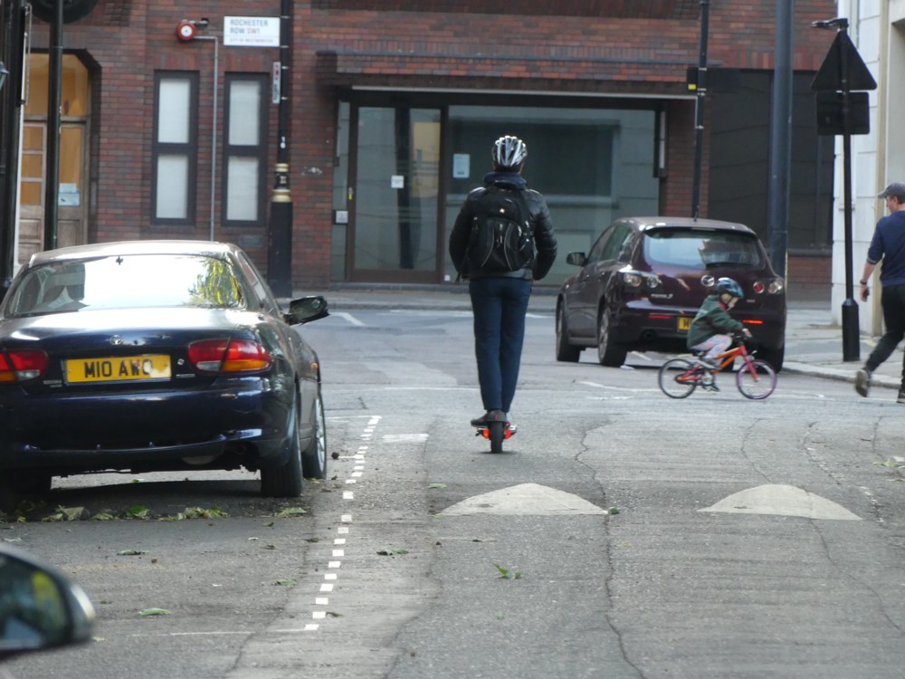
Last night I went shopping, and was out for about an hour. In that time, I observed three more e-scooters in action. Three. In the space of an hour.

First, on the left below, was the usual. A guy on an e-scooter, scooting past me so quickly I hardly saw him. This time, I did have a camera with me, and managed the photo you see. Thank goodness for zoom:

On the right, it gets a bit more interesting. We are now in my local supermarket of choice, Sainsburys. I spotted a lady pushing what I could clearly see (from the wires) was an e-scooter with an e-. I asked her, as super-politely as I could manage given the circumstances, if I could photo her e-scooter. “I’m writing an article about e-scooters.” “Not you, just the scooter.” She agree very readily, so there is her e-scooter.

Then it got really interesting. I spotted a guy, not just pushing his e-scooter around, but using it to carry his basket of purchases. Same request from me. Photo please, not you, just the e-scooter, please say if you don’t want this, ingratiate ingratiate. But, surprising answer, beyond the Yes Fine Photo Away bit, I mean. Turned out this was the same guy and the same e-scooter as in this earlier posting here. “You photoed me before!” Oh, wow, that was you.

So again with the photoing, not of him but of the e-scooter, this time with his shopping basket aboard:

You can see a bit of my basket on the right there. The real point, however, is how very fortuitously convenient it is to plonk your basket on an e-scooter like that. Nobody planned this. When they were designing e-scooters, nobody said, what about supermarket shopping? It just happens to work well. You’ll be seeing a lot more of this in the future. There will probably even be design tweaking, to include a shopping basket of this sort in the design of the entire e-scooter, just like is happening with food delivery motor-scooters.

I asked E-scooter Man if he’d had any grief about bringing his e-scooter into Sainsburys. Funny you should ask, he said. No grief from Sainsburys, but, the nearby Tesco wouldn’t let him do this. So he said, fine, I’ve been shopping at Tesco’s all my life, but if you don’t want this, I’ll take my business elsewhere. No problem, your gaff your rules, but I’m off. Whether these contrasting decisions reflected a big Tesco-v-Sainsburys commercial divergence, is some sort of class thing, or merely reflects that Sainsburys has bigger aisles, I do not know. My guess is, local staff made it up, but Tesco will give it further thought. Prediction: the design of shops will also be affected.

E-scooter Man agreed with my claim that bikes are useless for urban shopping, because you have to leave them outside, and sooner or later, they’ll get stolen. “I’m not leaving my bike out there.” Everywhere I go in London I see bikes parked outside, and a regular percentage of them are severely damaged, especially the wheels. Sometimes entire bits are missing. And of course if it’s all been nicked, you don’t see that, but it still happened. But, when you stop riding your e-scooter you can take it with you. Above all, if necessary, you can carry it with you. If, in mid-shop, they tell you to stop pushing it around, you can simply fold it up and carry it. Are they going to even forbid you to do that? Surely not. You need never be separated from from your e-scooter. Which means it could still be mugged from you, but is far, far less likely to simply be stolen or maliciously wrecked in your absence.

New category here. E-scooters.

Shark skin under microscope

Is this for steering, or just to damage you if you rub them up the wrong way?

With thanks to Matt Ridley’s Twitter feed.

According to a commenter, these are “dermodenticles”, but google asks: Did you mean dermal denticles?

According to this:

These denticles decrease drag and turbulence, allowing the shark to swim faster and more quietly. Olympian swimsuit designers have taken a page from the shark’s playbook and created a fabric that mimics the exact proportion of the shark’s denticles, hugely improving a swimmer’s speed.>

Blog and learn.

The China Works Tower

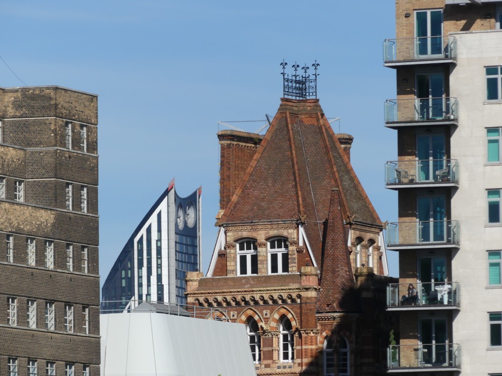
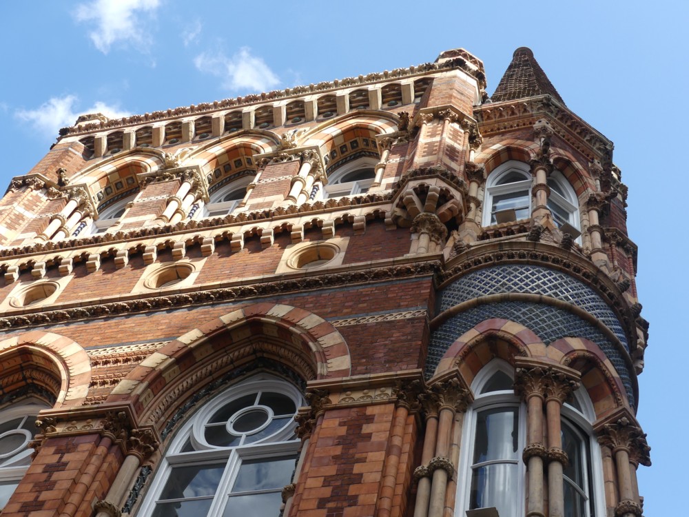
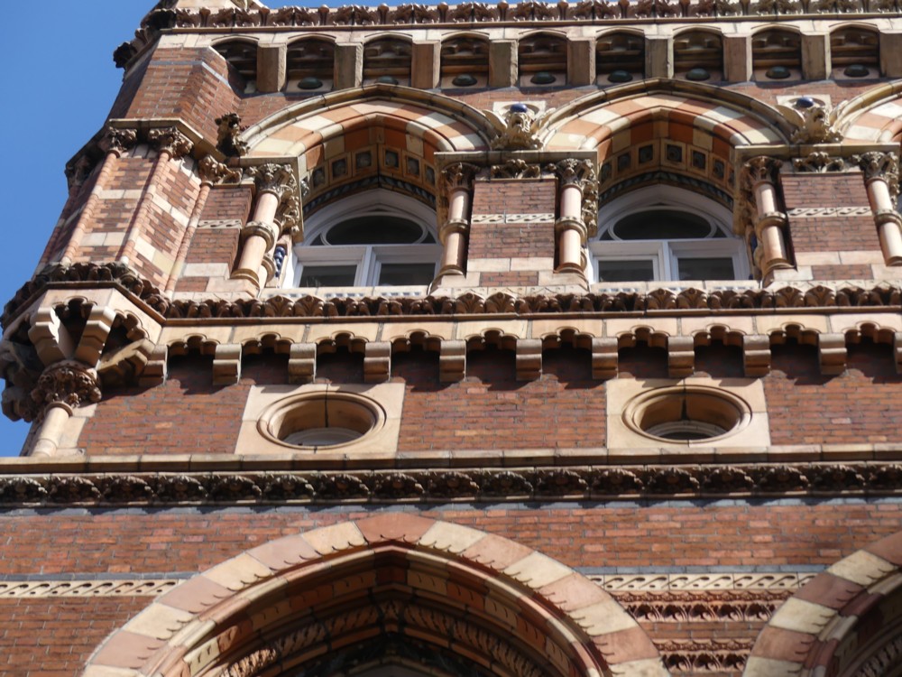
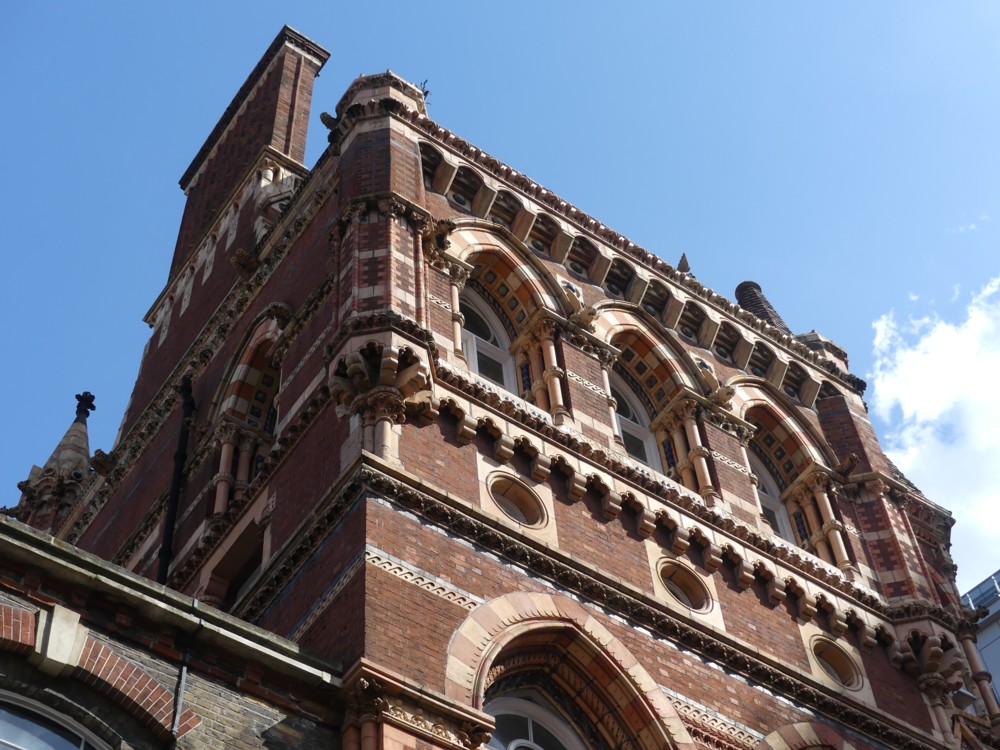
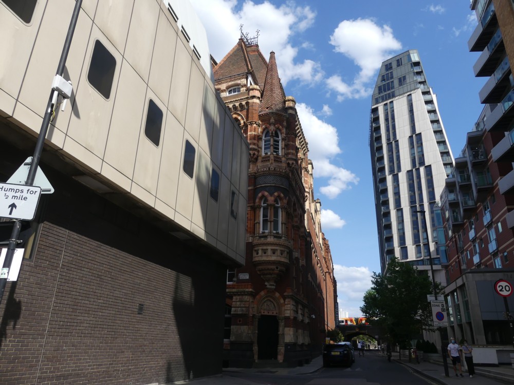
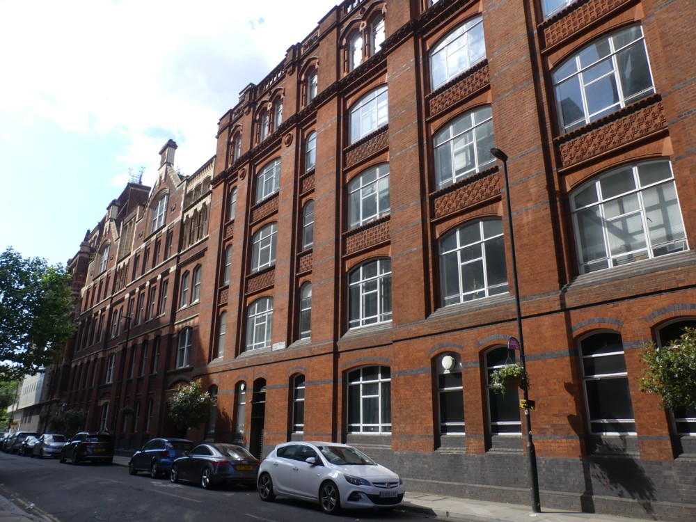
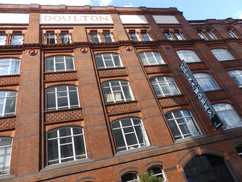
A while back I was walking along by the River, just upstream from Lambeth Bridge, and photoed this photo (number 5 of these) of the China Works Tower (thank you commenter Alastair for identifying it):

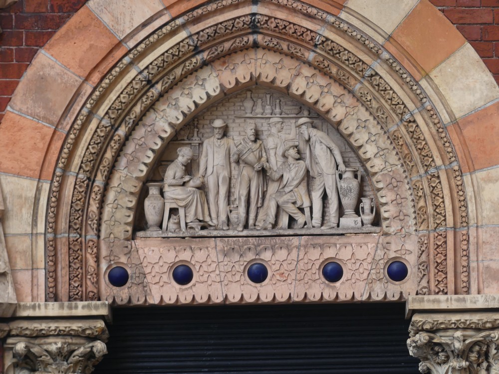
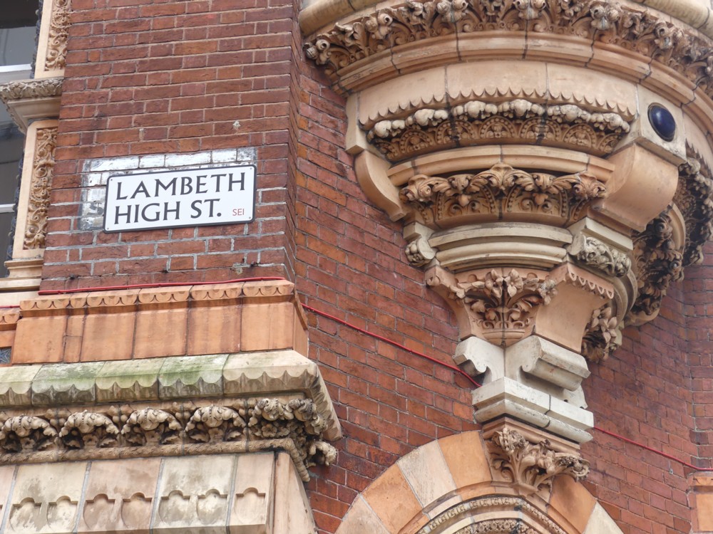
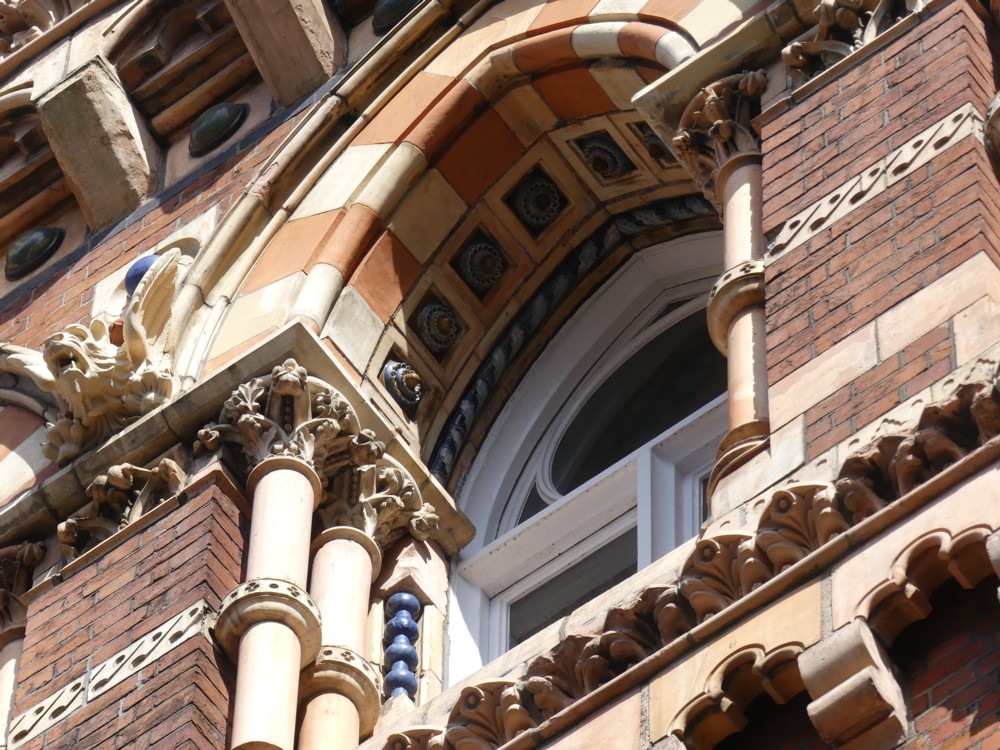
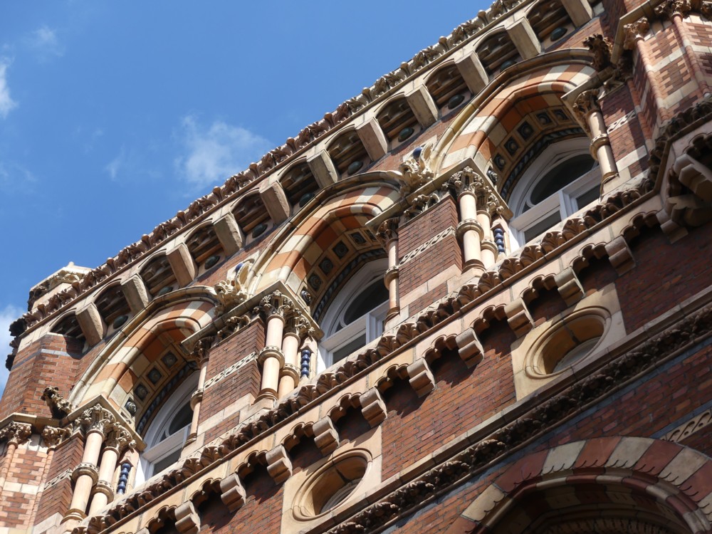
Also a while ago now, I went back there, yes, to photo stuff like all the signs at the other end of that link, but basically to check out this China Works building from close-up:

In an earlier posting here about would-be applier of architectural decoration Adam Nathaniel Furman, I said:

Furman intends to apply ornament with colourful abandon.

But, not the old sort of ornament that the Victorians liked to do, and against whom the original Modernists reacted with such disgust. …

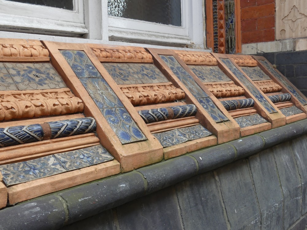
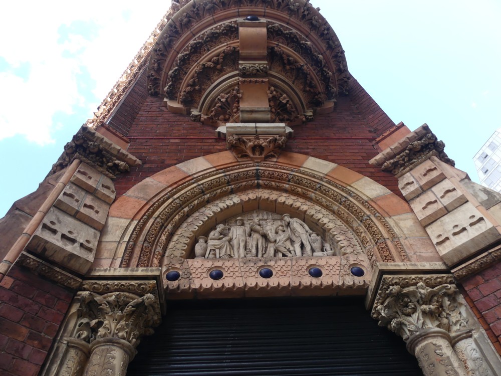
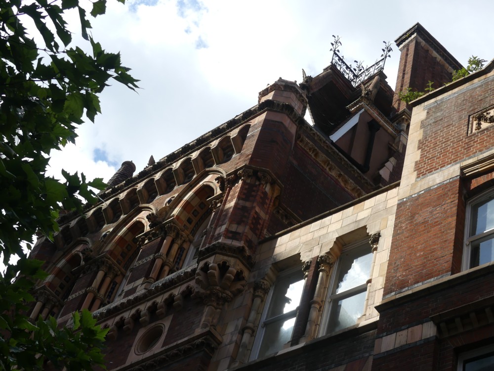
Well, the above photos are of just this old sort of ornament, the sort that Furman doesn’t want to do. But, technologically, he intends to use very similar techniques. Ceramics. Also known as: China. (Odd that, naming a material after the big old country where they got the idea from. Are there any strange things called, in foreign parts, Britain or England? So, how’s your meat? Okay, but it could use a dash of Britain. Your skirt’s falling down, try using an England.)

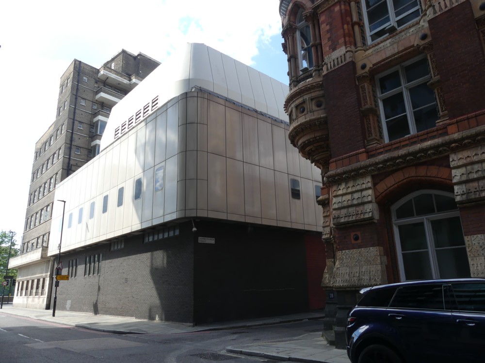
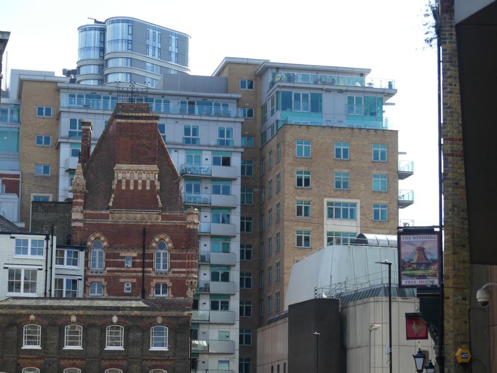
This China Works Tower is surrounded and jostled aggressively by modern buildings, designed by the sort of people who grew up believing all the old sort of ornament to be an aesthetic abomination, or at the very least an aesthetic dead-end.

The most aggressive architectural jostler is a fire station, immediately the other side of a very narrow road. Which happens to be the start of Lambeth High Street, which is odd but there you go. Here are photos I took of all that jostling, with the fire station in the middle photo here:

You can see the white roof of the fire station in the photo at the top of this posting.

Luckily, the China Works Tower is not entirely isolated, and is hence not totally smothered by later buildings. It was once only a small part of a bigger collection of buildings, and a decent chunk of those earlier buildings remains, attached to the Tower and keeping it company:

There was a lot of sunshine and shade colliding on the facade of the Tower, so that doesn’t look so good there. But the blander, less decorated and bigger stretch of the old building was easier to photo, as you can see.

I shouldn’t grumble too much. At least the Tower survived, along with a chunk of the earlier buildings it presided over. The Tower was the architectural advert, so to speak, for a real business, one that survived longer than most Victorian-era enterprises, way past World War 2. And then the Tower was saved by an early manifestation of the Conservation Movement, in the form of two rich fogeys, aesthetically speaking. The link above, in paragraph one of this, concerning the history of this place and what they’re now doing with it is well worth a follow, so here is that link again.

I wouldn’t want London to consist only of such ornamented antiquities, but I am glad that quite a lot of such oddities still survive, and that they now look like having a decent future, to follow their distinguished past. And I am glad to have lived long enough to have experienced a time when this past can be easily learned about. During the last century, I would see such a building, wonder about it for about one minute, and then forget it and move on to the next equally baffling oddity.

WHAM!

While searching the photo-archives for something else completely, I came across THIS!:

I photoed the above in the summer of 2016, in the Tate Modern gift shop.

Art galleries fascinate me, even though I often don’t like the Art that’s on show in them. And I am in particular fascinated by the gift shops that are now always attached to Art galleries. These places are often more crowded than where the Art is being shown. The above is only one of many, many photos, of Art stuff, that I have photoed in Art gallery gift shops.

In the case of this Roy Lichtenstein stuff, you can make a pretty good case for saying that those cushions, for instance, are as “authentic” Roy Lichtensteins as the “original” painting that the cushions were copied from. After all, the “original” painting was itself a copy, of something a lot like the cushions. And the original comic that Lichtenstein copied his painting from was mass produced, just like the cushions. Only the fetishism of the authentic unique object, by an officially recognised Artist, is holding back the dam of absurdity here.

I’m guessing that the business that Art galleries do in their gift shops, and in their equally vital coffee shops, is the difference between economic famine and something more like feast.

I also think that Art galleries are popular places to spend time in, again not because of the Art, but because of the quiet. Art galleries do not, on the whole, play annoying music, and talking in loud voices is considered boorish. The result is something a lot like a church.

Adam Nathaniel Furman – Colourful Modernist

Here we go. Colourful Modernism is on the up-and-up:

Design education “brainwashes” students into rejecting colour, pattern and ornament, according to Adam Nathaniel Furman, who said a group of London designers is finally overcoming bias against their use.

Furman named the movement “New London Fabulous” and described it as “design and architecture as a visual and cultural pursuit, which is highly aesthetic, sensual and celebratory of mixed cultures”.

The thing you have to understand about “architecture” (as opposed to just shoving up machines for living and/or working in) is that famous architects do most of it, and you have to work long and hard to become one of these people. What designers and architects aged around 35-40 are fantasising is not what gets done, except on a very small scale.

Architecture is not like Art. Art, you can actually do, now, whoever you are. You don’t need a room full of old people to all agree to spend a huge amount of money on it. (It helps that in addition to costing nothing, Art doesn’t have to “work”, as in: not collapse and not leak, and so forth.) But “architecture” needs just this sort of tedious functionality. So, you need to have spent a life-time impressing the clusters of old people who matter, persuading them that you are a safe enough pair of hands as well as a genius, blah blah. Your contemporaries with proper jobs, basically. So, you spend your life doing architectural propaganda and publicity. You do manifestos, books, essays, and little design jobs that attract disproportionate attention, given their often humiliating size (i.e. lack of it). Like Adam Nathaniel Furman is doing. Then, when you’re about sixty, the old men may pick you from the ranks of all the propagandists and visionaries, and let you build a bank headquarters building or an apartment tower or a museum, and that’s your chance. If that stays up, doesn’t leak, and attracts tourists and sells in miniature form in tourist shops and on postcards – if it is declared to be “iconic”, you then have the rest of your life to go on doing “architecture”. You become, as we now say, a Starchitect. Main rule to follow then: stay alive as long as you can.

Notice how Furman is both turning his back on “Modernism” and yet not doing this. His stuff, if and when he ever builds much of it, will still look “modern”. It is merely that he is utterly rejecting one of the founding principles of Modernism. He embraces colour, and also “pattern and ornament”. As he points out, “Modernism” as originally proclaimed, was often quite colourful. But the colours were just painted on. Colour was not stuck on, in an obviously colourful way. “Applied ornament” was an object of hatred and contempt for the original Modernists, and in practise, as we know, they and their followers mostly shunned bright colours also. Furman intends to apply ornament with colourful abandon.

But, not the old sort of ornament that the Victorians liked to do, and against whom the original Modernists reacted with such disgust. Furman is proposing enough of a change to enable architecture fans like me to see something big happening. What he is not saying, merely because Ancientists also like “pattern and ornament”, is that he actually wants to be an Ancientist himself. Perish the thought. He wants to “celebrate all cultures”, rather than just ours as it used to be.

Personally, I find Furman’s “fabulous” designs more than somewhat garish and over-the-top. But then, I almost always dislike strikingly new architecture, until I see it and get used to it. And whether I personally end up liking whatever Furman builds or not, in London it will fit right in. Why shouldn’t it? Everything else does.

Train chat – ugly and old versus pretty and new – double-decker trains in Britain

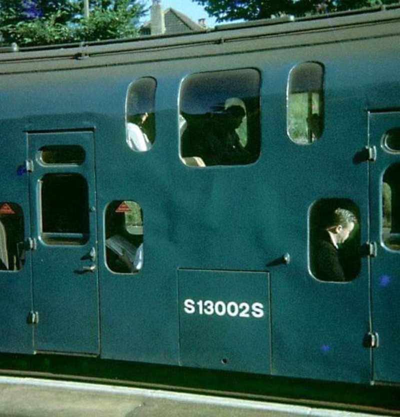
I get nostalgic about cars, even though cars have clearly improved quite a lot since my childhood. But the trains of my childhood, them I do not miss. The average train in Britain has, I think, got a lot prettier and nicer to use than the immediately-post-Beeching clunkers I used to travel in from Egham to Waterloo.

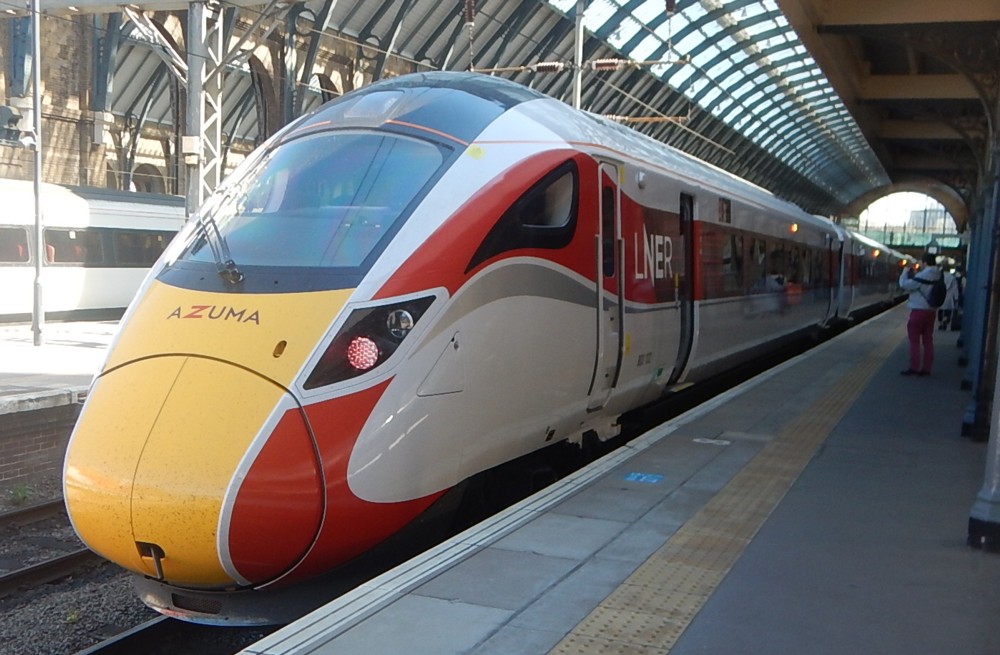
Recently, in connection with some forgettable muddle concerning some bad weather which had disrupted train services, I came upon a photo that illustrated this. Or I came upon another photo, and googled “azuma” (sounds like an on-line gambling den), and got to this photo, whichever:

My point being that that is a really sweet looking train, compared to the lumpish Southern Region trains I remember. Automatic doors have replaced doors which were like the doors of bank safes. Light materials have replaced heavy materials. There is elegant streamlining sculpture at the front. The carriage is one long single compartment, instead of divided into separate compartments, in which you could get stuck with a weirdo. (I realise now that I was often that weirdo.) That kind of thing. Just getting on and off these horrible old trains took about three minutes, compared to the about-one-minute process that happens now.

Well, more recently, on another random walk through The Internet, I came upon this amazingly angry blog posting, about double decker trains, which featured this amazing photo, of a British double-decker train:

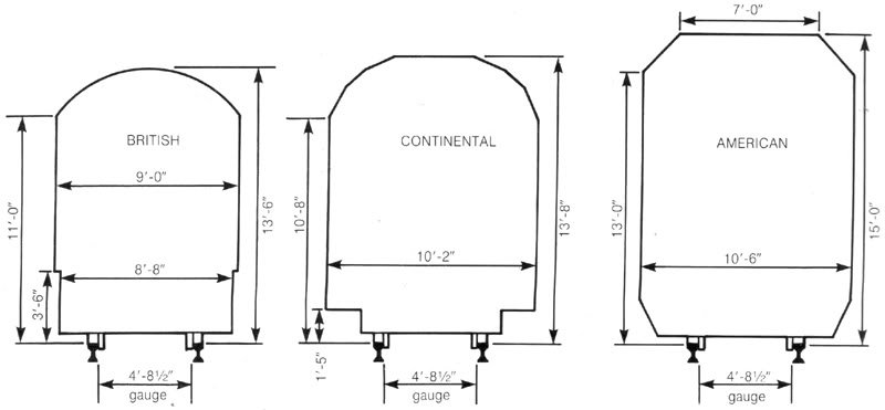
Double decker trains are common on the Continent, but not here in Britain, and this angry blogger is not happy about this! But the reasons for their absence here seem to be more complicated than I had supposed. It’s not that there is simply no room for them under our bridges. It seems that they were tried (see above), but were not persisted with.

This intriguing graphic shows that actually, Britain could accommodate such trains, if it wanted to:

I did not know this.

Unlike this angry writer, of the angry blog post where I found these images, I am quite used to not understanding why something has happened that makes no sense to me, or in this case has not happened when it might make sense to me. No doubt those far closer to the action than me or than Angry Blogger have their reasons. Also, Angry Blogger doesn’t think like an economist or a man of business, but more like a Continental dirigiste. He wants double-decker trains! If those who should have arranged this, but who didn’t, chose not to because of various quite subtle trade-offs involving how many more people you can actually fit in a double-decker train (what with having to include the stairs), how much longer it might take for people to get on-and-off them, what sort of extra air conditioning might be needed, how much heavier and more structurally robust everything might have to be, blah blah blah, then as far as Angry Blogger is concerned, it is because they lack Vision! Not because they might have looked into it, and decided to spend their limited budgets in other more humdrum and more sensible ways. (I don’t know what Angry Blogger thinks about HS2. I suspect him of broadly favouring it, but of thinking that it’s being Done All Wrong!!!)

The other thing I like about the photo of the double-decker British train is that it illustrates all that old school clunkiness that used to afflict British trains of all kinds, way back then. Yes, I remember now. I think I got into all this double-decker train stuff simply because I was looking for a picture of a clunky old train, and came upon this clunky old double-decker train.

Dig deeper into the British double decker train issue, by becoming a follower of this Twitter group, to whom Angry Blogger (to whom deep thanks despite everything) links. Where it says:

Not followed by anyone you’re following.

It figures.

Meanwhile, it is clear to me that we in Britain have double-decker buses, unlike on the Continent, because, unlike them, we have Vision!

Lambeth signs

This afternoon, I plan on retracing the steps I took last Wednesday, past Tate Ancient, along the river and across the River, to check out that Ancientist Tower that commenter Alastair so kindly identified.

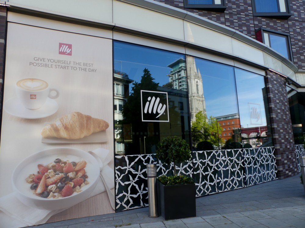
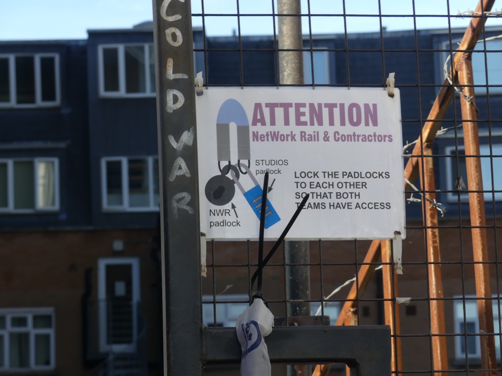
Meanwhile, here are some more photos I took on the far side of the River on that earlier expedition, of signs:

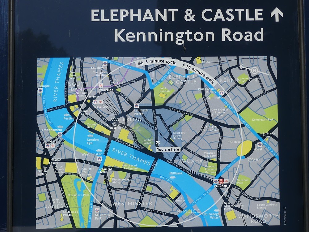
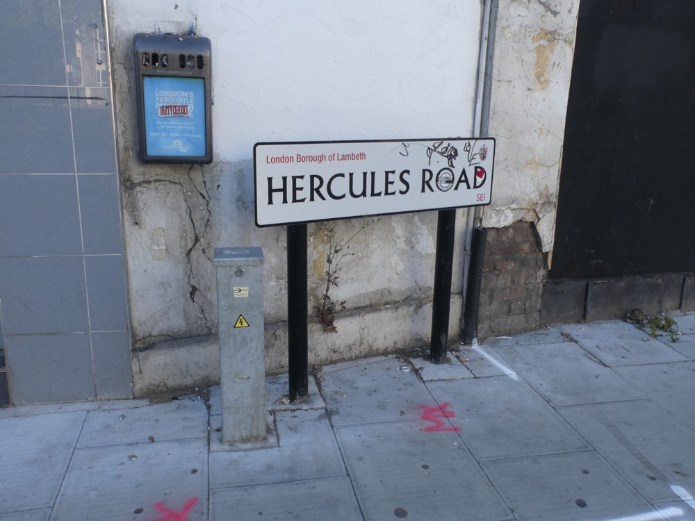
I love signs, and I love photoing signs. Photoing them is good because signs can be tedious and time-wasting to read at the time, but fun to read at your leisure. They are informative in the obvious way, and also wondrously varied in style and atmosphere. Signs, for instance, can tell you a lot about the politics of a place. How well-governed, or alternatively intrusively and officiously governed is it? By what sort of people? What’s the crime rate like in these parts? Are strangers welcome? Animals? That kind of thing. Even a mere photo of a street sign, if you include some context, can tell you a lot. A defaced sign, as in photo 8 above (a bit), tells you something, about local behaviour and about local official concern about such behaviour.

I am particularly fond of the officially erected maps that adorn all big cities these days, especially the bit where it says “You Are Here”. London’s signs of this sort are a fine example of the genre, which I constantly photo (see the first photo above), both for their aesthetic appeal, and to tell me where I was.

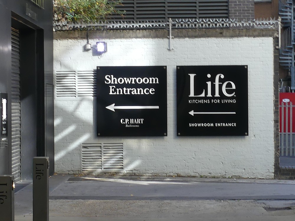
By the way Life (see photo 4) is not life; Life is (see photo 5) a kitchen appliance showroom.

All the enterprises referred to in the above signs are now, inevitably, shut. Long may that not last.