Red staircases at the top of the Heron Tower

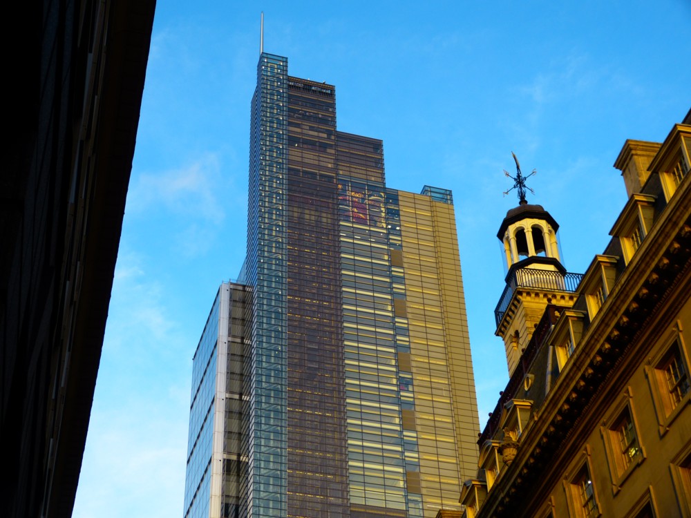
So there I was in the City of London, during the early evening of November 23rd 2012, photoing all that there ever was of The Helter Skelter that never was, and in among all that I also photoed the Heron Tower. The one that used to be called the Heron Tower, which they tried to call the Salesforce Tower, but which remains the Heron Tower:

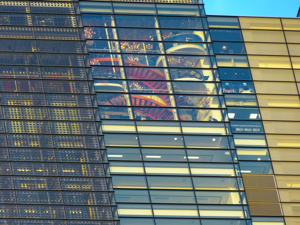
That being a photo that wouldn’t be worth showing here, except that the reason I photoed it was that it explained and supplied context for this next photo, which I had photoed a few moments earlier:

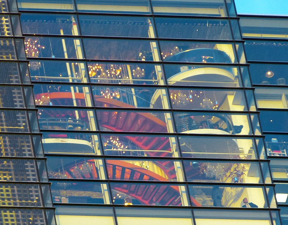
Let’s take a look at what we see there in more closer-upper detail:

I like how we have that bloke bottom right, telling us the size of everything. It’s bigger than I’d have guessed without him there.

It’s not often you get to see inside the tops of towers like that. It helped that it was early evening, because that’s the time when artificial light starts to assert itself, but there is still enough natural light outside for the outside of the building to be clearly visible also.

I went a-googling, to try to find out what was and maybe still is going on in there.

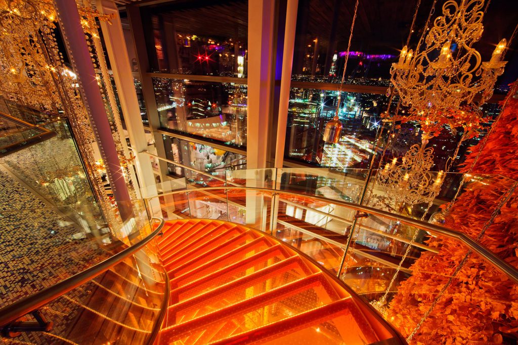
I found my way to this photo:

Curved red staircase, clearly at the top of a tower. That had to be it. And when I googled “red staircase heron tower” and that same photo came up, that settled it.

Two names kept coming up: Sushi Samba; and: Duck and Waffle. Had Sushi Samba perhaps closed, some time around 2017, and been replaced by Duck and Waffle. Sushi Samba sounds like the sort of one-off foodery that opens, and then closes; while Duck and Waffle sounds more like a tried-and-tested formula, of the sort that replaces one-off fooderies that are closing. Was that what had happened?

These people, who did the interior design for this place, explain:

This floating “culinary village” is set in a three-story crystalline volume at the top of Heron Tower, the tallest building in the City of London. The space is home to both SUSHISAMBA London, the renowned Brazilian/Peruvian/Japanese restaurant, and Duck & Waffle, a unique 24/7 restaurant that is inspired by British artistic and culinary traditions. A sweeping sculptural orange glass and metal staircase connects all three levels, decorated by a wall of street art.

So, both tried-and-tested business recipes and both happening there from the get-go, which presumably happened when the Heron Tower really was “the tallest building in the City of London”.

Another enterprise I learned about was the guys who actually built these staircases. And oh look, they also do roof clutter. Memo to self: get back to that site and have a deeper rootle around. For instance: they built/worked on that bizarre bit of roof clutter on top of the Guy’s Hospital Tower.

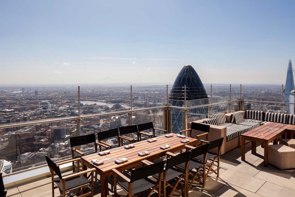
But the most enticing thing I found while scrabbling about trying to work out the SushiSamba/Duck+Waffle story was this very enticing photo:

That photo being one of these.

According to GodDaughter2’s sister, you can just go up there, with no airport checking-in crap, like it’s a regular place on the ground. I guess the Heron Tower isn’t reckoned to be “iconic” enough to merit counter-terrorism theatre.

Another memo to self: go up there.

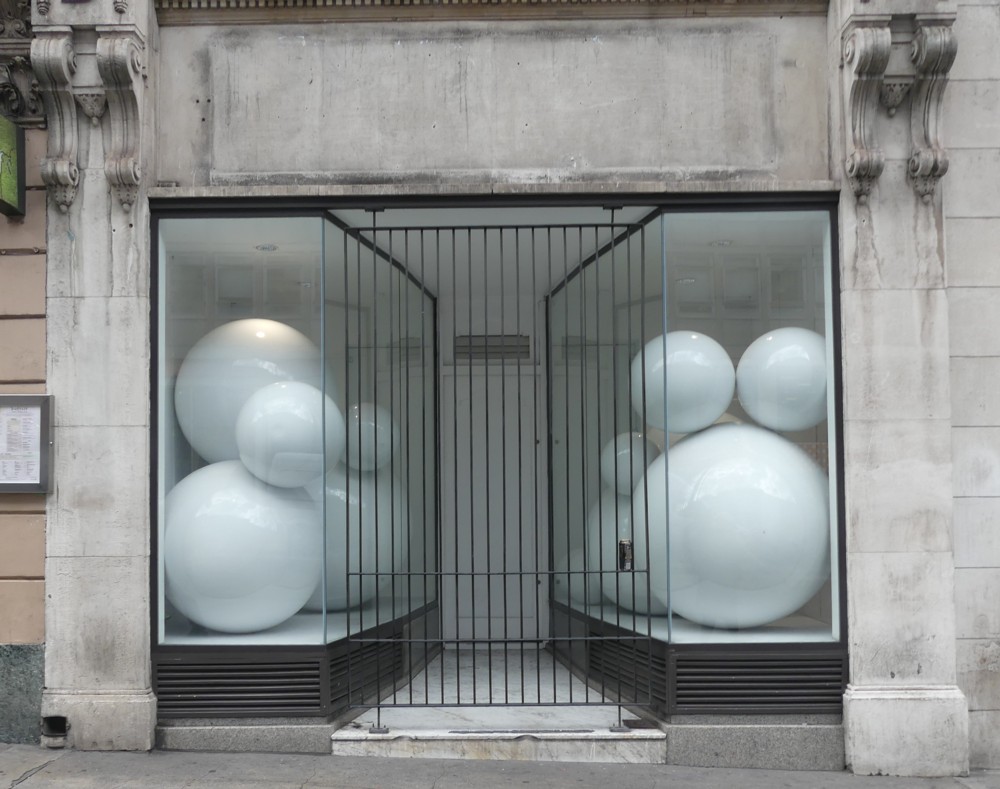
Balls

Indeed:

I have had a busy day and have a busy evening ahead of me. So, for here, I needed just one photo to stick up. And preferably one that speaks for itself, so I wouldn’t have to add lots of complicated explanation.

So, there’s a photo, which I photoed in Regent Street, back in July, on the same day I photoed these photos and these photos.

The above photo does the opposite of speak for itself. It positively demands some sort of attached explanation. But, I have no idea what that explanation might be, so have nothing to add. Which means that it actually serves my purpose very well.

Have a nice evening.

Thoughts on the British Library

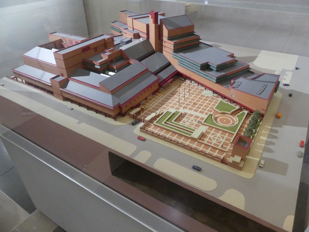
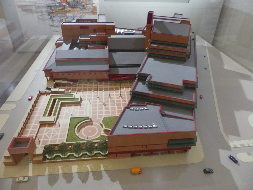
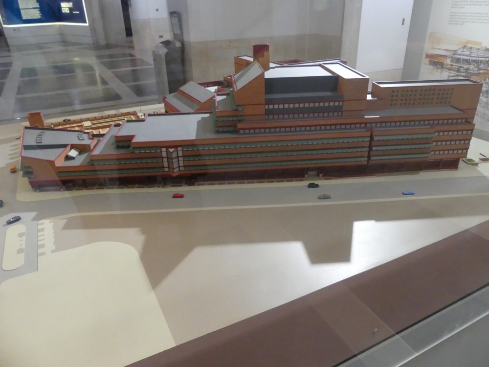
Recently a friend fixed for us to visit the British Library. Inside the British Library there is a big architectural model, of the British Library. Which looks like this:

I have never really given much attention to this building, which I now regret. Because, what a very interesting building it is.

In contrast to most of the modern architecture being done in London at the time when the British Library was built (it was opened in 1973), the British Library looks more like an assemblage of buildings than a building built all at once. Most of London’s big new architect-designed buildings from that time look geometrically pulled together, so to speak. It’s as if the architect was looking for the one big simple shape that would accommodate all the bits of the building, like someone designing the packaging for a complicated bit of equipment that consists of a number of different bits.

But with the British Library, the only unifying principle at work is that all the buildings are made with the same red bricks. That’s how you know it’s all the same building. Otherwise, the way it looks is that way because that was the way the particular bit of the building in that part of the building needed to look. It’s not so much a design as an agglomeration. A brand new exercise in the picturesque. Lots of buildings, all different from each other, all jumbled together, and all built in a similar style.

Bike with no chain

This bit of video, courtesy The Independent, impresses me greatly. It’s a new design for a bike, but a bike which doesn’t use a chain:

The bike instead uses a shaft-drive system to transmit power from the pedals to the wheel. … Manufacturers claim it makes power transfer more efficient.

I’m guessing that, if that’s true, this is made possible by new materials, and in particular by plastic that is both very light and very strong.

I particularly like how they include a multi-speed gear, just by having a cog-wheel that shifts along the shaft.

It will be interesting to see if this really is an improvement which catches on, or is merely an internet-friendly idea that turns out, for various simple or complicated reasons, not to be any use.

Says the first (cynical) commenter: it’s not new, and …:

Everything works in a lab.

We’ll see.

Palfinger Epsilon

Indeed:

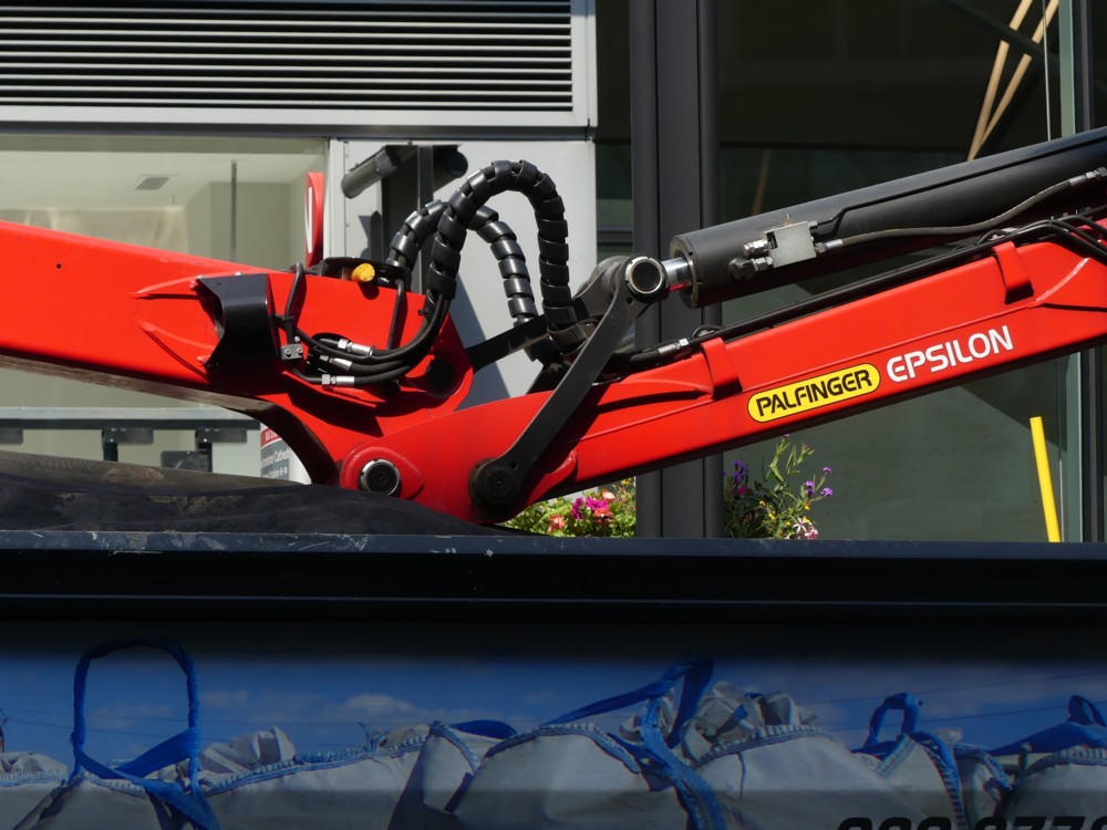
That’s a detail in the middle of a device I spotted on a lorry in Victoria Street this afternoon. It’s a grab crane.

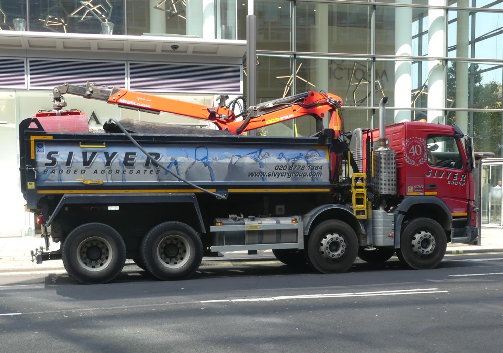
Here’s the lorry:

As you can perhaps see, the job of Palfinger Epsilon is to grab bags of bagged aggregate.

I have taken to always having a fictional book on the go, and currently that book is Vernor Vinge’s A Deepness in the Sky. Palfinger Epsilon sounds like one of the characters in this story.

Yesterday in Euston Road

Yesterday I met up with a friend in Kings Cross, and afterwards, what with the victoria Line being all over the shop, I walked along the Euston Road, to places where other tube lines could be easily reached.

Here are a few of the photos I photoed:

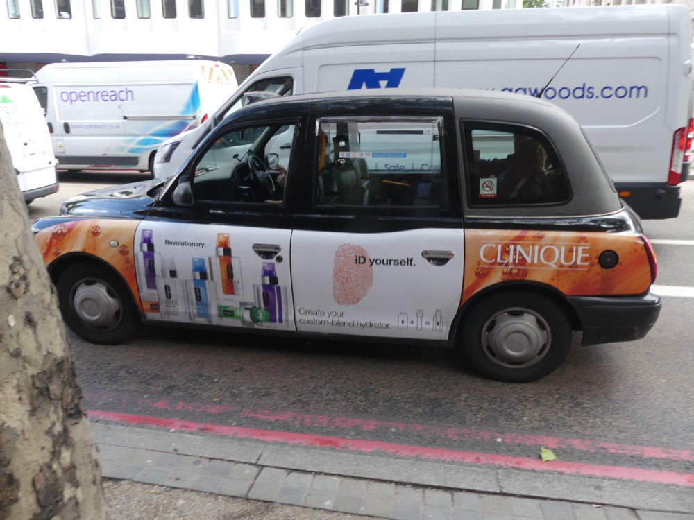
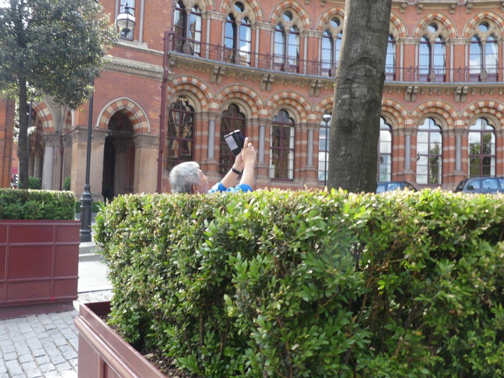
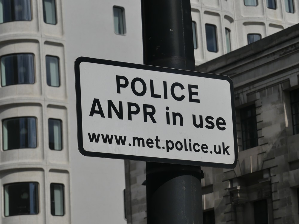
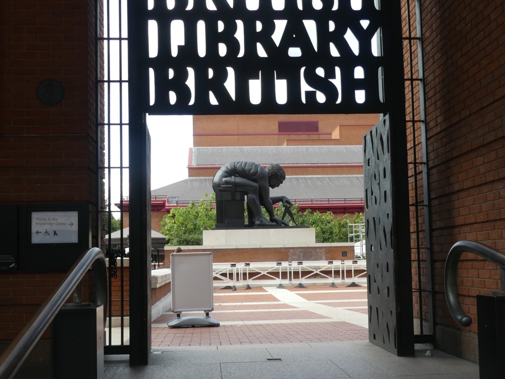
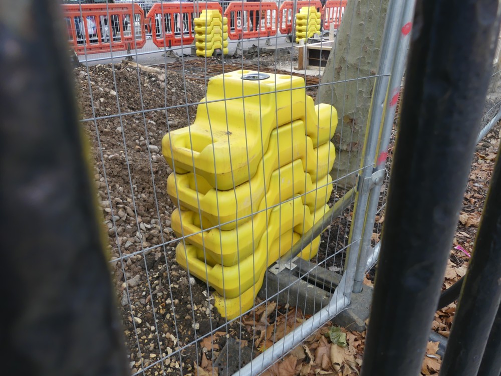
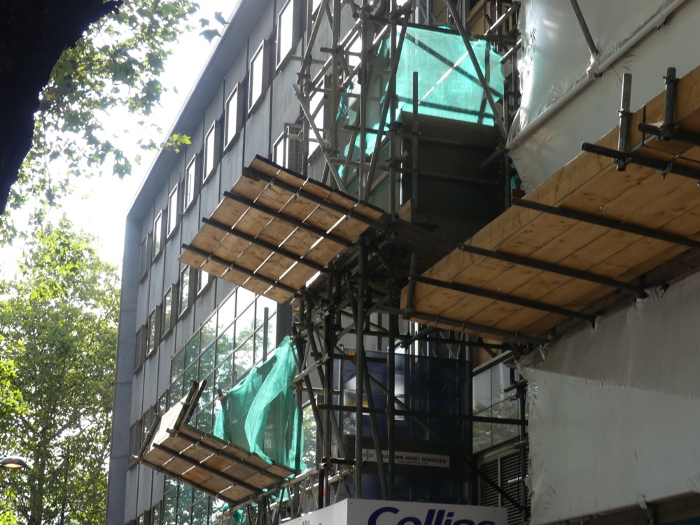
My usual preoccupations are on show. Signs (ph4 ph5), sculpture (ph5), things that look like they could be sculpture but are not, like scaffolding (ph8) and like those strange yellow things (ph7). There’s even a photoer photo (ph3), outside St Pancras. And a taxi advert (ph2, about how you can “ID yourself”.

ANPR, I now learn, refers to Automatic Number Plate Recognition, which it would appear that motorists don’t need to have explained to them. But what are the strange yellow things? Weights to stop the fences being pulled over, is my guess.

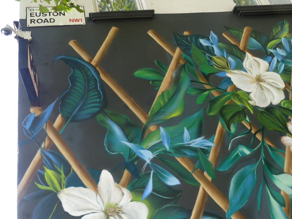
Plus, note the surveillance camera, top left, in the last otherwise oh-so-pretty photo.

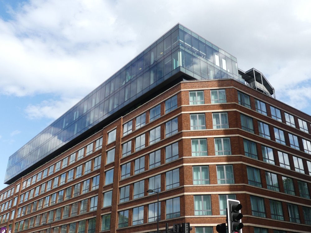
More pleasingly, I like how that glass penthouse-like (pentoffice?) addition has been added to the slightly older brick structure (ph6). The opposite of roof clutter. A lot of architecture is about adding stuff to already existing buildings these days. Which makes a nice change from smashing everything down every time, which they of course still do a lot of.

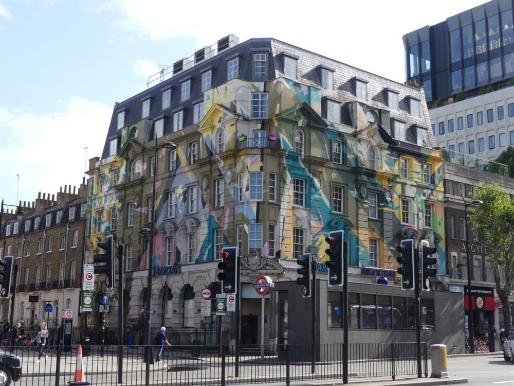
Adding stuff includes adding paint, to an already existing building (ph1). That building always amazes me whenever I see it. It’s a bank. There seems to be an architecture rule that the more flamboyant the building, the duller the institution that occupies it. Vice versa often applies too, I think.

Walking north to the Dome

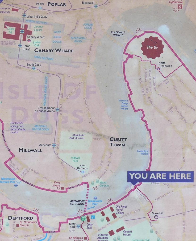
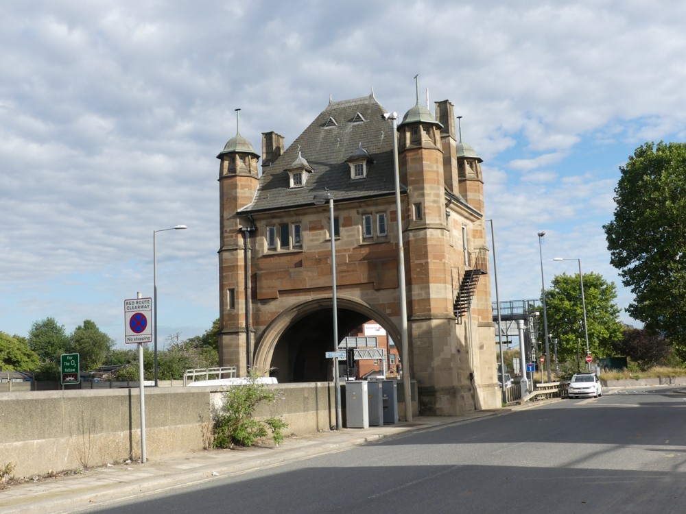
So there I was at YOU ARE HERE …:

…, and following a bit of shipspotting, I made my way north along the wiggly pink line beside the River.

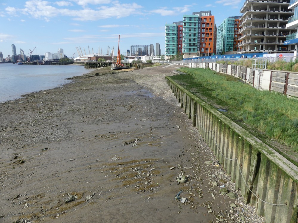
And so now here is another of those click-click-click in-your-own-time fast-or-slow-or-as-you-wish galleries, of the sort I never used to do on such a scale at the old blog, because they were so much harder to do and so much harder for you to click-click-click your way through:

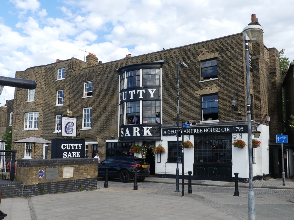
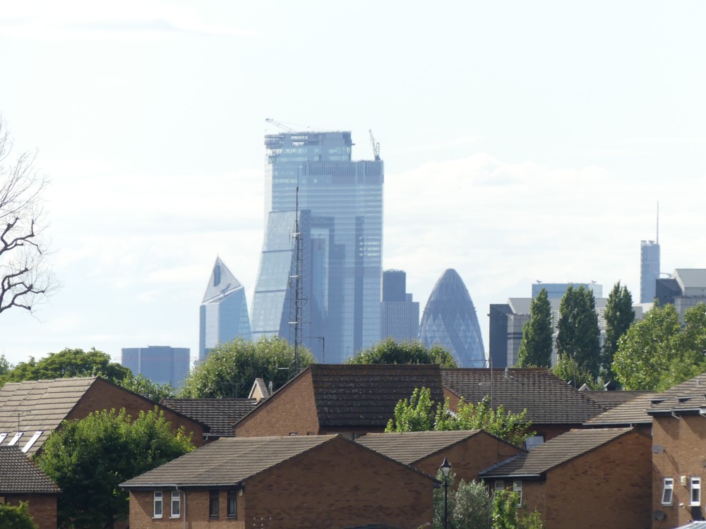
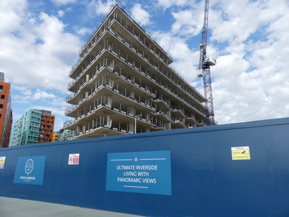
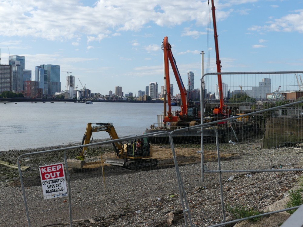
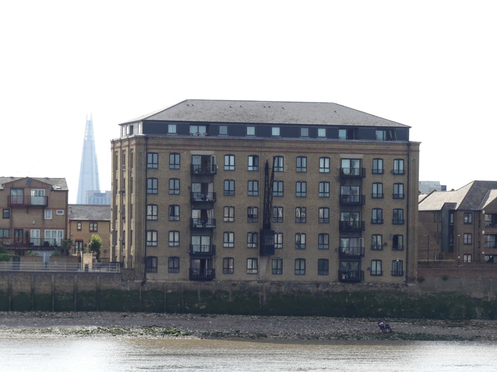
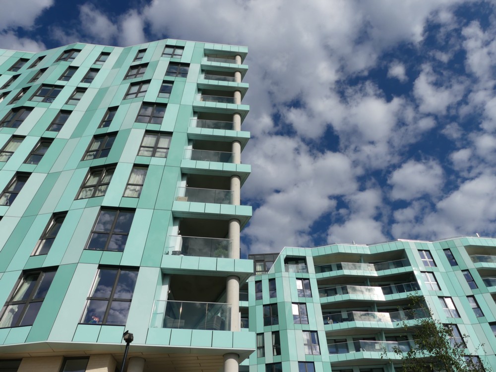
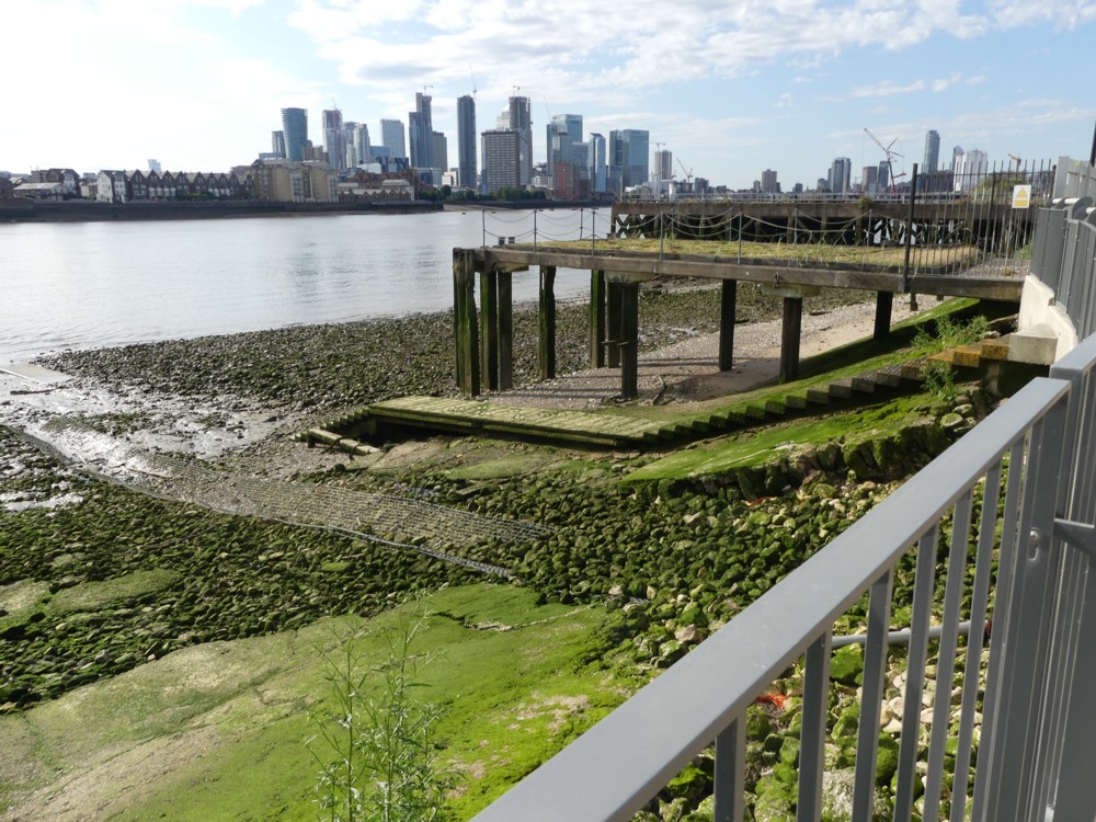
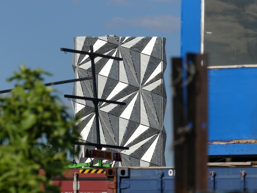
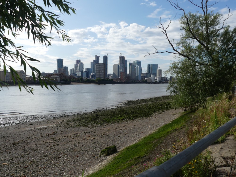
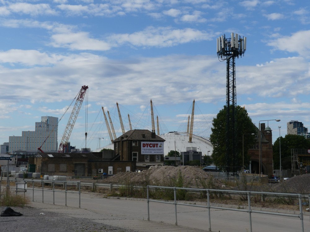
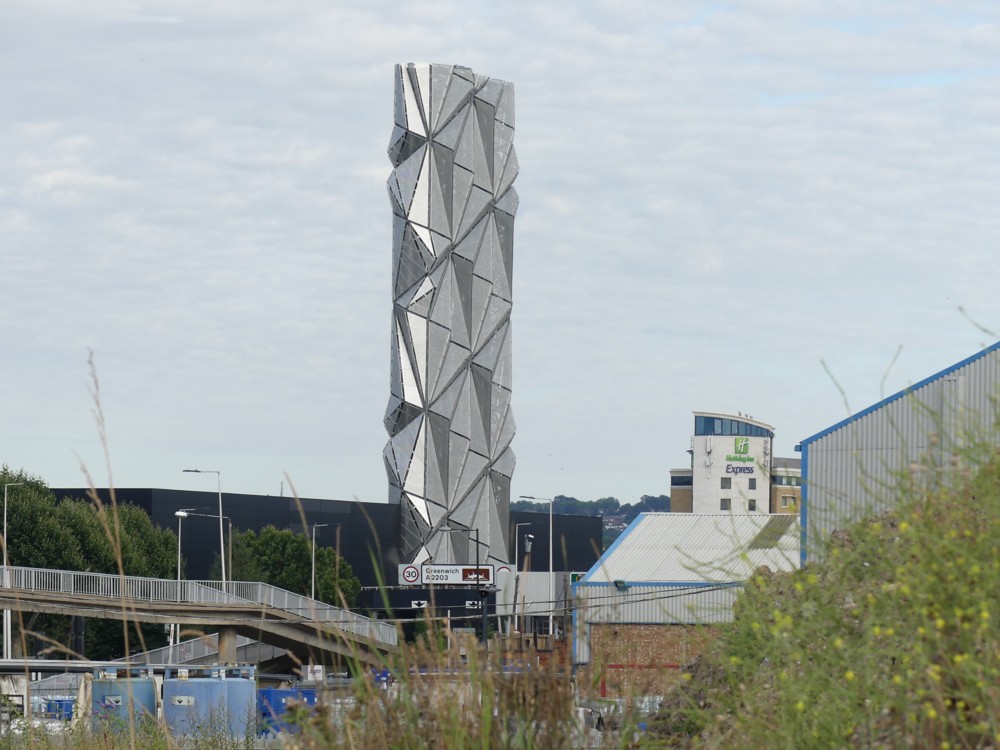
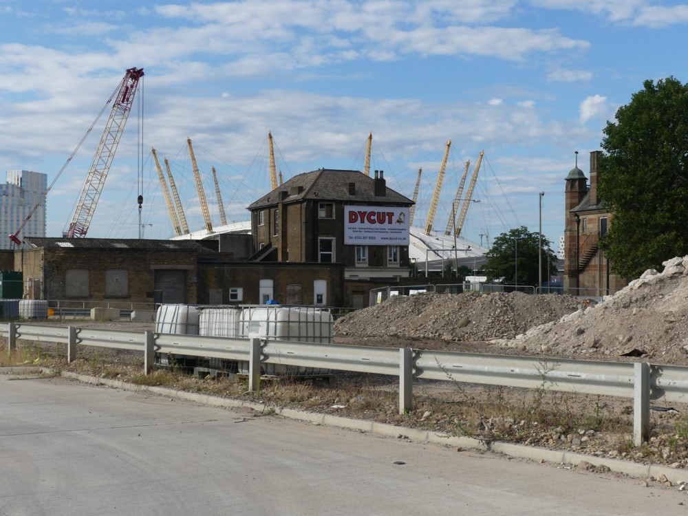
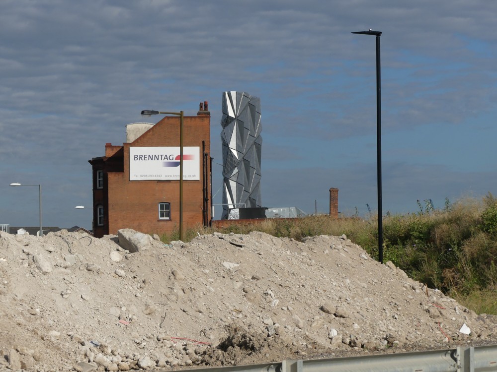
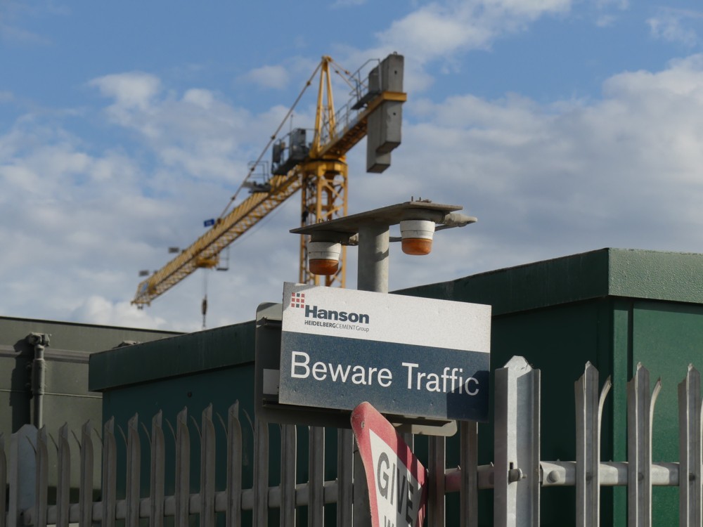
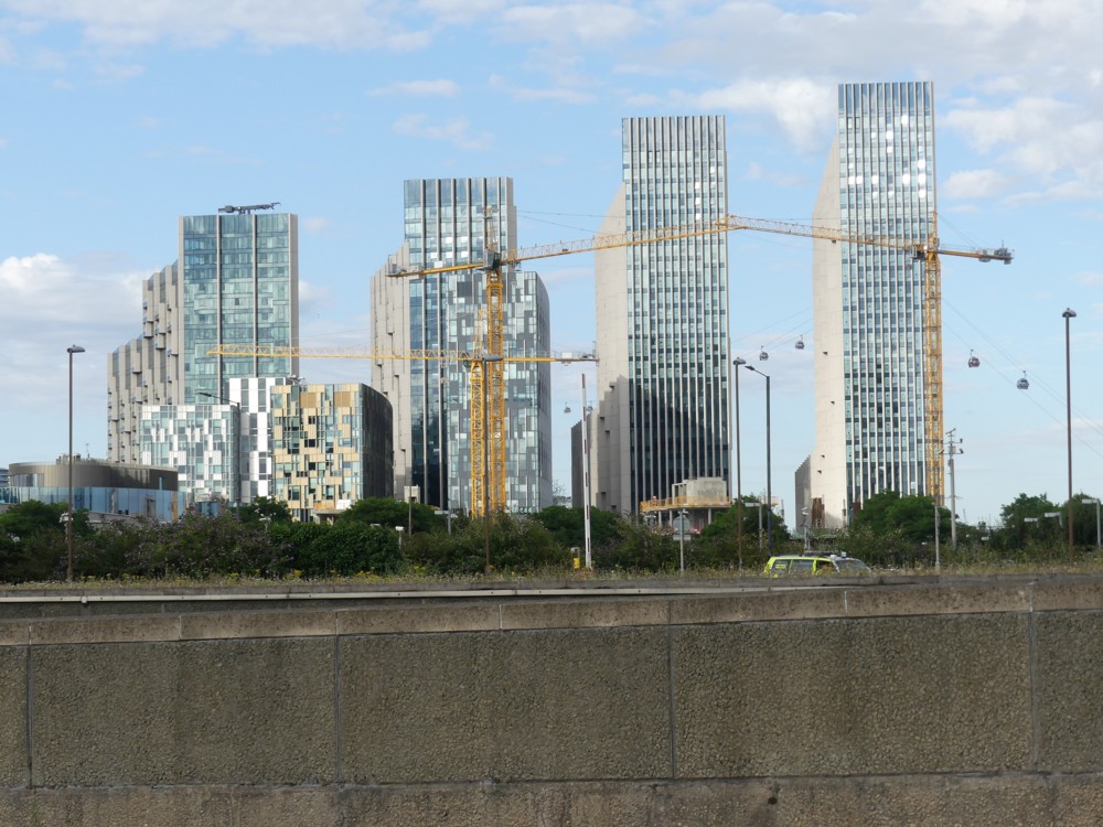
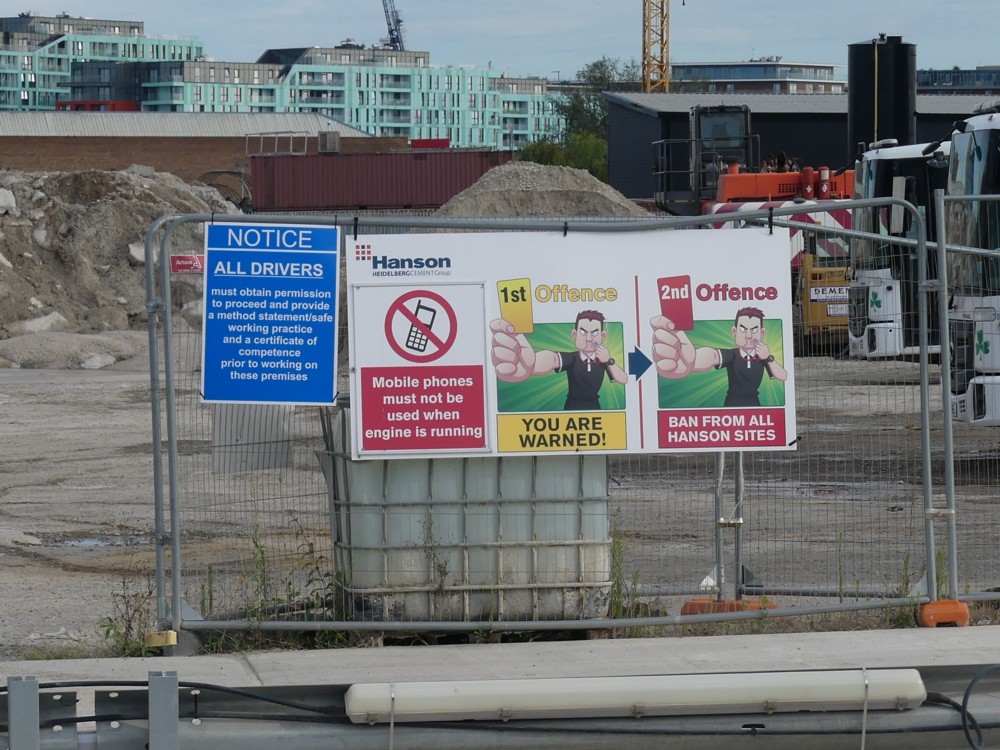
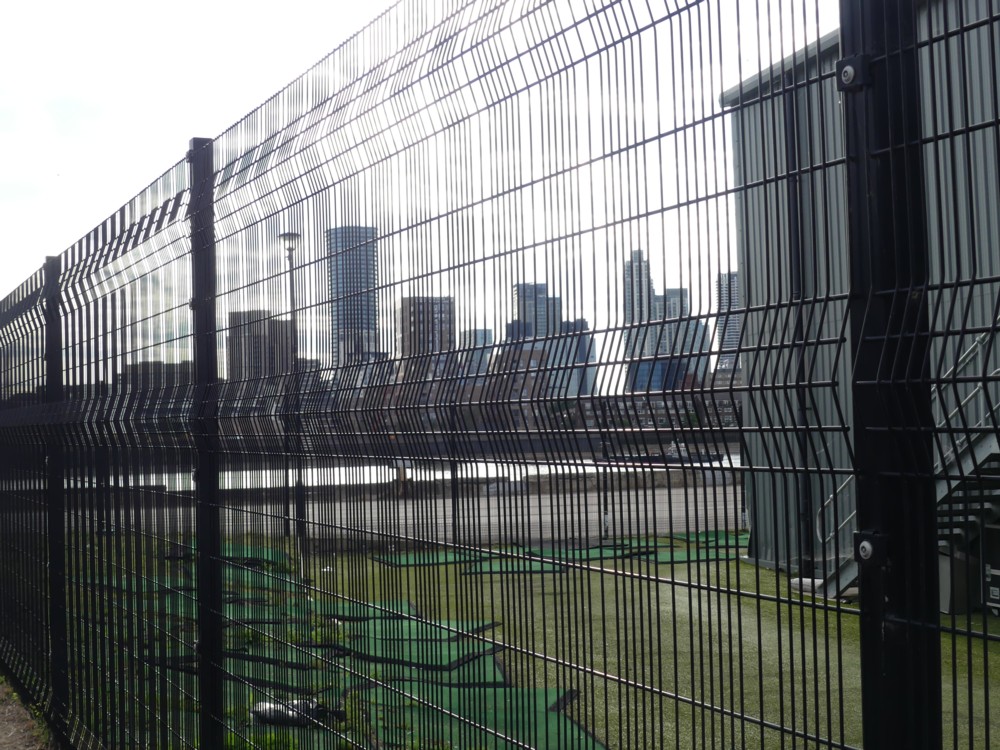
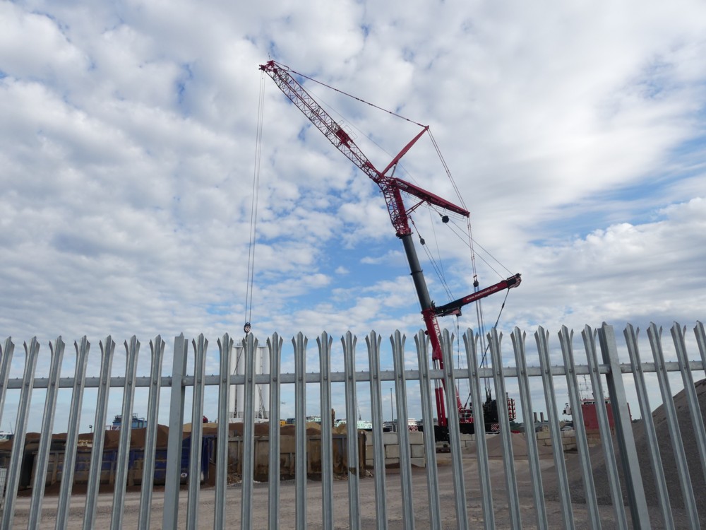
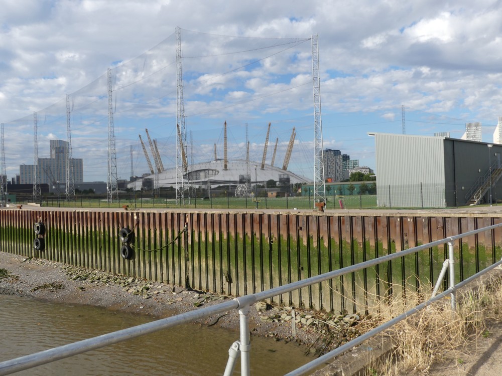
Looking back, at such things as the quadruple chimneys of the Greenwich Power Station. Looking left across the River to the towers of Docklands and towers further away. Looking at the strange shore, between the River and the land I was walking on, and at the strange things people do to such shores. Looking to the right, at the new machines for living in that are being constructed next to this shore. And looking to the right further away, to catch occasional glimpses of the Optic Cloak, which I admire more and more every time I see it.
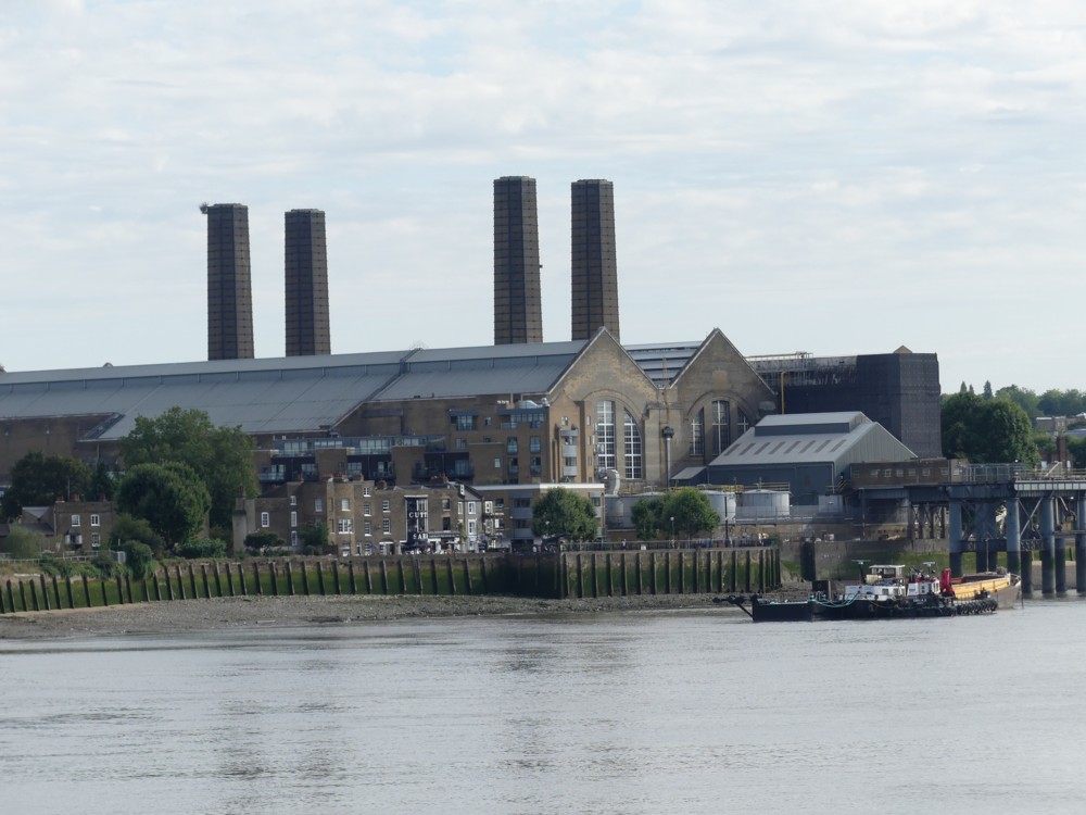
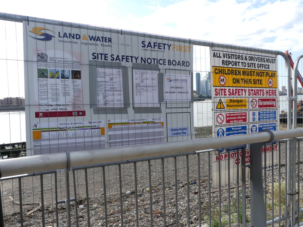
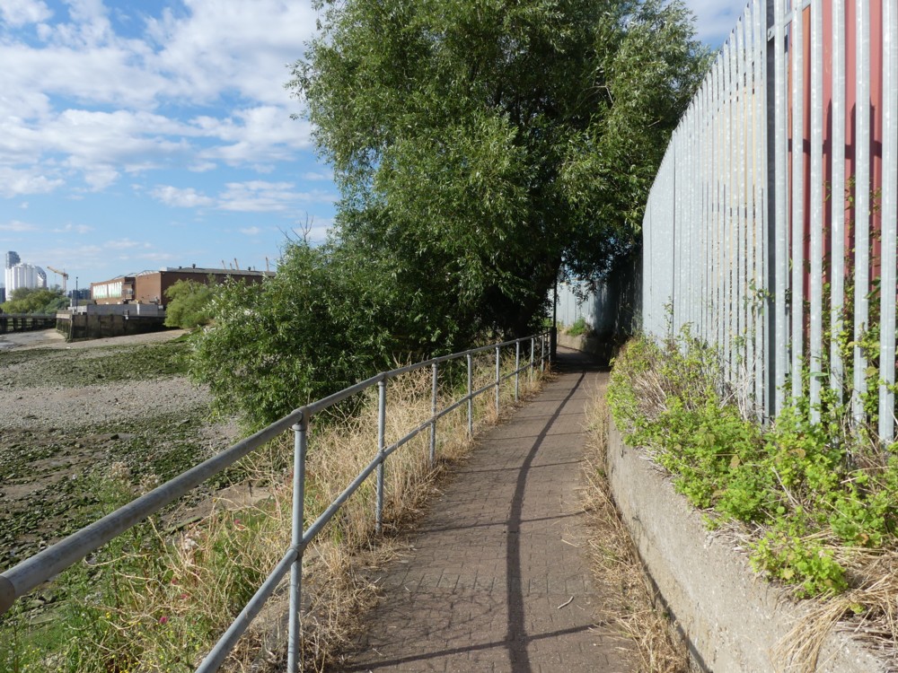
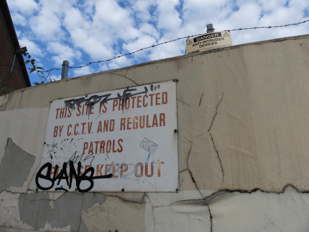
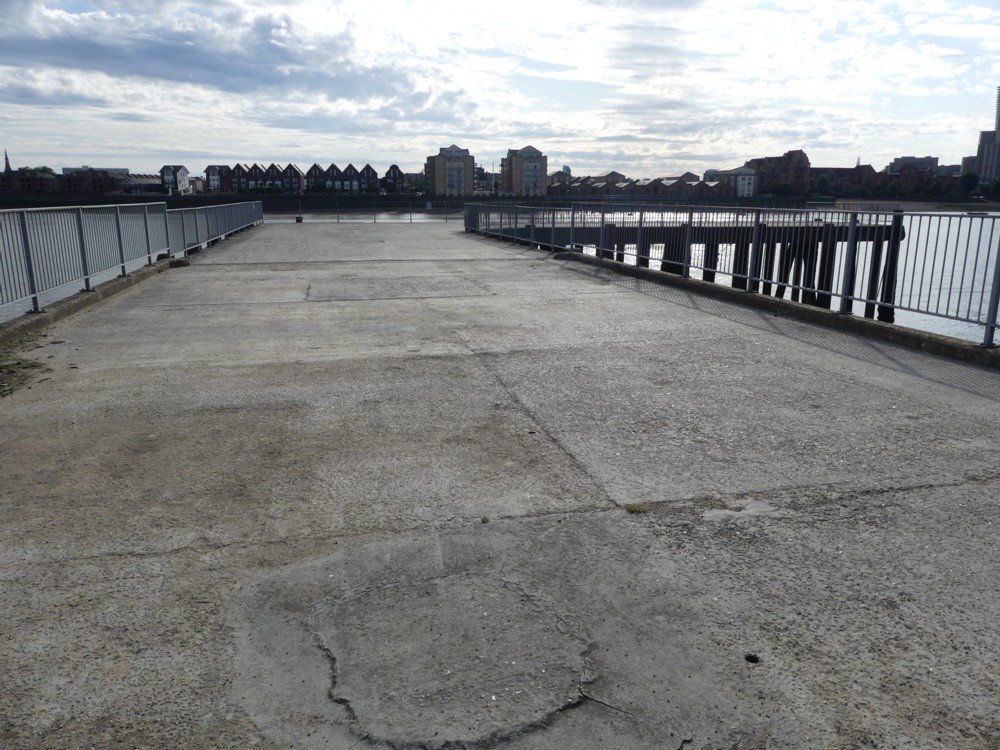
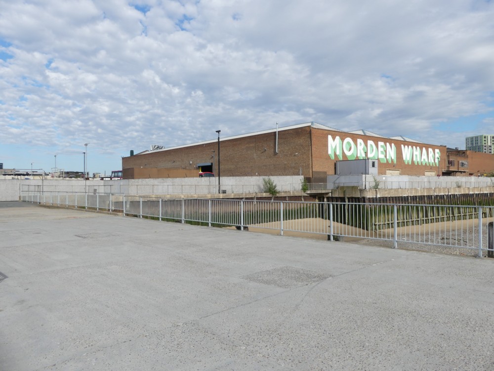
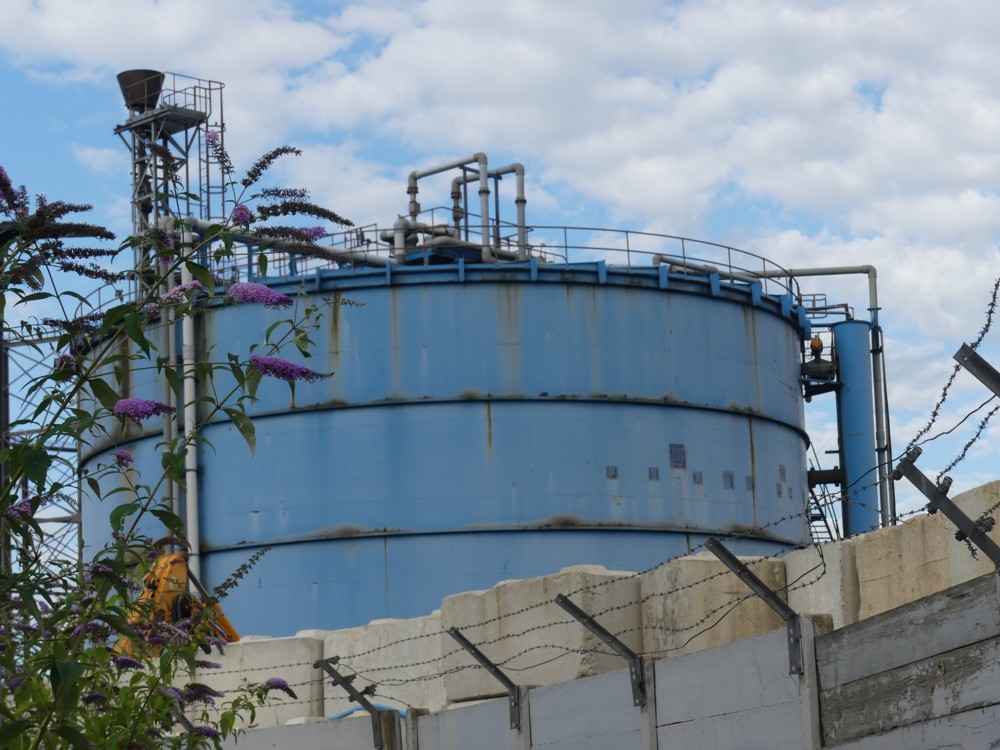
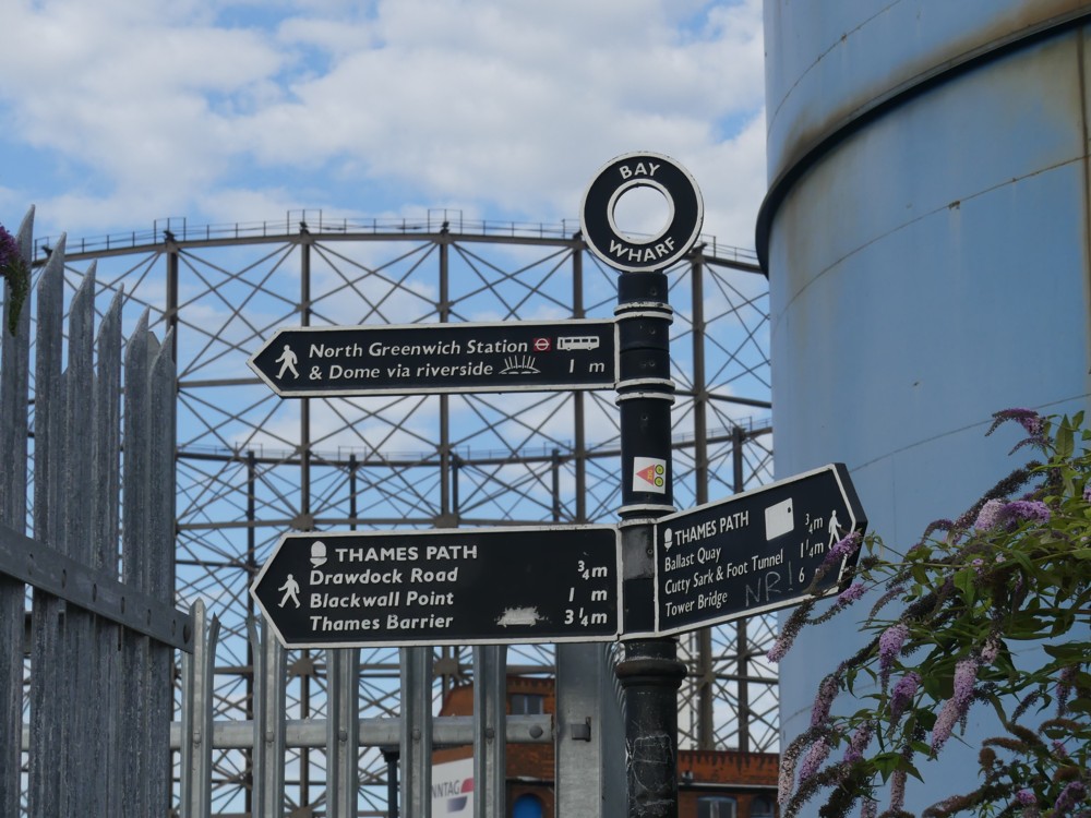
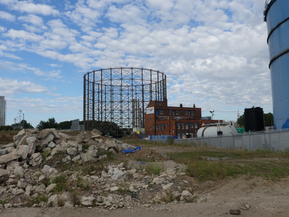
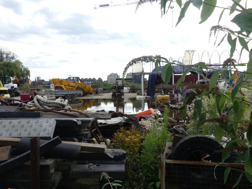
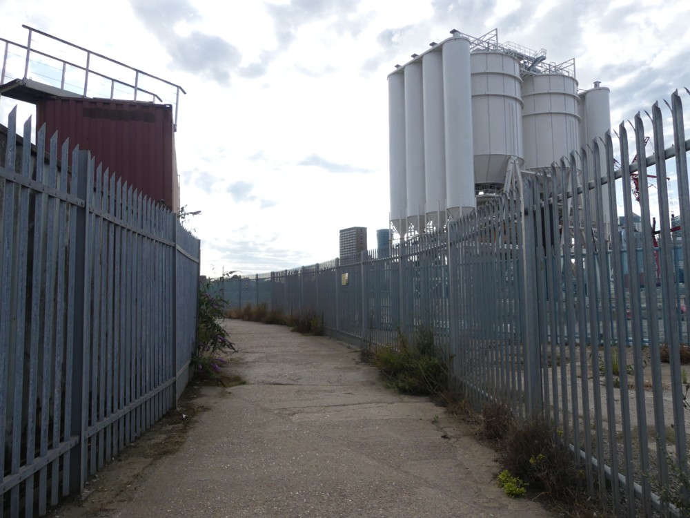
There is no theme this time, other than the theme of this being where I was and this being what I saw from where I was. Fences, scaffolding, cranes, towers, and lots of signs, and, in general, a place that will be very different in a few years time. Also, quite a lot of plant life of various sorts, which I always enjoy in moderate doses, in among all the urbanity.
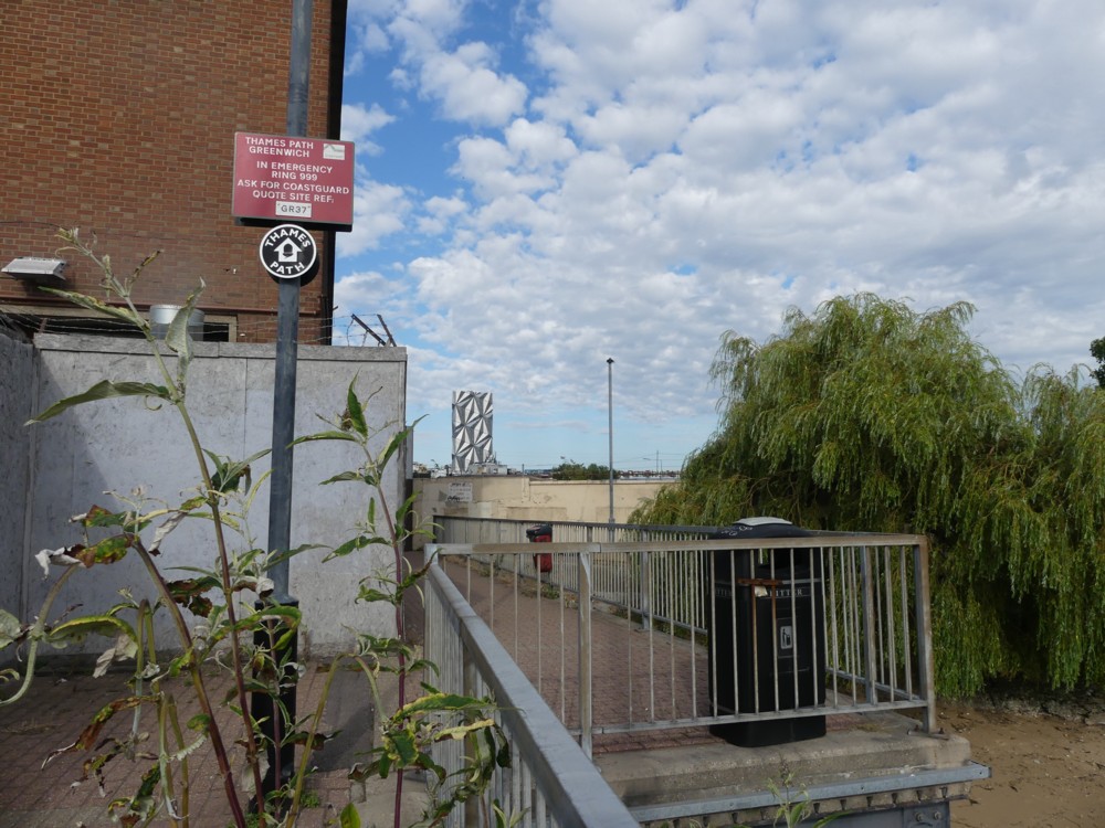
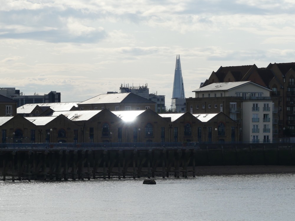
The walk involved quite a bit of digressing inland, as walks alongside the Thames tend to. This being because they are constantly altering what is next to the Thames, and don’t want you getting in the way while they’re doing that.

The final photo in this gallery features a huge fence, for stopping balls escaping from a mini-golf range. I did not see that place coming.

Rotating bridge proposal

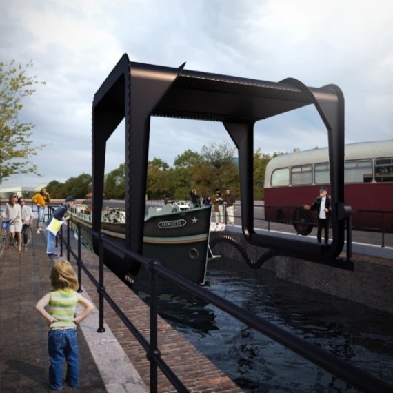
Cody Dock is one of my favourite little spots-that-most-people-have-never-heard-of in London, and here is what looks to be a brilliant idea for a bridge there, by someone called Thomas Randall-Page:

That’s the bridge in its two possible states. Left, people can cross it. Right, bigger-than-small boats can go under it.

I tried to contrive a verbal description of how it works, but have failed. It’s all to do with rotating the square shaped bridge in such a way that its centre of gravity stays steady. But, (a) take my word for it that it’s very clever, and (b) follow the link and see how right I am.

The world does not seem to be building many new big bridges, but it is still contriving little bridges of great inventiveness, if only because they’re cheaper.

London’s machines for living in are getting better

Le Corbusier famously described homes as machines for living in, and if this Property Reporter piece is anything to go by, it would seem that London’s machines for living in have been getting better lately:

Traditionally, period London property consistently outperformed new build in terms of desirability and price. However, times are changing and now there’s an emerging trend of buyers preferring new to old.

What this tells me is that the quality of the newest London homes has finally got better than the quality of older buildings from a hundred years ago and longer. The dark age of what can only be described as architectural incompetence, that the Modern Movement in Architecture unleashed by including so many very bad ideas about how to design things in its bran tub of ideas, looks like it may be over. In London, anyway.

This doesn’t mean that people love how the latest London “dwellings” look. They merely, given the choice between living in a picturesque building that works somewhat badly or an ugly lump of soulless modernity that works better, prefer the latter. Function trumps form. You want your life to work. If that means it looks a bit boring, so be it.

People never did hate actual functioning buildings; they merely hated “functionalism”. Sneer quotes there because “functionalism” tended not to function properly. “Functionalism” included too many bad ideas about how to design things, bad ideas like: it’s clever to turn your back on conventional designs for stuff. Housing modernity is now a bunch of design conventions that actually work, and which architects who wish to remain in employment now know not to turn their backs on. Despite many mere appearances to the contrary, architects in London are now very conformist in how they work, and that works much better.

The ideal arrangement, then, might be to have a brand new home – the very best and latest machine for living in – but for the outside of it to be old.

So this later bit in the Property Reporter piece especially interested me:

American buyers traditionally insisted on new build, but ironically they are now championing the old – but not the draughty, leaky version of old! Projects that leave the period façade in place, while replacing the rest with what amounts to brand new are top of the list for buyers from the USA.

You see a lot of this sort of thing being done in London, if you look out for it.

Please do not explain this T-shirt to me

Speaking of cats, as I just was – well, of one cat – here is another cat-related photo, of one of the many photoers I photoed ten years ago to-the-day yesterday:

Photoed at the north end of Westminster Bridge, with the trees of Parliament Square in the background.

I kept that one back for today. That T-shirt looks like she might even have made it herself.

Once again we see in action one of those ultra-cheap and ultra-cheerful digital cameras, of the sort that has now been pretty much completely swallowed by the mobile phone.