Stop your dog pulling on his leash – make your dog pull you

In my recent rootlings about in This is why I’m broke I came across two dog related devices that seemed rather impressive, in the usual punitive and exploitative (respectively) ways that dog related devices so often are.

First, there was this rather sneaky Tug Preventing Dog Trainer:

Train your dog to stop pulling on the leash when you walk with this tug preventing dog trainer. Every time old Sparky pulls on the leash, this clever device will emit a harmless ultrasonic tone that only he can hear, encouraging him to stop pulling and tugging.

Encouraging. That’s one way of putting it I suppose.

But this does confirm that dogs respond to instantaneous punishments for defying your will. They respond in particular by not doing whatever it is, and in general by regarding you as their dog superior. Once subjugated, their deepest pleasure is in serving you.

Serving you, for instance, by supplying power for your Dog Powered Scooter:

Harness your dog’s endless energy to travel around with the dog powered scooter. This revolutionary form of transportation safely allows you and your canine to move in the same direction – giving you and your dog a fun outlet to get some healthy exercise.

Well, dogs seem always to hanker after more exercise than most of their human masters ever seem to desire. This contraption solves that problem very nicely.

Originally posted at Brian Micklethwait’s Old Blog

Hippos

One of the depressing things about the Internet is that excellent places, because not quite excellent enough, or because for a few months they don’t feel quite excellent enough, fall off your radar. Well, maybe not yours, but mine.

So it has been, for me, from a time way back when to about the day before yesterday, with the excellent and constantly updated site which relentlessly explains that This Is Why I’m Broke, this being a succession of things. Rather expensive and somewhat esoteric things, of the sort which someone, maybe you, is going to like a lot.

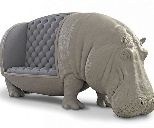
Things like this:

I have recently acquired a new Cleaning Lady, and her partner happens to like hippos a lot. This is just the kind of thing that he would love. And for a mere £82, 555 it could be his.

It wouldn’t suit me. Quite aside from the thermo-nuclear expense, when I purchase seating I need it to seat the maximum number of people in comfort that it can, in the space that it occupies. This is for my meetings, of which there was another this evening. This hippo sofa is altogether too much hippo and not nearly enough sofa, for my purposes.

And I’m guessing that even Cleaning Lady’s Partner would hesitate at the price, and be told by Cleaning Lady that it would occupy too much space. They being a couple who think that emptiness is a desirable quality in living space. (I like emptiness, but like even more having somewhere to put all my books and CDs and home-recorded DVDs.)

I must have been quite a blow for Cleaning Lady’s Partner when (a) he first set eyes on the above hippo sofa (he will definitely have set eyes on it, because his hippo radar is state-of-the-art) but then (b) having, reluctantly, to decide that, hugely appealing though it obviously is, he could not, in all conscience, purchase it.

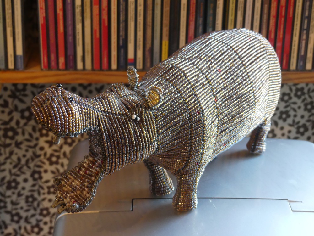
But the good news is that I recently encountered, in a local charity shop, and immediately did purchase, the hippo shown below:

You couldn’t sit on this hippo, and frankly, it looks considerably less like a hippo than the hippo sofa does, despite its sofa. But it is a lot smaller and it was a lot less expensive than the hippo sofa.

Following the meeting, Cleaning Lady seems to have departed with the hippo, or I hope she did because I cannot now find it. Hope Partner likes it.

I love digital photoing. For many reasons, only one of which is that when you give someone an amusing present, you can photo it before handing it over, and carry on enjoying it in a convenient, digital form. I took many more photos of the hippo than just that one, but I am now in a hurry to finish this, so one photo will have to do.

Originally posted at Brian Micklethwait’s Old Blog

The leaning tower cranes of London

I love cranes, especially those big tower cranes they use to build Big Things. So tall. But so thin. But they do trouble me. How do they stay up? Why don’t they ever fall over? Well, they do, sometimes. But mostly they don’t.

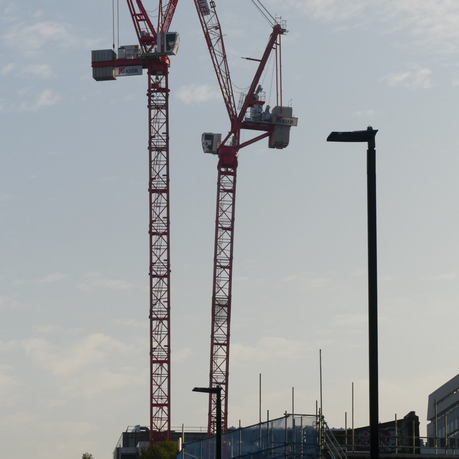
And, as I couldn’t help noticing when I was out and about last Sunday, these tower cranes often lean over, in a way that looks like it is asking for headline-making trouble.

Consider one of these cranes, the one on the right, that’s leaning over, about four degrees off of the vertical. How does that not fall over? (Thank you vertical lamp post for telling us what vertical is.)

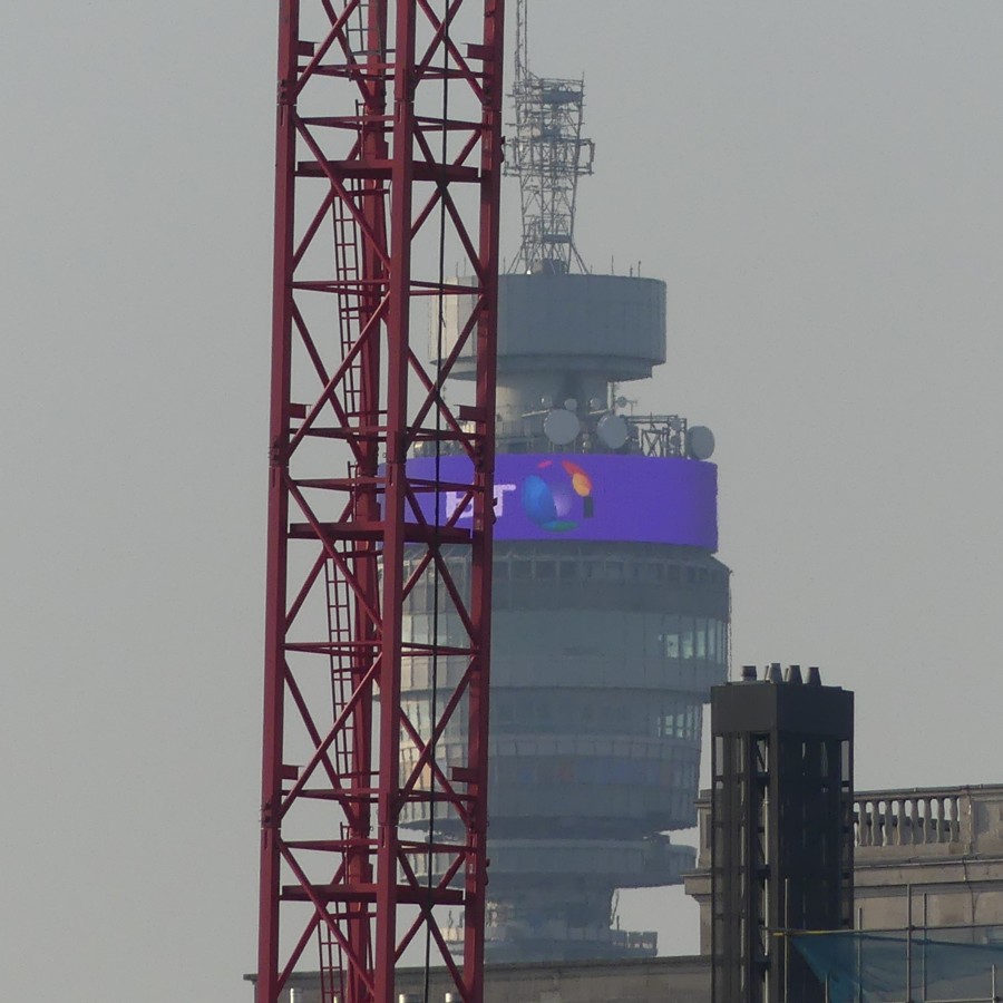
Well, I’m guessing these people know what they’re doing. No, scrub that, I’d be amazed if they didn’t know what they’re doing. This kind of thing just has to be business as usual, no matter how crazy it may look to mere passers-by. As I discovered when I went looking for other leaning cranes in my photo-archives, and I found one that I had photoed just an hour earlier, on the same walkabout:

I think we may assume that the BT Tower is the very definition of vertical.

In each case, the crane is bent backwards by the big concrete blocks that compensate them for the lifting job they do with the other end of their tops. But when no lifting is happening, the compensating weight has no weight to compensate … it. And the result can look very scary.

No London cranes have been reported collapsing during the last few days. So, like I say, no problem.

Originally posted at Brian Micklethwait’s Old Blog

IKEA launches first range of furniture for cats and dogs

Here.

Originally posted at Brian Micklethwait’s Old Blog

A busy day that never happened

Today I had a taste of what my life would be if I had the Sky TV cricket channel. (It would be over.) I watched Surrey play Somerset on the live feed from the Oval which comes complete with the BBC’s sound commentary. I had all sorts of plans for today, but managed to get very little else of consequence done.

Surrey spent their day trying to ensure that they avoided all possibility of being relegated from Division One of the County Championship. When they finally managed to defeat Somerset, they found themselves lying second in Division One. Division One contains eight teams, two of which will be relegated, and it’s all rather close, apart from Essex, who have already won, and Warks, who have already been relegated. So, a very strange day, but ultimately a very good one.

So, quota photo time:

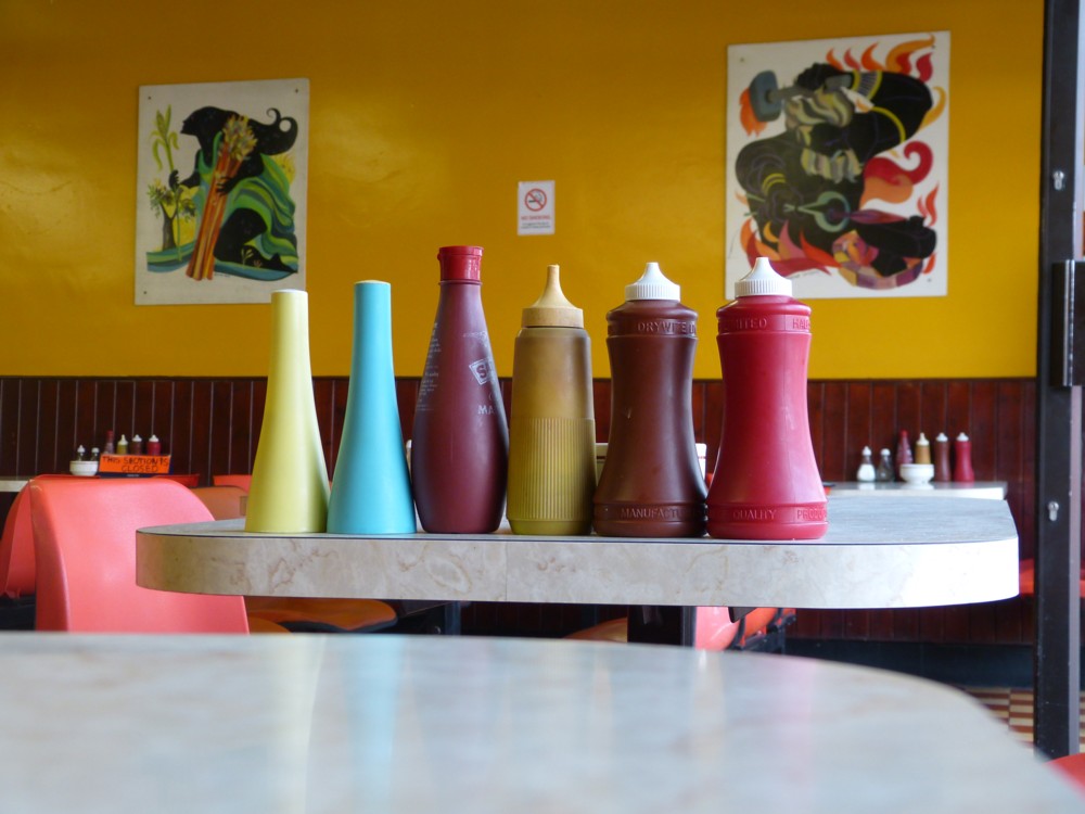
Yes, it’s a still life, with condiments instead of old school food in old school containers. Little Big Things, you might say. Photoed five years ago, in a cafe only a very short walk away from the Oval.

Originally posted at Brian Micklethwait’s Old Blog

Thumbnails

Click on the thumbnail on the right to see why I’m presenting this photo to you, as a thumbnail.

Photo taken outside (as you can probably work out) Westminster Abbey in December 2015.

Originally posted at Brian Micklethwait’s Old Blog

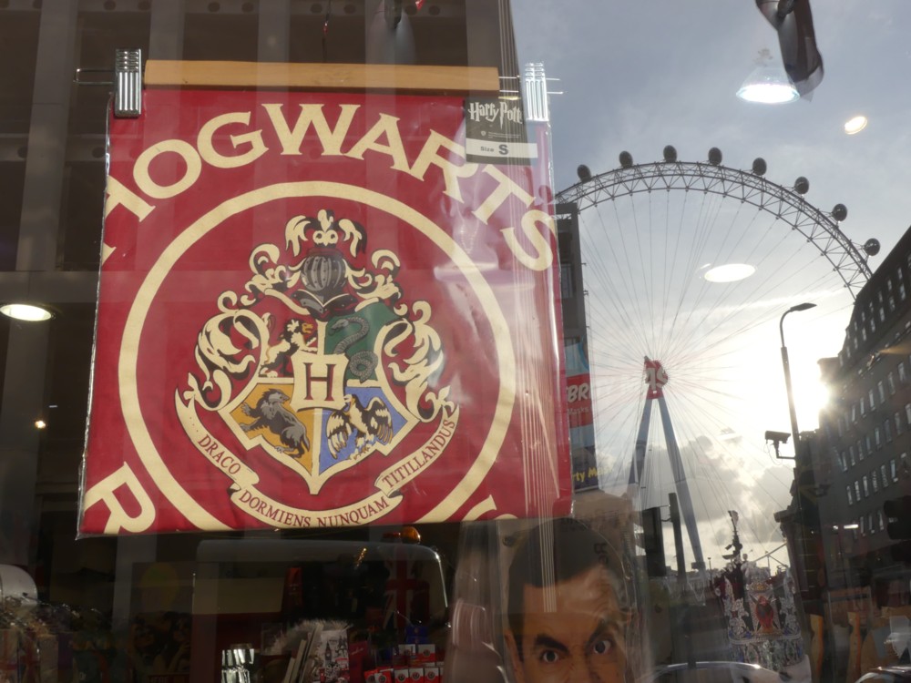
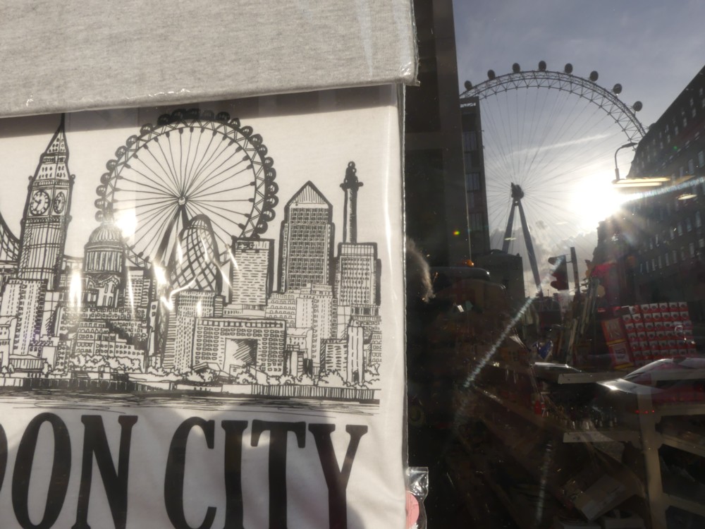
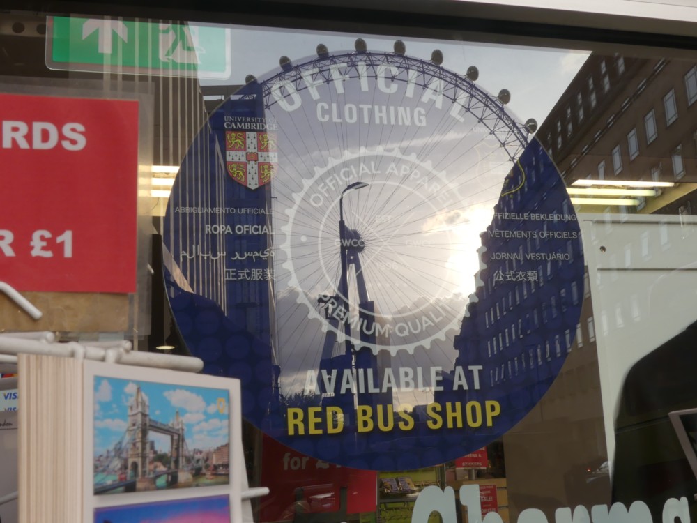
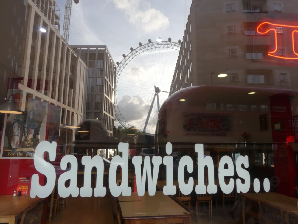
The Wheel reflections and The Wheel juxtapositions (and a The Wheel postcard)

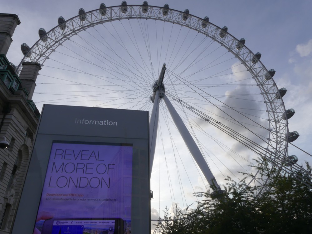
About a week ago or less, I found myself in the vicinity of The Wheel. The light was very good, with lots of sunshine and lots of lurid looking clouds. So, I took photos.

Below are a clutch of The Wheel related photos. My opinion of how to photo The Wheel is that you should combine The Wheel with other things. Like graphic designs featuring The Wheel which are in the vicinity of The Wheel. It’s the old modified cliché routine.

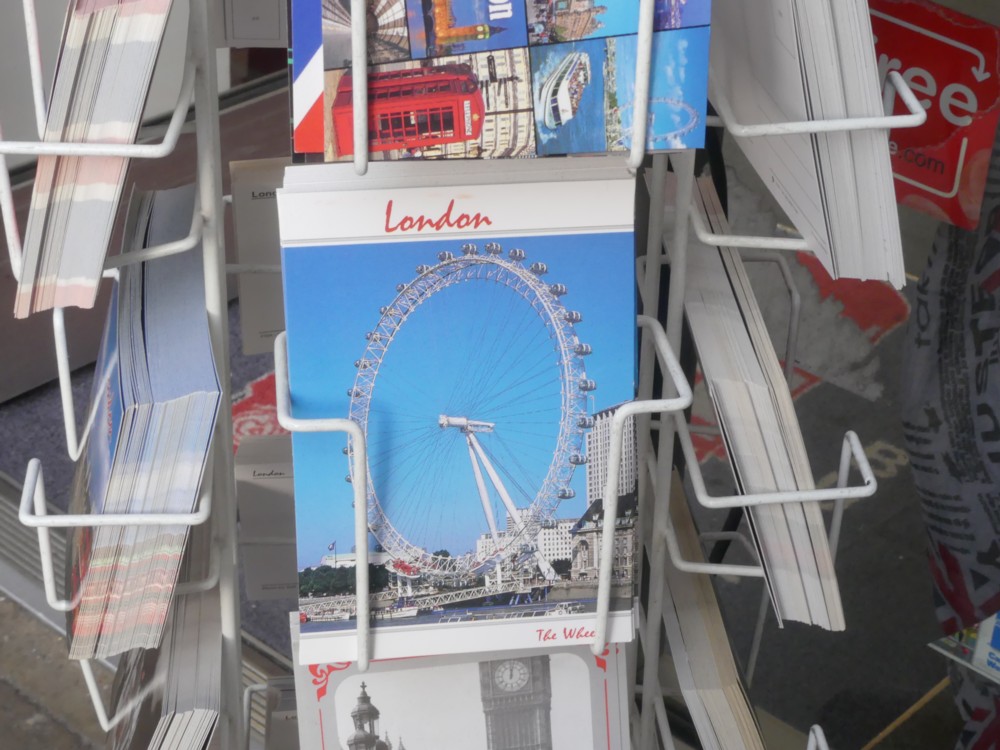
In this photo clutch, however, I do include one very old school photo of The Wheel. It’s the photo I took of a postcard (1.2), which features The Wheel. And look what the postcard calls The Wheel. It calls it The Wheel: “The Wheel”. None of this “London Eye” nonsense. Do large numbers of people in other parts of the world call The Wheel The Wheel? I do hope so. And I hope that this habit conquers London.

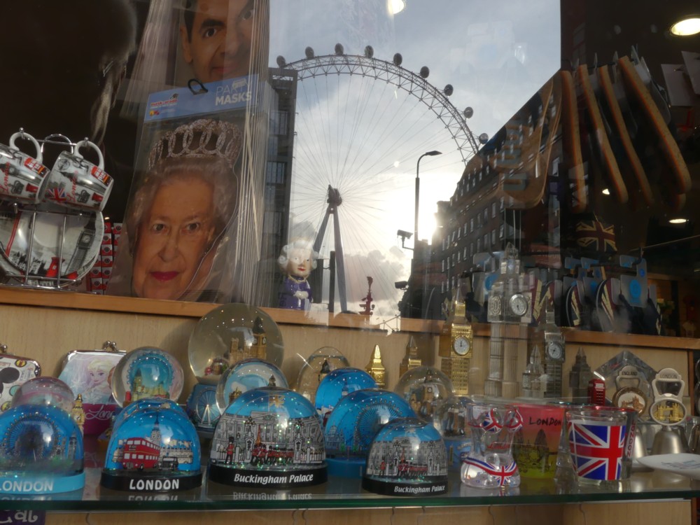
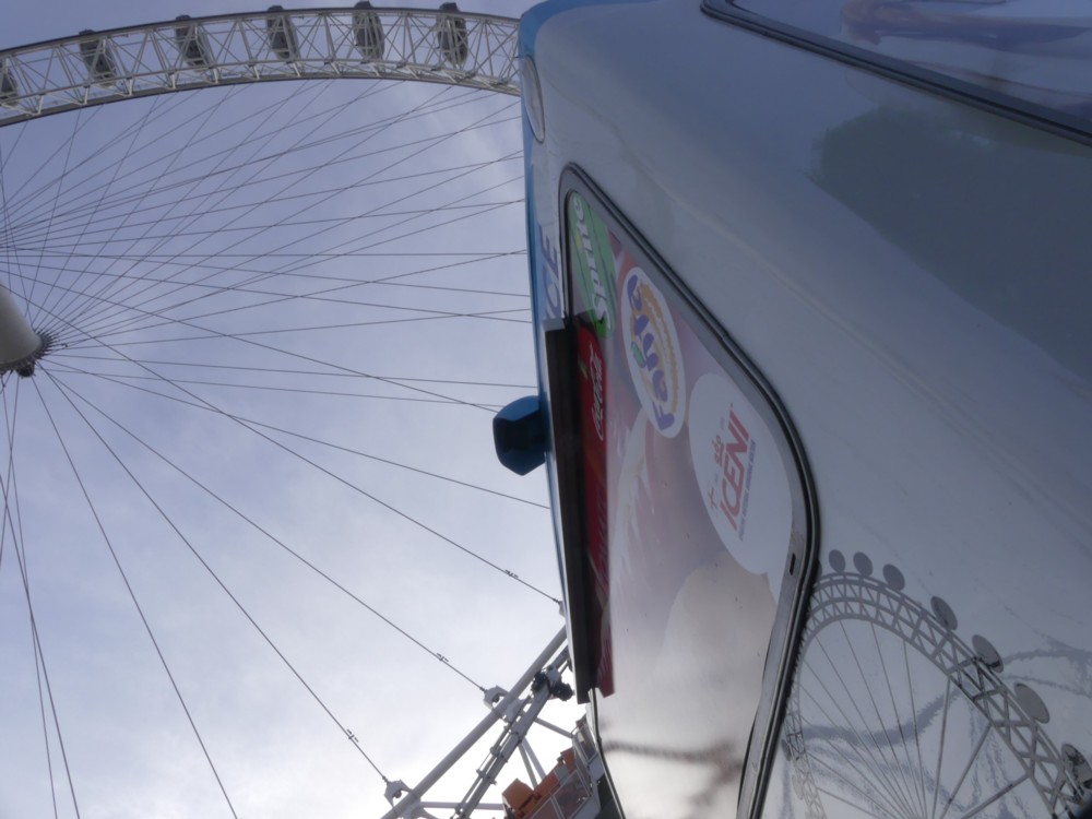
The next four photos, after the postcard (1.3, 2.1, 2.2, 2.3) are all of The Wheel reflected in a tourist crap shop. And then 3.1 is of The Wheel reflected in a place, next door, that sells sandwiches.

I like how I totally lined up the circular blue logo with The Wheel reflection, in 2.3. Could I also have done something similar with the circular things in 2.1 and 2.2, in the latter case an actual picture of The Wheel. I rather think that I tried, but couldn’t do that. But, memo to self, return to this enticing spot, on a nice day, and see what I can do.

This is what I like about taking photos in London, rather than in some foreign spot that I am only going to be in once. If, upon reflection back home, I suspect that I might have been able to do some of the photos better, I can, in London, go back to try to do this.

Originally posted at Brian Micklethwait’s Old Blog

Aug ’17 OSB6: Camden Highline

The titles of these things were getting to be too long-winded.

So yes, the Camden Highline.

Bid to turn disused railway between Camden Town and King’s Cross into elevated ‘Highline’ park

Sadiq Khan throws weight behind Camden highline project

The official website.

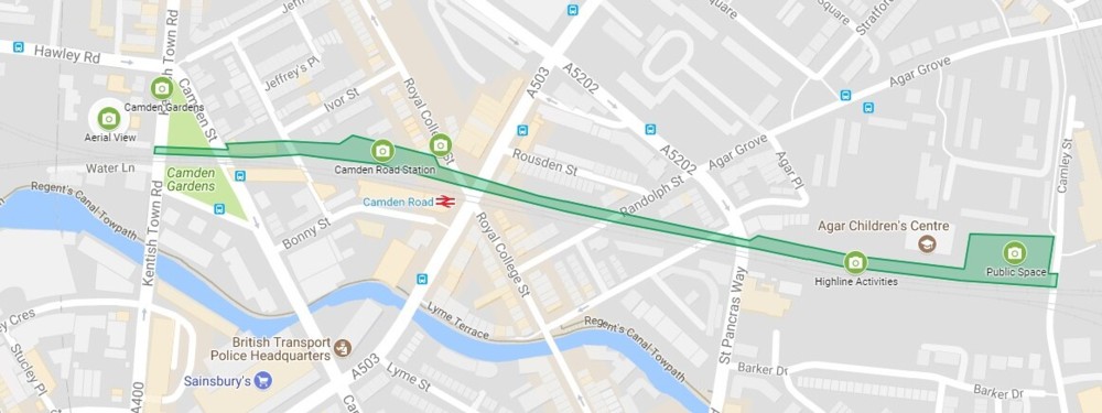
Where they hope it will be, just north of the Regent’s Canal:

Click on that to get it twice as big, and consequently (if your eyesight is anything like mine) legible.

Those little green circles are cameras. Presumably this means good places for photography. If and when they contrive this, I will definitely be checking it out.

Long moderately high platforms, even ones that are not very high, often supply great views, because you can walk along them until the great views appear.

Originally posted at Brian Micklethwait’s Old Blog

Two Seifert roof clutter clusters

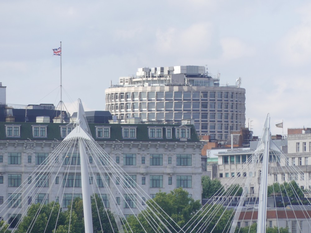
It’s no great surprise that, at the website of the hotel that now calls itself Park Tower Knightsbridge, they are keener to show you pictures of the hotel’s interiors and of the views to be seen from the hotel, than they are to show you what the hotel itself looks like to the outside world.

That being this:
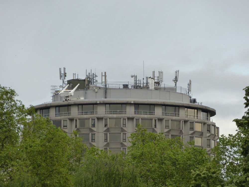
That’s a photo of this building that I took five years ago, from Hyde Park, which is not a place I visit very often. Personally, I am rather fond of this building. But I am not the sort of person who would ever stay there. I’m guessing that those who do stay there are not that fond of how it looks from the outside.

Park Tower Knightsbridge was designed by my favourite architect from the Concrete Monstrosity era. Favourite in the sense that when it comes to your typical Concrete Monstrosity architect, I hate almost all of what they did. With Richard Seifert, I just hate some of it, and rather like quite a lot of it.

Especially now that this style is in headlong retreat, and all the arguments about it concern whether this or that relic of the Concrete Monstrosity era should or should not be dismantled. When this style was on the march, smashing everything in its path to rubble, I would gladly have said goodbye to Park Tower Knightsbridge (or whatever it started out being called), if that was what it would have taken to stop the Concrete Monstrosity style in its tracks. But now, I favour the preservation of a decent proportion of London’s Concrete Monstrosities. I suspect that they may turn out, in the longer run, like the medieval castles of old (definitely feared and hated when first built), in eventually being regarded as charmingly picturesque.

And, I especially like the Park Tower Knightsbridge, because of its striking concrete window surrounds, and its non-rectangularity. See also No. 1 Croydon, which I think may be my absolute favourite Seifert.

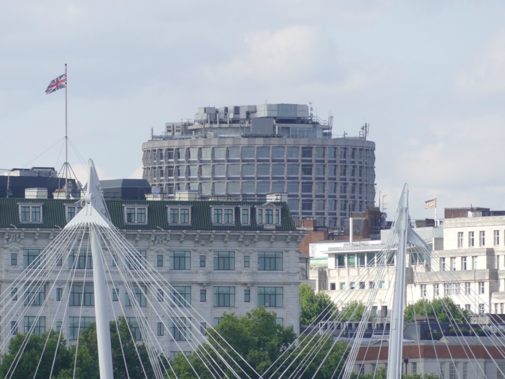
Striking concrete window surrounds and non-rectangularity might also be why I like this next building, One Kemble Street, also designed by Richard Seifert, and already featured here in this posting, which includes a photo of how it looks when viewed from the upstairs bar of the Royal Opera House Covent Garden.

I took these photos, within a few seconds of each other, minutes before taking this rather blurry photo of the ROH.

In addition to being a posting about how I am rather fond of these two Seifert buildings, it is also a rumination upon roof clutter.

Note how both these buildings have an abundance of roof clutter perched on their tops. But note also how that clutter is so arranged as to be largely invisible to anyone standing anywhere at all near to the building.

If you image google either One Kemble Street or Park Tower Knightsbridge, what you mostly get are these close-up views, with all the roof clutter out of sight. It’s like those who own these buildings care very much about the impression the buildings give to passers-by, and most especially to those who actually go into the building, but do not care about how the buildings look to the rest of London. They probably figure that nobody really sees these buildings, except from nearby where you can’t miss them. But from a distance, and now that the architectural fashion that gave birth to them has been replaced by other fashions, they just, to most eyes, fade into the general background architectural clutter which is London itself. If there is clutter on top of them, well, that’s London for you. London, like all big cities these days, abounds in roof clutter.

I don’t know. I’m still trying to get my head around these thoughts. Maybe it’s just convention. On stage appearances matter, and offstage appearances do not. When it comes to how things look, the side walls of these buildings count. They’re on stage. Their roofs do not count. They’re off stage.

Originally posted at Brian Micklethwait’s Old Blog

I don’t know whether it’s the weather or my camera

I have a new camera, and I am not as happy as I would like to be about the photos I am photoing with it. They often seem vague and blurry, as if seen through a mist.

But then again, the humidity levels during the last week or two have been very high. Maybe the views have all looked as if seen through a mist because they were seen through a mist.

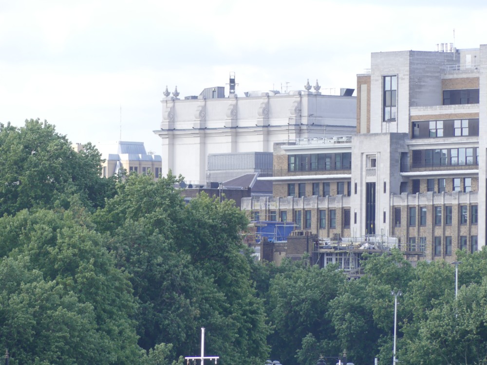
Here, for instance, is a photo of a favourite building of mine, the big decorated box that is the Royal Opera House Covent Garden, as seen from Westminjster Bridge, which is quite a way away:

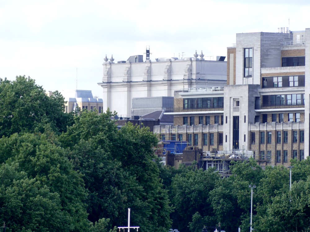
But I got to work with my Photoshop clone, and beefed up the contrast, and darkened things a bit.

Thus:

Which looks a bit better. I’ve chased away some of the mist. The trees look greener. The details of the ROH’s exterior decoration are clearer.

I have a vague recollection of trying to reset my camera, so that it did things more darkly and more contrastingly. Maybe at that point, I contrived to do the opposite of what I thought I was doing.

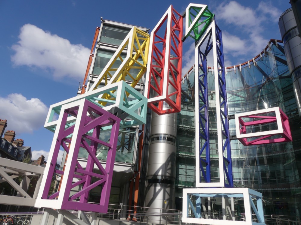
But then again, not long after taking that photo, I took this one, of the giant 4 outside the Channel 4 headquarters building at the top end of Horseferry Road, a short walk away from where I live. I often go past it on my way home after an afternoon of wandering, and so it was that day, nearly a week ago now:

That looks bright enough and clear enough, doesn’t it? That’s without any zoom, i.e. space filled with blurriness. And without this weather making its presence felt, the picture doesn’t look like it needs any artificial editing attention. So maybe the camera is fine, and it has been the weather. And I just made the weather better.

Originally posted at Brian Micklethwait’s Old Blog