When what I think it is determines how ugly or beautiful I feel it to be

I am intrigued by how political opinions influence aesthetic feelings. Can you think that something is beautiful merely because it is the way that you think, in a political sort of way, that it ought to be? I say: yes.

I have been experiencing an illustration of this tendency recently. And the effect was thrown into sharp relief by the fact that I changed my idea of what the thing was, and that changed how I felt about it aesthetically. Although the thing itself hadn’t changed at all, I immediately found myself liking the look of it better. I had felt it to be ugly. Now, although I wouldn’t call this thing very beautiful, I don’t see it as ugly any more.

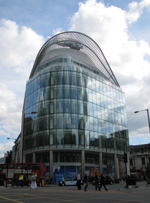
This is the thing that I had been regarding as ugly, It is to be seen across the road from Victoria Station:

The ugliness of it is in its non-symmetry, and in the utterly irrational and incoherent contrast between the rectangular block in the middle of it and the curvey bits on the top and at one end. Why would you make a thing looking like that?

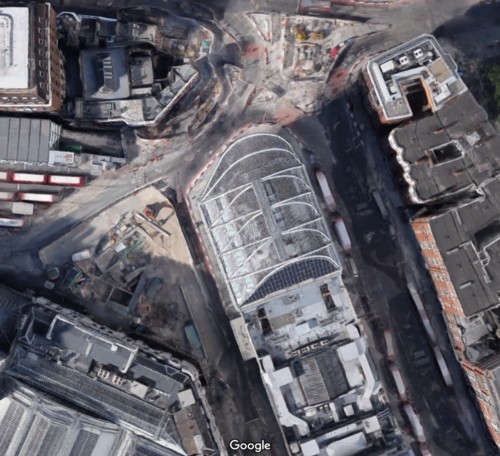
The best way to see how ugly this thing is (or was), is to look at it from above. Here is the google satellite version:

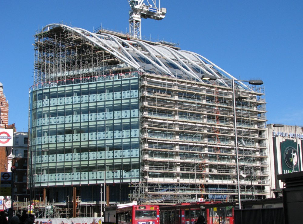
But then what should have been obvious to me all along became obvious. The rectangular block wasn’t designed into the building we are looking at. It had been there all along. The curvey bits had merely been added to the rectangular block, at one end and on the top. This building wasn’t all one design. It was a doubling up of designs:

There you see a photo, which I took in 2009, of this thing while they were doing it. It doesn’t prove that it was done in two entirely distinct stages, of which this is merely the second stage, but it seems to suggest that. The new building activity seems to concern the curvey bits on the top. The scaffolding next to the rectangular bits looks much more like the kind of scaffolding you put up when you are merely revamping an already existing building. And that, I am almost sure, is what is happening there, to the rectangular bits.

What I now see when I look at this ungainly thing is that rather than it being a very ugly piece of one-off design, I now see it as a charmingly quaint urban agglomerative confluence of constrasting styles, such as London contains a hundred examples of, and hurrah for London. London itself, as a whole, is just such a multiple design confluence. Old meets new, and both live to tell the tale. Or in this case new meets newer. This weird-looking building is a two-off design, you might say. It is a two-off design, and it looks exactly the sort of way a two-off design ought to look.

If I am wrong about it being a two-off design and I learn that actually it was all designed at once, I’ll probably go back to thinking it ugly.

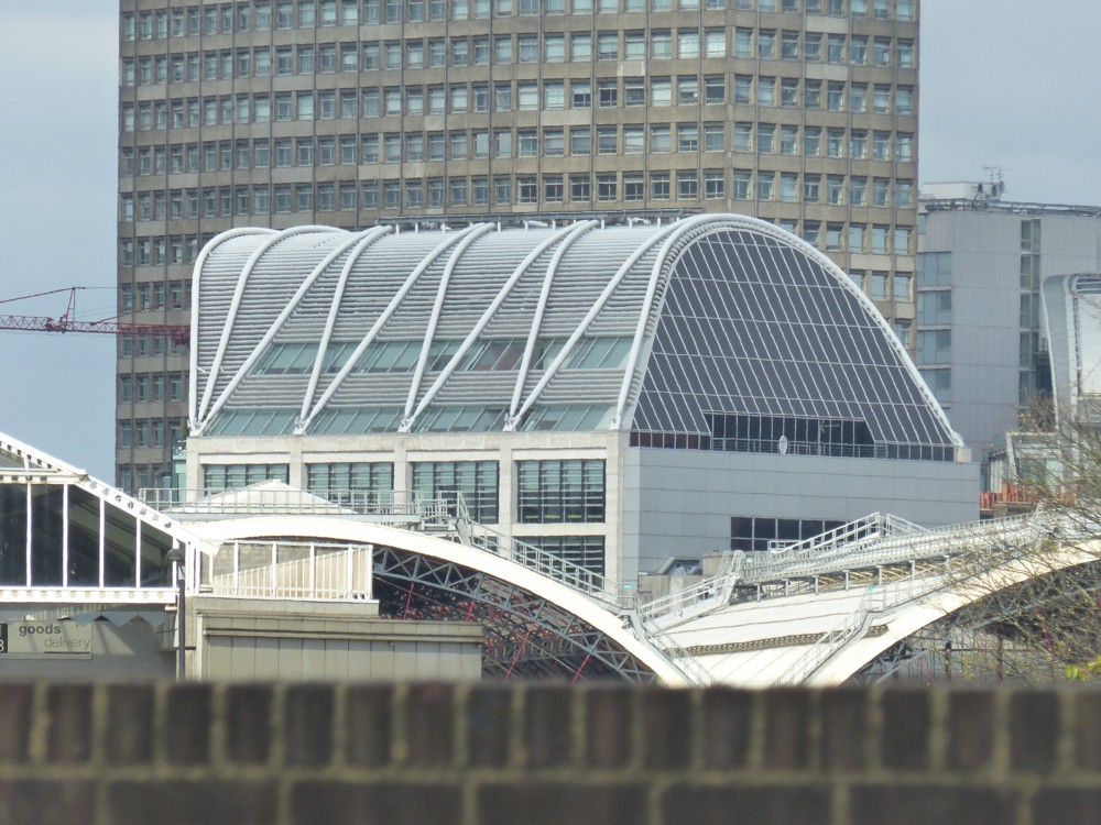
Here are some more pictures of it that I have taken since then, from various angles:

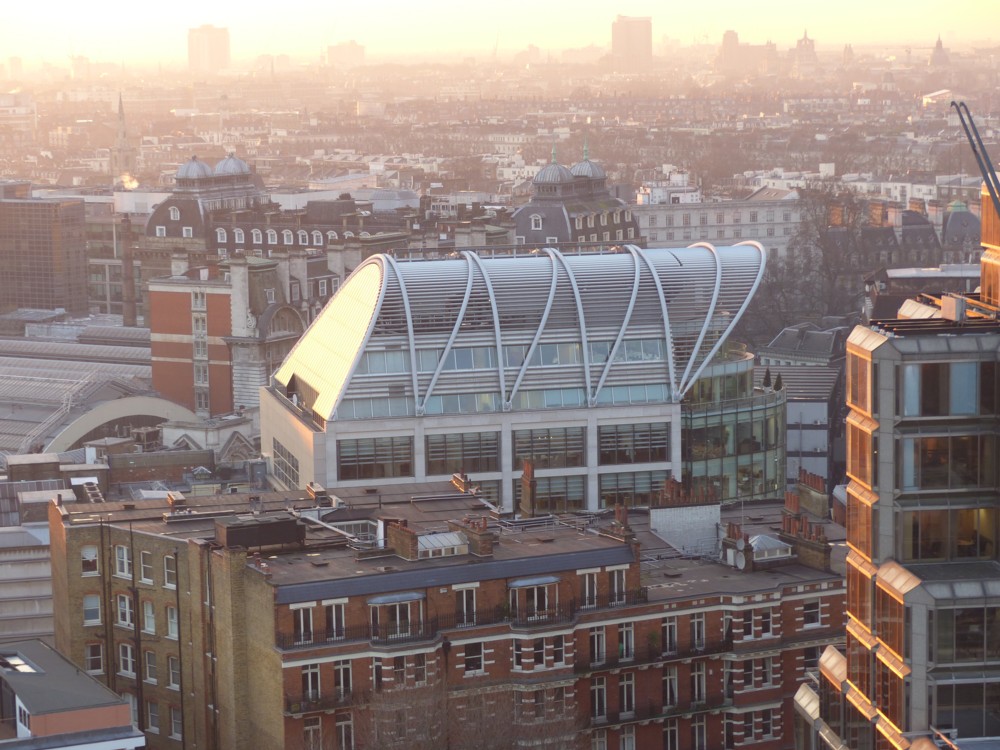
That picture, to my eye, makes it look downright beautiful. As does this next one, taken looking into the evening sun from the top of Westminster Cathedral, even more so:

But now, the plot thickens, or maybe that should be: the plot gets thinner, back to its original state.

My internet searching skills are very primitive. I have just had yet another go at finding out what this odd building is called, at any rate by those who own it or who are in the business of renting it out. And I have finally managed to learn that they call it “The Peak”. Heaven knows why. It doesn’t look like much of a peak.

Anyway, knowing this, I eventually found my way to this description of The Peak. And what do you know? (More precisely: What the hell do I know?) It would appear that this ungainly thing was what I had originally assumed it to be: a one-off design. The whole thing was built all in one go. So what had seemed obvious to me was not even true, let alone obvious.

The Sheppard Robson designed building adjoins the Apollo Theatre and replaces two existing structures. The Vauxhall Bridge Road and Wilton Road elevations incorporate robust Portland stone-clad columns and spandrels with intricately designed glass solar shading louvres between.

The louvres provide a dynamic visual effect to the building both during the day and at night. The prow of the building facing Victoria Street is curved, following the site boundary, and an arcade has been provided at street level to substantially increase the pavement width along one of the busiest pedestrian thoroughfares in central London.

So, what will I now feel about this building? Will I go back to feeling that it is ugly?

This will not be a decision. It will simply be a fact, which I will discover by introspection. How do I now feel? As of now: not sure. My mind may decide that, because it had, for a while, been deceived by this building, and dislike it more than ever before. But, I am starting to suspect that, having found beauty in this object, even though this finding was based on an error, my mind will be reluctant to surrender this happy feeling.

Incidentally, I have already posted here a photo of the roof of this building, and in particular of the crane that sprouts out of that roof to clean the windows. I’m talking about the last of the three photos in this posting.

Originally posted at Brian Micklethwait’s Old Blog

Lea River footbridge

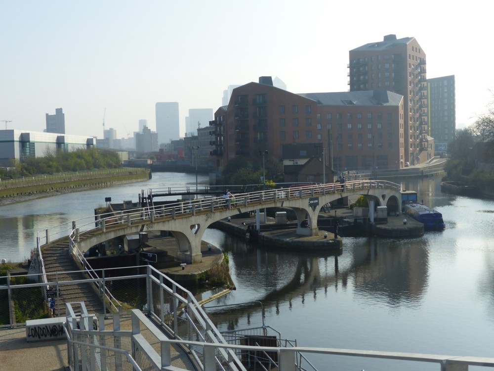
I like this footbridge, and I like this photo of this footbridge:

I took this photo on the same day I took this gasometer with towers photo, and these cat photos (LINK TO THE OLD BLOG).

We are looking down from the road bridge that takes Twelvetrees Crescent over the River Lea and Bow Creek. It’s a delightful spot, to be found at the top right end of the Limehouse Cut. On the right, we see the Limehouse Cut about to make its bee-line for the Limehouse Basin. And on the left, the River Lea is about to wend its very winding way down to the River. Where the Lea empties itself into the Thames is right near where I took these fish photos.

The reason I cross-reference all these photo-postings of mine is because the idea of these expeditions is not just to see amusing things in isolation, but in addition to that to build up the bigger picture in my mind of what that part of London, and in particular its waterways, is like. All these walks need to join up with each other, in reality and in my head. The latter I achieve by trawling back through my photo archives, by repeatedly meandering about in google maps, and by connecting up this blog posting with that one. And by going on more expeditions.

Originally posted at Brian Micklethwait’s Old Blog

The Limehouse Cut is boring to walk along …

Today I had what I suspect may prove to be a once-in-a-lifetime experience. I say that because it was so boring that I may never do it again. I walked the length of the Limehouse Cut:

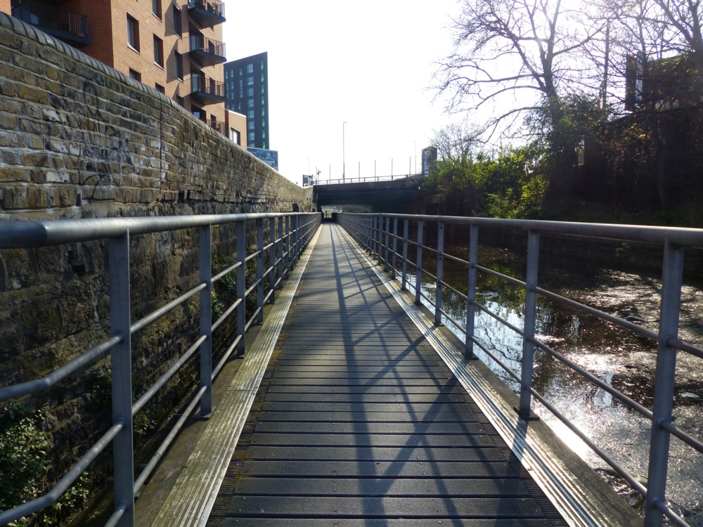
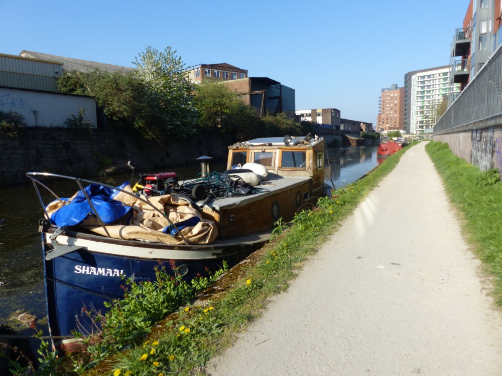
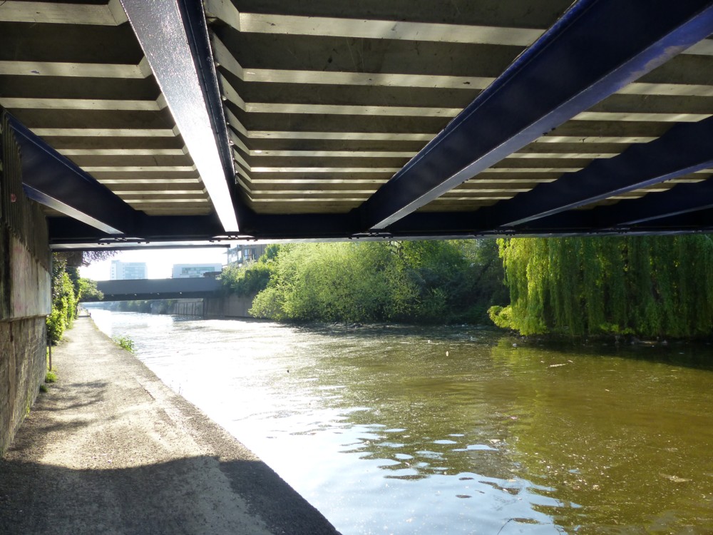
The thing about the Limehouse Cut is that it is dead straight, as purely man-made things so often are. So, when you are walking along next to it, you find yourself staring forwards at an infinitely receding, dead straight, unchanging canal-side path. The Limehouse Cut is dead straight, and hence dead boring.

Click on that dreary little map of the Limehouse Cut, above, and you will get the context, which shows also how most waterways in London look. Not straight. And that makes them much more amusing to walk next to. Usually, when walking beside a London waterway, there are constant twists and turns. New things regularly come into view. The whole atmosphere of the journey keeps changing. But when things straighten out, like they did today, it can get very repetitious.

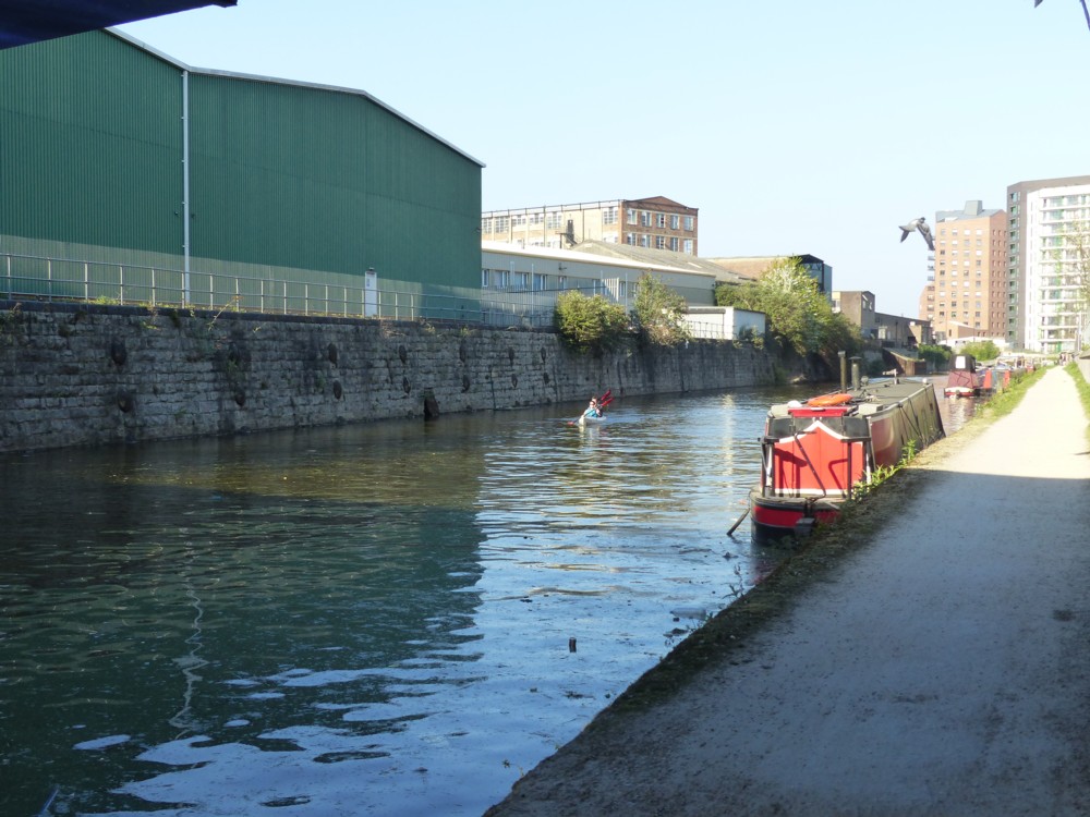
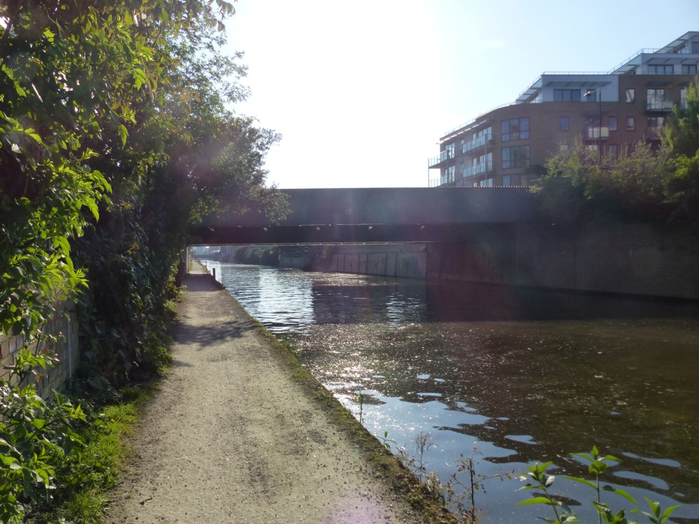
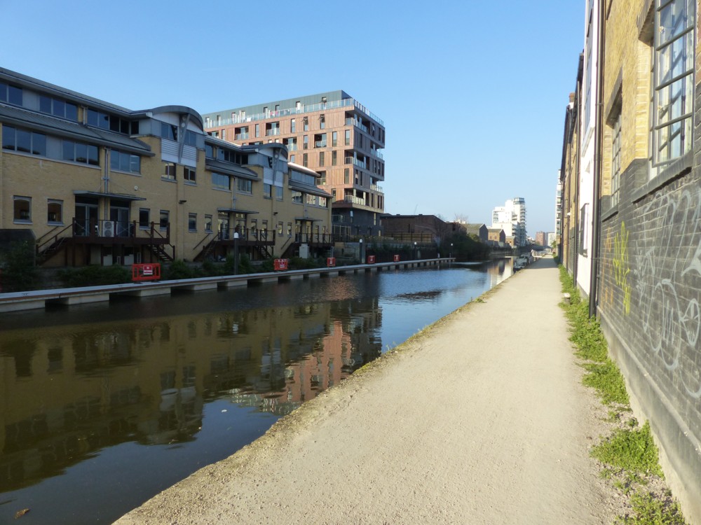
Here are some pictures that make that point:

I have long noticed something similar when it comes to walking along roads. Long straight boulevards are an ordeal. Twisty and turny walks, with lots of visual variety and with obstacles in the way so you can’t see miles ahead, are, I find, much more appealing.

The point is variety. Anything that just keeps repeating itself is dull. Even if it is something you might think picturesque, like a waterway with lots of boats on it. But that gets dull also.

I was actually not surprised by this. I was expecting it. But, I was hoping against hope that there might be a good view in the distance, like the Shard maybe. Or that it wouldn’t be boring. Well, it wasn’t entirely boring. There were things to see that were surprising. Plus there was a park that I was able to visit. But basically, it was boring.

But the thing was, what if the Limehouse Cut was really exciting? I had to make quite sure that this was not so. So, there was a meaningful mission today, and it was accomplished. And it didn’t take that long.

Originally posted at Brian Micklethwait’s Old Blog

IKEA furniture – Lego furniture?

So I had a look around Dezeen to see what’s there that’s interesting, and their most popular posting right now is about IKEA. All I saw, for several days, was: IKEA. So I ignored it. But on close inspection, the posting is actually rather interesting. Its title is: IKEA switches to furniture that snaps together in minutes without requiring tools.

Quote:

The fiddly ritual of assembling IKEA furniture is set to become a thing of the past as the furniture giant introduces products that snap together “like a jigsaw puzzle”.

The brand has developed a new type of joint, called a wedge dowel, that makes it much quicker and simpler to assemble wooden products. This does away with the need for screws, bolts, screwdrivers and allen keys.

My chosen destinations for furniture are charity shops, mostly. That or basic second hand places. Partly that’s an aesthetic preference. I take pride in the cheapness of my living arrangements, that being my preferred look. But part of that is because I have always assumed that flatpack furniture is indeed too fiddly and complicated to be relying on. Also, frankly, I basically just don’t like IKEA’s furniture.

But for those who do like IKEA furniture, it looks like it is about to get a bit simpler to assemble.

Thought. Does Lego make furniture? I just googled that question, and google answer number one was this:

A company is making furniture that is like giant Lego for your home:

This furniture is designed to be taken apart over and over again.

It is called Mojuhler and is flatpack, modular furniture that can be changed from a chair to a table in minutes.

You can fund the project on Kickstarter from about £80.

Nice basic idea, but scroll down and you get to pictures of brackets and screws! Screw all that, and not with a screwdriver. It looks more like Meccano than Lego, I’d say. It says on the right at that place that it failed to get its funding. If that’s right, I’m not surprised.

This is more what I was thinking.

One of the basic drivers of design is the desire to own bigger versions of the stuff you played with as a little kid. A lot of Art is like this, I believe. So, why not furniture too?

Originally posted at Brian Micklethwait’s Old Blog

Something there

Nothing here today, but something there. Another case of starting something for here, but putting it there, as was this.

Spent my evening getting my colour printer back in business. Took me five minutes to find the on/off switch.

Originally posted at Brian Micklethwait’s Old Blog

What I’ll be talking about this coming Friday

Christian Michel hosts talks he calls 6/20 talks, because they happen on the 6th and the 20th of the month. And this coming Friday, Jan 6th, I am giving a talk, about politics and aesthetics, and how they interact.

This is the email I sent to talk host Christian Michel, about what I will be saying, or more precisely, what I will be asking:

My talk will be about what we each think is the truth about politics, and about how that relates to what we each think is beautiful.

What are your political opinions? What are your ideas of beauty? How do these things relate to each other?

Are your political loyalties and beliefs the result of your already existing ideas about what is beautiful? Did you arrive at your political views because you think that the political world you desire would be beautiful, as you already understood that?

Or, is it more the other way around? Do your present ideas of what is beautiful result from what you have already decided is the political truth of things? Would your politics lead to a world that looks a particular way, and do you therefore consider that world to be beautiful?

Or, for you, do the causal links go in both directions? That certainly applies to me.

Or, do the above questions rather baffle you? Because for you, what is politically true and what is beautiful are two entirely separate issues? For many who, like me, call themselves libertarians, I should guess that this might be the answer, even though this is definitely not my answer.

I put my subject matter in the form of questions, because I hope that potential attenders will receive advance notice of these question, and that some attenders at least will arrive with their own answers.

I will supply introspected answers about my own political and aesthetic preferences and how they are related, a lot of them involving architecture. But I hope I will speak briefly enough to leave plenty of time for others to offer their answers to my questions. Or, of course, to say that the questions are silly, or whatever else they want to say about what I have said.

My current plan is to read out the above, and then illustrate it with some personal examples, and with some other examples that seem to be quite common, and commonly talked about.

My personal examples involve things like the extraordinary aesthetic appeal of American stuff, like their cars and their fighter jets, which got me thinking about why America actually worked better than the USSR, whose stuff seemed to be grey and dull and unglamorous by comparison. That got me started towards being a libertarian, I think, way back in the 1950s.

In a related way, I then began to observe that British public sector architecture, which set the tone of the entire architectural scene in the sixties and seventies, had that same Soviet style drabness about it. Modern architecture only became flash and glamorous, in the eighties.

All that, among other things, turned me into a libertarian. And since then, I have tended to like the look of physical assemblages of objects that strike me as embodying liberty. Skyscraper clusters and roof clutter being good examples. I’m pretty sure I wouldn’t be so fond of roof clutter in particular if I had more bossy tastes in politics, if you get my drift.

That’s a pretty simplified summary of some of my aesthetic-political thoughts-feelings. But it suffices to illustrate the kind of thing I’ll be talking about.

As for similar stories told by others, I am struck by how an architectural style is often regarded as ugly, while it is advancing and hence seen as threatening, but later regarded with affection, once it has been defeated and is in retreat. This happened with the New Brutalism, widely hated during its years of ascendancy, now only in the news because some now want its surviving edifices to be legally preserved.

On a huge, historic scale, this is what has happened with Norman castles. Feared and hated when built, and for centuries after. Now quaint and picturesque tourist traps. Same kind of thing with big steam locomotives, at first feared and hated, now worshipped.

Many feel threatened by the very contemporary architecture that I personally like, and that’s because they see it, as do I, as embodying the very free market (-ish) ideas that I like, and that they dislike. It’s more complicated than that. But again, you get the idea.

My intention is to rattle through what I have to say quickly, to leave plenty of time for attenders to offer similar aesthetic-political memoirs of their own.

I’m putting this here so I can link to it in emails to potential attenders. Emails work better when they are short, but when they can be lengthened, so to speak, by those reading.

If you want to know how to attend this talk, or other talks in the same series, email me (see here top left) or leave a comment and I’ll put you in touch with Christian Michel.

Originally posted at Brian Micklethwait’s Old Blog

A useful little party

The party I hosted on New Year’s Eve was rather exclusive. Nobody was actually forbidden entry. But I was very late with the invites, and because I feared that so few would be attending, I actually told people that if they wanted a proper, noisy, standing room only do, rather than what actually happened, they ought to steer clear, and that meant that even fewer people came. But it also took the pressure right off me, because whoever did come had been duly warned. The fireworks that those still present at midnight looked at and photoed from my roof (see below) were a bit out of the ordinary, but I had not seen that coming and so did not make that a selling point. Next time round, if there is a next time round.

But, I did have some fun conversations. And in particular one that has just resulted in this posting at Samizdata, about Shipping Containers. And about other Things. Once again, I at first wrote all of this for here, but then transferred two thirds of it to there.

Originally posted at Brian Micklethwait’s Old Blog

Nelson statue in Greenwich

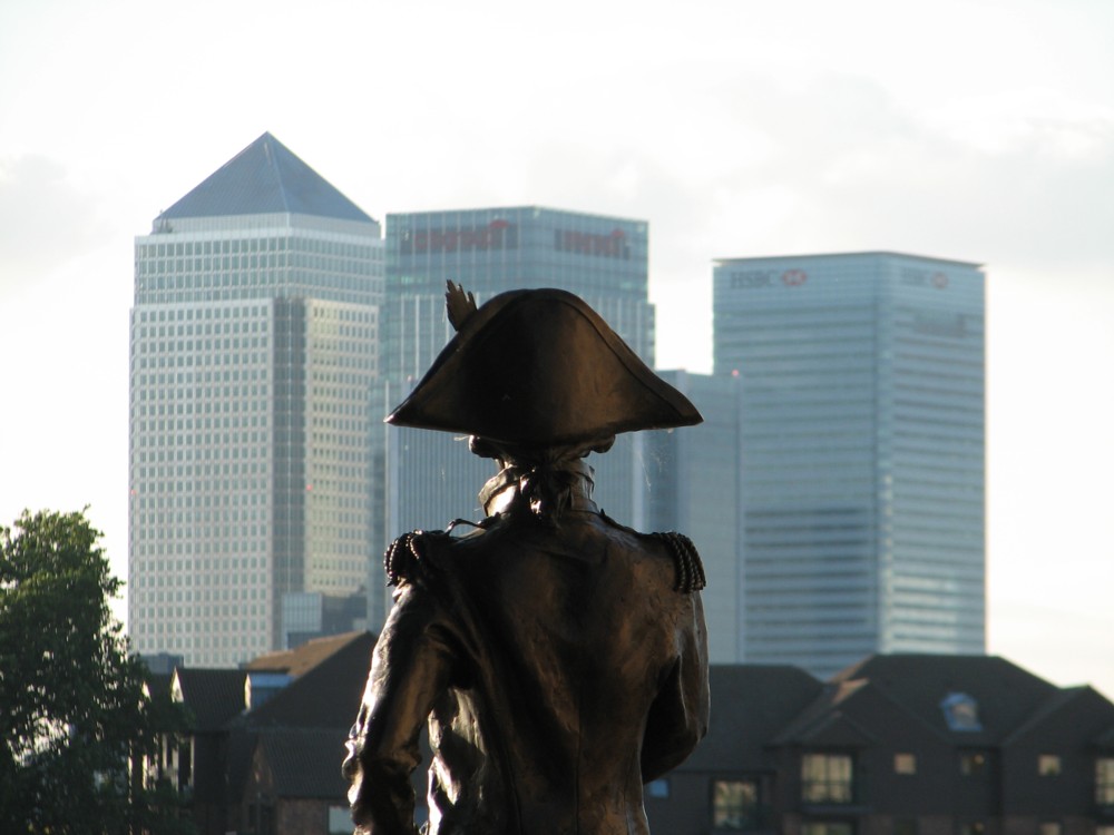
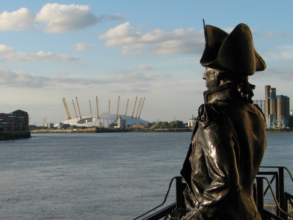
I remember the time well. It was when I first had a really nice camera, and I explored the banks of the River Thames, finding all manner of things that I never knew existed until I chanced upon them, camera in hand. This statue of Lord Nelson, for example, which is outside a pub called the Trafalgar Tavern, in Greenwich, which I encountered in July 2007:

The www offers two sorts of pictures of this statue. There are the ones that show his face and medals, with the Trafalgar Tavern behind his Lordship, often with the word Trafalgar carefully included. And there are the views from behind, like mine, which provide a modern background, in the form of the Docklands towers or the Dome.

I did take a front view of this statue, but it was totally ruined by my shadow blasting its way into the middle of the picture. The fact that I didn’t bother to retake that shot tells you that I preferred the modern background shots.

Originally posted at Brian Micklethwait’s Old Blog

Sickness and sunset

Being sick as in feeling sick, and occasionally being sick as in being sick. As in expelling stuff I had previous eaten from my mouth.

Quota photo time:

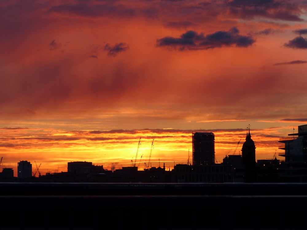
There was so much light crashing across London from west to east that evening the eastern clouds were lit up pink, like they were a sunset or something. So I know what you are thinking. It must have been one hell of a sunset to do that. And you are not wrong:

If I wasn’t sick I probably wouldn’t indulge in such a lurid sunset, which I photoed last Saturday evening on Tower Bridge. But I am sick. I can do what I like.

Actually, it’s already getting better. But wish me well anyway.

Originally posted at Brian Micklethwait’s Old Blog

Bard and Shard

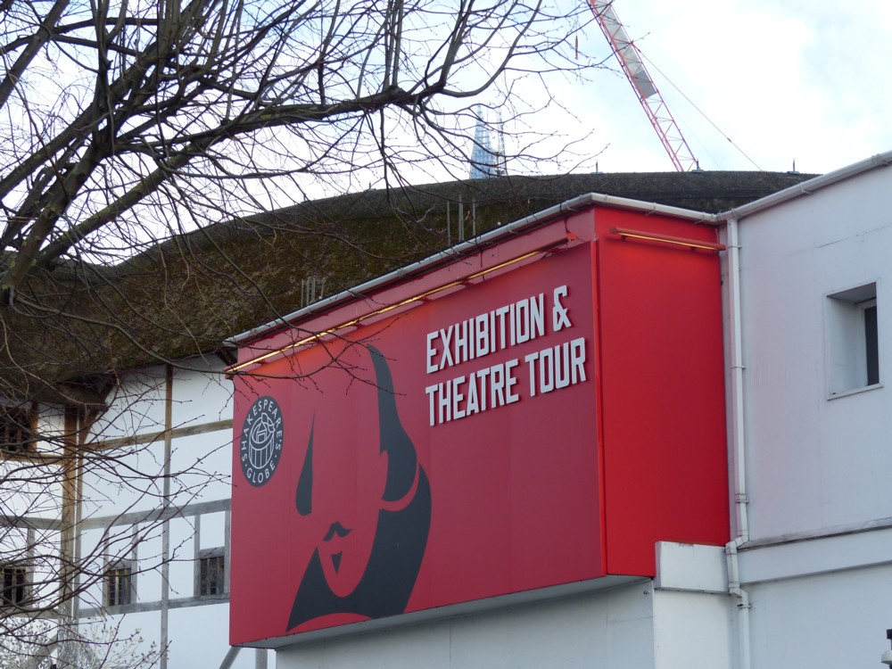
Indeed:

It’s been a long day. It’s been a long day partly because I spent a lot of it out and about, taking photos, of which the above is just one. But it was still a long day.

I hear a lot of complaints from my fellow Londoners, to the effect that the Shard is all very nice and tall and pointy and everything, but that it doesn’t look finished. That weird top. It ought to be a smooth, single point. Instead, well, look at it. It looks like someone shot the original top off of it with a giant catapult.

But although this strange and “unfinished” top may make the Shard look less conventionally pretty, it does make that top very recognisable. You only need to see the very top of that weird top peaking out above something else nearer, and you know at once what you are looking at. And I more and more find myself believing, about architecture in London, recognisable trumps pretty. (I more and more feel this way about the entirety of the Walkie-Talkie.)

Originally posted at Brian Micklethwait’s Old Blog