John C. Reilly – Ian Hislop

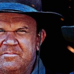
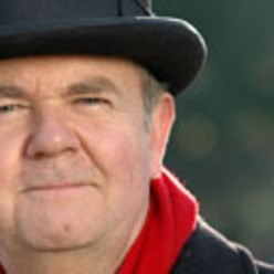
On the left here, John C. Reilly, shown enacting one of the Sisters Brothers, Eli, in the graphics advertising the movie of that name. On the right, Ian Hislop, editor of Private Eye, and star of long-running BBC comedy quiz Have I Got News For You? My instant reaction, when I first saw that advert for The Sisters Brothers, was that Reilly looked like a homicidal and weather-beaten version of Hislop:

I can’t be the only one now noticing this. Yet googling “John C Reilly Ian Hislop” yielded only information about either John C Reilly or Ian Hislop. There was no mention of any physical resemblance between these two persons.

Originally posted at Brian Micklethwait’s Old Blog

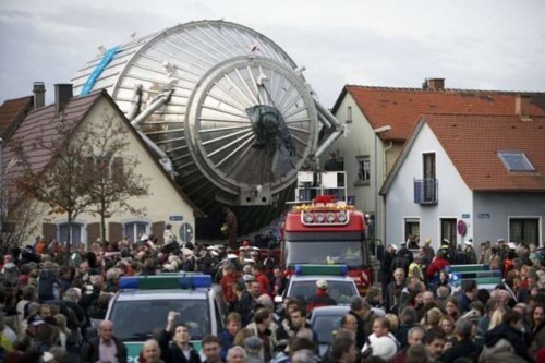
A device for measuring neutrinos being transported through Karlsruhe

Here:

It reminds me of the scene at the end of Starship Troopers (a scene which I may now be imagining (but I think it happened)) where the victorious Starship Troopers celebrate their capture of The Queen Bug.

Originally posted at Brian Micklethwait’s Old Blog

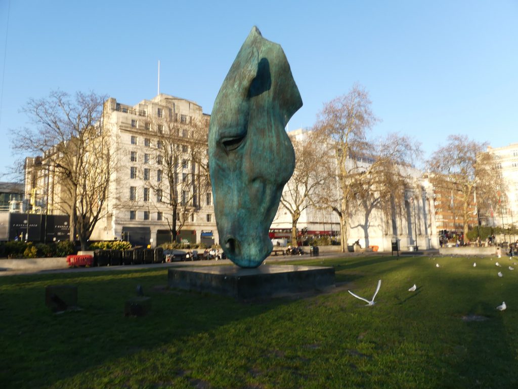
A horse’s head at Hyde Park Corner

This afternoon, GodDaughter2 and I walked from the Royal College of Music, up past the Albert Memorial, then through Hyde Park to Hyde Park Corner, and then on to Soho Square.

At Hyde Park Corner, GD2 directed me to this sculpture, which I never knew about until today:

GD2 likes this, especially at night when it’s lit up.

This guy also likes it. This guy, on the other hand, hates it.

Me, I’m not sure. It’s very striking, was my first reaction. But now, I’m troubled by the way that, because the head is pointing downwards, the cut through the neck of the horse seems like a real cut, rather than just a sculptural convention. It made me think of that famously gruesome horse’s head in the bed scene in The Godfather. Perhaps more seriously, I feel that the way the neck is cut like that makes the shape of the object as seen from a distance excessively determined by the cut, rather than by the fact that it’s a horse’s head.

The problem is that, what with this sculpture being called Still Water, the horse’s head has to be pointing downwards, because the horse is presumably drinking that water. So if you want only the horse’s head, that head has to be cut off, one way or another, and any way that happens is liable to count for more than it should.

Originally posted at Brian Micklethwait’s Old Blog

A design success and a designfail

Again from designboom, this posting about a Ukrainian rug-maker who is souping up his designs with modern references. I particularly like this one:

This works for many reasons, one of them being that there is something very medieval and nostalgic about the whole Star Wars franchise, and lots of cinematic and other scifi in general. Faster than light travel, for instance, isn’t modern. It is a bogus technology trick for turning the future back into the Middle Ages, into a world full of faraway wonders and monsters, but not so far away that you can’t reach them soon enough to still be alive when you get there and make your visit count.

By the way, I think “designboom” postings are very badly designed. The basic problem, although not the only one, is their juvenile refusal to understand capital letters, and their determination instead only to use capital letters for acronymic organisations (like, in this case: “OLK”), but never to signal the beginning of a sentence, or the beginning of a heading. Or for something like Star Wars. This is stupid when you are simply writing a chunk of prose. But it is seriously stupid at a website, because websites are tricky to make clear at the best of time. Boom? No. Fail. Pity, because they seem to have a lot of good stuff.

This blog, the one you are reading now, is much better designed. To look at I mean. Not how it works, which is very badly.

Originally posted at Brian Micklethwait’s Old Blog

Photo-edited from zero to hero

I remember, during the reign of President Bush Jnr., how I used to blog about how photography was used to glorify President Bush. Well, here’s another political photo of a rather similar sort, which has been an open window on my computer for some time:

What I find entertaining about this photo is the extreme contrast between the clearly very humdrum appearance, for real, of the old guy in the photo, and the way that (I suspect) pushing just one Photoshop button has turned this same guy into something almost heroic.

The headline above the photo is telling:

The most consequential conservative leader of the century? He’s still alive, in office and owed an apology

The old guy in the photo-edited photo is US Senate Majority Leader Mitch McConnell, whom the Tea Party people used to regard as a waste-of-space sell-out, but who is now being lauded to the skies by the Trumpsters.

Says Jewish Chronicle writer Marc A. Thiessen:

While President Trump deserves credit for making outstanding judicial nominations, long before Trump declared his candidacy McConnell was laying the groundwork for a conservative transformation of the federal judiciary. It was, he told me in an interview last week, “entirely premeditated.”

McConnell reminds me of a particular American actor, whom I recall having seen in a number of movies. Trouble is, that actor is the sort of actor you recognise the face of, but whose name you never quite register. It’s that sort of face.

Originally posted at Brian Micklethwait’s Old Blog

La Taupe

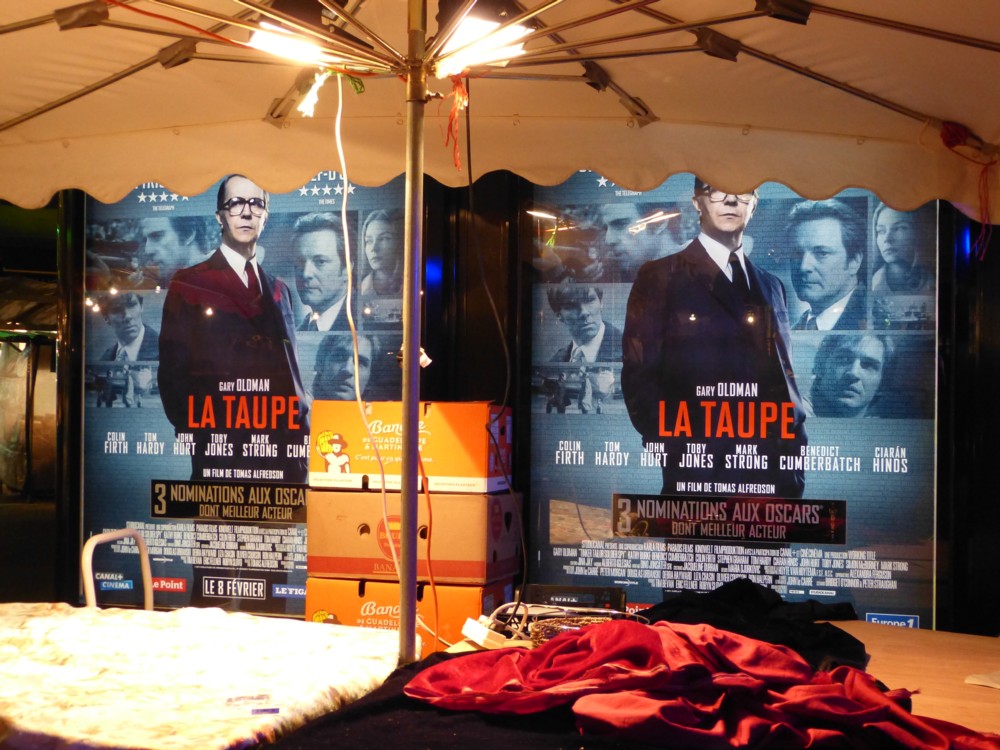
To me, nothing says Abroad quite like a poster, somewhere in Abroad, advertising an English speaking movie, whose English title I already know, with a foreign title that is different, but with all the same star names:

La Taupe means The Mole. I preferred the TV series, but I love this poster. Photoed by me in Paris in February 2012.

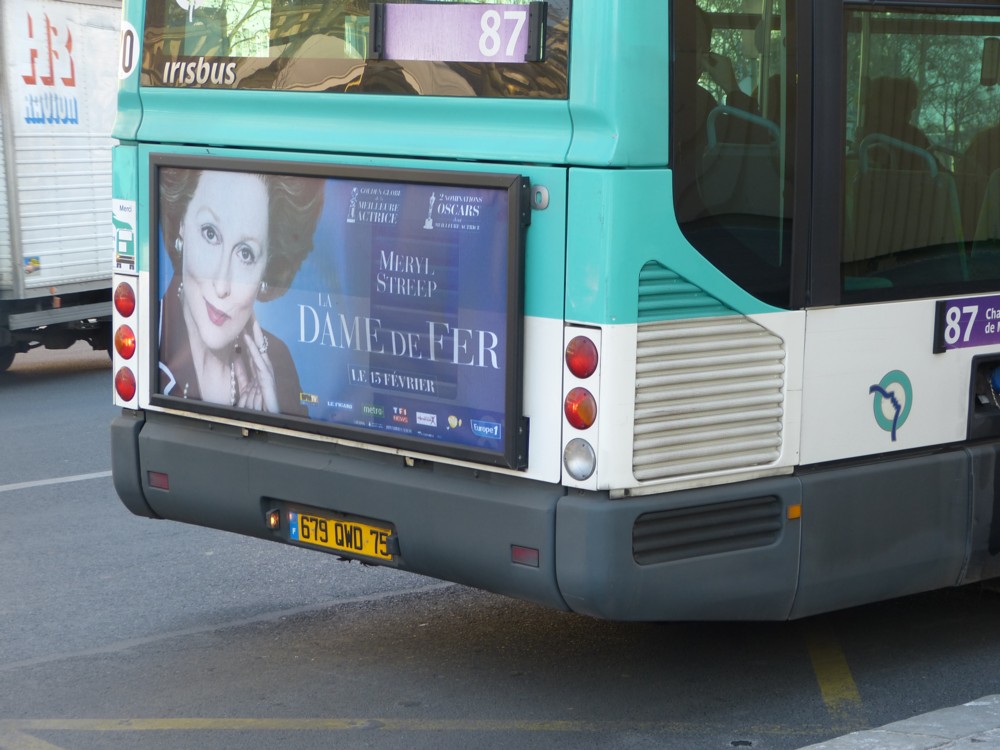
As was this, on the same expedition:

In the same directory, I encountered other photos of posters advertising the following movies: Drive (Ryan Gosling), Ghost Rider (Nicolas Cage), Underworld (Kate Beckinsale), and Star Wars Episode 1 (whoever). But in those posters, the titles stayed in their original English. Why?

Originally posted at Brian Micklethwait’s Old Blog

Driverless vehicles with faces and driverless vehicles to sleep on

Driverless cars will happen, eventually. But when they do, who knows what they will be like, or look like, what they will do or not do, what other changes they will precipitate? When this finally happens, it will surely be the railways, or the internet, in the sense that it will be big, and that nobody now knows how big or what the details will consist of.

Two driverless vehicle articles came to my attention today, both of which illustrate how very different driverless vehicles could end up being to the vehicles we are now familiar with.

This Dezeen report reports on a scheme by Land Rover to put eyes on the front of driverless vehicles, to communicate with pedestrians, the way pedestrians now look at the faces of drivers to negotiate who goes where, when. Makes sense. With no driver, and the vehicle driving itself, it could use a face, or else how will the vehicle be able to participate in after-you-no-after-you-no-after-you-no-I-insist-so-do-I sessions?
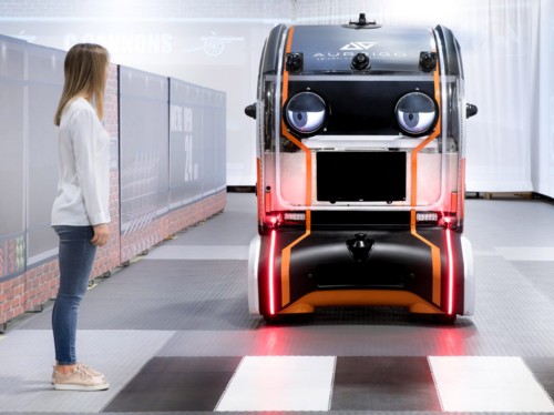
So, does a robot with a working face (in due course robot faces will be a lot better than that one) count as: “Other creatures”? I say: yes (see below).

Will the Thomas the Tank Engine books prove to be a prophetic glimpse into the future of transport? Eat your hearts out, SF movies. Didn’t see that coming, did you?

And here is a posting about how people might choose to sleep in driverless vehicles on long journeys, instead of going by air. The problem with going by air being that you have to go by airport, and that sleeping in the typical airplane is for many impossibly uncomfortable. But, if we do sleep on long distance driverless vehicles, what will we do about going to the toilet? Stop at a toilet sounds like an answer. But what will the toilet be like? Might it also be a vehicle?

The point is: nobody knows how driverless vehicles will play out. Except to say that if they look like cars and vans and lorries look now, that would be an insanely improbable coincidence.

LATER: More about those eyes here.

Originally posted at Brian Micklethwait’s Old Blog

Do they know it’s them?

Here are two fun and silly and consequently viral animal videos that I was recently shown on Twitter, but they both raise a non-trivial question about animals and their degree of self-awareness.

First up, a cat looks in a mirror, and is surely not aware that the other cat is him/her. Cats are much stupider than they seem to us, because their basic method of going about things is the way a wise human goes about things, often rather slowly, carefully and thoughtfully, or else in a way that looks very alert and clever. But, often they are thick as several planks.

Meanwhile, a dog watches herself on TV doing one of those canine obstacle courses in a show. Dogs behave like stupid humans, with wildly excessive enthusiasm for stupid things, and consequently we tend to think of them as being very stupid. But the typical dog is a lot cleverer than the typical cat, I believe. Dogs don’t care how stupid they look. Cats typically don’t either, but cats typically behave like they do care about looking stupid, unless you dangle something in front of them on a string, at which point they go crazy, unless they are too old to care.

But back to my self-awareness point.

As commenter “Matt” says, of the dog watching herself on TV:

This is amazing I hope she knows its her.

In other words, Matt is no more certain than I am that she does know it’s her. Maybe she’s watching a totally different dog do what she likes to do, and she’s excited about that, just like any other sports fan.

The cat video ends with a variation on what seems to be a regular internet gag about misbehaving reflections (that vid being in the comments on the cat vid), but that’s a different story. Someone else adds a Marx Brother, or maybe it’s actually two Marx Brothers, doing the same gag, in those far off days before there was an internet.

Originally posted at Brian Micklethwait’s Old Blog

James Bond’s next Aston Martin

Here.

Basically it’s a drone that can twiddle two of its propellers. A robotised, propeller version of a Harrier Jump Jet.

However, the notion that flying cars will reduce or avoid traffic congestion is absurd. Once such contraptions are finally made to work, they will not reduce or avoid traffic congestion They will cause traffic congestion to take to the skies. They will give a new dimension to what is now a merely two dimensional phenomenon, and not in a good way.

Enjoy these days of big, empty, blue skies, while you still can.

Originally posted at Brian Micklethwait’s Old Blog

Big Thing Alignment with an appropriate slogan in the foreground

Photoed by me last Monday, from the train on the way back from Denmark Hill (which is where I also photoed that helipad (better to scroll down to that)):

The train being the explanation for that reflection, on the right there.

At the time, of course, I was merely going for that rather splendid Big Thing Alignment, of The Shard with The City Big Thing Cluster. And at the time, I was merely regretting that it probably wouldn’t come out quite as sharply as I’d have liked, and so it proved.

What I was not going for was a machine in a foreground with the words “REACH FOR THE SK…” on its arm. Presumably reach for the SKY. Which is, I think, rather suitable.

Shame I didn’t quite get all of that little slogan, but I got enough for the photo to be worth showing here.

Originally posted at Brian Micklethwait’s Old Blog