Helping hands

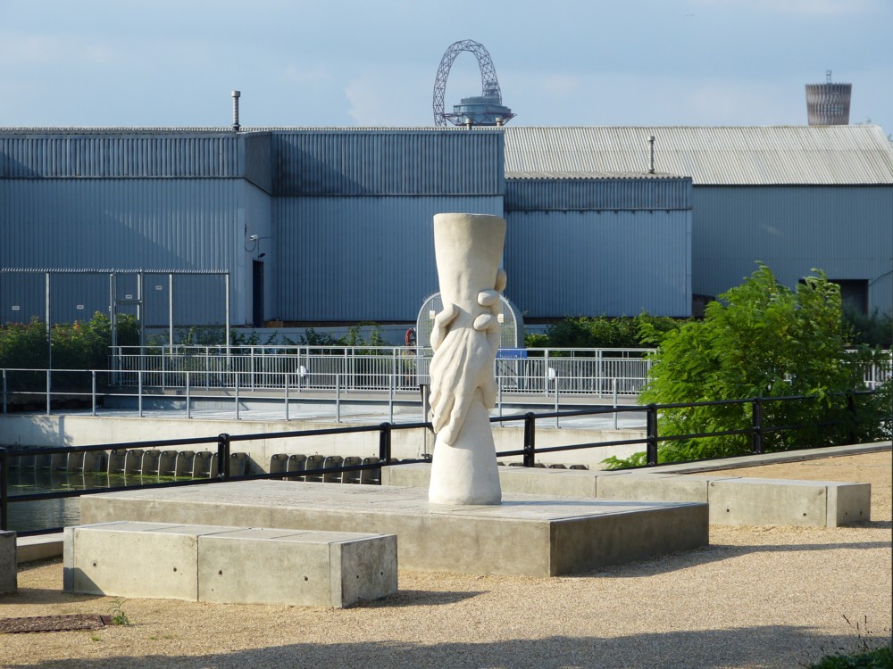
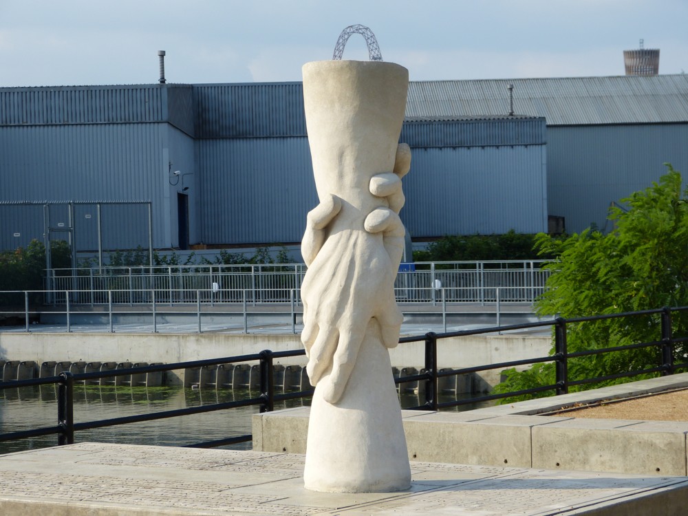
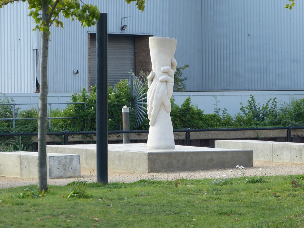
On that same photowalk with GodDaughter 1, five years ago, that I mentioned yesterday, and a bit earlier than when I took yesterday’s photo, of her and her shadow and my shadow, I took these photos:

You can see how that little mind of mine was working, can’t you? That being one of the amusements of me taking so many photos that comes across years later. I can now see exactly what I was thinking, in a little photo-moment, five years ago.

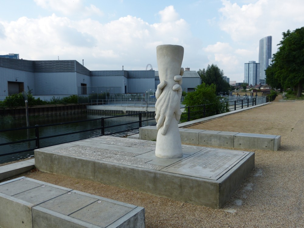
I encounter an interesting sculpture. (I find that I like sculpture more and more, provided I like it of course.) Then, in the distance, I see a favourite Big Thing, in this case the Big Olympic Thing. I line up the Big Olympic Thing up the sculpture. I line it up again, this time including only that very recognisable top of the Big Olympic thing, and putting that right on top of the sculpture, like a handle. Good. Nice one.

Then I draw back, and take another shot that provides some more context, while being careful to keep the Big Olympic Thing present, to one side. What I do not do, regrettably, is photo any sign or caption which told me about this piece of sculpture. What is it? Who did it? When? Why? What’s it of? There must have been some clue I could have photoed.

Happily, this is the twenty first century, and a little descriptive googling (“sculpture clasped hands” or some such thing) got me to places like this, which tell the story. And it’s quite a story.

Originally posted at Brian Micklethwait’s Old Blog

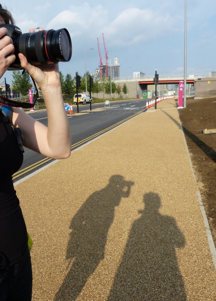
Photoer shadows

From the I Just Like It directory:

That’s GodDaughter 1 on the left there. We were on one of our photowalks, in August 2013, in other words just under five years ago. I was looking for something dated, perhaps because temporary, and there was quite a lot of stuff in that part of London, Olympic Games territory, that must look very different now. But that snap grabbed my attention, and I hope it tickles yours.

Originally posted at Brian Micklethwait’s Old Blog

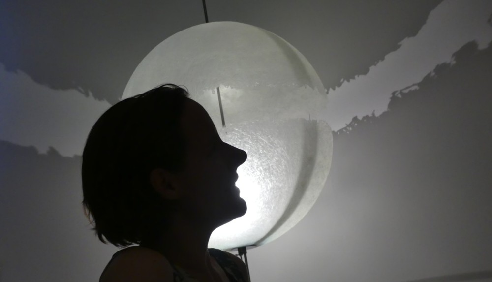
A friend in front of a strange lighting effect

I took this somewhat over a week ago, at a friend’s, of another friend:

I took several versions of this shot. The above was the first and best version, once I had realised that I could crop it to include everything about the shot that mattered and remove everything that didn’t, basically by losing a chunk at the bottom of my original. I tend to resist cropping. There is something (to me) pure, even perfect, about the image exactly as it comes out of the camera, no cropping, no enhancing, no nothing. But this time it made for a definite improvement, I think.

The subject of the photo (perhaps mutual friends of her and me will recognise who it is (and also where it was taken)) put it on her Facebook page, which is very flattering.

She being an Instagrammer used only a square version, which may or may not have been an aesthetic preference. Personally, I find the patterns made on the wall by that strange planetary light fitting very intriguing, especially in a photo, which, by eliminating all context and knowledge of what is going on makes it seem all the more strange. That’s the thing about photos. All you see is the photo.

And talking of how others may recognise her, I find it intriguing how very recognisable she is, to me anyway.

In her version, she added some blue to the wall. To make it more weird and outdoorsy, and less specific? In general, I like it when people take my photos and play around with them. Again: very flattering.

She also said something about how her scrunched up shoulders revealed how stressed she had been lately. I never noticed that, neither when I photoed the photo, nor since. But one thing I do know, from speaking to my friend Bruce the Real Photographer, and being photoed by Bruce the Real Photographer, and from speaking to others who have been photoed by Bruce the Real Photographer, is that Real Photographers know all about things like that. Real Photographers, of the sort who photo people, are experts on human physiology. They know, for instance, how to make your face look different by making you move your body around. Had he been photoing this lady, he would have made her relax.

But I wasn’t doing a portrait; I was just snatching a fun shot, uninvited. Then once I had worked out how to crop it, I sent it to her, and asked could I put it here? She said yes, and also could she use it too. So all the niceties were observed, as is proper in this age of face recognition software and easily violated intellectual property rights. Whatever they are, exactly. In plainer English, both of us like this photo, and are happy for it to get around.

Originally posted at Brian Micklethwait’s Old Blog

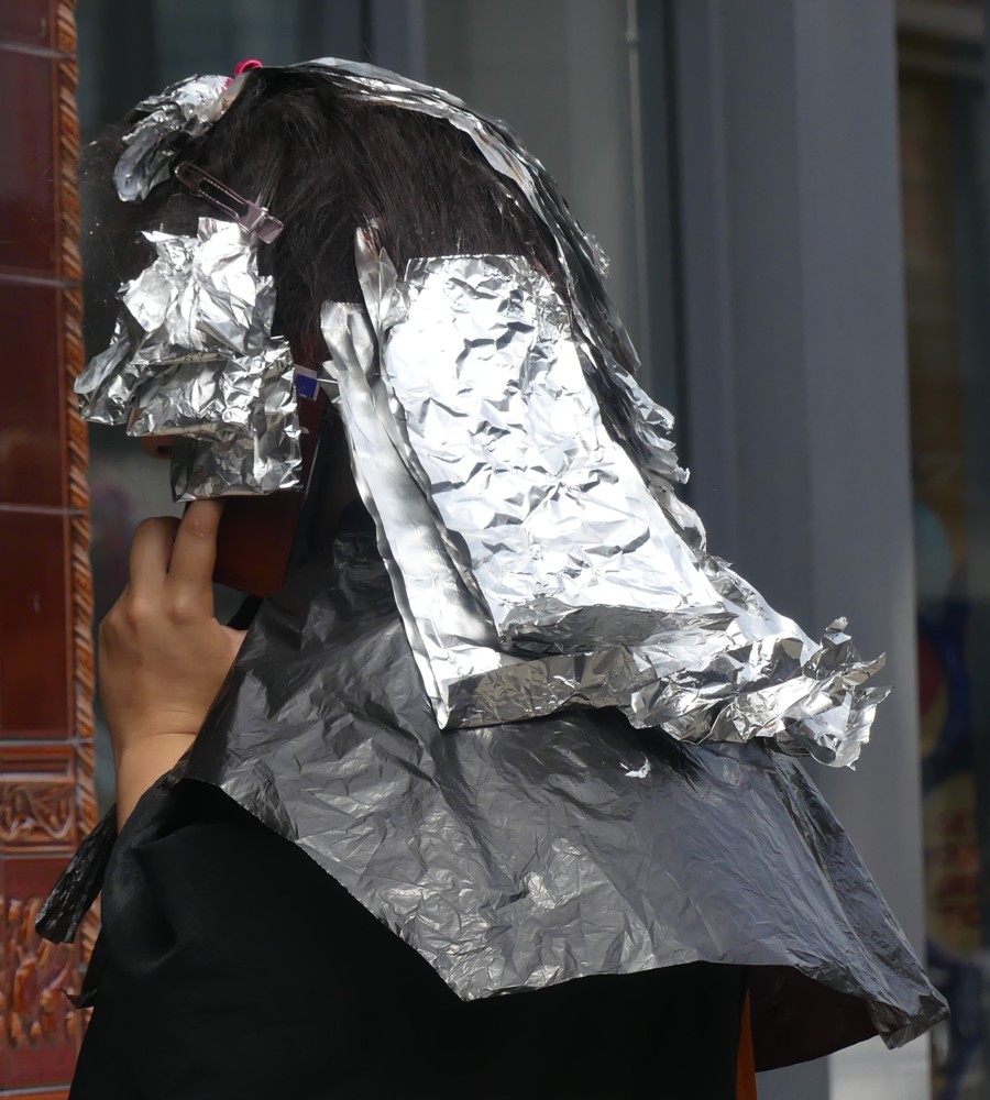
Interesting headgear

The final full day of The Great Heatwave of 2018 was two days ago, on August 7th. August 8th was a couldn’t-make-up-its-mind day, and today was a could-make-up-its-mind day, and it made up its mind to be cold and wet and generally horrible, perhaps in honour of the Lord’s Test between England and India, today’s first day of which was totally rained off. One day, magic beams will rise up into the sky from around the boundaries of all major cricket games and will divert the rain into giant vats, also on the boundary, and play will proceed no matter what the weather beyond the ground. (Such devices will also transform global agriculture, and make the entire population of the world obese.)

So, as I was saying, two days ago was the last day of the Heatwave, and maybe it was this heat which cause this lady to be wearing, in a street near me, this headgear:

This lady looked normal enough, apart from the headgear. I made no secret of the fact that I was photoing her, and she clearly saw me doing this and didn’t seem to min. Or maybe she was concentrating on her phoning and actually didn’t see me. Either way, I waited until her face was hidden.

The sane explanation for the headgear was the heat. And honestly, I do believe that this was what it was for. That heatwave really was very hot.

Originally posted at Brian Micklethwait’s Old Blog

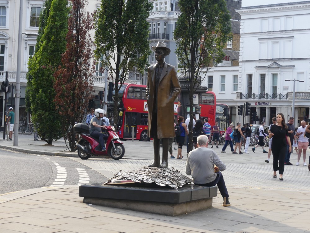
That Bartok statue again

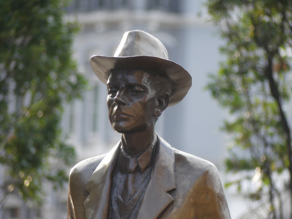
Yes, every time I visit my friends in Fulham Road, I get out at South Kensington tube, a bit early, and I photo, and then sit on the plinth of, the Bartok statue. Follow that link to find out why it’s there.

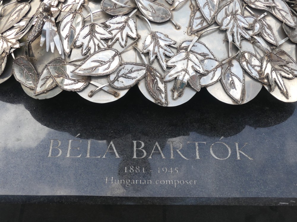
Context, caption, and the prettiest photo I photoed of this, this time around:


Music is made up of melody, harmony and rhythm. What I like most about Bartok’s music is the harmonies, of the more “beautiful” and less strident sort. Too many instruments, too loud, or a piano on its own ditto, and he loses me. In other words, I basically don’t like Bartok’s music that much, but I sometimes very much like the sound that it makes. I especially like the very beginning of the Concerto For Orchestra, the Piano Concertos (especially number three), and the string quartets. Oh, and I really like Bluebeard’s Castle, provided the singing is bearable. I especially like the in-English CD I have of it that came attached to the BBC Music Magazine about two decades ago, in which Sally Burgess sings superbly. Memo to self: listen to that again. I presume that Bluebeard himself is the usual industrial drill noise that almost all such singers perpetrate for a living, but it will be worth it for Ms Burgess.

This is the recording I mean. Click on that, and you will discover that you can listen to it too.

Originally posted at Brian Micklethwait’s Old Blog

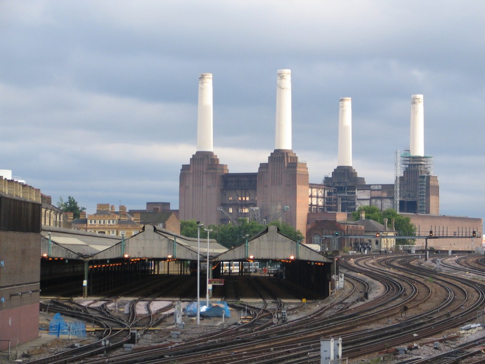
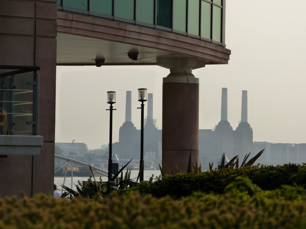
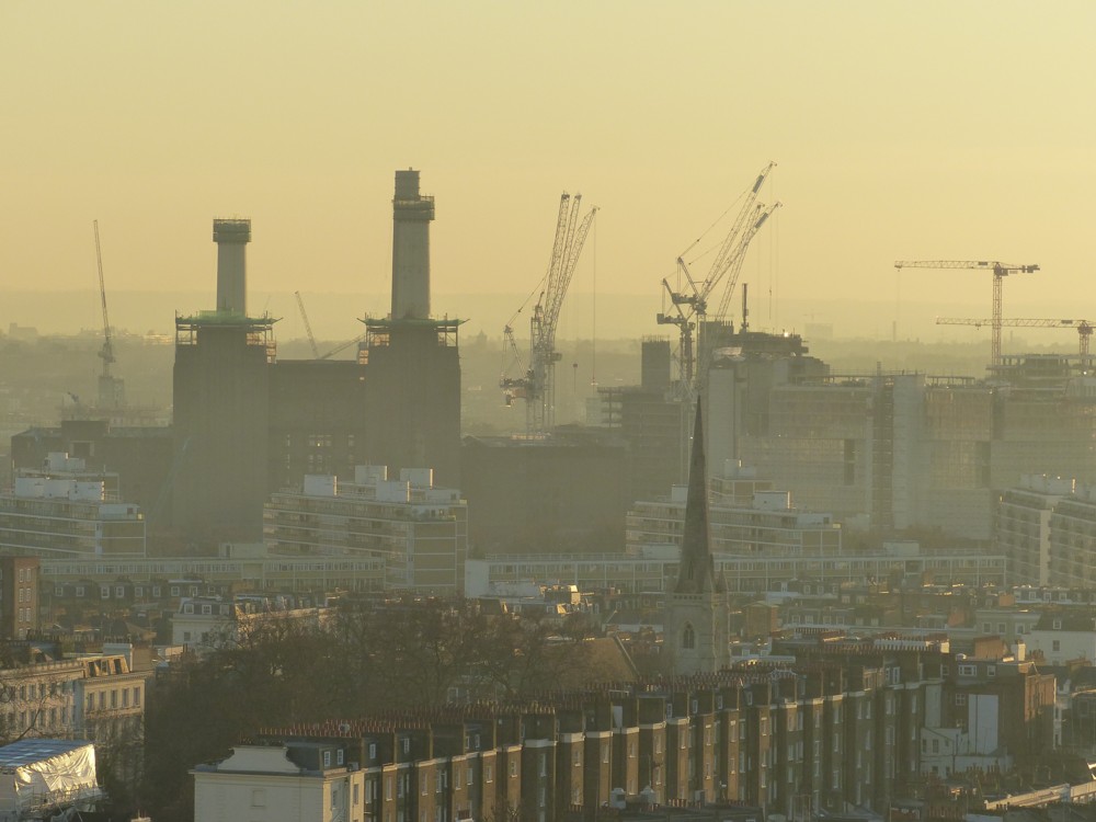
Battersea Power Station – 2005 – 2012 – 2016 – 2017

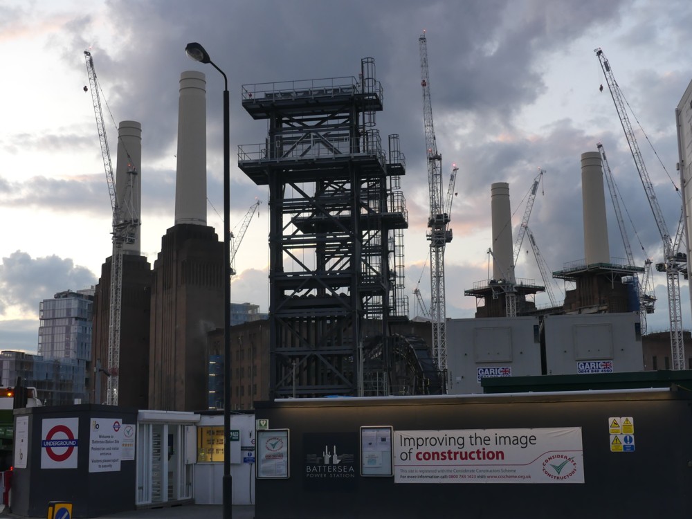
If you do four photos, adding very little in the way of verbiage, are they still quota photos? Probably, but what the hell. Today was hot, and this morning’s England v India test match finale was very tense. So this here’s your lot:

The Battersea Power Station is now smothered in cranes, so you’ll at once realise that the top two of these photos were taken earlier. 1.1, 2005, is a favourite view of many photoers, from Ebury Bridge, at the far end of Warwick Way from me. 1.2, 2012, was taken from the south end of Vauxhall Bridge. 2.1, 2016, how it from the top of Westminster Cathedral, in 2016. 2.2, 2017, is closer up, when I was checking out the beginnings of the work to extend the Northern Line, in 2017.

Whether you like Battersea Power Station or not (I happen to like it a lot), you’d surely agree that it is a very recognisable edifice, and I can understand why many regret that it is about to be surrounded by apartment blocks, of a similar height to the main body of the Power Station. But, that’s London for you.

Originally posted at Brian Micklethwait’s Old Blog

Orange umbrellas in Lower Marsh

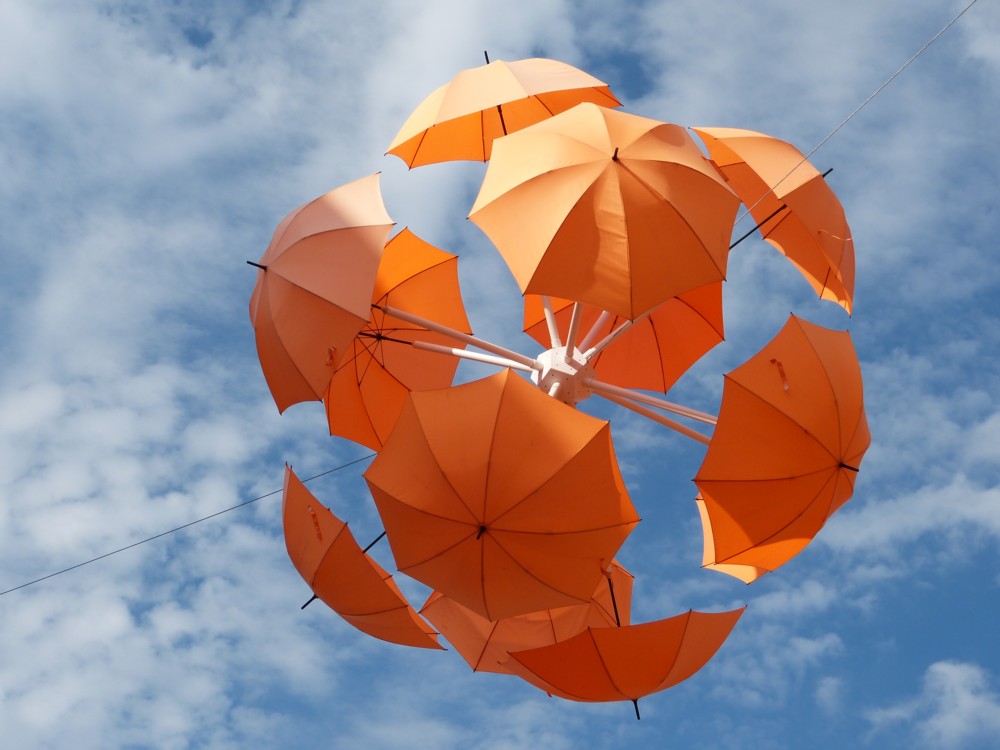
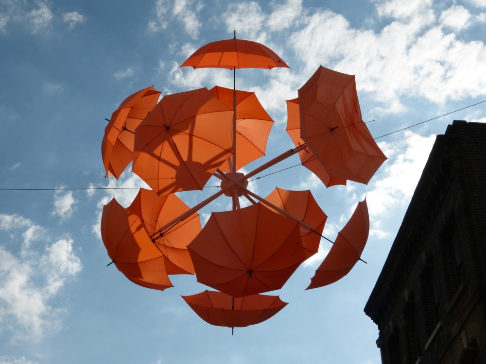
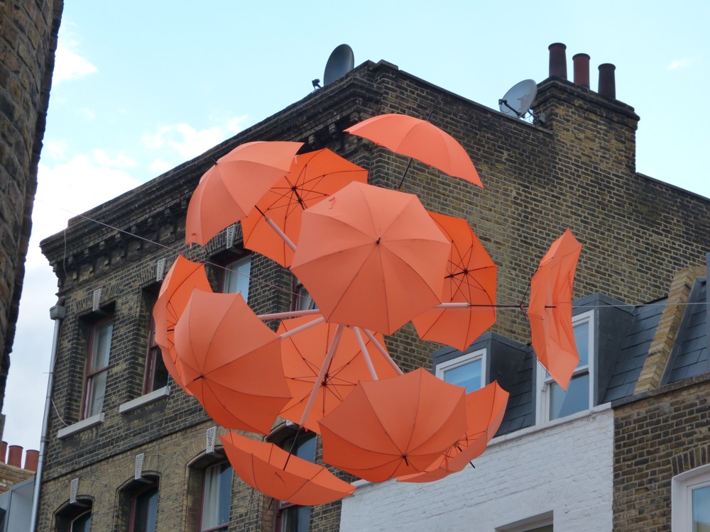
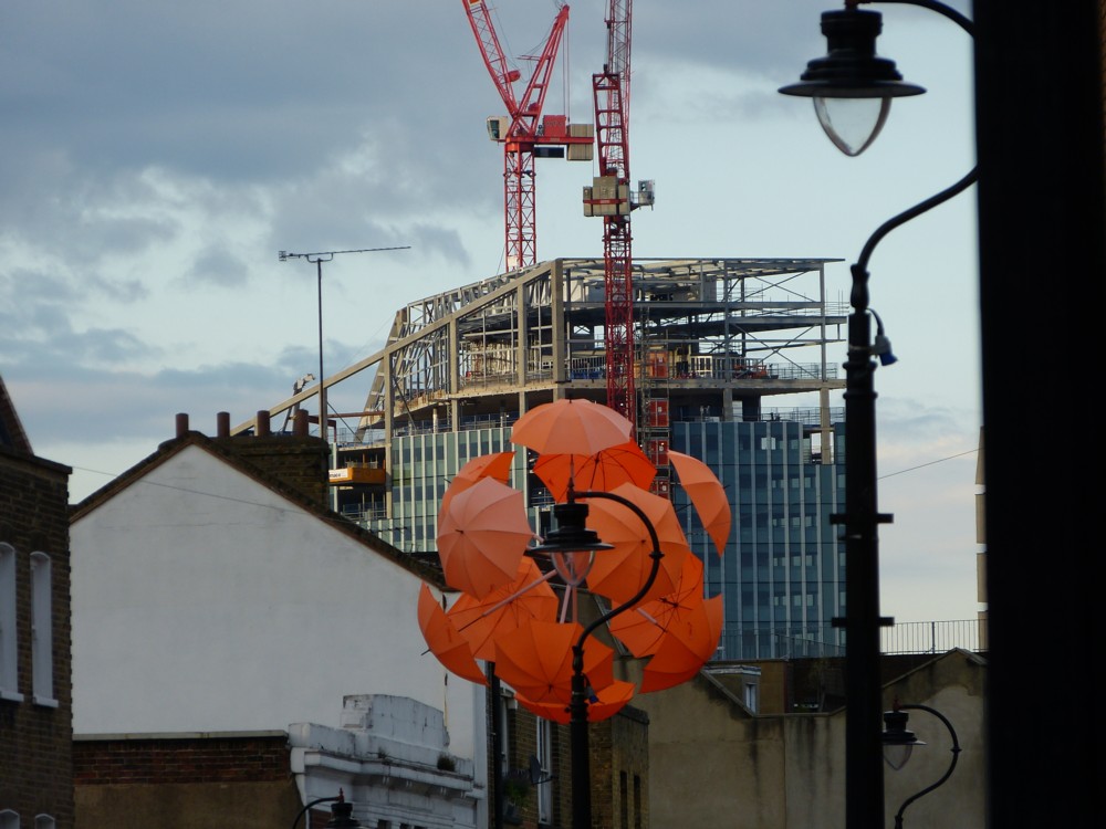
On August 2nd 2013, exactly five years ago today, there was a clutch of orange umbrellas above Lower Marsh. (Also (see bottom right), 240 Blackfriars Road was under construction.) I don’t believe I mentioned these umbrellas at the time I photoed them, and now, I can’t google my way to any sort of explanation of them. But, I think I recall investigating them at the time, and I think they were some kind of advert for an art gallery. This guy agrees that these umbrellas were indeed there, then, but he doesn’t say anything about them either.

Anyway, here they are, as I photoed them then:

The bottom left one looks to me like the head of some kind of oriental feline creature.

Originally posted at Brian Micklethwait’s Old Blog

The City Big Things looking like a model

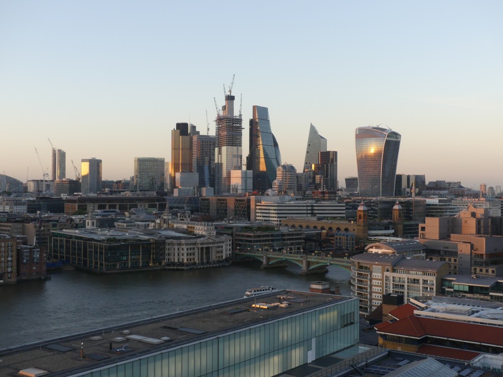
Indeed:

Taken from the top of the Tate Modern Extension, about one month ago.

I think the reason it looks (to me) like a model is the way the river looks. That doesn’t look like water. It looks more like some hardboard painted the colour of the river, and then covered in transparent glue, to make it look like it’s water. Something like this is how modelers do it. So if it looks like this, it makes everything else look like it must be a model too.

It’s also something to do with the lighting of the entire scene, at that time of the evening when it doesn’t know if it’s daylight or evening. Magic hour, I believe, is what the movie people call this time.

I already very much like the latest City Big Thing, the Scalpel. Very recognisable, no matter how far away you are.

Originally posted at Brian Micklethwait’s Old Blog

Uncluttered French train roofs

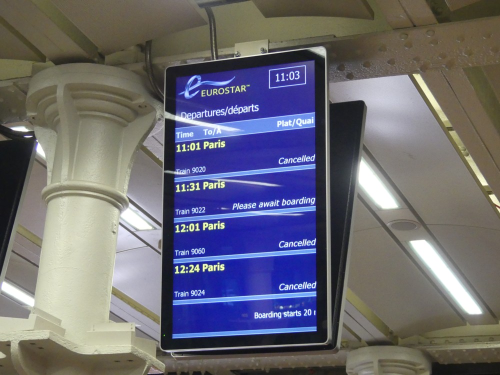
When I recently went to France, there was a rail strike on. I even took a picture of the strike, in the form of an electronic sign at St Pancras full of train cancellations:

But, what happened to this strike? Is it still going on? Or has it finished? If it has finished, who won?

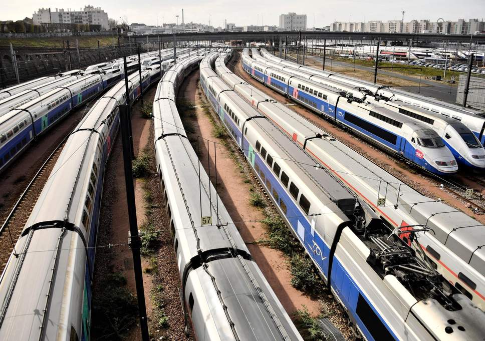
I am none the wiser about the answers to these questions, but while seeking such answers, I came across this photo, of French trains, taken by someone looking down upon their roofs:

Not much roof clutter to be seen there. (See below. This is now a preoccupation of mine.) Does the clutter on top of these trains not even exist? Or, is it merely covered up? (More research is needed.)

Originally posted at Brian Micklethwait’s Old Blog

A photo-rumination on French rail clutter

6k has Flickred a wonderful little collection of photos he took on a recent expedition to France (he blogs about these here), of which this was one of my favourites:

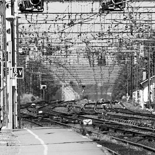
I particular like the extreme middle of this photo, which I have taken the liberty of cropping out and lightly sharpening:

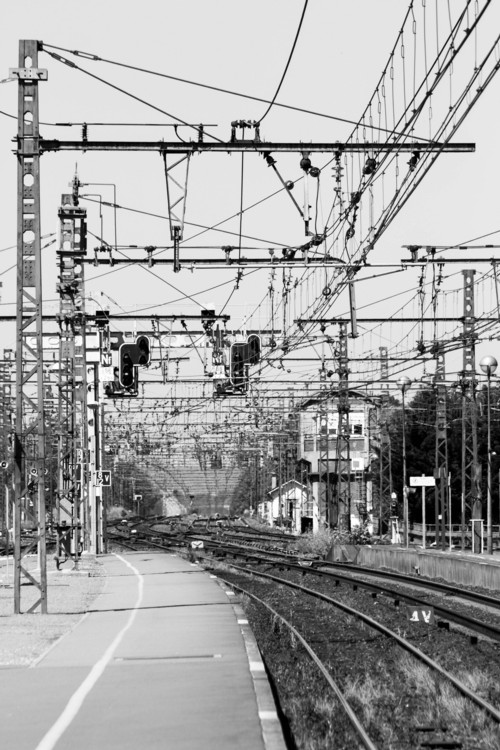
I love roof clutter. So it’s no surprise that I also love rail clutter. And France, so excellent at roof clutter, also does rail clutter exceptionally well.

Rail clutter embodies the exact same aesthetic contrast that roof clutter points to. One part of what you are looking at is obsessed over, aesthetically. The facade of a building is minutely contrived to look the way it should look. And then on top of it, you can just shove up anything you like, to let out smoke, receive and send signals and generally do stuff on the roof. Well, rail clutter is a lot like that. The trains (especially the trains in France (and especially the high speed trains in France)) are aesthetically magnificent, or at least are intended to be are are considered to be by their creators (and I happen to agree with them). Yet all around them is rail clutter, to feed the power into the trains, and this clutter is built in a totally functional manner, to do that job, no matter what kind of a jungle of mess that results in.

Let’s see what the photo-archive tells me about how this obsession played out on my own most recent expedition to France.

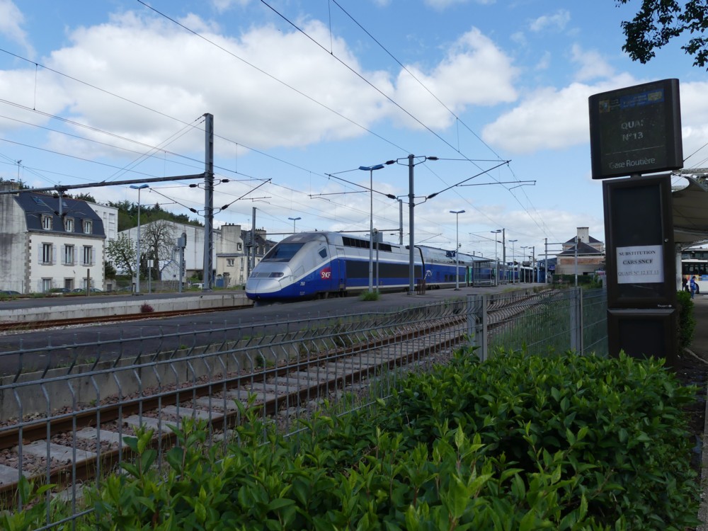
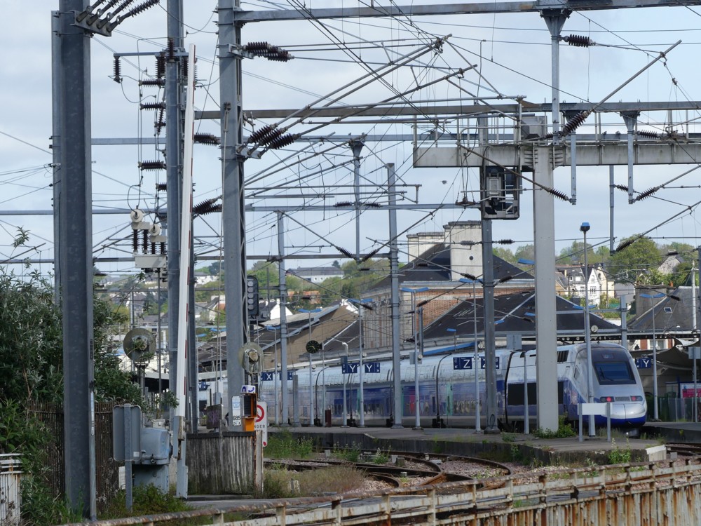
Here are two rail clutter photos, both featuring one of those beautiful trains, and both taken at Quimper railway station:

On the left, you can pretend that the rail clutter isn’t there, if you really want to. But on the right, the photo is photoed in such a way that you really can’t do that. Look at that clutter! I lined it all up with itself, just like 6k did in his rail clutter photo.

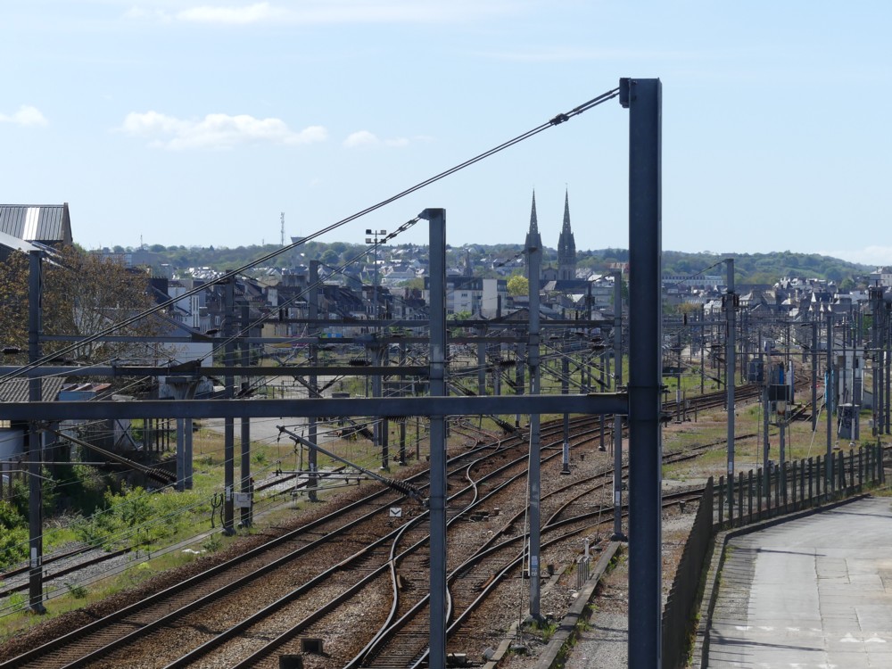
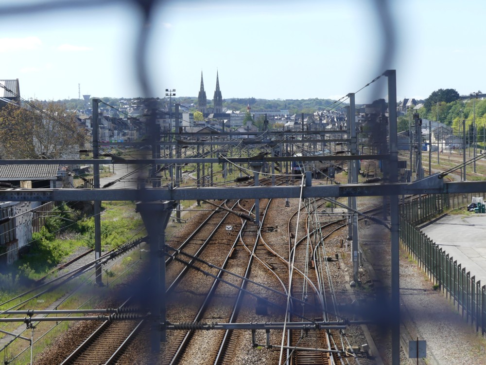
Here are a couple more photos of Quimper, taken from the footbridge over the main railway line off to the west of the city, right near where my hosts live, and in particular of the twin towers of Quimper Cathedral. These two photos point to that same rail clutter aesthetic contrast by shoving it next to a cathedral, instead of next to a train. But it’s the same point. The cathedral has been obsessed about aesthetically for centuries. The rail clutter just looks how it looks and to hell with that.

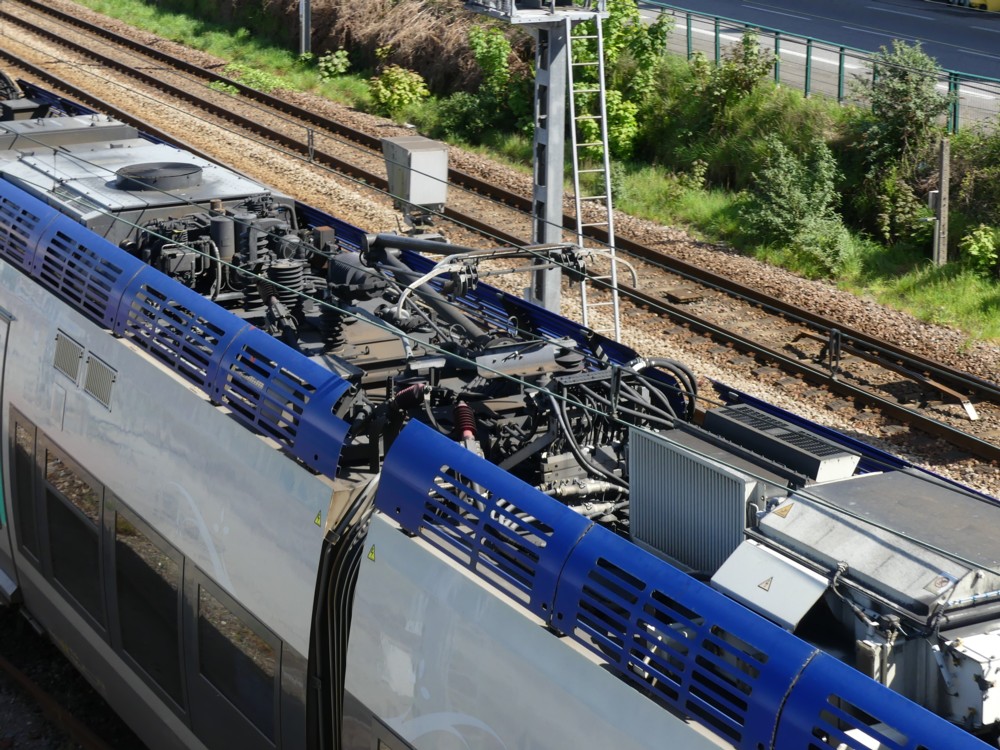
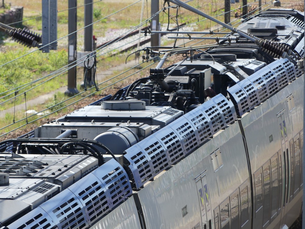
But for me, perhaps most interesting of all, here are a couple of photos which point to a closely related phenomenon, which is the matter of clutter actually on the top of the trains. That’s right. Trains also, themselves, have roof clutter on their roofs:

I remember noticing this phenomenon, pretty much for the first time (as in really noticing it), when I took this little clutch of photos. From that same footbridge in Quimper.

I have the feeling that British trains are not so roof cluttered. Memo to self: look into that. But that can wait. There’s been more than enough cluttertalk for this posting.

Originally posted at Brian Micklethwait’s Old Blog