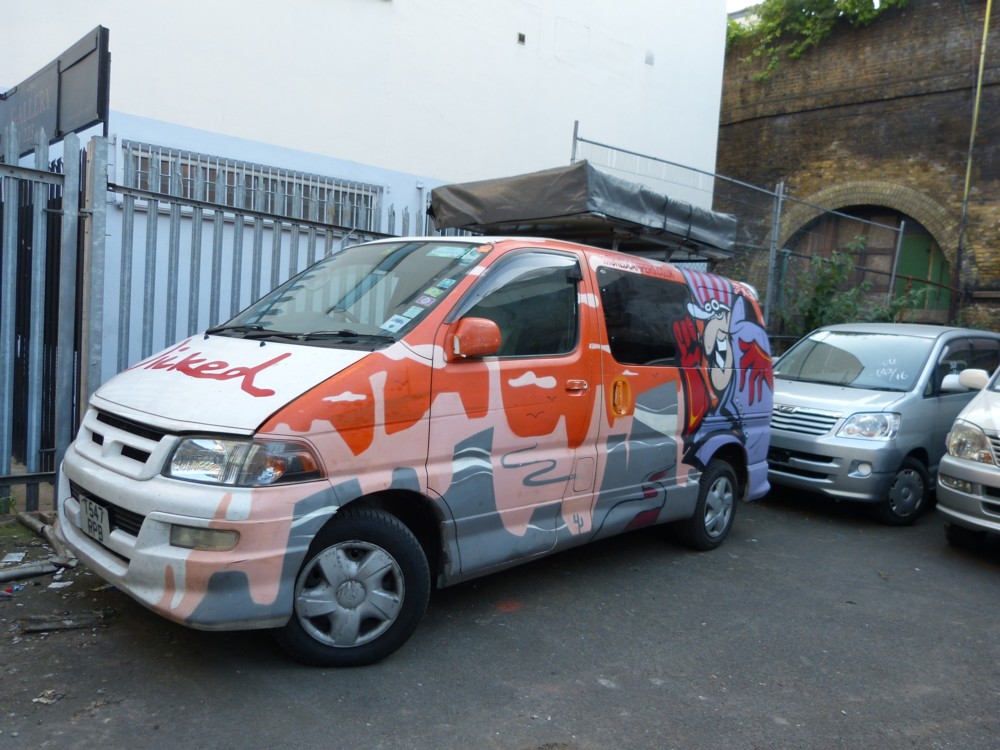
I miss those Wicked Campervans

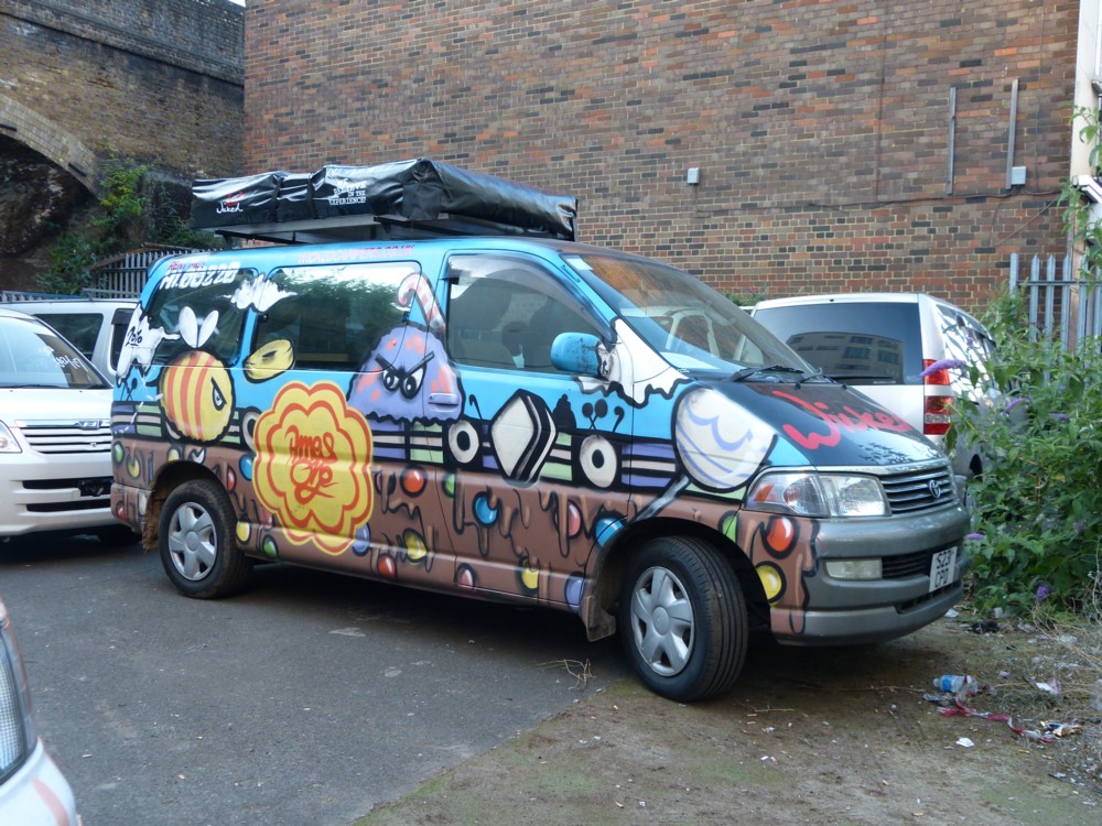
I do ever more trawling through my photo-archives, and every time I do this, I seem to come across more Wicked Campervans, Wicked Campervans that I have not shown on a blog before, like (I’m pretty sure) these two, which I photoed in the summer of 2014:

I don’t really understand either of these WCVs, but the one on the right has definitely non-human creatures on it, so it’s suitable for a Friday here.

I miss these vans a lot. They used to live not far from Lower Marsh, where I used to go to buy second-hand CDs. And there was a brief time when they used to congregate in Lower Marsh itself, in a piece of dead land now built upon to a much more lucrative purpose.

That arrangement was never going to last, and they’ve now moved up north.

One for the “You Are Here” collection

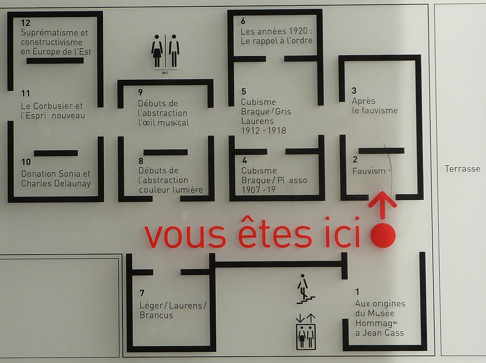
Nowadays, cameras can tell you exactly where you were when you took a photo, as well as exactly when you took it. But I can’t be doing with all that. I prefer taking photos like this one as I do my out-and-abouting, that say, as this one does, “You Are Here”:

And that one says it in French. Excellent.

We’re in the Pompidou Centre in Paris, in the bitterly cold February of 2012. Even remembering how cold that visit was makes me shudder now. But the Pompidou Centre itself was warm enough, and the views in it and from it were most diverting.

I have quite a few Paris postings here now, but have yet to transfer any of the postings from the old blog that I did about that earlier 2012 trip . My favourite, from a more recent and much warmer visit, featured my all time favourite food photo.

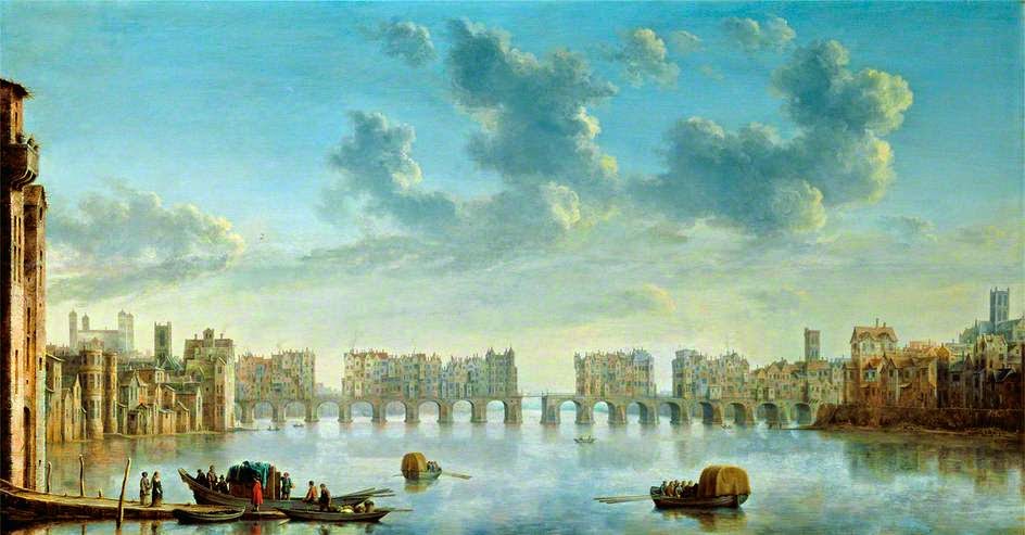
View of Old London Bridge from the West

Found this here:

Painted in 1650. it’s this.

I particularly like how this shows the architectural dominance of old St Paul’s, on the right, and even more so of the Tower of London, to the far left. These were, for many centuries, London’s Biggest things.

In 1666, the Great Fire damaged old St Paul’s so badly that they had to build a new one.

Until 1561, when it was struck by lightning, old St Paul’s had a spire. Blog and learn.

Colourful mural in Chelyabinsk

I get regular emails about new architecture, and trust me, there’s less of it happening now. And what there is now being done is mostly generic machines-for-living-in and machines-for-working-in. The age of starchitecture is pretty much over, for the time being. Covid? That hasn’t helped to be sure. But it felt like it was slowing down well before that.

So, to cause a stir and get noticed, what do “designers” now do? Answer: They paint eye-catching murals on the faces of all those regulation boxes.

Thus:
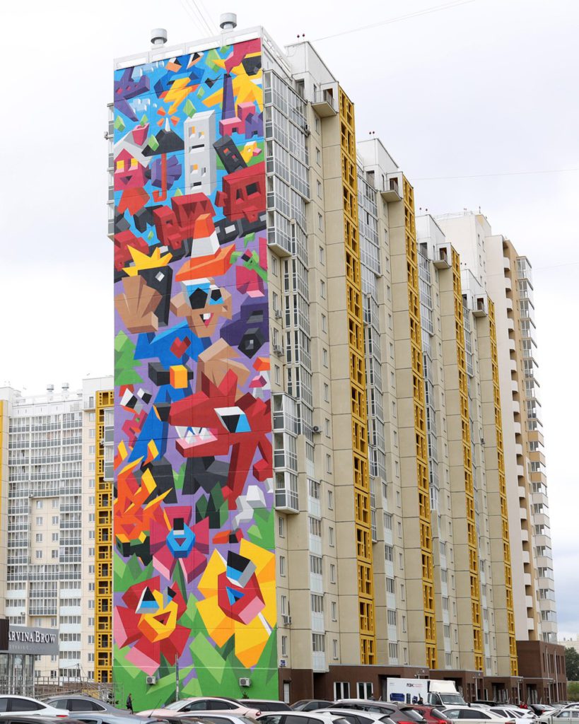
The official explanation of this mural is that it’s something to do with the environment, human impact on, blah blah. Like that’s a bad thing. But, as Mick Hartley (at whose blog I found this) says:

… you’d be forgiven for not quite grasping the ecological message.

Indeed. It looks more like a celebration of how humans are able to subjugate their environment and make it their own. I’ve never been to Russia, but my understanding is that their “environment” is a lot scarier than ours is, and that they consequently sentimentalise it a lot less than we do.

But whatever this Chelyabinsk mural may “mean”, it is yet another straw in the wind of colourful applied decoration that is now seriously blowing around the world. If you can’t do new buildings of note, you can still paint the buildings you have, old and new, in a newly colourful way.

Also, I suspect that paint for use outdoors is getting better, as in fading more slowly. I tried googling about this, but all I got was stuff about how to become a better painter of indoor pictures. Can anyone offer any pertinent links on that subject?

Canaletto – and now

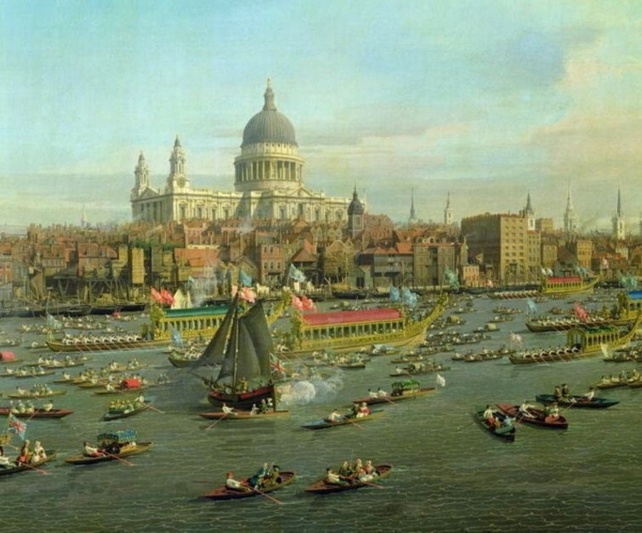
Came across this picture of St Paul’s by Canaletto, with boats, done in the 1740s:

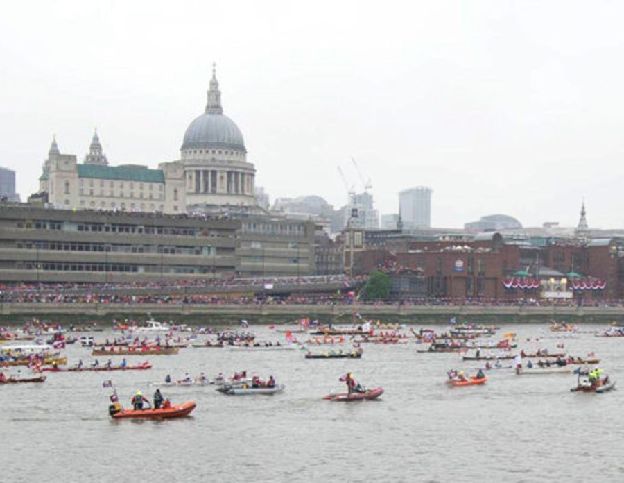
I tried to find a bigger version. I failed, but did encounter this, from the Daily Express of June 4th 2012:

WITH its spectacular pomp and ceremony, yesterday’s river pageant evoked the alluring images in Canaletto’s painting The Thames on Lord Mayor’s Day which depicted a royal flotilla against a backdrop of the City and St Paul’s Cathedral more than 250 years ago.

That “backdrop” is not what it was. St Paul’s is still St Paul’s, but what’s in front of it has taken rather a turn for the worse.

I’ve surely photoed photos of that scene, although not with that many boats. I recall getting interested in the Faraday Building, the one with the green roof in the photo above, which was the first big architectural violation of that St Paul’s view.

In the Canaletto, notice all the spires there, of other places of worship, most of them also designed by Wren.

Butterfly on wall

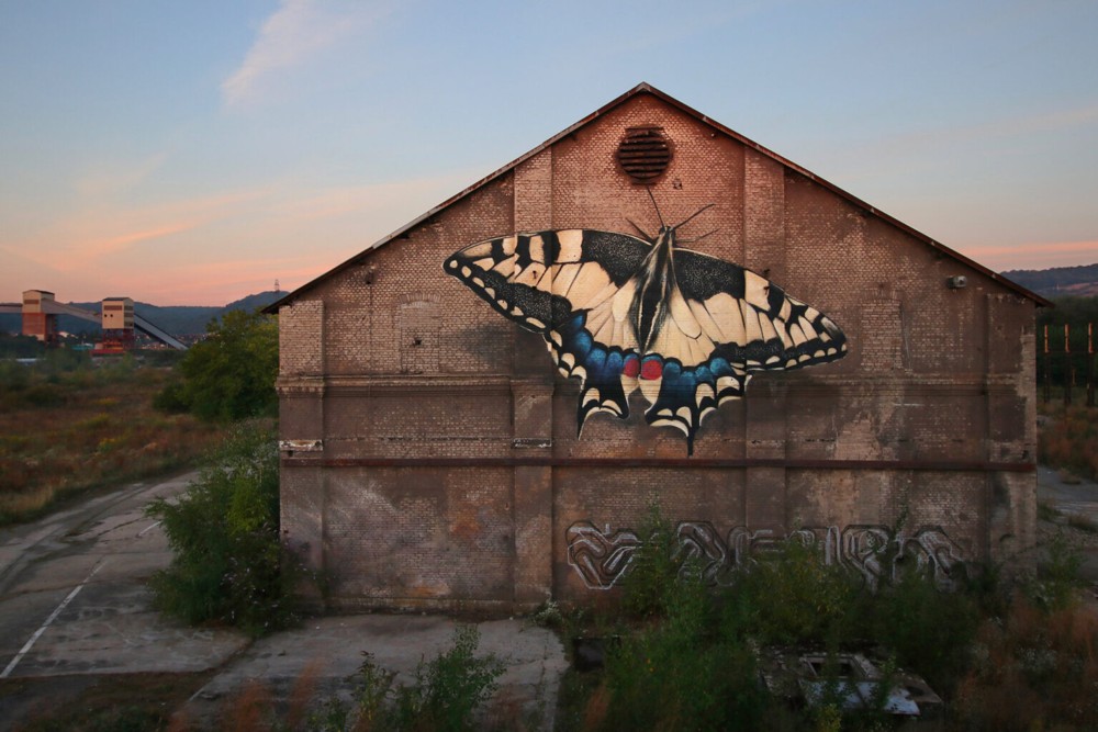
Via the latest clutch of David Thompson ephemera, my favourite of these:

A somewhat nicer way to apply colourful decoration than what’s in this photo, I think. Besides which, applied colour need only be temporary, so all tastes can take it in turns. If you want to make it permanent, photo it. Photos like that one of the painted butterfly will last longer and better than the painted butterfly will.

I like how they’ve added a shadow under it.

Colourful buildings in Leyton High Road

Memo to self, check this out:

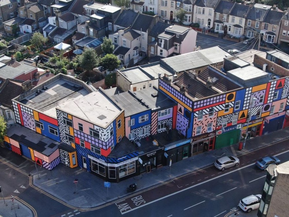
This is the work of Camille Walala (who also did all this), and it’s Walala Parade.

The Londonist reporter is very right when he put, right underneath the above photo, these words:

Step onto Leyton High Road in east London, and you may think you’ve walked onto the set of a kids’ TV show.

The relationship between changes in childhood imagery and subsequent changes in the world of design and architecture is an under-explored subject, in my opinion.

In which connection, see also, this.

Like it or hate it (and I quite like it), the future of architecture is going to be more colourful.

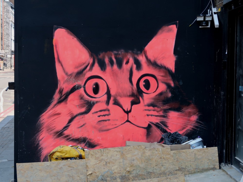
Red dog – red cat

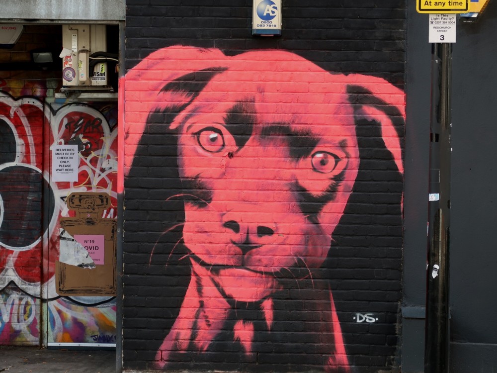
Mick Hartley has been spotting red pets, out East in Mick Hartley land:

Woof. Miaow.

In London, and I suspect elsewhere, interesting new murals now seem to be more numerous than interesting new buildings. And more interesting, I’d say. To put this another way, murals are now the latest architectural thing.

One of these muralisers should be let loose on this building.

More London

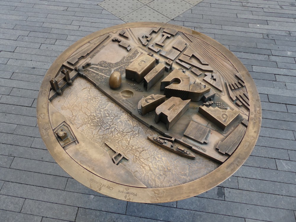
Back in March 2019, on the same day and just before I photoed these photos, I photoed this photo:

What I like about that is what I also find weird about it, which is the way that this metal circle of 3D map information kind of hovers weightlessly over the pavement.

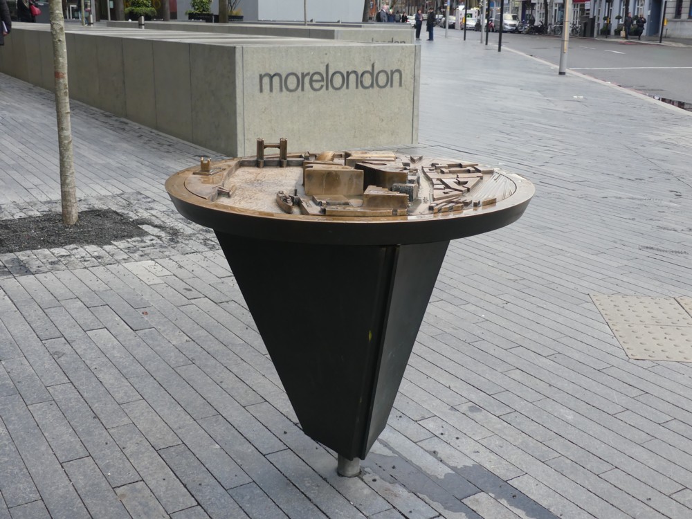
Luckily I soon found another photo which explained this weird effect with logic:

But now, there was another mystery. What is “morelondon”? Turns out it’s More London, which was the place where I was.

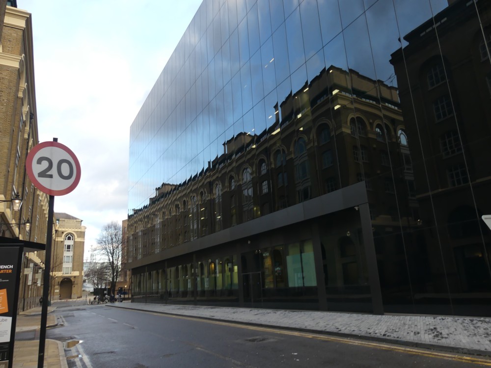
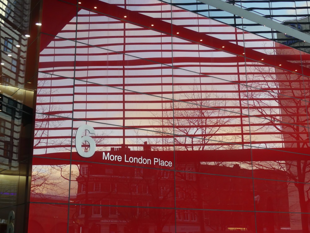
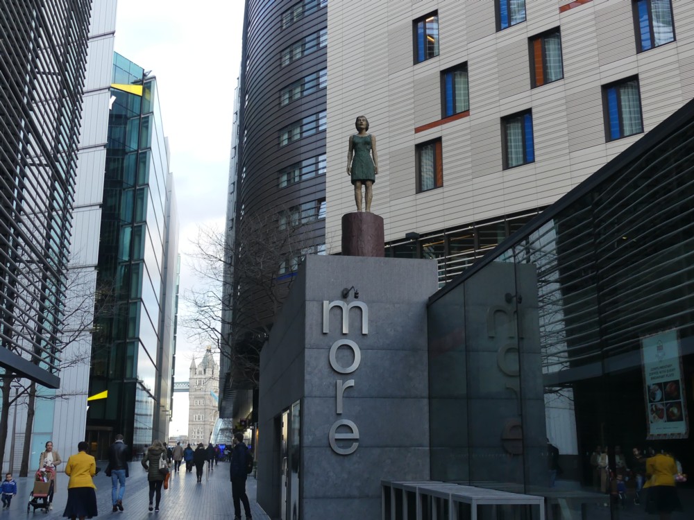
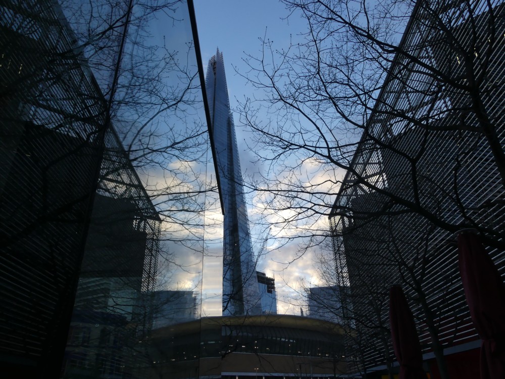
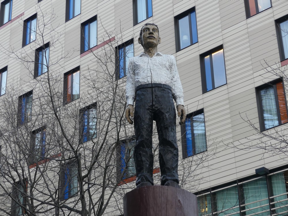
Here are some more photos I photoed at the same time as the two above:

The reason I made them look so small in this posting is in the hope that you will be deceived about what is going on, in photos 1 and 4 there, 1 especially, 4 in a general way, but 1 in a very particular way. Click and you’ll surely see what I mean.

The strange coloured-in statues are, I now learn, by Stephan Balkenhol. More about him here. At the time I recall wondering if they were Art, or just advertising of some kind. Art, it would seem.

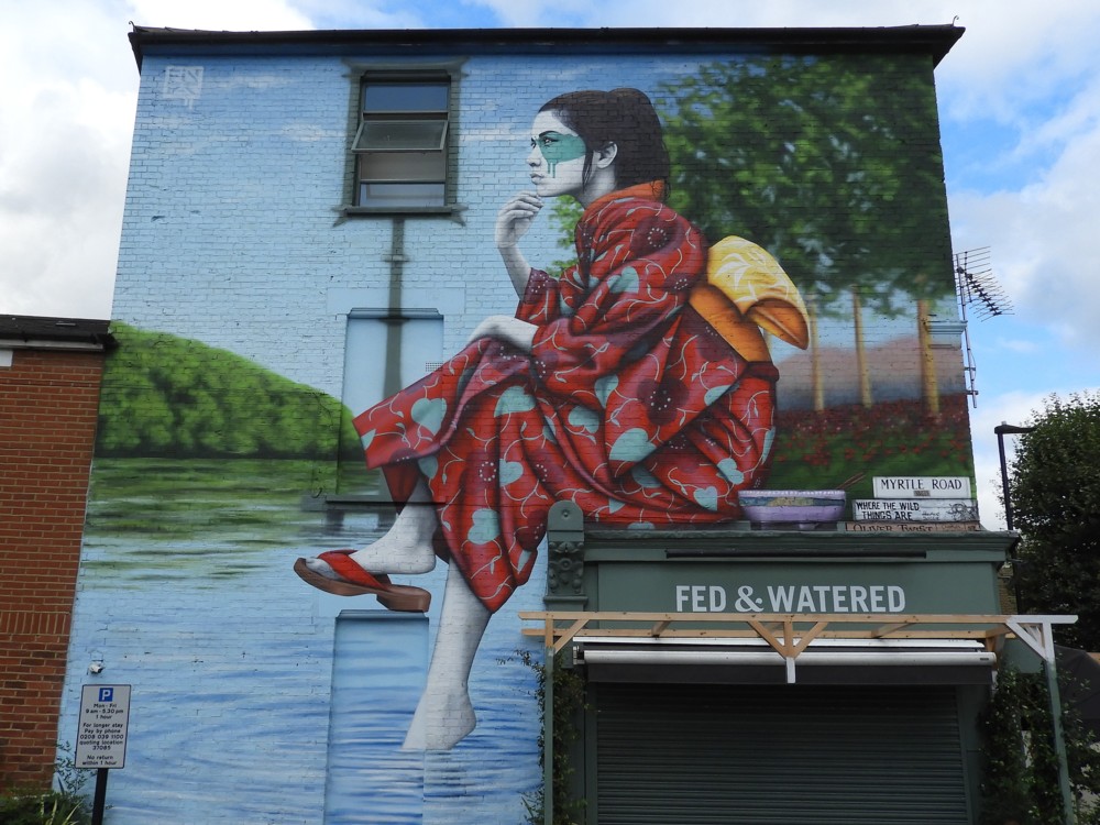
A Japanese lady sits on a shop front

Photoed by me last Tuesday, in Acton:

See eleven more photos of this mural and further information about it here.

As my title says, I like how Fin Dac has used the details of the surface he was faced with, turning bugs into features.

Fin Dac is Irish, so this is cultural appropriation. Which is fine. If we’re not going to allow cultural appropriation, we might as well close London down now.