Two faces of Bruce the Real Photographer

Last week Bruce the Real Photographer (regular name: Bruce Nicoll) dropped by and we went out for a coffee. While we coffeed, we got onto the subject of how faces look different depending on how far away the camera is. By which I mean: Bruce the Real Photographer told me about this. (He mentioned this famous photo, on the right here, to illustrate what he was talking about.)

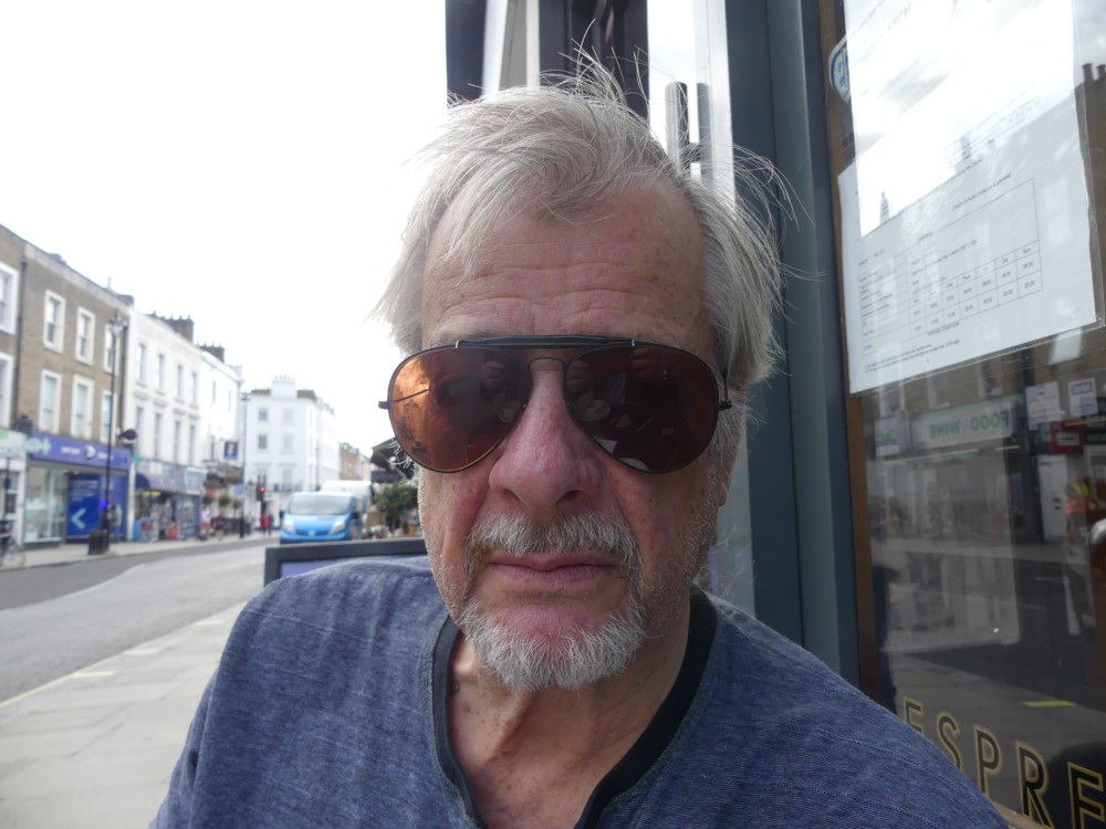
Inspired by this portraiture lesson, I at once took a very close up photo of Bruce the Real Photographer, which looked like this …:

…, and then I walked away and took this next photo, with lots of zoom, so that his face occupied most of the photo in the same way as it did in the above close-up:

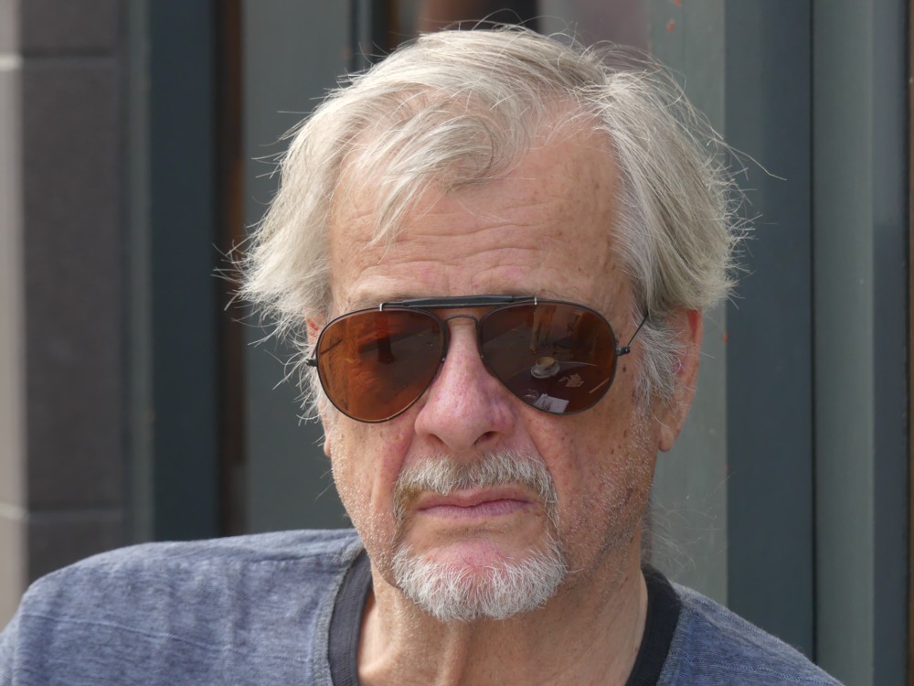
The contrast is remarkable. His face is a whole different shape, depending. And look what happens to the background.

I sort of knew all this. But sort of knowing something and knowing it for sure are two distinct things. Knowing it and really seeing it are also two distinct things.

I photo a lot of buildings, close-up, and from a distance with lots of zoom. But these tend not to be the exact same buildings from one moment to the next, and the above contrast very seldom jumps out at me.

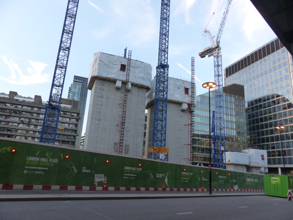
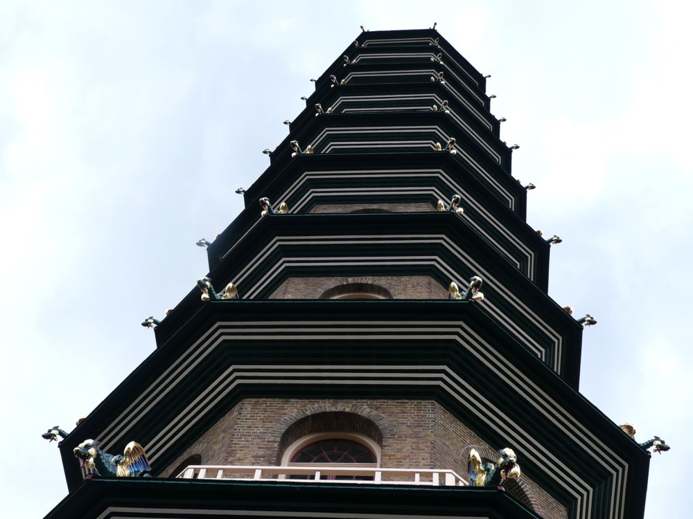
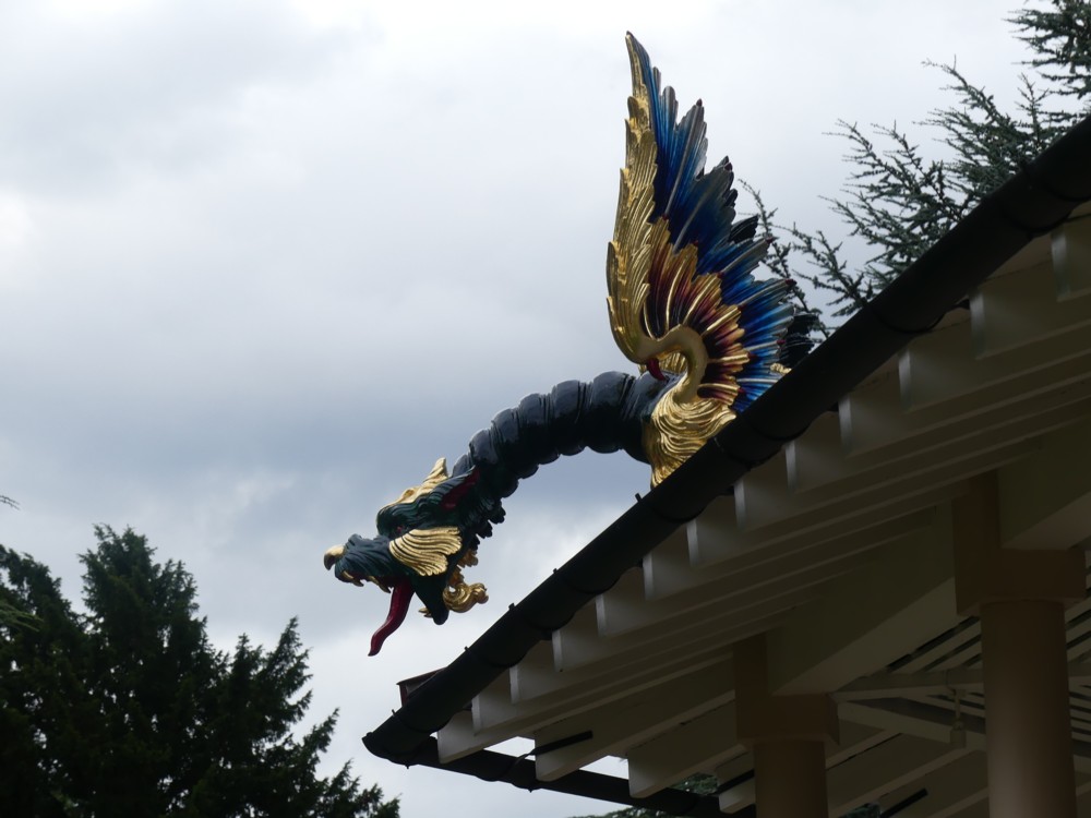
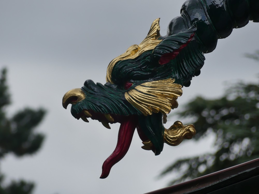
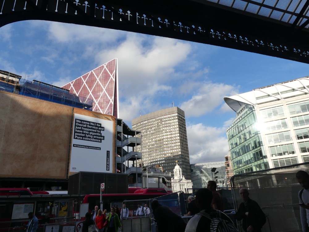
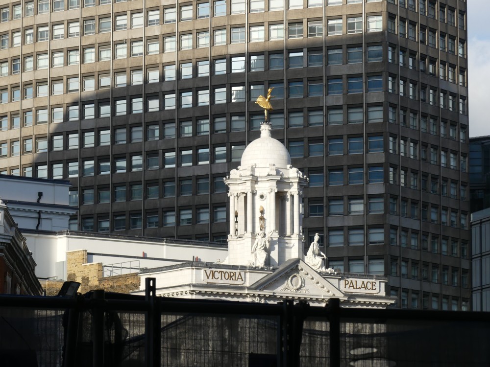
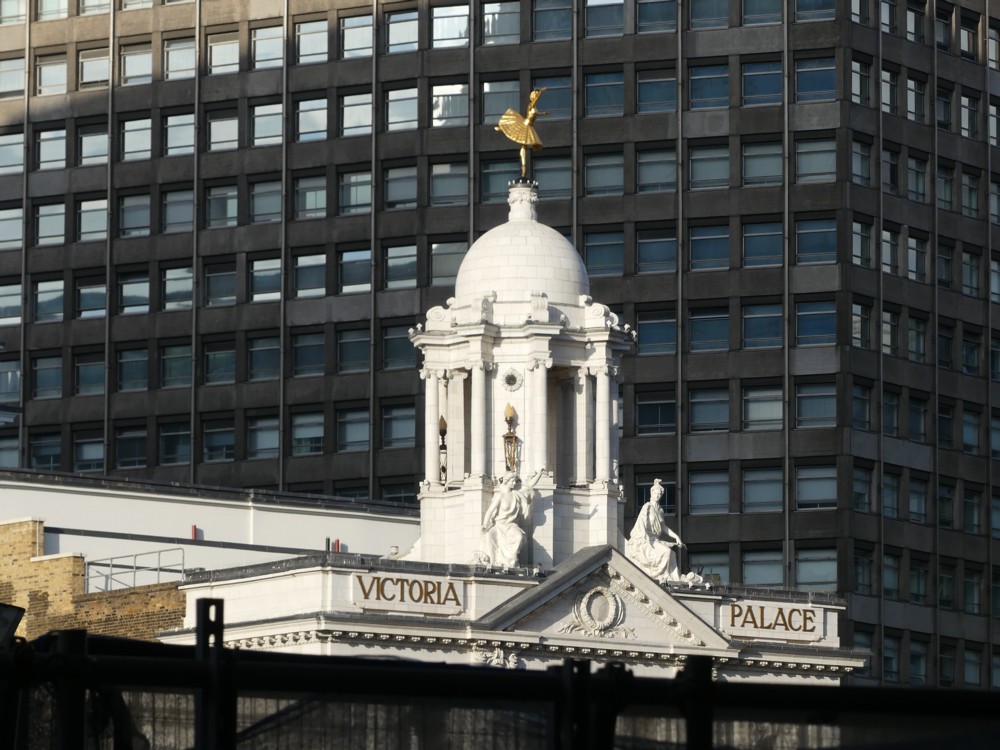
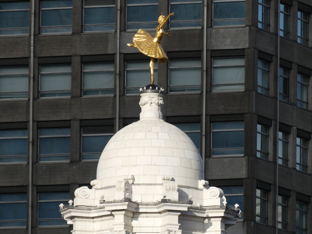
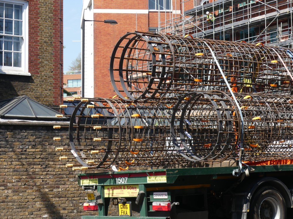
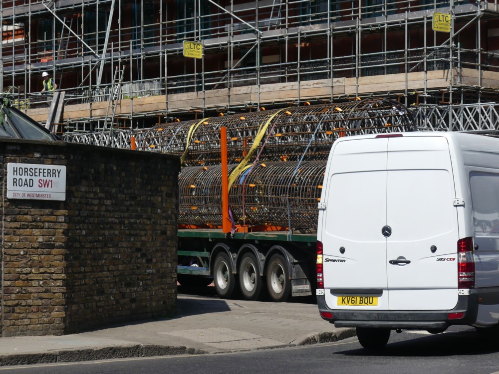
Mostly, what I see is another equally clear contrast but what looks like a very different one. I see extreme angle differences, like when verticals converge, or not, depending on how far away you are. I mentioned in passing, yesterday, how buildings do less of this when you are further away. When you are far away, you can get exact horizontals and exact verticals, the way you don’t when you are close-up. See the first photo below, which was done with lots of zoom from far away.

It all makes perfect sense. When you work it out, it becomes obvious. It is obvious that, if you are far away from someone who is wearing glasses and he is looking straight at you, you are more likely to see his face through those glasses and less likely to see the background beyond his face through his glasses. It’s all a question of angles.

It is obvious that if you are close up, you see only the front of his face. Further away, and you also see the sides of his face.

And it’s obvious that if you are far away from a rectangle that is at a slightly higher level than you are, it looks more exactly rectangular the further away from the rectangle you get. Again, the angle changes.

But that’s what knowledge is. When it becomes “obvious”, that means that you know it.

Here is another photo of Bruce the Real Photographer, which I took immediately after taking the second of two above, but this time with no zoom:

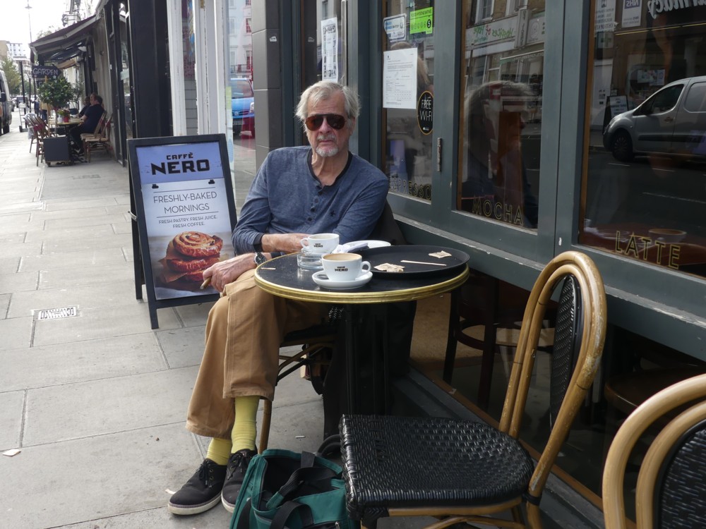
This shows that I was never actually that far away from Bruce the Real Photographer. It’s merely the difference between very close and not so close, two places which are only a second apart from each other. With buildings, you need to get a lot further away to make much difference.

To show you just how Real a Photographer Bruce the Real Photographer is, go to this long ago posting here (LINK TO THE OLD BLOG), which has a whole clutch of some of his best looking stuff, but small enough to fit on this blog and not to be worth anyone serious about copying to copy.

The first photo there is a particularly good one of the actor Dudley Sutton, who nrecently died, causing much lamentation in the antiques trade.

Originally posted at Brian Micklethwait’s Old Blog

Thoughts on concentra …

I was reading this piece by Will Self about the baleful effect upon literature of the internet, screen reading instead of proper reading from paper bound into books, etc. But then I got interrupted by the thought of writing this, which is about how a big difference between reading from a screen, as I just was, and reading from a printed book, is that if you are reading a book, it is more cumbersome, and sometimes not possible, to switch to attending to something else, like consulting the county cricket scores (Surrey are just now being bollocked by Essex), seeing what the latest is on Instapundit, or tuning into the latest pronouncements of Friends on Facebook or enemies on Twitter, or whatever is your equivalent list of interruptions.

This effect works when I am reading a book in the lavatory, even though, in my lavatory, there are several hundred other books present. The mere fact of reading a book seems to focus my mind. Perhaps this is only a habit of mine, just as not concentrating is only a habit when I am looking at a screen, but these onlys are still a big deal.

The effect is greatly enhanced when I go walkabout, and take a book with me. Then – when being publicly transported or when pausing for coffee or rest or whatever – I cannot switch. I can only concentrate on the one book, or not.

It’s the same in the theatre or the opera house, which friends occasionally entice me into. Recently I witnessed Lohengrin at the Royal Opera House, Covent Garden. The production was the usual abomination, but the orchestra and chorus were sublime, as were occasional bits of the solo singing. And I now know Lohengrin a lot better. Why? Because, when I was stuck inside the ROH, there was nothing else to do except pay attention. I could shut my eyes, which I often did. But, I couldn’t wave a mouse or a stick at it and change it to The Mikado or Carry on Cleo, even though there were longish stretches when, if I could have, I would have. It was Lohengrin or nothing.

I surmise that quite a few people these days deliberately subject themselves to this sort of forced concentration, knowing that it may be a bit of a struggle, but that it will a struggle they will be glad to have struggled with. I don’t think it’s just me.

This explains, among other things, why I still resist portable screens. Getting out and about is a chance to concentrate.

Originally posted at Brian Micklethwait’s Old Blog

Art and information

Maybe “art” is putting it a bit strongly, but nevertheless, I do really like this photo …:

… which I took in the summer of 2015, somewhere in the City of London. The directory I found this in is called “Looking4BroadgateTower”, so that tells you roughly where I was.

BMdotcom-wise, this photo has so many boxes ticked.

– First things first: cranes. In this case, crane towers. BMmmmmm.

– Reinforcing rods, sticking out the top of the lump like vegetation. Reinforcement: insufficiently sung heroism of modernity.

– A crane tower shadow, on …

– … that material they shove over …

– … scaffolding.

– That monochrome thing that happens during sunsets. And – who can say? – maybe even during sunrises.

– The way that sunlight hits crane towers and just lights them up, which I so often try to get and so seldom manage to get.

– Lots of horizontals and verticals, made possible not by Photoshop(clone)ing but by the excellent zoom lens on my nearly-but-actually-not-SLR camera, with its one brilliant super-zoomy lens.

So, lots to like there. But what and where was this? This is the kind of thing I like to know.

Luckily, I took informational photos, as well as arty photos like that above. Always, when out taking photos like the above, take lots of photos which are not for art, but for information about that art. I need to keep telling myself, because often I fail to do this.

I fail, that is to say, to take photos like this …:

… which scores about zero for artistic impression, but which tells me what all that art in the first photo above actually was.

In the above (information) photo we see the same crane towers and the same lump, but viewed side on. It’s definitely the same stuff.

There’s even a name and a website to be seen, if you crop it, and then expand it to be 500 pixels across, like this:

So, there we have it. It’s the earlier stages of this. Once you have the words to describe what you want to learn about, the internet suddenly starts to work.

This being this:

My best guess is that the lump of art in the first photo in this posting is somewhere in the middle of the more complicated computerised Thing on the right.

Originally posted at Brian Micklethwait’s Old Blog

Eric Lu playing Beethoven 4 on the TV

I am watching, on my television, Eric Lu’s Leeds Piano Competition performance of the first movement of Beethoven’s Piano Concerto No 4, a performance I earlier listened to on the radio. My impression from the radio was that this was a rather “private” performance, and somewhat more so than I think ideal. But the exact same performance, on TV, now seems, perhaps because the public nature of the event itself is inescapable, much less private than I had supposed from the radio. Every bit as good as I recall, but different. More assertive, more rhetorical, more like a Shakespeare soliloquy spoken out loud, and quite loudly, to a theatre audience than the same soliloquy done as a stream-of-consciousness interior thought process, perhaps also on the radio. Odd how the medium can have such an impact on the message.

I see from the Eric Lu website that this Beethoven concerto performance, together with two Chopin solo pieces that he played in earlier rounds, is now being made available on CD.

Now I am watching a Chinese guy play the Schumann concerto. And the contrast in how it comes across is exactly the same as with Lu’s Beethoven performance.

Originally posted at Brian Micklethwait’s Old Blog

Michael Jennings explores Tehran

At my home on the last Friday of this month (Friday September 28th – which is in six days time), Michael Jennings will be speaking about Iran, and in particular about how he recently spent some time exploring its capital city, Tehran. The easiest link to learn more about Michael’s amazing globetrottings is to this list of his Samizdata contributions.

Each month, I solicit a few words from the speaker, to email to my list of potential attenders. A few days ago, Michael sent me rather more than a few words about what he’ll be speaking about, more words than I need for that email. But I don’t want all these words going to waste, so, with Michael’s kind permission, here they all are. In the email I send out tomorrow evening, I will be quoting from this, but will include the link to this posting, so that all who want to can, as they say, read the whole thing.

So, Michael Jennings on “Exploring Tehran”:

In recent years, I have done quite a lot of travelling in the Middle East.

From the western perspective – and particularly from the perspective of the western media – it is very easy to look at the Muslim Middle East and see something homogeneous. If you are inclined to see militant Islam and related terrorism as a threat, it is easy to see it as a single threat. However, there are two main strains of Islam, Shia and Sunni, and these are centred in two quite different cultures and civilisations: the first in Iran and the second in the Arab world.

These are two of the three largest cultures in the Muslim Middle East – the third being Turkey. These three cultures speak three unrelated languages – Farsi, Arabic, and Turkish – and the history and differences between these three cultures go back thousands of years – long before the time of Mohammed. These cultures are tremendously divided today. Iran fought a truly ferocious war with Arab Iraq between 1980 and 1988, the memory of which hangs over the country the way World War 1 probably hung over Europe in 1935. Much of the wars of the past 15 years in Iraq and Syria have been about Shia Iran (Persia) and Sunni Arab Saudi Arabia jostling for position in the Middle East. As to where Turkey stands in all this – I think Turkey is trying to figure this out.

I am not remotely an expert in any of this stuff. I have, however, spent a considerable amount of time travelling around the Middle East and North Africa in recent years. I love to explore cities on foot. I have done this, or attempted to do this in many places. Slightly less than two years ago I spent 10 days exploring Tehran on foot. Despite the fearsome (justified) reputation of the regime that rules Iran, I found – from my perspective as a Christian westerner – the most culturally familiar and welcoming culture that I had found travelling in the Middle East. Despite the fact that Iran is the only country in the entire world where all women are required to wear a headscarf at all times, I was struck by the fact that the role of women in public life was clearly much higher and that women are clearly much better educated and have a far more prominent role in the economy than in any Arab country I have been to. The Iranian middle class is substantial, and it is a very westernised middle class. At times in North Tehran I found myself in cafes and restaurants that easily could have been in hipster areas of Los Angeles, apart from the lack of alcohol.

I also found something that I should have known already – Iran is a trading, commercial nation. In South Tehran I found myself in shopping streets and bazaars that resembled East Asia – possibly commercial districts of Bangkok or Hanoi – more than anything elsewhere in the Middle East. I found myself sitting in stores being made tea (and being offered illicit alcohol) by merchants who wanted to tell me all about their trading trips to Shenzhen. It was fascinating.

And yet, this is a country that faces sanctions, and is cut off from the official system of international trade. What happens when you cut such a country off from the official system of international trade, and international academia, and international everything and so impoverishing the country, even though this is a culture that wants to participate? Come along to my talk, and I will speculate. Or possibly just show you my holiday pictures.

The basic point of my meetings is for people to attend them, but another point of them is for me to spread a gentle wave of information about people who have worthwhile things to say and interesting stories to tell, even if you do not actually attend. This posting now means that, this month, that second mission is already somewhat accomplished.

Originally posted at Brian Micklethwait’s Old Blog

The Great Pagoda of Kew Gardens – and its dragons

The high point, literally, of the expedition that GodDaughter2 and I made to Kew Gardens back in August was our exploration of the Great Pagoda.

From the top of the Great Pagoda, you can see the Big Things of Central London. But what the Great Pagoda itself looks like is also worth examining.

Here is an early view we had of it:

And here is how it looked when we got closer:

The Daily Mail describes the Great Pagoda as Britain’s First Skyscraper.

Now look how it looked when we got closer still:

So, what are those sticky-outy things on the corners of each sticky-outy roof?

That’s right, dragons. And we’re not talking merely inflated dragons. These are solid looking and scary. You couldn’t kill these dragons with a mere pin prick, and you wouldn’t dare to try.

Most of the Great Pagoda dragons look like this:

We discovered when we got there that the recent restoration of this Great Pagoda had, only a few weeks before our visit, been completed. We got very lucky with that.

Read more about these dragons, and about the Pagoda that they now guard, in this Guardian report.

This Great Pagoda, London’s very first Big Thing, was built by Sir William Chambers in 1762. The dragons were a feature of the original Pagoda, but in 1784 they were removed. Being made of wood, and following a burst of wet weather, they had started to rot.

Wikipedia says that Kew Gardens was adopted as a national botanical garden in 1840. Would that be when the Pagoda was opened to the general public? Whenever exactly that was, Kew Gardens and the Great Pagoda have been what we now call visitor attractions for quite a while now.

During World War 2, the Great Pagoda was used to test bombs. You can still see one of the holes they made in all the floors, to allow the bombs to fall. Keeping that for everyone to see now is a nice touch, I think.

Kew Gardens contains lots of greenery, and green stuff on sticks. What do they call those things? Trees. Kew Gardens has lots and lots of trees, of many different brands.

So, on the left here, the hole in the floor. On the right there, the seat made from many trees:

And in the middle, the seat, seen through the hole.

But back to those dragons. The old rotting dragons have now been almost entirely replaced by 3D printed dragons, which look solid but which are actually far lighter than the old-time originals.

On the lowest roof, right near the ground, there was a different sort of dragon, which looked like this:

I wonder what the story was of that one, for there did indeed seem to be only one such blue dragon. Had the original plan been to make all the dragons like that one? But did its structural weakness cause them to abandon that plan, and go with the other darker green dragon with its scary red tongue, and with its rather more solid wings? Don’t know, but whatever the story is, the winning dragon design is pretty good also.

Everything about how the Great Pagoda looks, inside as well as its exterior, says: class. This is a visitor attraction that I warmly recommend. There is no lift, not originally of course, and not now, but the steps, although quite numerous, are at a comfortably mild angle – rather than, say, like the ones in the Monument. Even better, each flight of steps you go up causes you to reach another actual floor, of the sort you can stand on, with windows looking outwards. So, oldies like me can go up two floors, say, and then have a comfortable breather, without blocking anyone else on the stairs. If we are on the right floor, we can even use that multi-treed seat (see above).

The weather on the day that GD2 and I visited Kew Gardens was not perfect. The dragons look rather dark and menacing in my photos. But that look works, I think. And as days out go, this day out was pretty much perfect.

Originally posted at Brian Micklethwait’s Old Blog

La Taupe

To me, nothing says Abroad quite like a poster, somewhere in Abroad, advertising an English speaking movie, whose English title I already know, with a foreign title that is different, but with all the same star names:

La Taupe means The Mole. I preferred the TV series, but I love this poster. Photoed by me in Paris in February 2012.

As was this, on the same expedition:

In the same directory, I encountered other photos of posters advertising the following movies: Drive (Ryan Gosling), Ghost Rider (Nicolas Cage), Underworld (Kate Beckinsale), and Star Wars Episode 1 (whoever). But in those posters, the titles stayed in their original English. Why?

Originally posted at Brian Micklethwait’s Old Blog

Pavlova in front of “Portland House”

Yesterday I was in Victoria Station, and as I emerged from it into … that mess of activity outside the front entrance, I noticed that the light seemed particularly appealing. At first what got my attention was the combined effect of the mess in the foreground, in the dark, and the assorted Medium Sized Things in the background, totally mismatched and just jambed down together in the London style, all illuminated. (See photos 1.1 and 1.2 below.)

But then, I found myself zeroing in, yet again, on Pavlova. What got me noticing her was that, finally, I seemed to have found the right moment to photo her with that big concrete lump that calls itself “Portland House” behind her. I have done this a lot, but it has never worked until now. This time, there was a shadow behind Pavlova, while Pavlova herself, and the dwarfed-by-modernity theatre on the top of which Pavlova dances, were both picked out by the light, a combination of circumstances I have never before encountered, or if I did I didn’t notice.

I took many photos of this effect. Partly because I can’t decide which one I like best, and partly because I think these photos look good when small, here are 3×3=9 of them:

Maybe the Wikipedia entry for Portland House does say who originally designed this unlovely edifice, but if it does, I couldn’t find that. Wikipedia does note, however, that Portland House is a miniature rip-off of the Pan Am Building in New York, now called something else.

Further googling got me to a piece by Mike Higginbottom entitled Pan-Am’s London sibling. He rather likes it. Plus, he name checks the now pretty much forgotten architect of said sibling: Howard Fairbairn & Partners. Modern Movement hulks by big name modernists sometimes have a certain in-your-face impact and memorability about them. But this hulk has always seemed to me to epitomise Modern Movementism at its dreariest. It’s not even “brutal”, just big, bland and boring. I greatly prefer Nova, the red diagonalised Medium Sized Thing nearby, which is also to be seen in photos 1.1 and 1.2 above.

Originally posted at Brian Micklethwait’s Old Blog

A lorry brings reinforcements

And no, I don’t mean reinforcements for an army. I mean the kind of reinforcements that end up buried in concrete.

Like these ones:

All six of these photos also feature one of the more impressive scaffolding arrays near me just now. The art of scaffolding and the art of creating reinforcements for structural concrete have much in common. Both involve putting together lots of bits of metal. Both need to result in a structure that stays put and does not collapse. Both look pretty to people like me.

But there are also big differences. Scaffolding is very visible, and it remains visible for the duration of its working existence. Scaffolding thus proclaims itself to the world, by its very existence. That we live in a golden age of scaffolding is obvious to all of us, whether we like this fact or hate it.

Also, scaffolding rather quickly punishes those who erect it, if they don’t do it right. While creating scaffolding, scaffolders make use of the scaffolding they have just been constructing, and they are their own first users. They thus have a literally inbuilt incentive to do their work well. And if they don’t, it is not that hard for others to spot this. Bad scaffolding wobbles. Such are my surmises about scaffolding.

Reinforcements for concrete are something else again. By the time they go to work, doing the job they were built for, everyone concerned had better be damn sure that they have done their work well. But, if they haven’t, the disastrous consequences of that bad work may take years to happen, and even then to be controversial. Who is to say exactly what caused a building to collapse? And if the building collapses rather catastrophically, it is liable to destroy a lot of the evidence of what exactly happened, and why. Investigating such catastrophes being a whole separate job in itself. So, getting these reinforcements right, with an inbuilt regime of testing and inspection and supervision, all managed by morally upright people whose declarations of confidence in what they have been inspecting can be relied upon, is a whole distinct industry.

But, this is an industry whose products, by their nature, end up being invisible. We all rely on such work being done correctly, not just “structurally” but also in a morally correct manner. Yet, we mostly never see this work, only its indirect results.

So, I hereby I celebrate the work, morally as well as merely technically good, that goes into the making of reinforcements for concrete. I salute the good men and true who make these (I think) beautiful objects, and who ensure that they perform faithfully. Their moral as well as technical excellence is all part of why I consider such reinforcements to be things of beauty.

I did some googling to try to determine exactly what reinforcements like those in my photos are used for. The lorry says R. SWAIN AND SONS on it. But they are hauliers, not makers of concrete reinforcements. The nearest I got to an answer was this photo, of objects just like those on my lorry, with this verbiage attached: “Prefabricated Piling Cages Made of Reinforced Bars On Site”. Prefabricated Piling cages. Piling sounds to me like foundations. (Yes.) The reinforcing has to be shoved down a hole in one go. It can’t be constructed bit by bit, in the hole. It either gets assembled beforehand on site, or, it gets assembled in a factory and taken to the site by lorry, as above.

The reinforcing that a structure needs when it is above ground, on the other hand, can be assembled on site, and I’m guessing that this is what usually happens.

Just guessing, you understand. My first guess actually was: for an above ground structure, until I came upon the photo I just linked to, and not foundations. But, what do I know?

Originally posted at Brian Micklethwait’s Old Blog

An ideal Showboat

Recently I bought a CD set of Showboat, and yesterday I listened to it. Showboat is not really my kind of thing. When it comes to singing, I tend to prefer either Schubert or the Rolling Stones. I bought this Showboat to learn more about a lady called Janis Kelly. As you can see to the right there, she is one of the star singers in this recording.

Janis Kelly is something of a legend in the classical singing world. She is a fine singer in operas and music dramas of all kinds, and she sang the part of “Magnolia” in this performance of Showboat. She is also a much admired singing teacher, of the sort that singers she has taught spend the rest of their careers boasting that they were taught by, in their CVs and programme notes. And, Janis Kelly just happens to be GodDaughter2’s singing teacher at the Royal College of Music. (GD2’s graduation recital being further evidence, to my ears, and eyes, of Ms. Kelly’s teaching prowess.)

Janis Kelly sounded great on this recording, but what surprised me was how much I enjoyed the recording as a whole. I am used to hearing shows like Showboat performed in a style that is aimed at audiences who basically prefer pop music to classical or orchestral music, and which typically uses pop brashness and pop exuberance to cover for the small number of musicians being deployed. This version of Showboat, however, was “orchestrated”, by Robert Russell Bennett. The sleeve notes claim that this orchestration is based on the “original 1946 score”, and (I’m guessing) might well be closer to what its composer, Jerome Kern, would have wanted than was any performance that Kern himself ever heard. This is a performance which makes clear the direct line from opera to operetta, to the music of Kern. Under the baton of John Owen Edwards, the orchestra makes a far lovelier sound than the din I was expecting.

Mercifully, what has not been opera-ed, so to speak, is the singing style. Where an operatically-inclined manner is appropriate, that is what happens, as when Janis Kelly sings, for example. But when it comes to a character like Ellie, sung by Caroline O’Connor, we get the full Broadway closely-microphoned belting style, a style that someone like Franz Lehar, or for that matter Franz Schubert, could never have imagined.

Further proof of the excellence of the singing in this performance is that, in the best Broadway style, and even when the singing is rather operatic, you can hear every word they sing. Had this show been sung in the full-on operatic style throughout, to emphasise that this is directly descended from Verdi and Wagner and Puccini, that would never have happened. (I’m still grumbling to myself about a performance of Madam Butterfly at the English National Opera (where everything is sung in English), where most of the solo singers might as well have been singing in Japanese for all the sense I could make of what they were singing.)

My feeling about opera is that I tend not to like how it is sung (too wobbly and verbally incomprehensible (see above)), but I love the sound that it makes, in between the singing. When it comes to singing, I tend to prefer the Abba style to the noise made by the average opera singer. (Above average opera singers are a different matter entirely. (Today I listened to Act 1 of this, also on CD, and it sounded stupendous.)) But as for what accompanies that singing, give me the sound of an opera orchestra every time, over the brash, jazz-band-based instrumental belting, banging and twanging that you mostly get when listening to “music theatre”, provided only that the music is the kind that works orchestrally, which in Showboat it is.

This Showboat, then, is for me the ideal compromise, between Broadway and the opera house, being the best of both and the worst of neither. Not bad for a fiver, which is all Amazon charged me for it.

Originally posted at Brian Micklethwait’s Old Blog