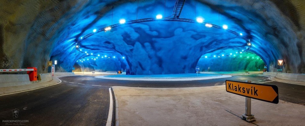
A roundabout under the sea

Joining up three bits of the Faroe Islands, with a roundabout instead of a triangle of separate tunnels:

It’s the red bit in this map. The yellow bits are still to come. There are a lot of yellow bits, to come. I did not know anything about these tunnels. Blog and learn.

Not humbled

Rob Henderson:

People say they are “humbled” when they win an award but I always thought it was more humbling to not win.

As another Tweeter (Felix Croissant!) says in response, it’s just something people say.

I suppose one reason for such exaggerated humility is to make absolutely sure you don’t say anything like: This proves I’m the best!!! Loo-ser-ers!!!

But just once, I’d love it if someone did say that.

John Simpson Architects

Fake Ancient is my rather sarky description of architecture that looks like it was designed a whole lot longer ago than it really was. But at its best it can be very impressive, and this evening I channel hopped my way into a television show (episode 9 of those 10) about a certain John Simpson, who seems like he knows all about how to do this style, although I only caught the end of it. A new name to me. He shouldn’t have been, but he was.

From that, straight to the John Simpson Architects website, and immediately a rather surprising discovery. John Simpson Architects are the people who have been redesigning the Royal College of Music, which is where GodDaughter2 has for the last few years been learning about how to sing. Throughout that time, finding my way through the college to wherever she and I were meeting, or to where she was performing, was like some sort of Ancient Greek myth involving a Labyrinth, the Underworld, and frightful punishments like Eternal Damnation if you got lost.

With luck GodDaughter2 will retain her right to take me to the RCM, and enable me to see all the new reshaping that’s been going on once it’s well and truly finished. What I’ve seen of it, of what has been finished, has looked very nice, but I never thought to wonder who had designed it all.

I think this is because this traditional style, to be more polite about it, of doing architecture, and especially when it is done as well as it is being done at the RCM, doesn’t give off that sense of an individual architect, imposing his wilful whim upon everything, in a way that would have been totally different if a different architect had been let loose on the place. Traditional architecture is, in other words, the opposite of Starchitecture. That being the point of tradition. It looks roughly the same, no matter who is doing it, because “doing it” means following it. So, although I wish I had been more curious about who was doing what at the RCM, I wasn’t. It just was happening, seemingly of its own accord.

But now I do know who’s been doing the designing, and I’m very glad to have learned this.

Judging by his performances on the telly that I did catch, John Simpson still seems to have plenty of active life left in him, which is very good news. And there was me thinking that this kind of thing might be dying the death whenever Quinlan Terry dies his death.

One for the “You Are Here” collection

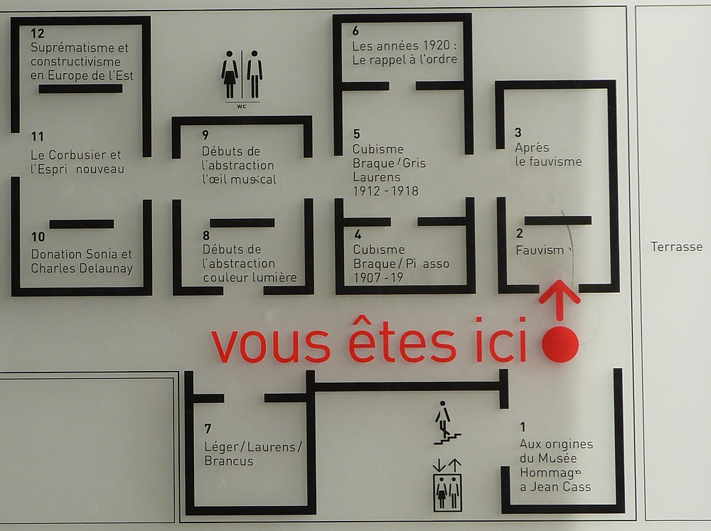
Nowadays, cameras can tell you exactly where you were when you took a photo, as well as exactly when you took it. But I can’t be doing with all that. I prefer taking photos like this one as I do my out-and-abouting, that say, as this one does, “You Are Here”:

And that one says it in French. Excellent.

We’re in the Pompidou Centre in Paris, in the bitterly cold February of 2012. Even remembering how cold that visit was makes me shudder now. But the Pompidou Centre itself was warm enough, and the views in it and from it were most diverting.

I have quite a few Paris postings here now, but have yet to transfer any of the postings from the old blog that I did about that earlier 2012 trip . My favourite, from a more recent and much warmer visit, featured my all time favourite food photo.

Vauxhall station signs and Big Things

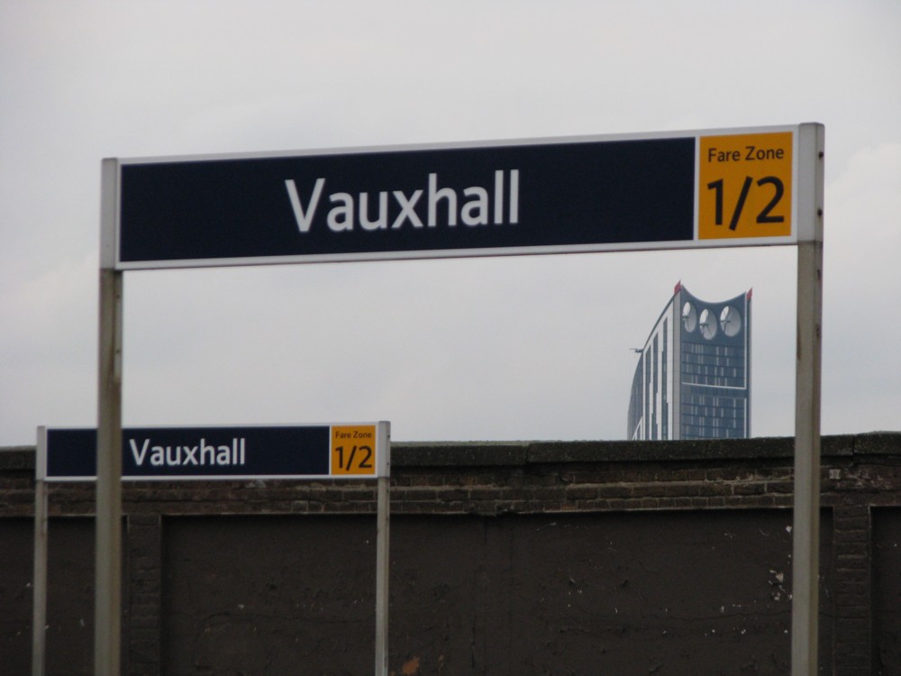
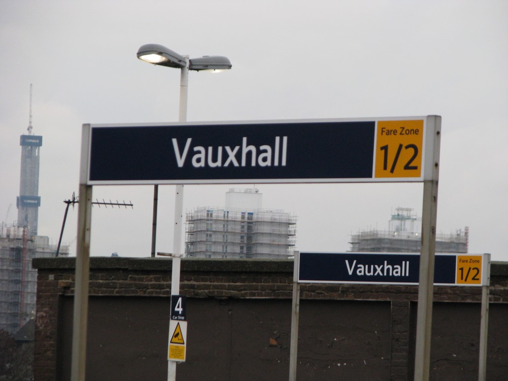
Two photos I took within moments of each other at Vauxhall Station, in January 2011:

I show you that one because I really like it. The Three-Eyed Elephant-and-Castle Tower looked particularly good when isolated, as it no longer is, and when framed by stuff in the foreground.

And then there’s this one, which does not score nearly so well for artistic effect, but which does show you that the Shard was then in the process of being constructed:

There the Shard is, or at any rate what they’d so far done of the concrete spine of it, on the left.

I can remember having friendly disagreements with Michael Jennings about whether they’d actually build that Thing, despite all their protestations that they would. I thought they’d build it, because I’m a pathological optimist. He doubted it, because he did. Because of that, the building will always have, for me, a slightly miraculous quality about it. Michael only had to have been a bit more right than he was (and we are talking about a man who is very right indeed about a lot of things), and like the Helter Skelter, the Shard might never have happened.

On how all new building on a large scale tends to start out looking meaningless

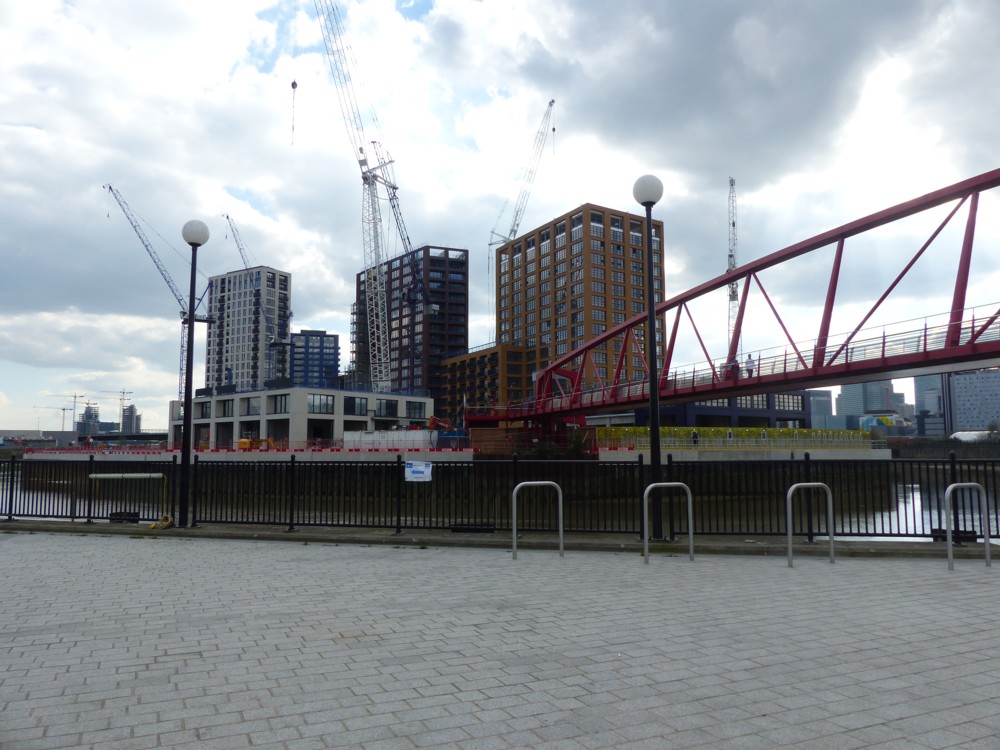
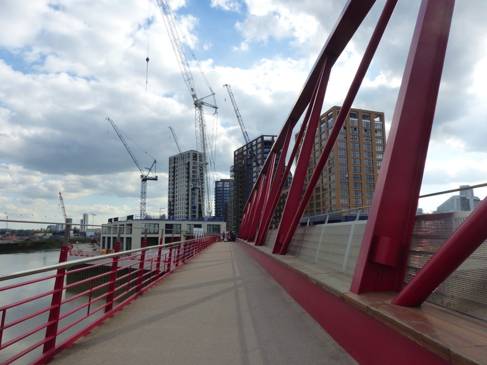
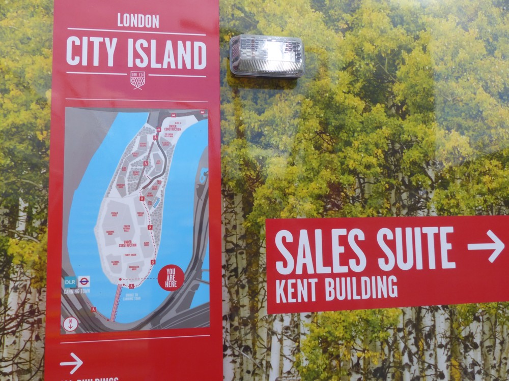
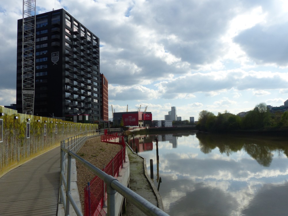
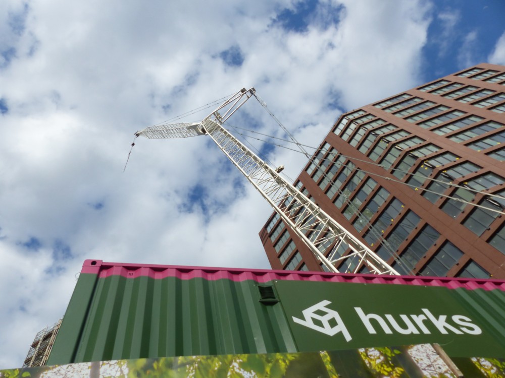
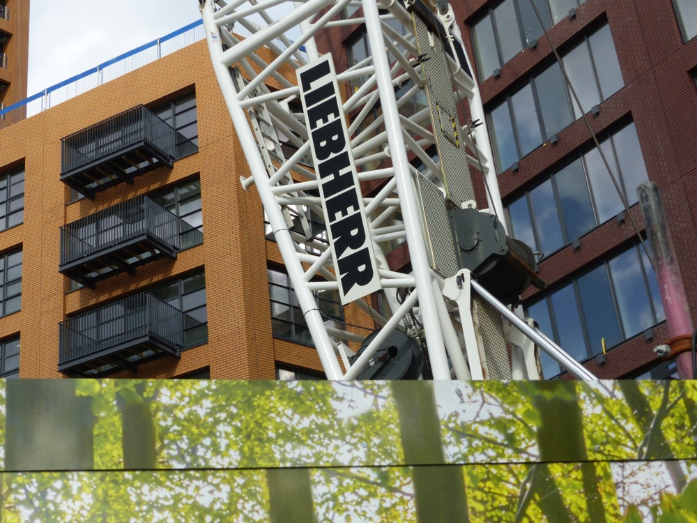
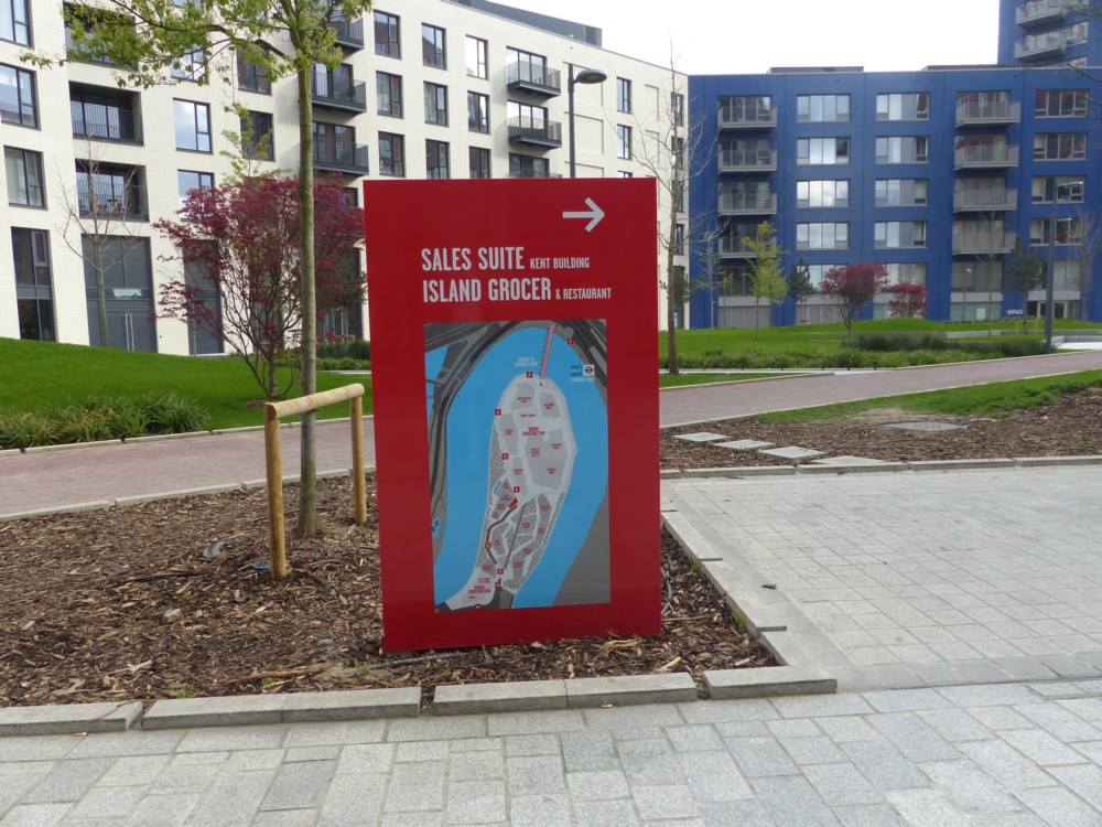
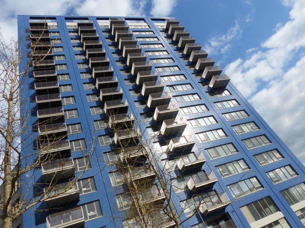
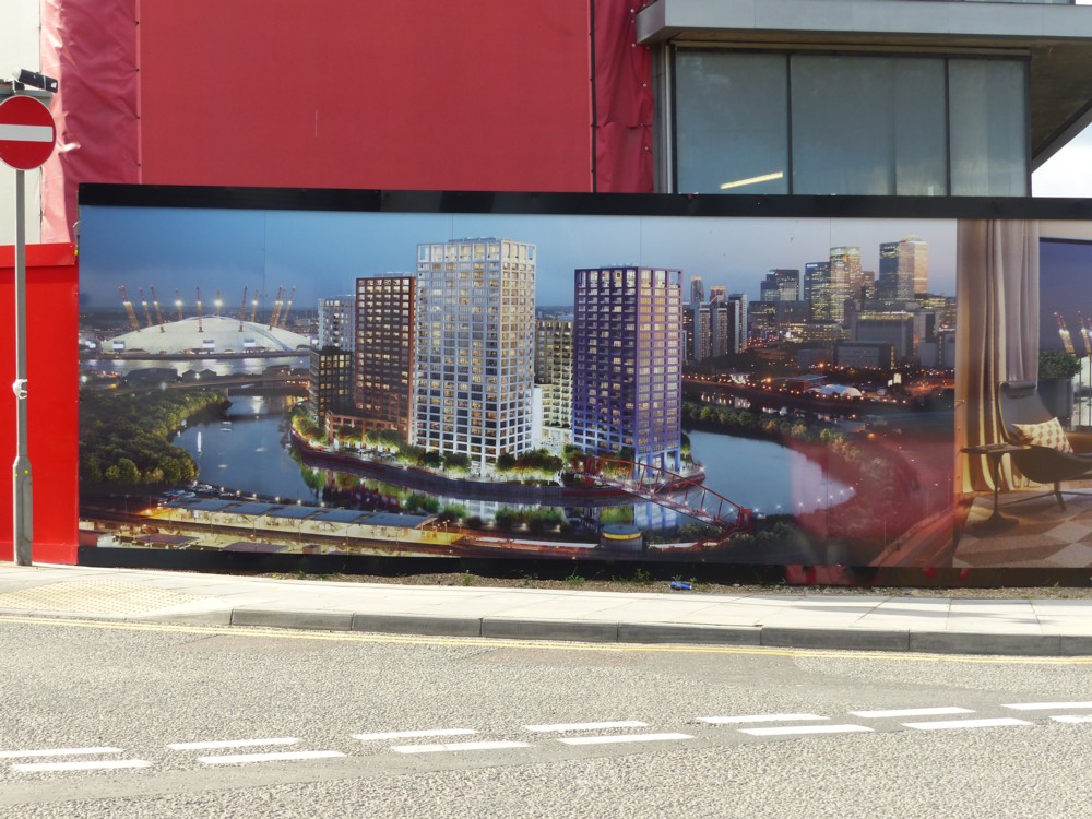
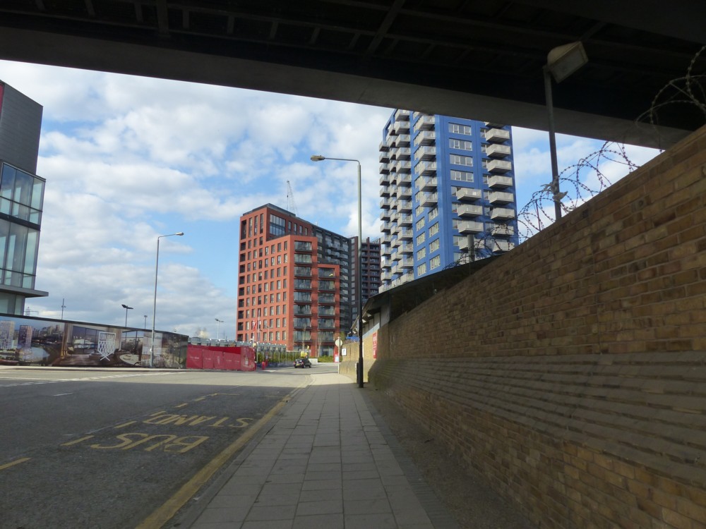
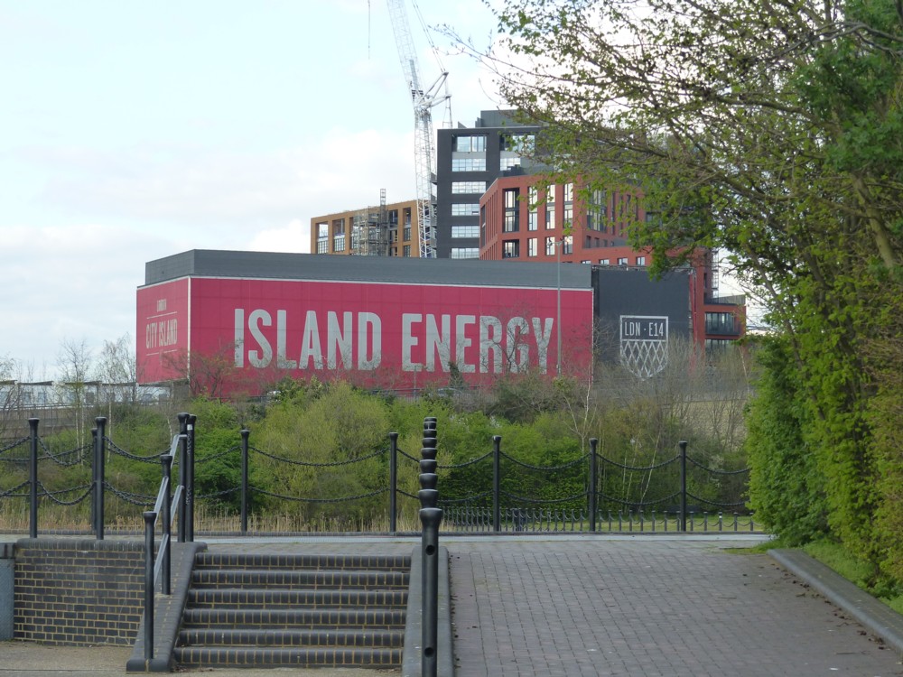
Here are some photos I took in and around City Island in 2017, while it was in the process of being constructed:

As you can see, there are maps and images as well as photos of the finished objects, to tell you what this place was going to be like. And cranes.

City Island is a particularly perfect illustration of what Modernist Architecture has now become, and as I have said here before, I quite like it. I especially like how City Island has what amounts to a moat around it, which gives it the appearance of a micro-Manhattan.

I entirely understand why Ancientists think that Ancientist architecture should also be allowed, and I’d also quite like to see more of that. But I suspect that if there were more of that, even the protagonists of such buildings would find themselves being somewhat disappointed, both in how others react and in how they find themselves feeling about what they were in theory so keen on seeing.

The basic aesthetic problem that new building of the sort we see on City Island is the sheer amount of it that is liable to be happening at any given moment. If lots of buildings are required, all for some similar purpose, then whatever gets built is liable to start out looking and feeling rather meaningless. And that emphatically will apply, I believe, if a mass of fake-Ancient buildings is what happens. That is awfully liable, at least to begin with, to look all fake and no Ancient. To look, in short, meaningless. So, why fight it? Why not build what makes economic sense, in a style that is rather bland, but efficient and reasonably smart looking, and be done with it?

What gives meaning to buildings is not just the way they look when they first appear; it is the life and the work that subsequently get lived and done in them. Because of those things, buildings acquire a particular character, and people start to have positive feelings about those buildings, provided of course the life and work they associate with the buildings is something they also have a positive feeling about.

If people hate what happens in new buildings, they’ll hate the buildings and yearn to see them destroyed, no matter what style they were built in.

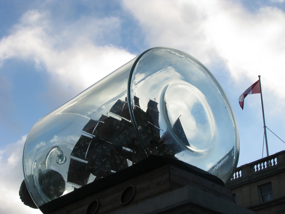
Ship in a bottle in Trafalgar Square

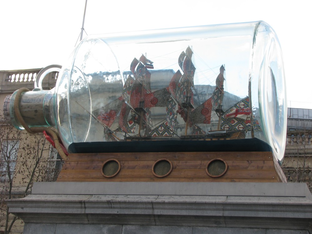
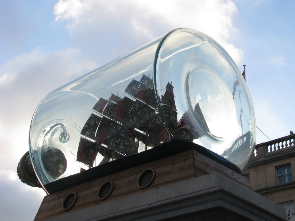
Ten years ago, I photoed this, in Trafalgar Square, on the plinth where they keep having different sculptures:

But I immediately forgot about it, and only learned about it again now.

But, the internet being the internet, I was quickly able to find out all about it.

The return of the black-all-over London black cab

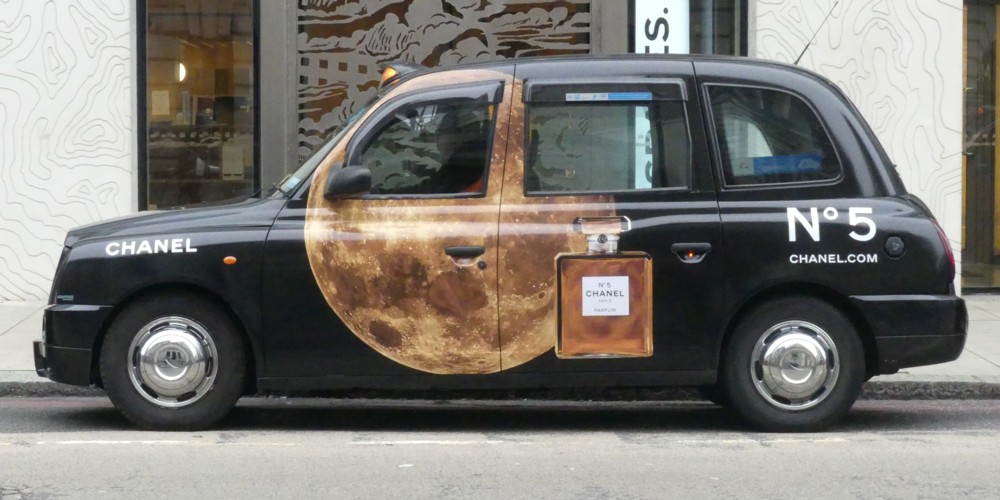
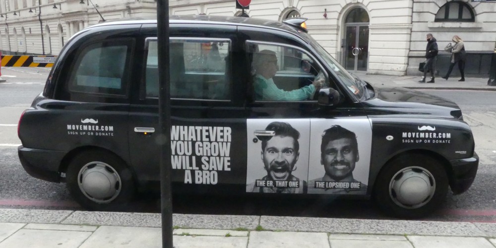
I was out and about in the Victoria Station area this morning, and it was very cold and very bad photoing light. But, taxis with adverts usually photo well. I saw two taxi adverts I’d not see before.

This, for perfume:

And this, for I don’t know what, but I’d not seen it before:

It had the look of the sort of advert that only happens when when the real advertising is happening a lot less, and they have spare slots going.

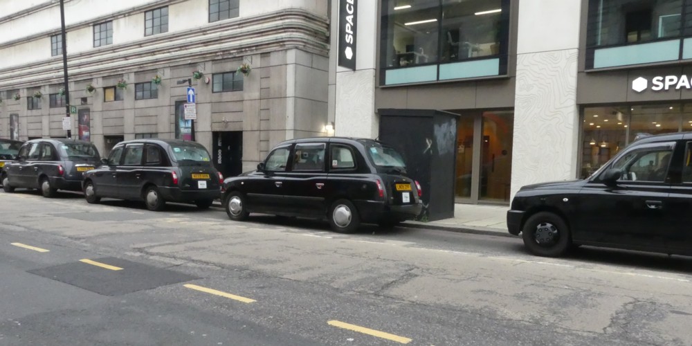
Because, that was my overriding impression. Hardly any taxis with adverts, whether I’d seen them before or not. And lots of taxis without adverts:

The ratio was about three or four to one, no advert to advert.

Then, the clincher:

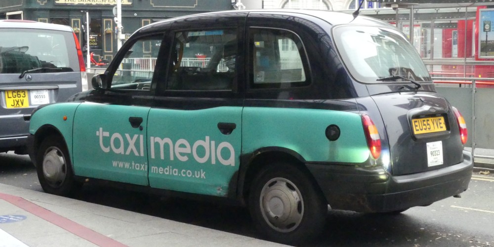
That’s right, a taxi with an advert for taxi adverts. A taxi advert in both senses, in other words. An advert for taxi adverts, on a taxi.

So, here is just another business going through very bad times. Has anyone, I wonder, committed suicide because he’s in the taxi advert business, and is heading for unavoidable financial disaster? It’s not a silly question.

There are just fewer people, and in particular far fewer high spenders and deciders-of-these-things, wandering about in London being influenced by such adverts.

I hear conflicting rumours and stories about just how bad, medically speaking, the Coronavirus story really is. In particular, I am hearing that it’s not just deaths that are freaking out the decision-makers, but the serious and often long-term damage done to people who don’t die. But I am still strongly of the belief that the cure is one hell of a lot more damaging than the disease.

Extraordinary tree

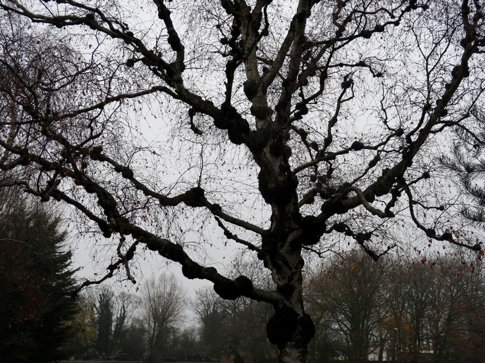
Mick Hartley has been checking out the Alexandra Palace part of London. And his basic point in this posting is that real birds perching on the heads of pretend birds is quite amusing. But then he includes this photo, like it was an afterthought that was too good to ignore, which has nothing to do with birds perching on other birds:

So far as I can tell, this tree looks entirely different from how it would have looked if humans hadn’t constantly been decided where each bit of it would go next.

Whether that’s right or not, I for one am very sure that trees are usually much more interesting when they aren’t smothered in leaves. This one definitely is.

Wooden maps of the world’s cities

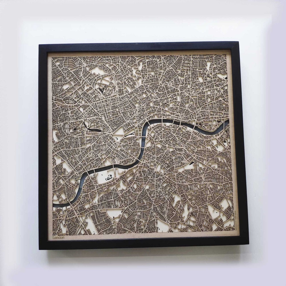
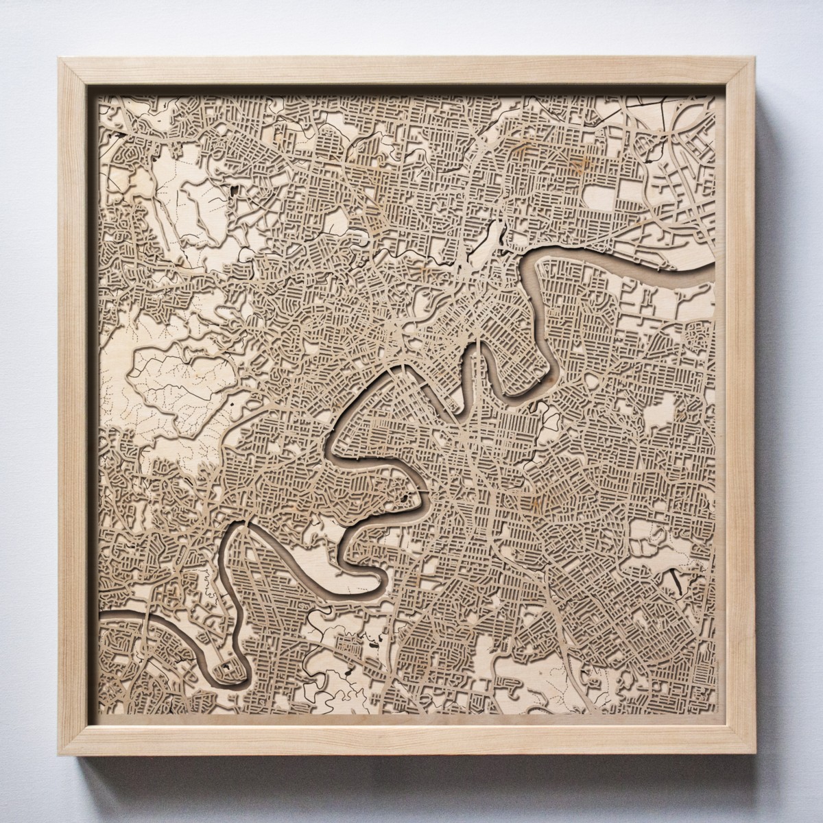
So I did a rootle through the latest stuff at This Is Why I’m Broke, and came upon these rather classy looking carved wooden maps of cities:

The one on the left is London, and sadly, nobody told them that London has been doing a lot of expanding lately, in general, and in particular out eastwards. I’d have preferred wider coverage, including such things as the Thames Barrier. Not that it matters to me, because CDs and books mean I have no wall space at all for such things.

The one on the right is Brisbane. I include this map because the river that runs through Brisbane and which presumably provoked that city’s creation, is positively Parisian in its convolutedness. Apparently, this Brisbane river is called the Brisbane River. I did not know any of this.